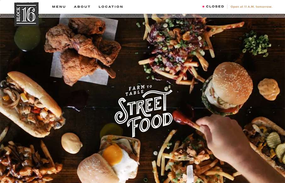
One more example of how restaurant sites are finally getting facelifts – love this one that Grain & Mortar did for Block 16 out of Omaha, Nebraska.
As an aside – restaurant websites have always been horrible (here’s my 2nd site I ever made for a restaurant franchise that I was a franchisee for – to be fair, I was a restaurant owner at the time, not a designer, or whatever I am now… Also note, Chrome wasn’t around then, so I see browser compatibility may be an issue with that site..). So again, I’m glad to see the design industry help the restaurant industry more.
Anyway – My job is easier when the designer points out the highlights of the site:
From the Designer: Grain & Mortar created a visually rich and playful site for Block 16 — a farm to table restaurant in Omaha, Nebraska. Our favorite features include the open/closed functionality in the navigation bar to accommodate Block 16’s slightly irregular hours, the integrated Facebook feed to showcase their amazing daily specials, and the mouth-watering videos that loop throughout the site.
Submitted by: Mike DeKay
Twitter: @grainandmortar
Role: Designer
Country: United States


0 Comments