
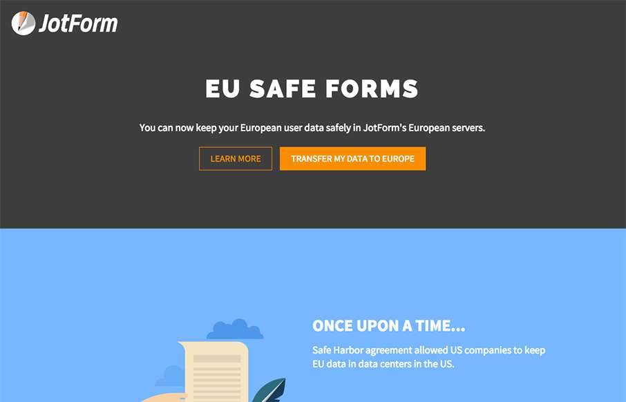
We’re reviewing this page for this page only. It’s a good example of great, clean product (product feature) page – good funnel – good illustrations. (keep in mind that parts of the JotForm site need a good bit of work design-wise – so my hope would be that they continue in this vein for the rest of the site).


Fitts’s Law: Why the Easy Button Wins
Large, close targets are faster to hit than small, distant ones, that’s Fitts’s Law. A look at the 1954 rule behind buttons, prime and magic pixels, thumb zones, and dark patterns.


0 Comments