Web Design Inspiration Curated
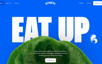
Bowery
Very nice layout with some very solid detail interaction work. I love the nav and how it minimizes as you scroll but let's you play between scroll and back-to-top. The section in the middle that locks the page but slides up the detail screens is also very well done.
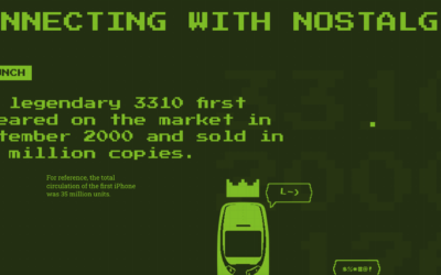
Nokia 3310
The legendary 3310 first appeared on the market in September 2000 and sold in 126 million copies. This website is a testament to that indestructible piece of history. 🙂 Also, this website is quite fun.
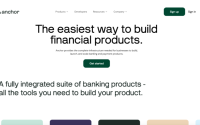
Anchor
Very cool animation and scrolling triggered animations. It's one of the first i've seen that make sense to the page's concept. Making it tie together with the copy is smart and makes me smile. https://youtu.be/6dmvdnlIZ6s
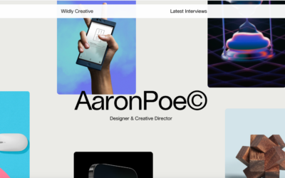
Aaron Poe & Co.
Clean 'bento' looking layout. Nice subtle scroll animations and the large images of the work let you see some good detail.
Klarna
Large and loud photography to tell the story of what it is that Klarna does. Good timing on the scroll animation sections and solid typography on top of all of it. Good stuff.
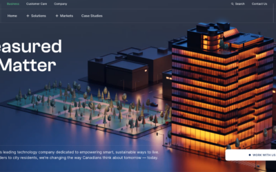
Wyse Meter
Super rich graphical design. Sharp photos and timing on the scrolling. I like it most at the point where it goes from the kinda "hero" section to the more content centric portions on the page. Solid work.
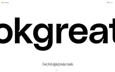
Okgreat
A nice mix between creativity and a clean interface with some funky fonts and sweet animations.
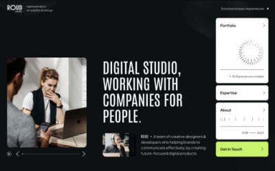
Roud Studio
Roud Studio’s creative website ingeniously displays usability in a unique and distraction-free way. With a focus on simplicity, it invites users to explore seamlessly, highlighting our innovative features without unnecessary clutter. Welcome to an online space where creativity meets functionality with a touch of unexpected delight.
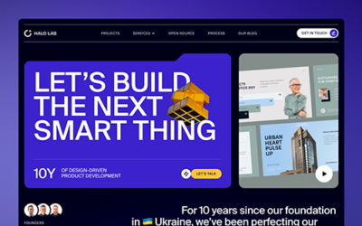
Halo Lab
Halo Lab’s product-oriented website features a folder-based style, offering intuitive navigation with a streamlined, organized interface reminiscent of a well-curated portfolio.
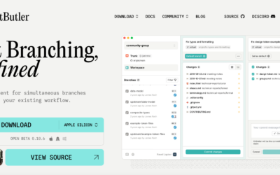
GitButler
Very strong design for GitBuilder, I love the detail work put into the interactions and such. Very clean layout and just fun. https://youtu.be/-fJsKwL0jwE
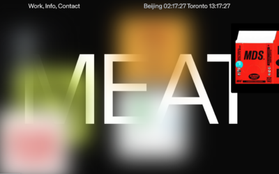
Meat
Brutalist style design? I kind of like it, the mouse-overs on the hero section are a mystery to me though. Overall I dig the layout and design. Fun stuff.
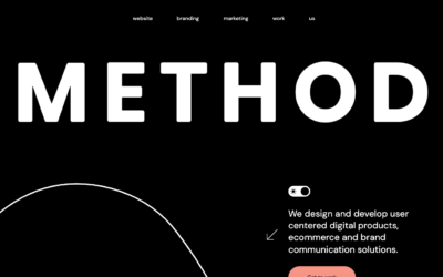
Method
The design studio Method offers a visually delectable treat with their Bento box, brimming with sugared almonds. Their adept use of pastel hues and curved corners infuses a modern, upbeat ambiance into the design, creating an inviting and aesthetically pleasing...
Electra
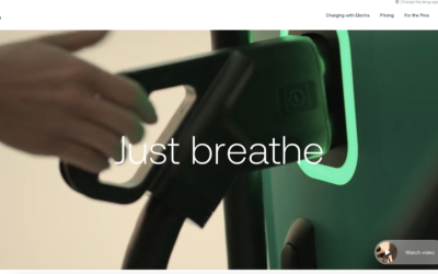
Electra, a manufacturer of car charging hubs, presents a website that exudes modernity and cleanliness in a subtle yet compelling fashion. The design features rounded corners and seamless, animated interactions, elements that contribute to its understated yet engaging...
bitesized
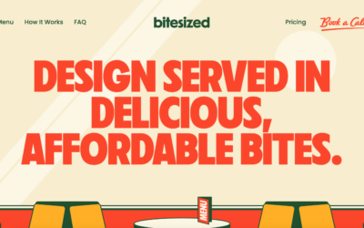
Bitesized has ingeniously crafted a website, cleverly themed around the world of fast food. The concept is brilliantly executed, featuring a striking color palette that resonates with the fast food industry, along with impeccable use of display typefaces that capture...
Robin Mastromarino
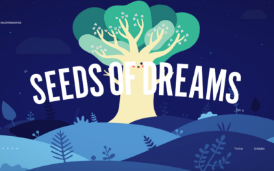
Robin Mastromarino, an interface designer deeply intrigued by user interaction, crafts a site with a playful ambiance. Projects are ingeniously presented on a clickable wheel, and the seamless transition upon clicking a project, where the header image straightens...
Locomotive
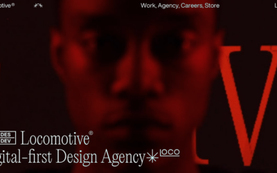
Locomotive adopts a minimalist brutalist aesthetic for its portfolio, yet it infuses the design with engaging elements, such as animated interactions and image pixelations, which enhance the visitor's experience.
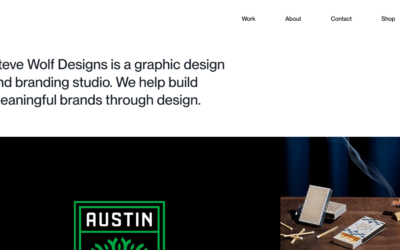
Steve Wolf Designs
Love the grid here. The juxtaposition of the type and images is solid. I like the little "flitter" of the photo before it loads into it's place on the grid, it's subtle, not subtle, and always makes you take note of the element.
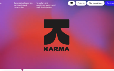
Tux Karma
Tux Karma, an initiative by creative agency Tux, is dedicated to championing projects focused on social and climate justice. The website features a bold design, marked by vibrant, fluid backgrounds, and an array of distinct typefaces. Additionally, it incorporates...
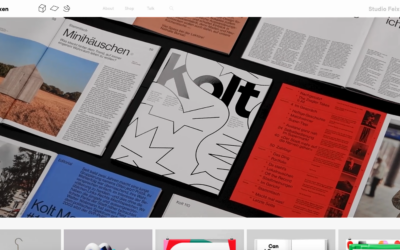
Studio Feixen
Studio Feixen's portfolio strikingly exemplifies the art of infusing vibrance without inundating the user. A harmonious equilibrium between playful and sophisticated elements suggests a perfect fusion of personal flair and top-notch craftsmanship.
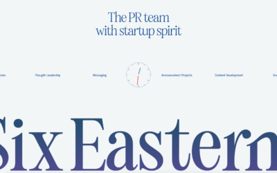
Six Eastern
Interesting overall interaction here making this side scroll. I'm not sold on it 100%, but it kinda works here - makes it all stand out. Good too that it's based on a foundation of solid visual design.
EMAIL NEWSLETTER
News & Articles
Looking Fast: The Art of Website Speed Perception
In the web world, technical speed and user perception matter. By improving design for a faster appearance, you boost conversions and stand out online. Speed isn’t just loading time; it’s perception.
Designing for Errors: Creating User-Friendly Contingency Plans
Contingency Design hinges on empathy, understanding user frustration, and transforming errors into positive impressions. By embracing these principles, you enhance user experiences, retain customers, and boost revenue in the competitive digital landscap
Fixed Navigation: Enhancing User Experience and Aesthetic Appeal
Explore the advantages and considerations of fixed navigation design in web development. Enhance user experience and aesthetics while ensuring it serves a purpose in your design.
HARD WORK. CLEAN FUEL. NO EXCUSES
Use “WARRIOR2023″ for 10% off.

