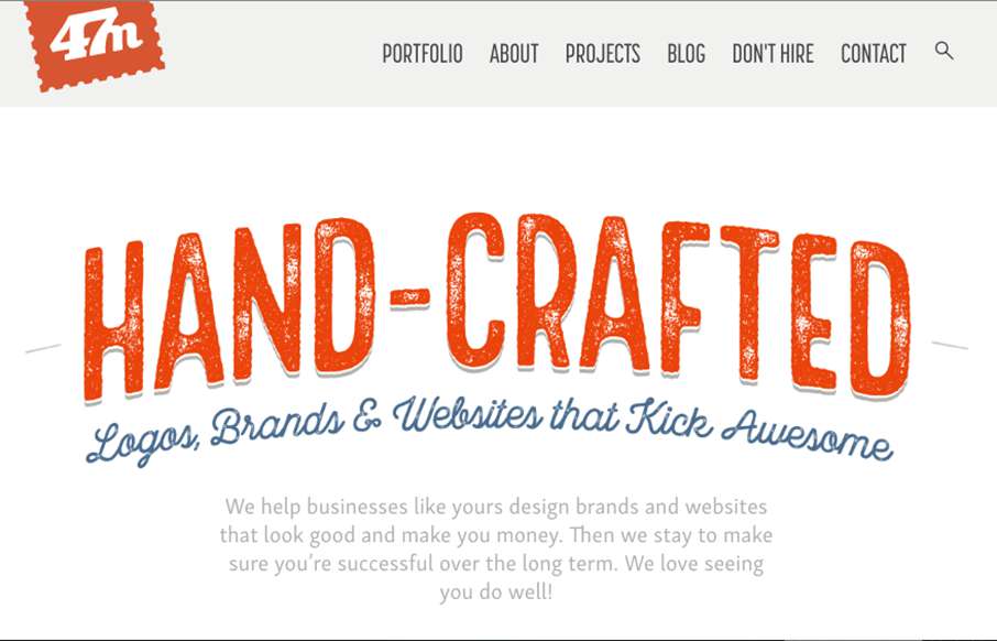
Pretty stellar work on the 47media website. I love the brand's tone and the way the visuals really support that first and foremost. The site's content is really well done and thought through, all the way down to the customized photography. Bravo!
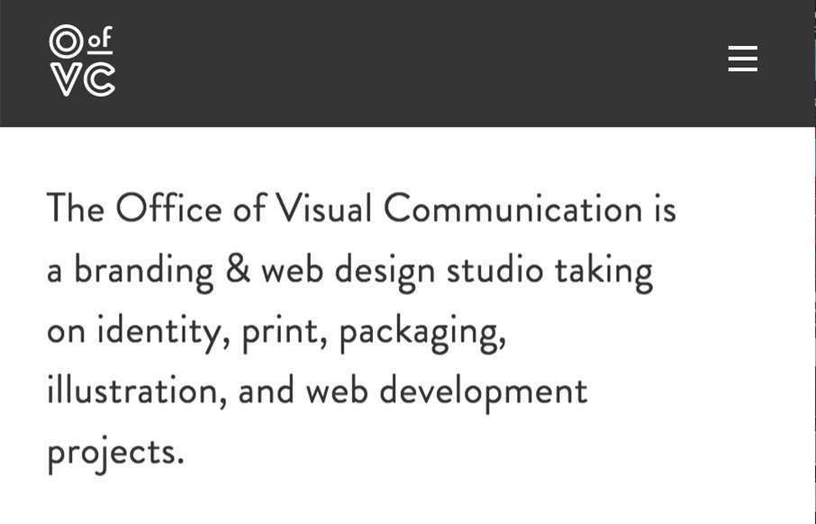
O.V.C.
Man, I love the name of this company. The graphic design is so on point too. I love this in every way. Submitted by: Brandon Vaughn Role: Designer & Developer Country: United States
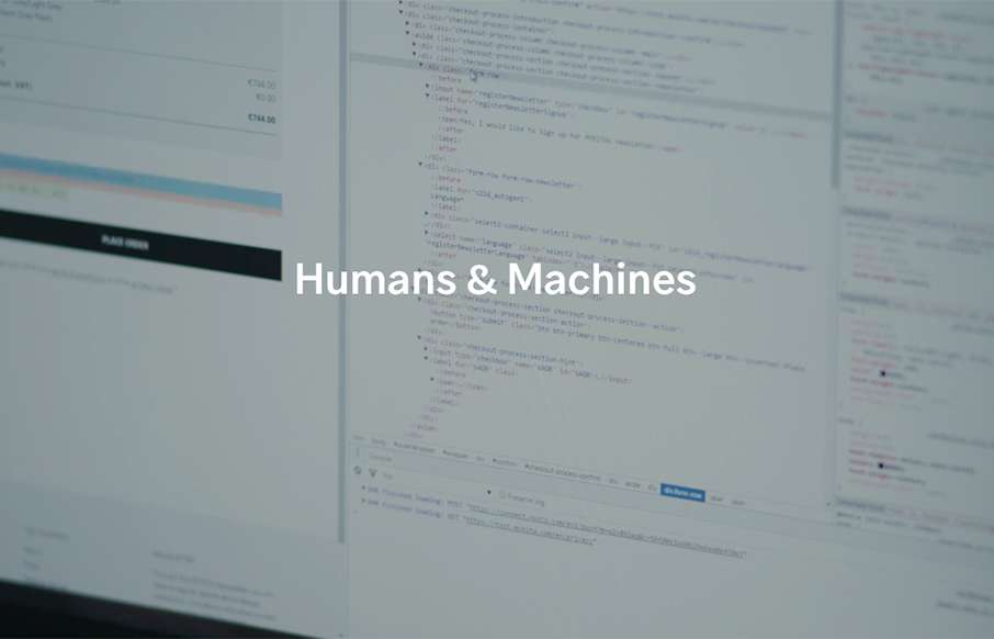
Humans & Machines
I like the minimal approach to the Humans & Machines website design. I also really dig the timed scrolling interactions, it doesn't feel at all like it's taking over my scrolling experience and is really smooth. Humans & Machines is an independent design and...
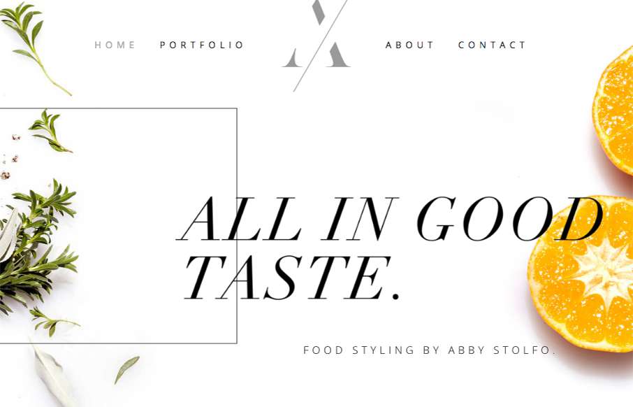
Abby Stolfo
Good design matched up with some good photography and nice flourishy details make this site really sing. I dig the overall vibe and tone. Good looking site design.
Pop Montreal
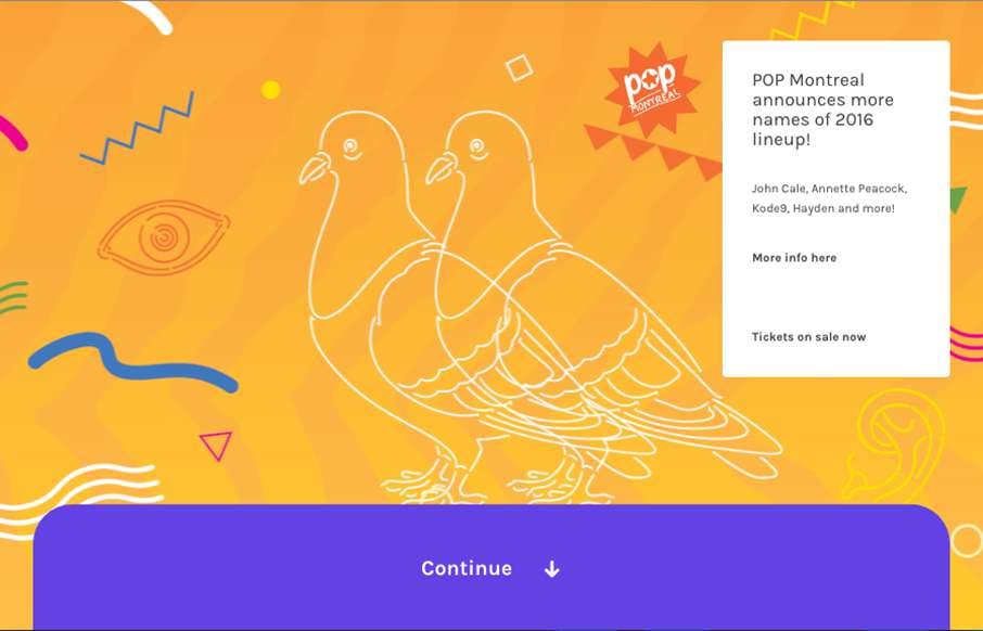
Pretty cool interactions on Pop Montreal. I like how the nav and the rest of the site sort of play off each other on the scroll like that. Then the big content areas and how they are broken up and made to look interactive by just layout is so cool.
Black Market
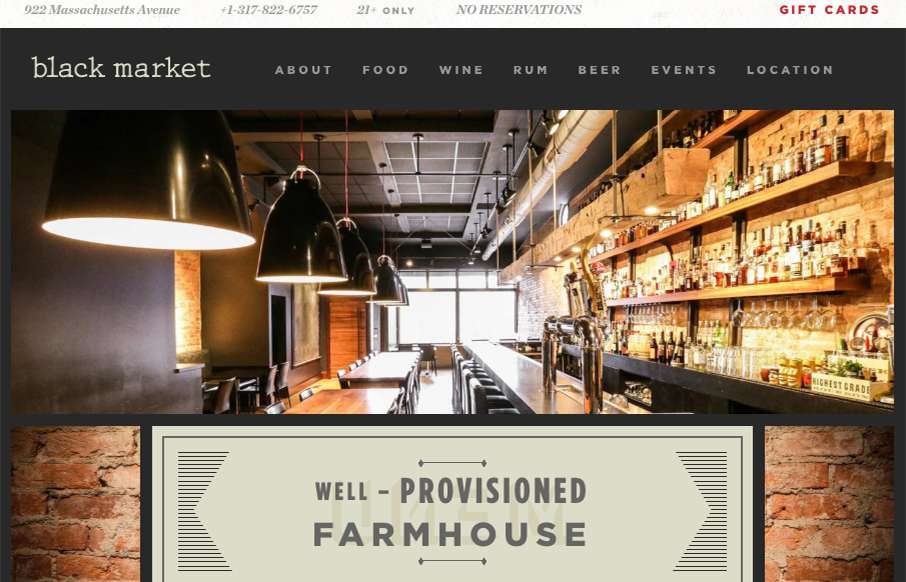
Got some good looking bold graphic look here on Black Market. I dig it. It reminds me of print a great deal which is good in this instance. I really dig it.
Brave People
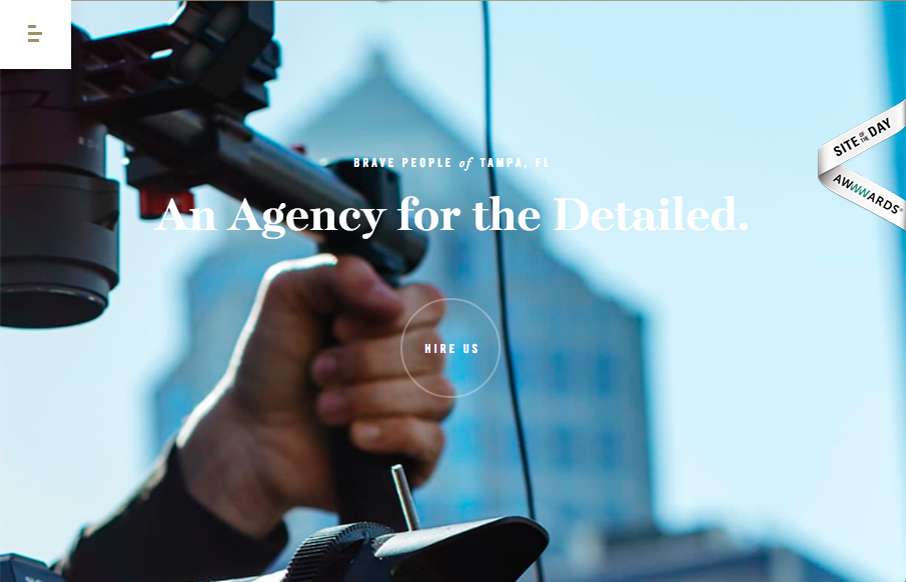
Such solid layout. And that menu nav design is pretty rad. I love the off-kilter approach to the overall layout, it keeps the site feeling fresh, even to someone who looks at thousands of sites a month. 🙂
Cuberto
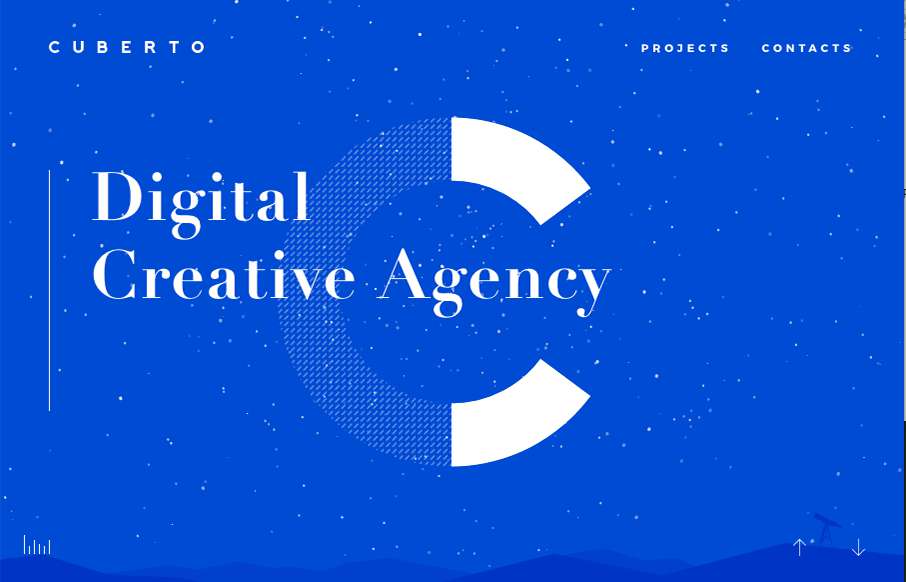
A little scroll jacking never hurt anyone, well not too much. Pretty solid interaction as you scroll here though, beautiful design for sure.
No-EE-KO
Pretty rad asymmetrical layout for No-EE-KO. The layout is bold and paired perfectly with the bold photography to show it off almost perfectly.
Galaxy Portfolio
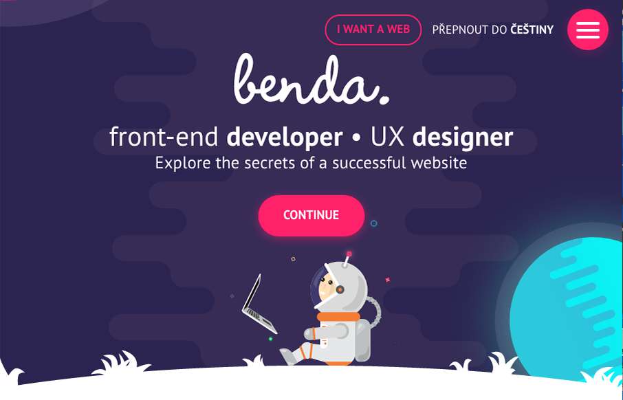
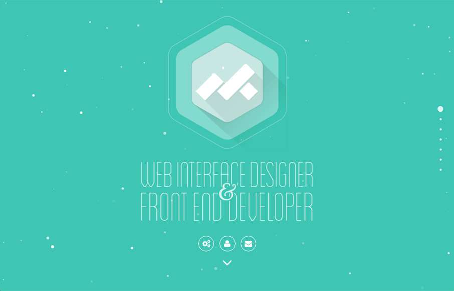
Very cool and fun approach to this design. I love the blend of the illustration work and the website's pieces/parts as well. Beautifully done.
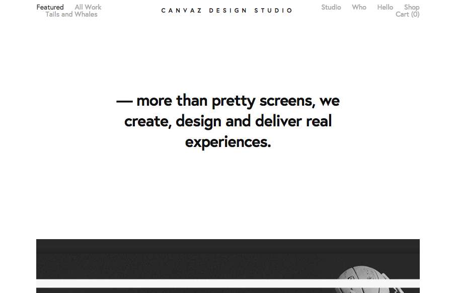
Canvaz Design Studio
Pretty cool breakdown of the links/interface on top of what is essentially a poster. I dig the graphic design approach a great deal here. From the Designer: This was made with the sole purpose of showcasing what we do best but also to some hidden and cool details that...
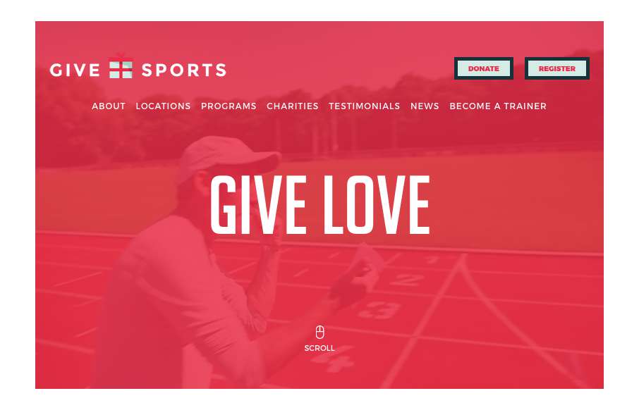
Give Sports
Strong, bold and clear design vibe. I love the heavy lines and graphic feel to the overall design esthetic. I like the interaction work too, simple yet strong. Really great work on this site design.
Myk Tongco
Pretty fun website design. I dig the animation on the hero area then the design of the portfolio section is unique too. I dig it! From the Designer: Myk is a remote freelance WordPress front-end developer based in the Philippines. Submitted by: Myk Tongco Twitter:...
ntgrate
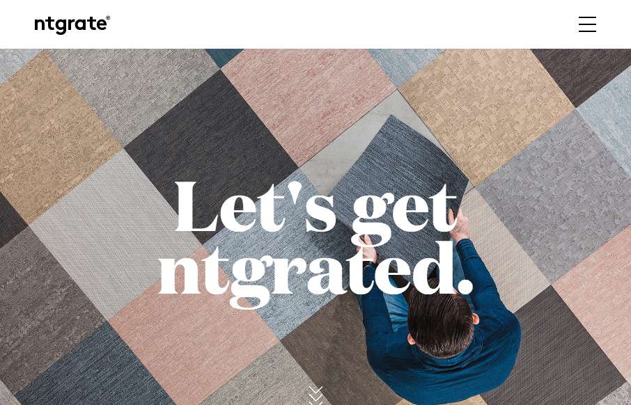
I really dig that navigation design and UX. Pretty slick. The scroll design is pretty rad too. I like this site most because it really feels different when i'm scrolling and interacting with it.
Stockholm Kajak
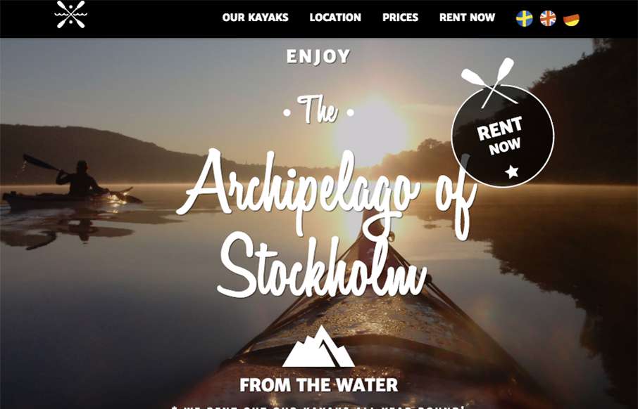
I'm a pretty big Kayaking trip fan. I always try to do it when I travel to different areas that permit it. This site isn't super special but there's some solid graphic design work and photography happening here that really makes the website work well. It's simple and...
VR Sessions
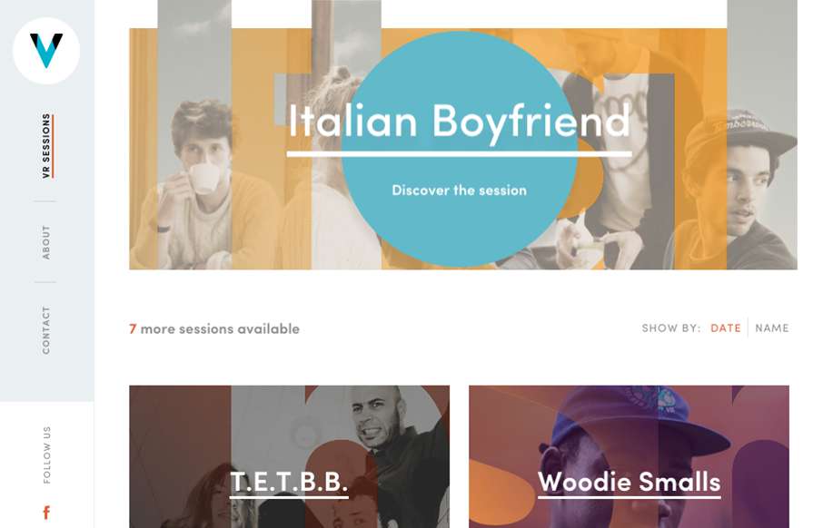
Pretty slick website design. It's largely mobile first and indeed I like the mobile to ipad screen size designs best. The "side bar" vertical navigation is unique, though I question it's usability, I'm not entirely sure it matters much for this site. Pretty cool...
Radolo
Pretty cool site design. I dig the bold graphic approach and the muted color palette. The project planner is cool as well as the fly-out menu design. Good work. From the Designer: In the newest iteration of the Radolo website we wanted to create a clean minimalist...
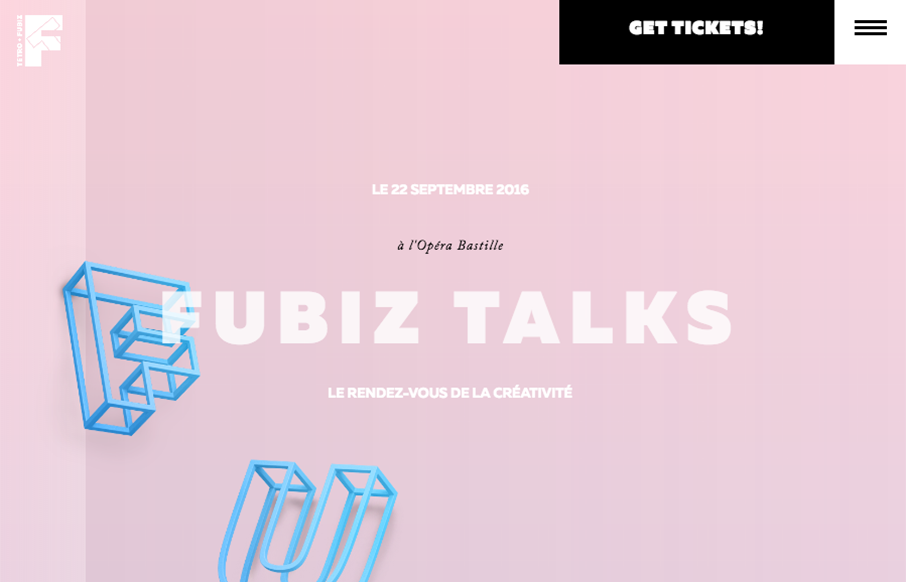
Fubiz Talks
Badass event website. I love the way they're utilizing the parallax thing with the floating image elements. Then the timed/triggered stuff is top-notch.
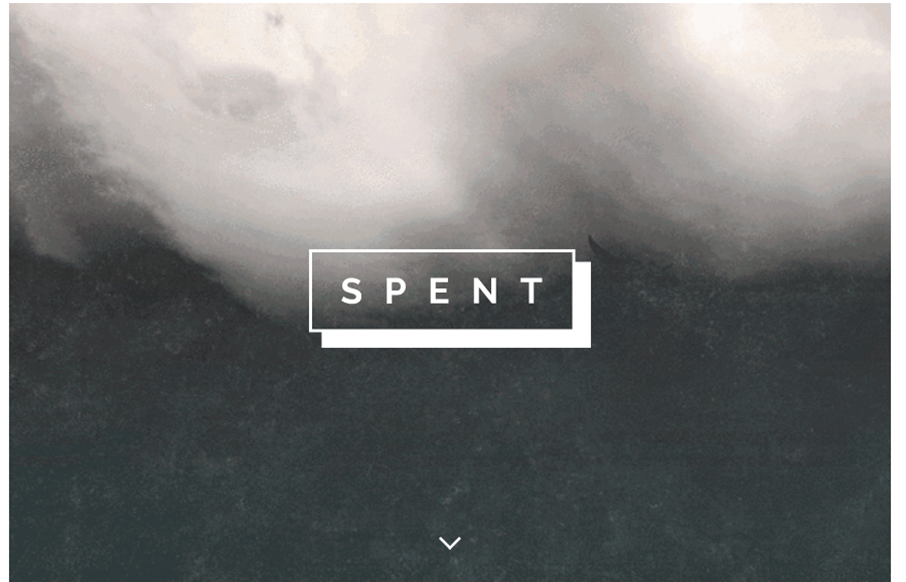
I Am Spent
A lot of this reminds me of David Carson's work. But kind of updated. I dig it, cool vibe and neat imagery overall when it's put together.
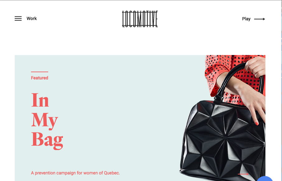
Locomotive
Pretty sweet layout. Very unique too. I dig the detail work and the interactions here and there. Solid.
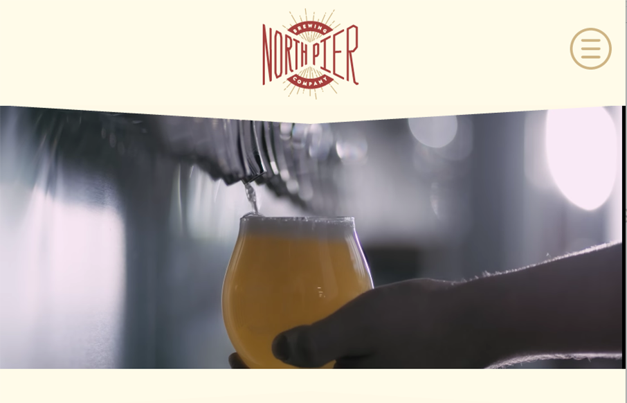
North Pier Brewing
Big bold type and cool earthy colors, really fits well with the "brewing" vibe. I also love the way they've utilized the youtube video too. Cool stuff.
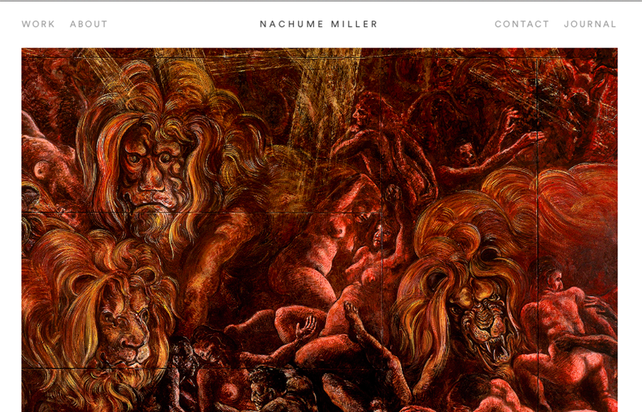
Nachume Miller
Beautifully simple portfolio and presentation. I love the video used for something like this too. Good stuff.
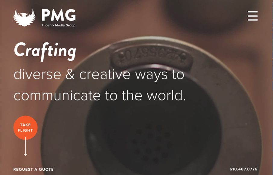
Pheonix Media Group
Really great timing on all the interactions and beautifully done to boot. I really love the pacing and all the detail work throughout this website. Very good work.
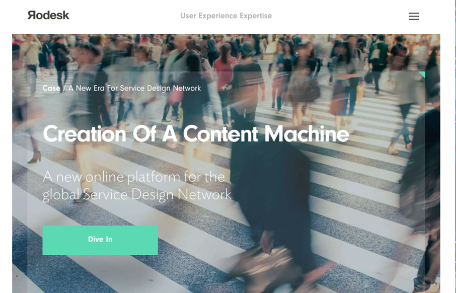
Rodesk
Damn this site is sexy. I love that navigation interaction and it's placement. I also love the way the content is stacked down the home page. Very cool vibe.
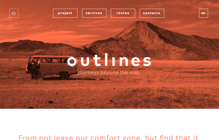
Outlines
Pretty cool use of the main image and the simplified navigation layout. I really like the visual interest in the layout as you scroll down the page. It generally keeps you eyes pulling down to get to more content.
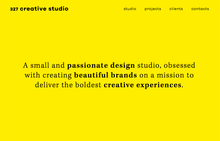
327
I love the bright yellow and the simple text used to make up this website design. I especially like the mobile view best. Really beautiful.
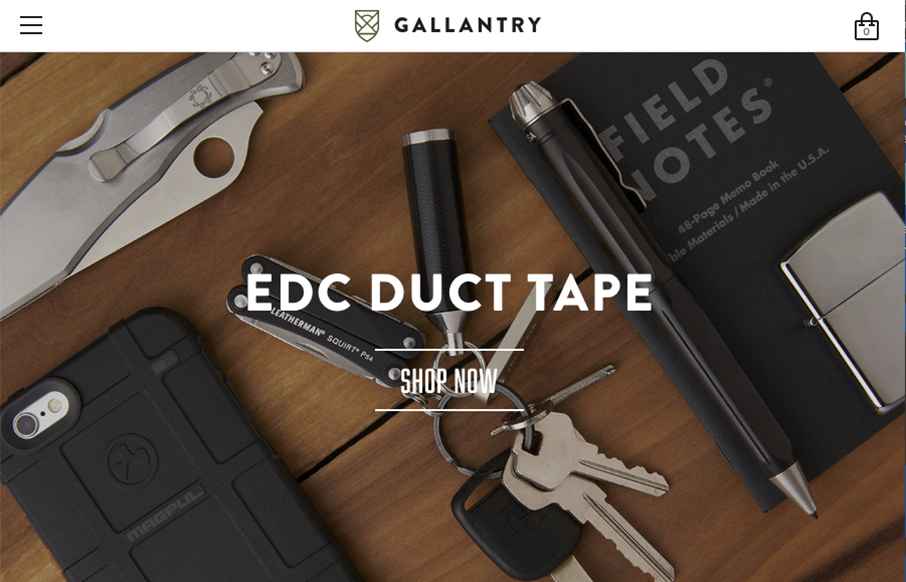
Gallantry
Pretty standard faire as far as an ecommerce layout goes. But I love the way the photography and overall simplification and coloring of the website itself is done. It all goes seamlessly together. That footer area too, nice.
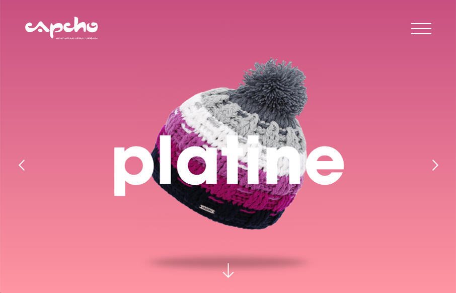
Capcho
Man, really cool interaction parts to this website for stocking caps. Very cool stuff, keeps you browsing. I love the way the images slide around as you scroll.
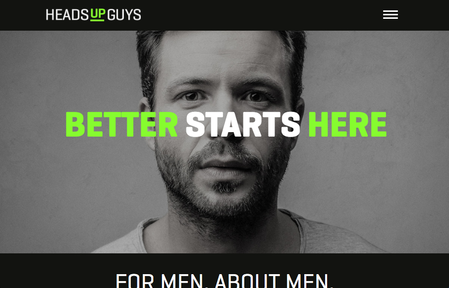
Heads Up Guys
Sometimes you have to go for a clean and clear presentation of a topic and content. The Heads Up Guys website is just that, all business. Good looking work.
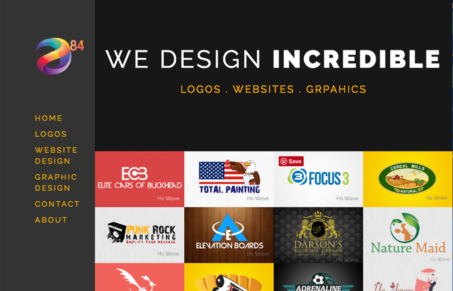
ArtsDesign84
Rich looking work. I dig the simplicity of the site and elements. Straight forward and not complex content. Good looking stuff here. From the Designer: We started as a small group ( we are still small ) of designers helping business persons and normal humans to bring...

