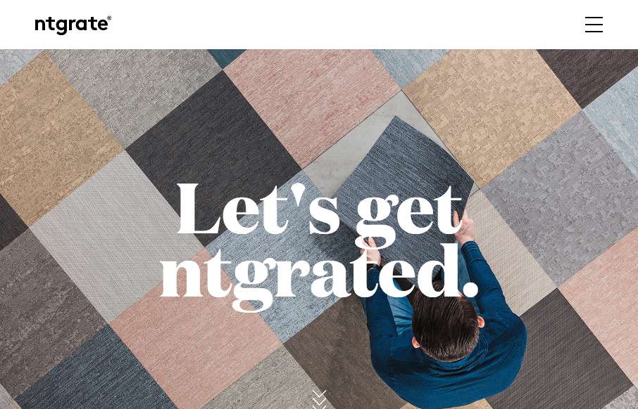
I really dig that navigation design and UX. Pretty slick. The scroll design is pretty rad too. I like this site most because it really feels different when i’m scrolling and interacting with it.
Glassmorphism: The Transparent Design Trend That Refuses to Fade
Glassmorphism brings transparency, depth, and light back into modern UI. Learn how this “frosted glass” design trend enhances hierarchy, focus, and atmosphere, plus how to implement it in CSS responsibly.


0 Comments