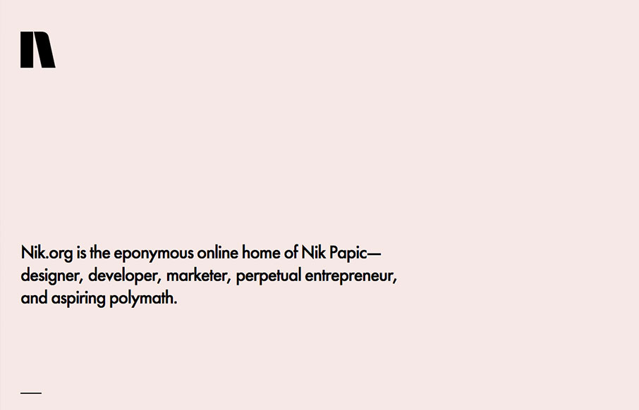
Lovely and simplified single page resume/portfolio website. I love the background color and the black/white palette. Nice grid work and layout too.
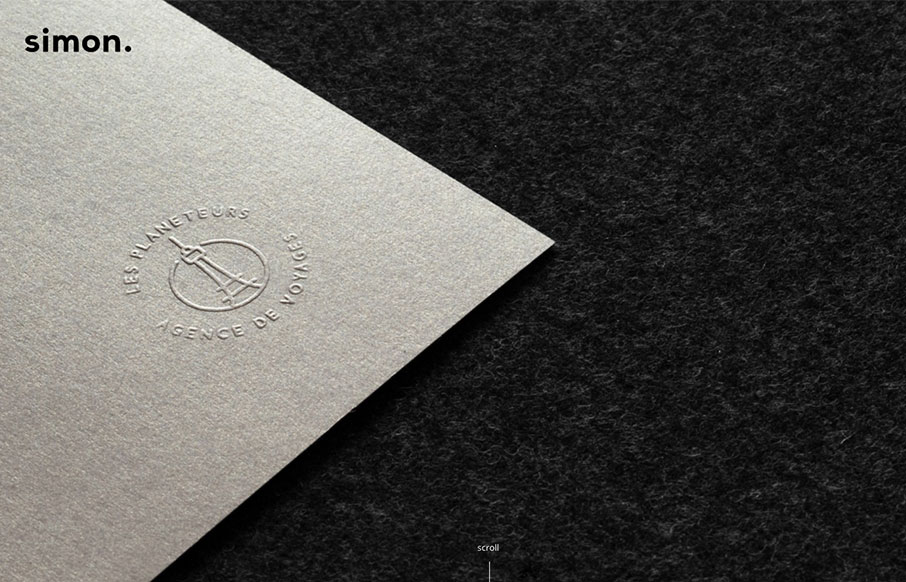
Clement SIMON
Very cool, beautiful and simple approach to Clement SIMON's portfolio. I love the way you scroll this and the imagery is timed visually just right. Beautiful little visual details too. From the Designer: Hi, I'm Clement SIMON, a 23 year old graphic designer and...
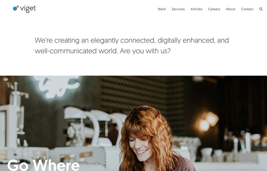
Viget
Love the new(ish) Viget site design. The simple grid and the beautiful typography and photography really bring the focus to the content. These guys are top-notch in the industry, go check the website out in detail and learn what you can.
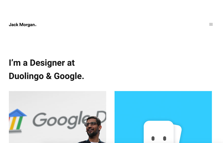
Jack Morgan
Portfolio for Jack Morgan designer at Google. Pretty good, minimal site design with some subtle interactions that really work. I love the stark design a good deal for this one.
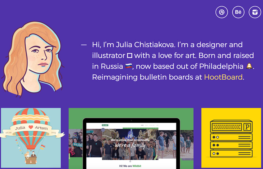
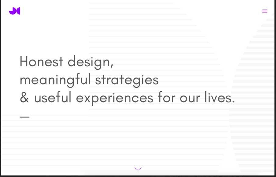
Julia Chistiakova
Love the clean approach to Julia Chistiakova's website/portfolio. The purple is unique and paired with the cool illustration makes it really approachable. Love the work too.
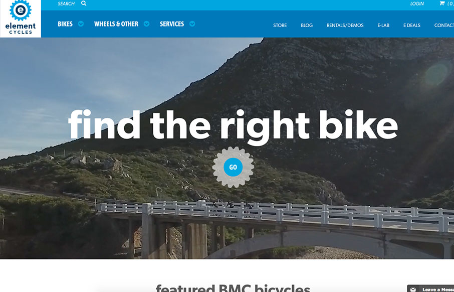
Element Cycles
Super strong layout for the Element Cycles website. I really dig the stark contrast but soft vibe. The nav is well done and simplified to make it quick to get to what you need. Strong video and product images too. From the Designer: We were really excited to work with...
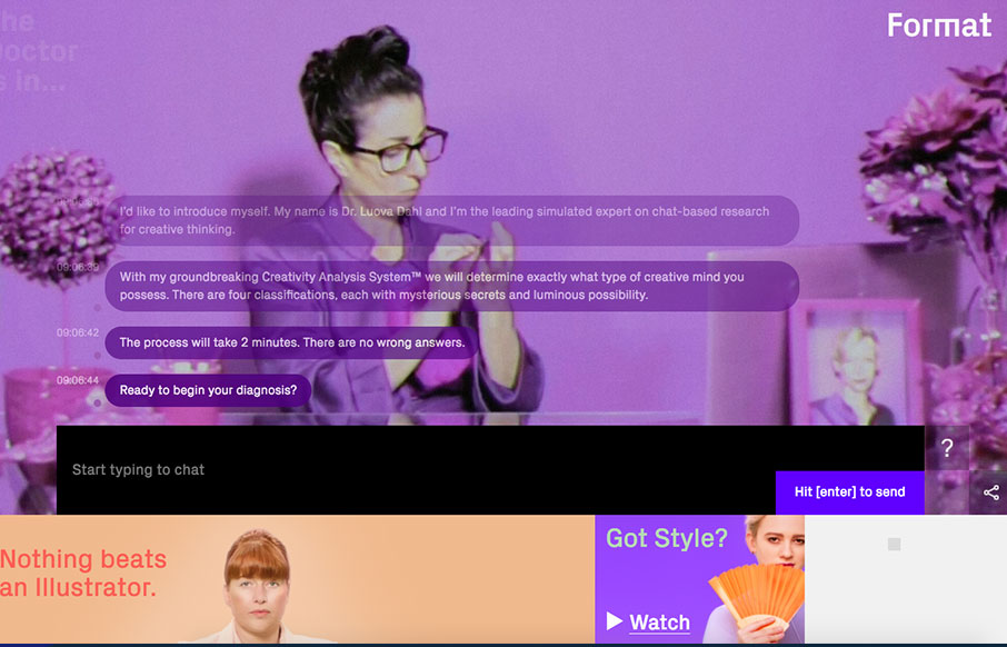
Get Your Creative Diagnosis
Pretty nifty chatbot type interface. The way they've mixed it with the funny video in the background and the super solid layout that surrounds it makes it really sing. I dig this. From the Designer: Are you an Electric Witch, a Trucker, a Crazy Ex or a Fire Starter?...
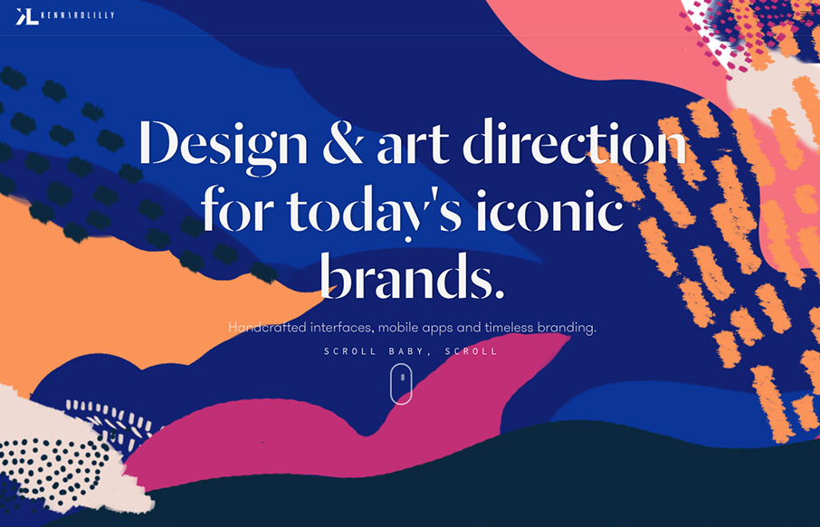
Kennard Lilly Design
I love the crazy colors and clear layout. It really makes this website explode with excitement. Solid work here. Submitted by: Kennard Lilly Twitter: @kennardlilly Role: Designer & Developer Country: United States
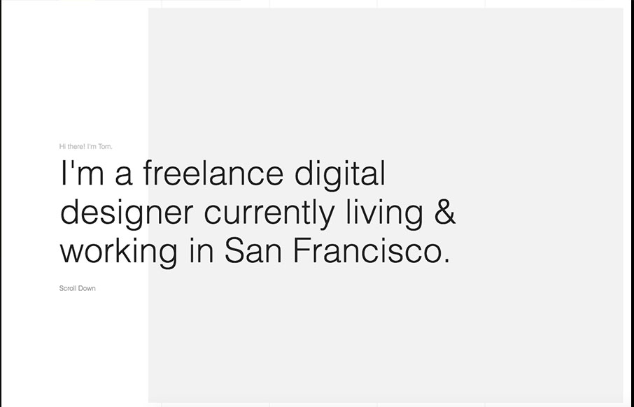
Tom Treadway
Love this type-heavy layout for Tom Treadway's portfolio site design. Clean and simple, focuses the visitor on reading and only shows the images that are needed. Bold stuff and well done. From the Designer: Portfolio for Tom Treadway – freelance designer in San...
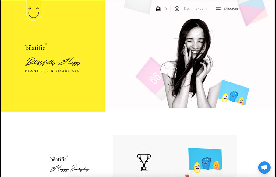
Beatific
Pretty unique looking/feeling e-commerce site. I love that it's for planners and they fully embrace the vibe of the product itself with the look & feel of the website. Bold yet happy colors and imagery. Makes me want to buy one honestly.
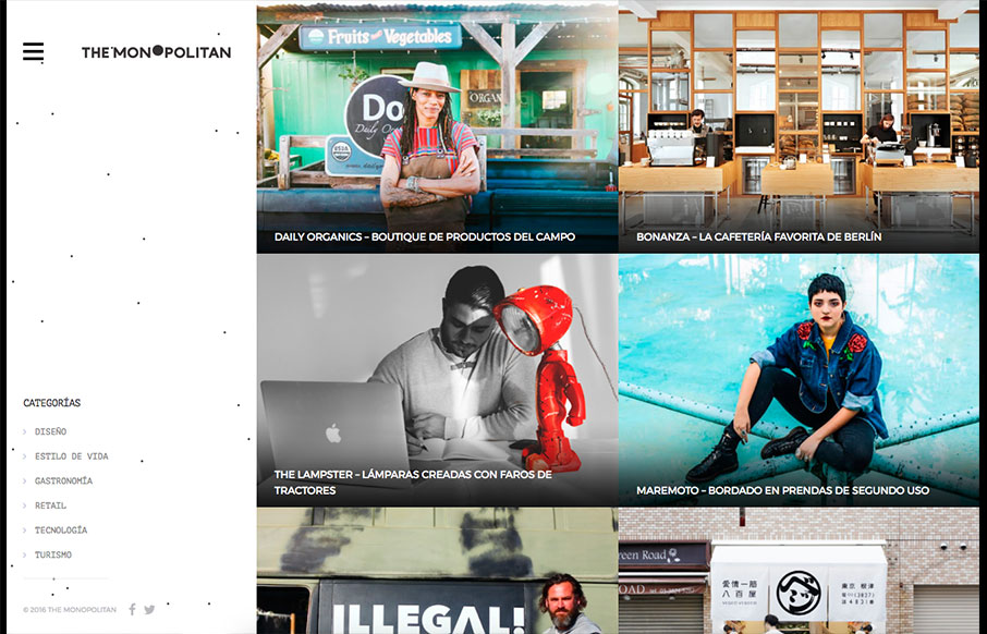
The Monopolitan
Pretty cool blog/news site layout. I like the basic grid and imagery. The hamburger nav with the nav items that only show once you click it seems a little unwarranted. Just my humble opinion, I don't like to hide things the user needs unless there's a reason. There...
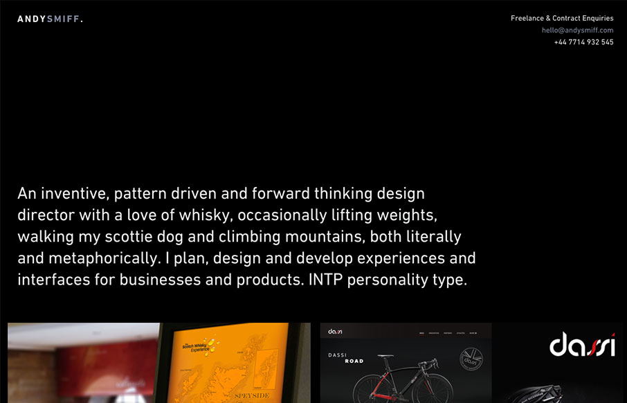
Andy Smiff
I love it when there's a good dark background website and it just works. Like with Andy Smiff's, I love how it really kicks in that classic way. Simple, straight forward, clean grid and clean type. Good stuff. Submitted by: Andy Smiff Twitter: @Andy_Smiff Role:...
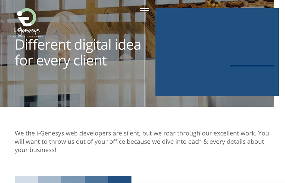
i-Genesys
Pretty nifty scroll triggered interactions and movement. I dig how the elements shift around as you downscale the browser window too. Showing off what they can do. Some clever layout and illustrations really seal the deal on this design. i-Genesys is a creative agency...
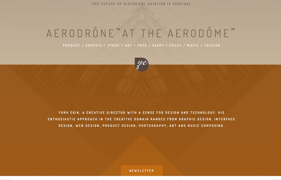
YORH EKIN
I like the subtle blend of colors and the slight movement of the graphic behind the main intro text as you scroll. The display of work is straight forward and fun enough to keep you scrolling. Yorh Ekin, a creative director with a sense for design and technology. His...
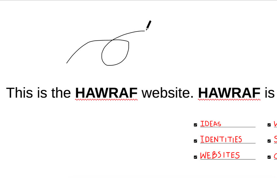
HAWRAF
Pretty dang crazy website. I kinda dig it though. It's highly confusing form a standard set of expectations, but it ends up working just fine. I actually called someone over to my desk and asked them to figure out how to do something on the site and they did no...
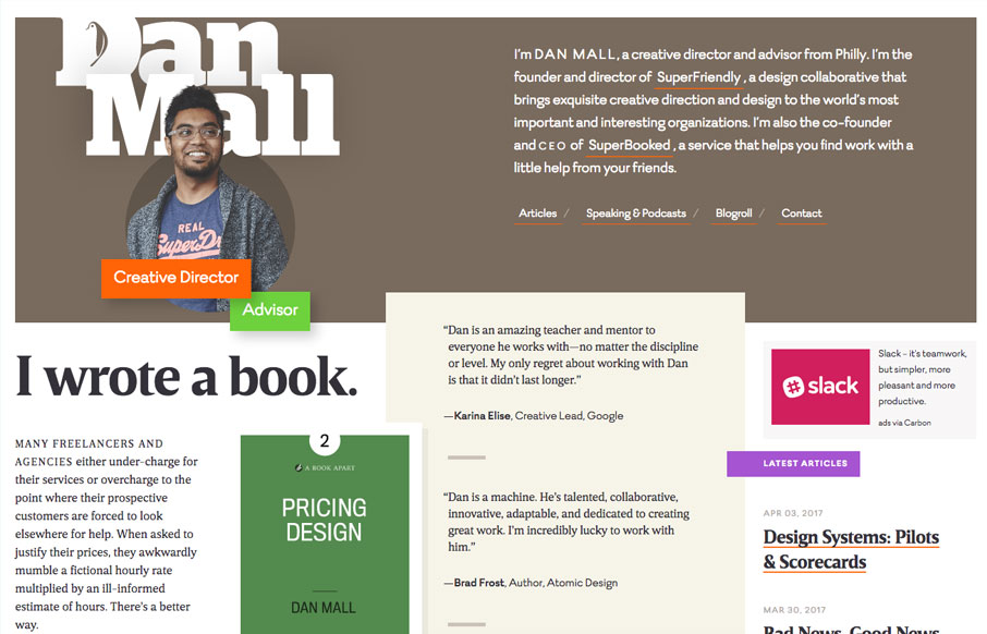
Dan Mall
Beautiful layout and design. I love the load-in animation, it sets up a fairly straight forward layout of visual elements in a really striking way. Crisp typography and color that help build a sense of contrast. Spend some time on this site if you can and learn.
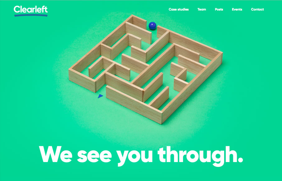
Clearleft
The new(ish) ClearLeft website is live. What a cool yet simple approach. I love it. There's some real beauty here in their approach. I particularly love the team page and the events page. Read Jeremy's Launch Note too.
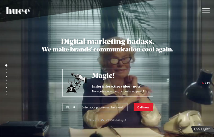
Huee
Lots of stuff going on with this website for Huee. It's pretty chock full of eye candy and movement, which should get many clients excited. I dig the background video of the lady pointing at the phone, pretty clever joke. The hamburger nav icon that opens up the slide...
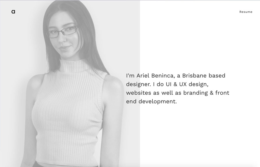
Ariel Beninca
Great portfolio website design for Ariel Beninca. I love the simplicity which makes you really notice the way the work is presented as you scroll down the page. There's a very clean aesthetic here but just enough movement and fun to show off some skill. Submitted by:...
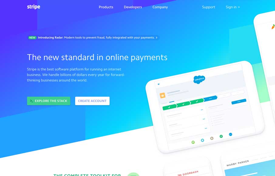
Stripe
Good lord I love the Stripe website. Everything about it. It's so visually dense with content and stuff but yet feels so light and airy. Yeah, I just said light and airy. 🙂 Seriously, you've probably spent most of your time with Stripe in the app or on your phone......
Siminki
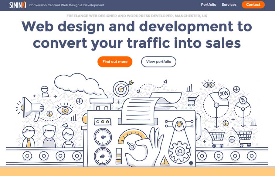
Putting this in the gallery because I love the illustration work. The line work is cool and it's inviting. The way the've weaved in the illustration with the rest of the page design is stellar work too.
Grant Burke
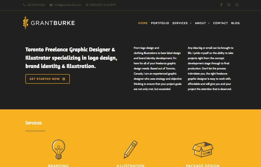
Neat interaction work here for Grant Burke's website. I like how the header/logo/nav changes around as you scroll. Nifty color choices too. The thing I love most is the multi-column layout for wider screens. You simply don't see that often and when I see it done well...
Tobias Van Schneider
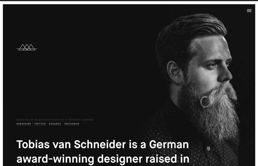
I really dig the bold type and overlay on the photo. Cool use of colors on the black background too. Tobias always has swag!
Colin Simpson Design
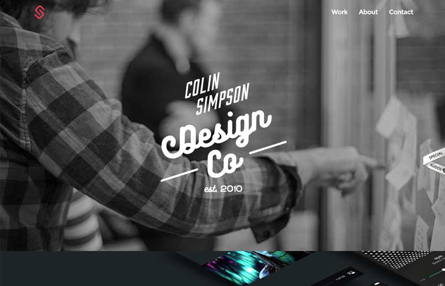
Love, love the typography on that logo mark. I also dig the big shots of the work, putting things in context like that, brilliant. From the Designer: The portfolio of Colin Simpson a UX designer from San Diego who helps elevate experiences for big and small brands...
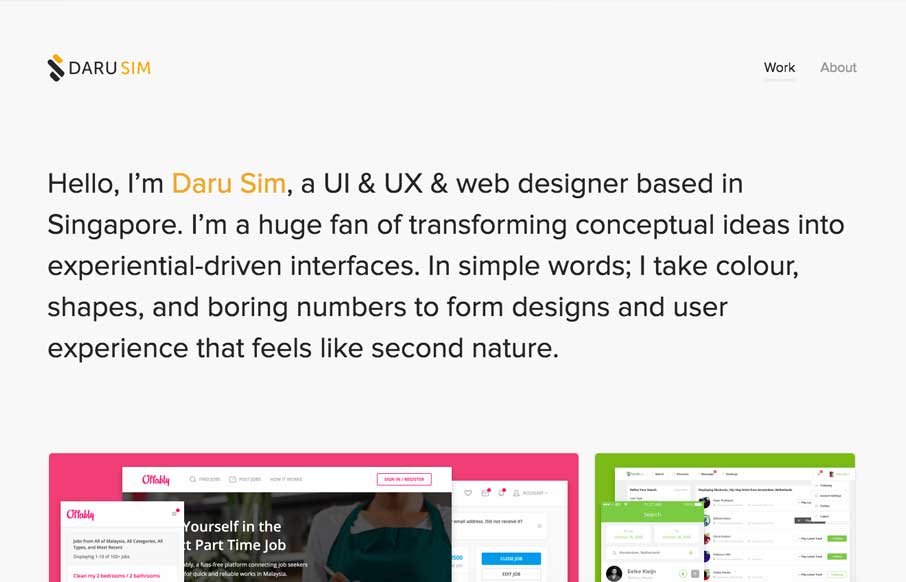
Daru Sim
Simple and effective. You can beat a one - two punch like that. This website embody's that in every way. From the Designer: It's almost the end of 2016 and I thought that its time to revamp my personal website (v3.0) and yay, I've done again and it is now live at...
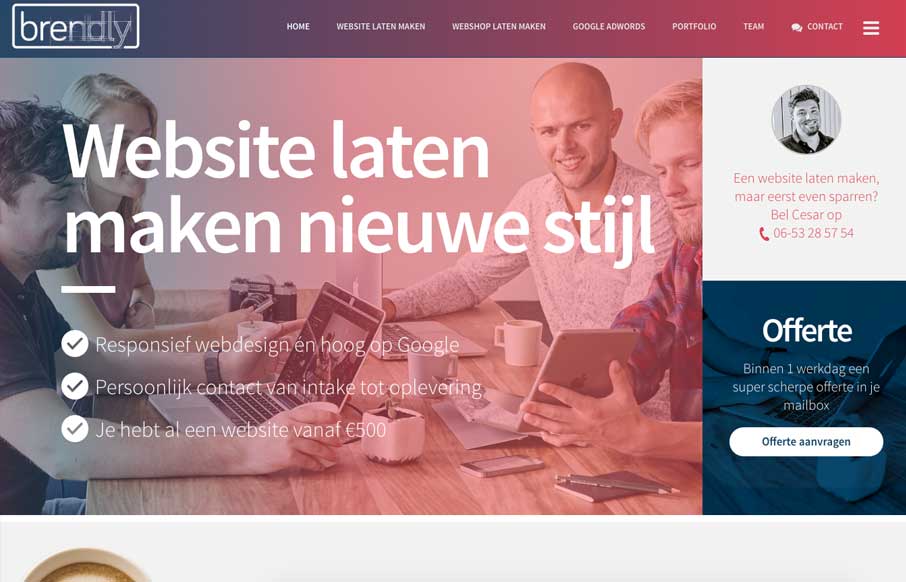
Brendly Webdesign
Pretty good layout, it keeps you moving your eyes around but on the right stuff. I also like how they've humanized certain areas like the contact us part, with a picture of one their team. Strong thinking here. From the Designer: We are a webdesign agency. The site...
Arsmoon
Love the vibe of this site. I really dig how the side nav icon/thing moves up so you notice it as you scroll down. Like the dark background setup here too. From the Designer: We are digital agency based in Ukraine. Our independent team help you to provide the best...
Amaro da Costa
Pretty sweet layout. I'm in love with the way the projects are displayed as you scroll down the page. Perfect really. Also some overall solid design. Submitted by: Joao Costa Role: Designer & Developer Country: Portugal
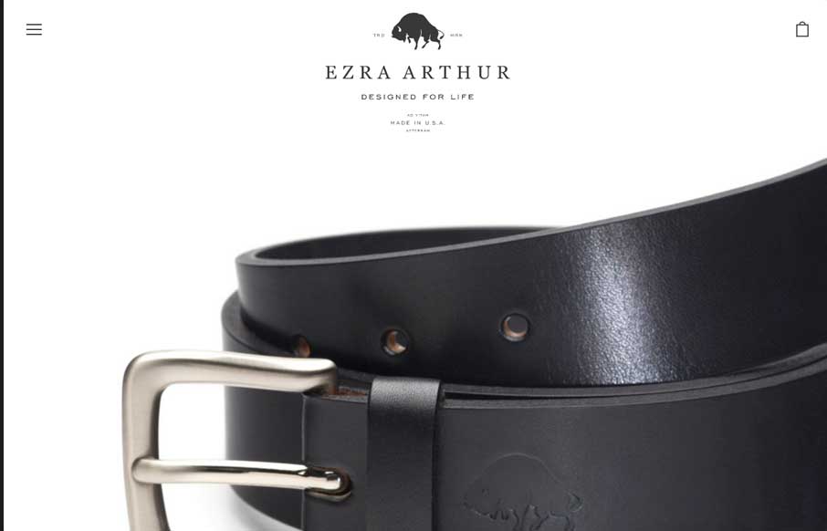
Ezra Arthur
I love the simplicity of this ecommerce site. The simple logo and big close up shots of the products are beautiful. Would love to know if this is an off the shelf theme customized or not. Good stuff regardless... Submitted by: Kia Bess Twitter: @kitchensinkinc Role:...
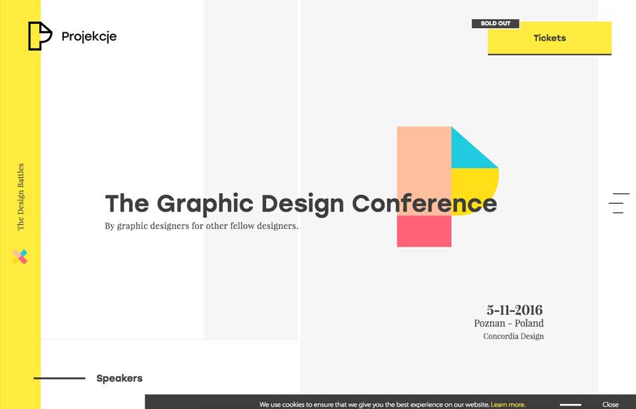
Projekcje
Pretty neat looking layout. I like how it pushes the boundaries of what a typical layout can be. It's pretty traditional under the hood but on the surface it's fresh and new looking. I particularly dig the submission form design. It's rare to see attention to detail...

