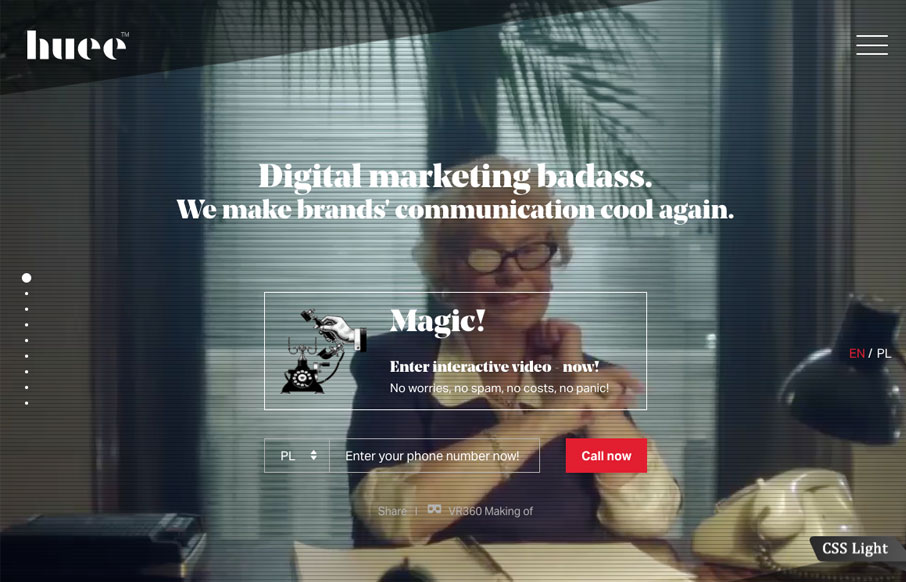
Lots of stuff going on with this website for Huee. It’s pretty chock full of eye candy and movement, which should get many clients excited. I dig the background video of the lady pointing at the phone, pretty clever joke. The hamburger nav icon that opens up the slide up nav view is pretty killer too.
The hardest part is always design experience for own agency. And we decided to provide multi device experience, with interactive video you can call in (with no fees) and provide experience in field of exploration company statements (the change part).


0 Comments