Web Design Inspiration Curated
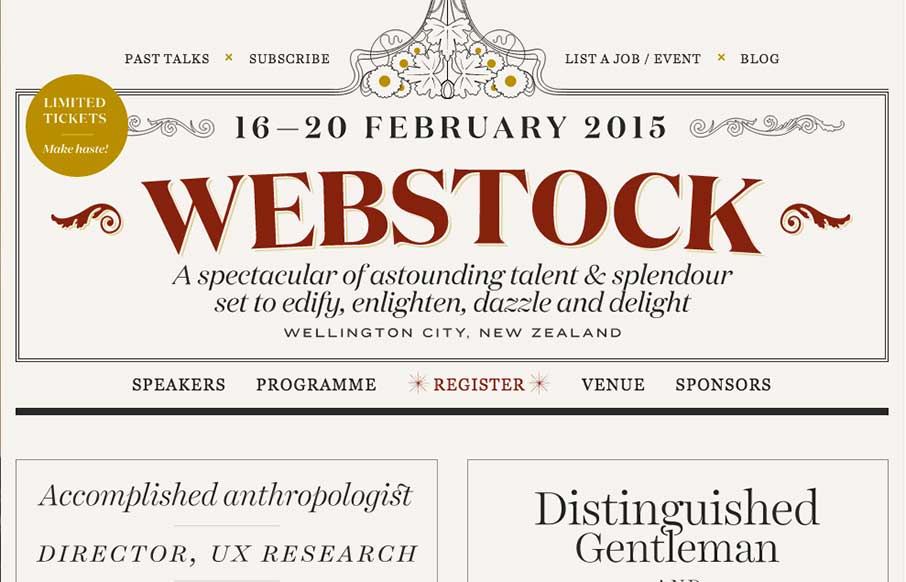
Webstock
The 2015 Webstock site is gorgeous. I love the typography and responsive treatment across the board on it.
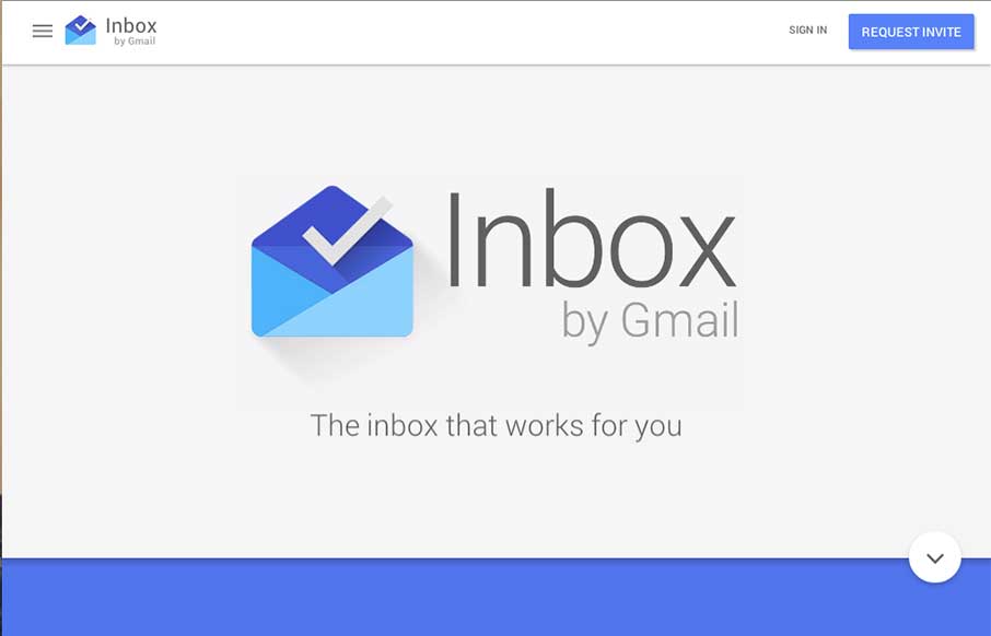
Google Inbox
Pretty cool page for Google Inbox. I dig the intro animation that smooths into the main page layout. Interesting approach to the page navigation, working mostly like a slideshow but scrolling down instead of left to right. Not exactly responsive all the way, maybe...
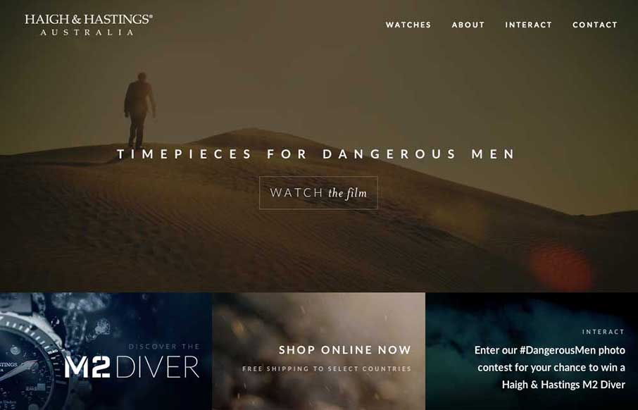
Haigh And Hastings
Very different vibe than what i'm used to seeing with the Haigh And Hastings website layout. I really like how the overall layout changes for the different screen widths. There's some dramatic layout changes - check it out.
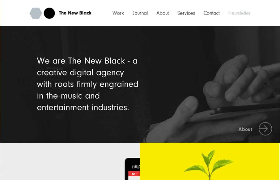
The New Black
I love the design for The New Black a lot. It's traditional in the way it uses the horizontal header bar, but very much not so in the way it's blocked out and uses interaction to get you involved in mousing around the page. Awesome stuff, done simply. Get's me every...
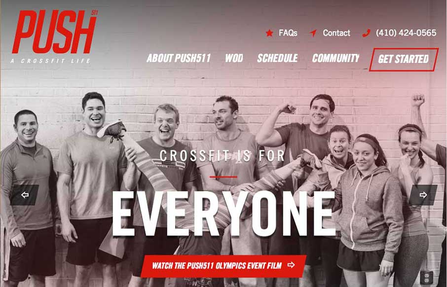
Push511
Nicely designed gym website for Push511 - most of the time websites in this category are just awful. This one however is one of nicest i've seen across many categories. Great work on almost all of the elements that make up a top-notch site here.
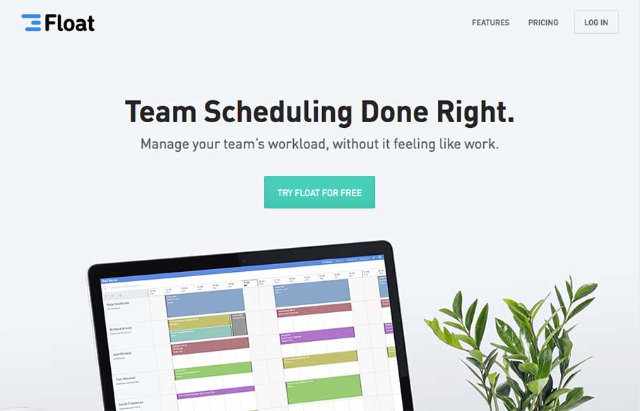
Float
Beautifully simple. I love it when something so simple can make a site be one of the best i've seen like the Float site. Smart image manipulation and a little narrative goes a long way. Beautiful new design for https://t.co/4ltwO0yAgr from @Yarcom — Matthew Smith...

BirdBrain Logic
Pretty standard feeling layout but they've used some smooth scrolling motion in the main nav bar and other elements to make the site have a nice memorable component. I like it.
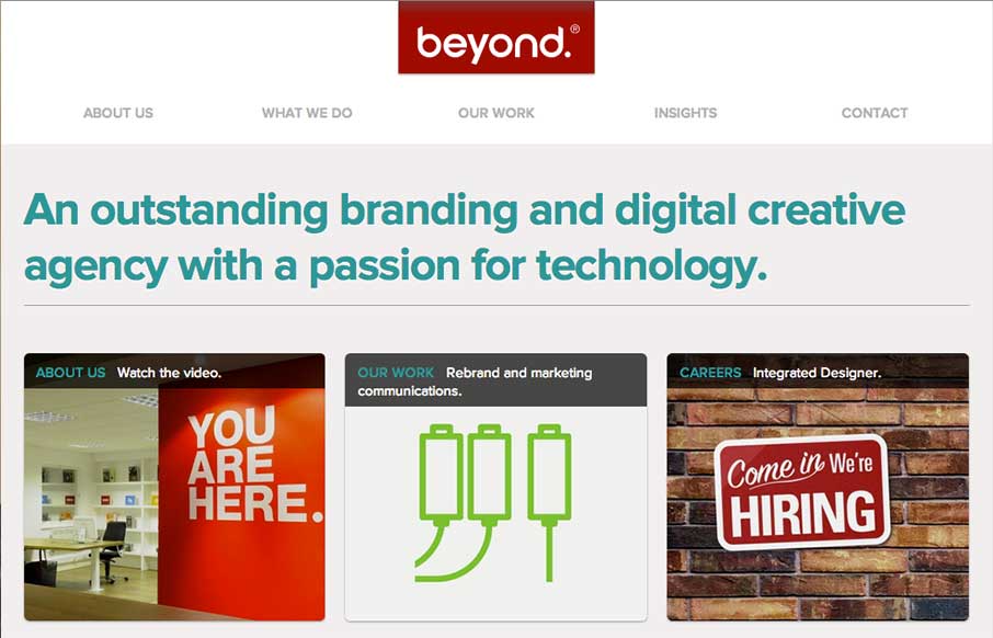
Beyond
Wonderfully simple but elegant layout. Tight spacing between elements and good vertical rhythm really makes this site feel like it was crafted with love. Also - check out the map on the contact page - same Google map - different look though.
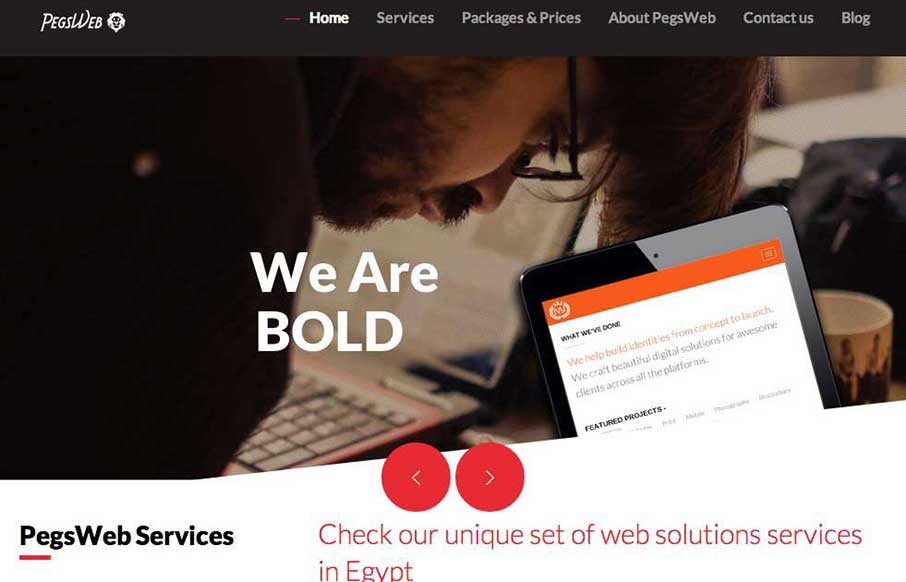
PegsWeb
Very intriguing layout. I like the main hero image area and the way pieces scroll into view. The map and contact form have a nice designery touch too.
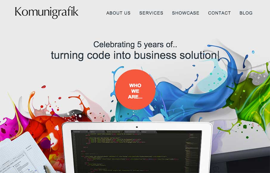
Komunigrafik
Pretty crazy navigation interactions on the Komunigrafik site. I'm not sure how I feel about it, what about you guys?
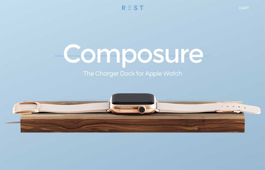
Rest: Composure
Very cool site design. looks like a cool product too - we won't know until the Apple Watch comes out 🙂
Archeeve
Nice dark design. You don't see too many sites done using dark background this well. I also really like the main/hero image of the app screenshot and how it lifts up and loads more into view when you mouse over it.
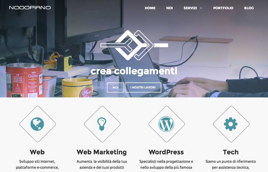
Nodopiano
It's always nice when there's a strong base to a design and always awesome when you layer good detail work on top of that strong base. That's what the Nodopiano site design does so well. This is my last work,the website for an italian web agency. It's a constant beta...
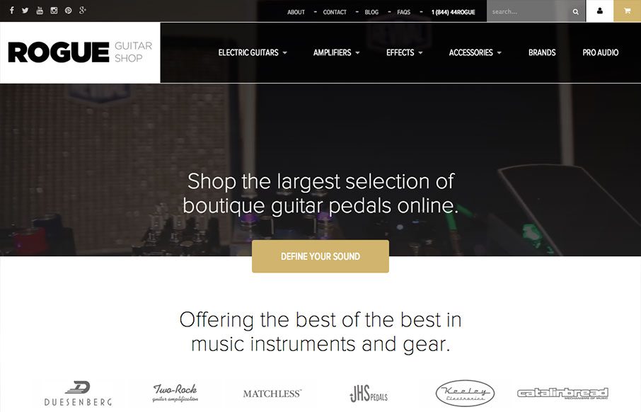
Rogue Guitar Shop
Man I love guitars. I love gear more. This site is plenty of eye candy and some good interaction design too. I like the big drop down nav design that includes pictures of the gear. You don't really even need to read to get where you want to go.
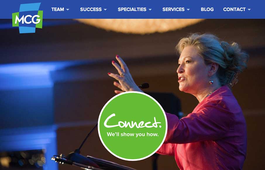
Moore Communications Group
Great look to this site. I dig the transitions from desktop to mobile on the responsive approach here. Also generally speaking the design utilizes some blocks or chunks of content which works well for scanning and adapting to different screen widths.
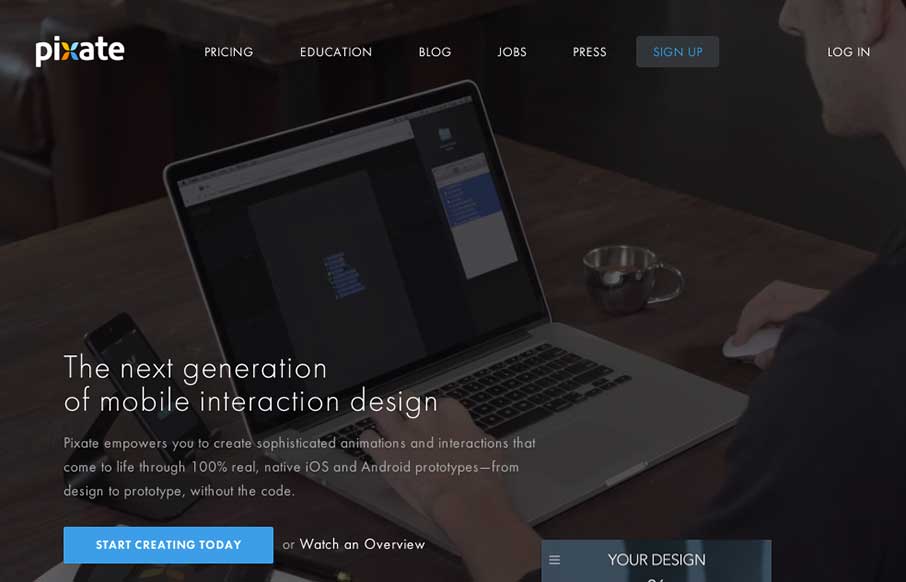
Pixate
As you may have guessed by now, we see a ton of websites - good, bad, spam (ugly). We also have seen every "app product page", that most have never deviated from the structure of the Square Reader product page from 3 years ago... Pixate could have gone there - and...
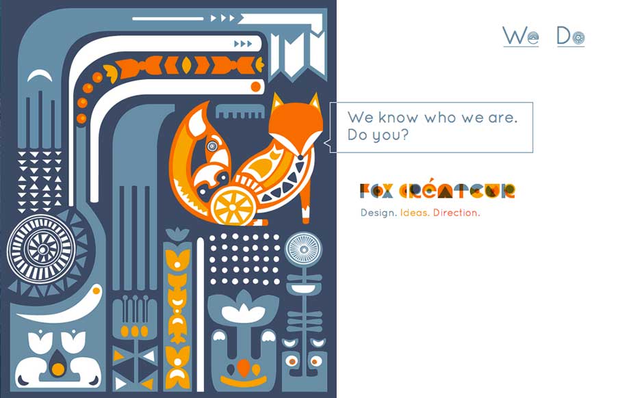
Fox Createur
This site wasn't submitted to us. I found it when I was looking at one of Fox Createur's client sites for a review. This gets down to two things that I love with great websites - simplicity and creativity. Hover over the image(s) on the right - now start clicking...
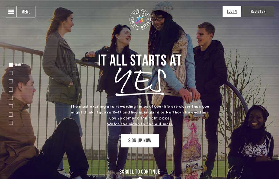
National Citizen Service
Loose visual style and stark graphic type and colors make up a site aimed at young people to signup for service. It's a smart design in many ways but the strongest part is it's mobile friendly enough to get the right audience looking at it. Submitted By: Tom Bradley...
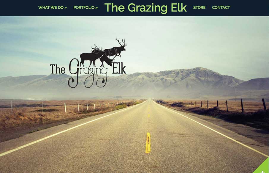
The Grazing Elk
I'm always intrigued when I come across a side scroller website. Rarely are the done well, this one is the exception to that. I totally dig it. Somehow they make it feel like a unique interaction. Good work. Submitted by: Lara Stephenson @thegrazingelk Role: Designer...
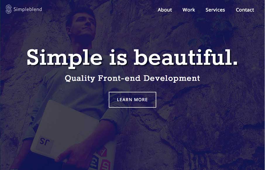
Simpleblend
Pretty much standard fare when it comes to design patterns of a portfolio site. However, the soft feel of the colors and design work and some details in the interactions, like the work samples section make this site work well enough for me to keep digging into the...
EMAIL NEWSLETTER
News & Articles
BizCraft Episode 4
 Episode 4 of the BizCraft podcast with Carl Smith and Gene Crawford. Recorded live on July 27th. Talking conferences, 2nd chances and Sparrow.
ConvergeFL 2012 is Officially Launched
![]() Officially announcing the lineup for ConvergeFL. October 4-5th in Tallahassee Florida.
Officially announcing the lineup for ConvergeFL. October 4-5th in Tallahassee Florida.
CSS Animation: How it works from transitions to animations
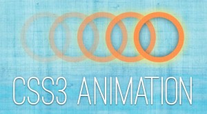 This article covers CSS animation basics and will help you learn it enough to add it to your development-toolbox.

HARD WORK. CLEAN FUEL. NO EXCUSES
Use “WARRIOR2023″ for 10% off.