Web Design Inspiration Curated
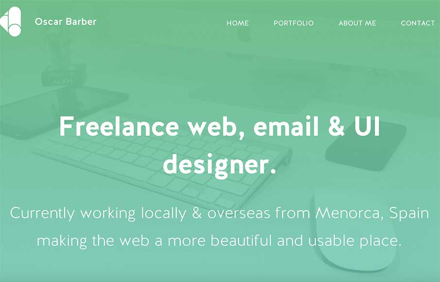
Oscar Barber
Oscar Barber has a good clean portfolio site. Sometimes that's just perfect - forget the bells and whistles and just make something good - Oscar did. Submitted by: Oscar Barber Twitter: @oscarbarber Role: Designer / Developer "Hi, this is my new site designed after 5...
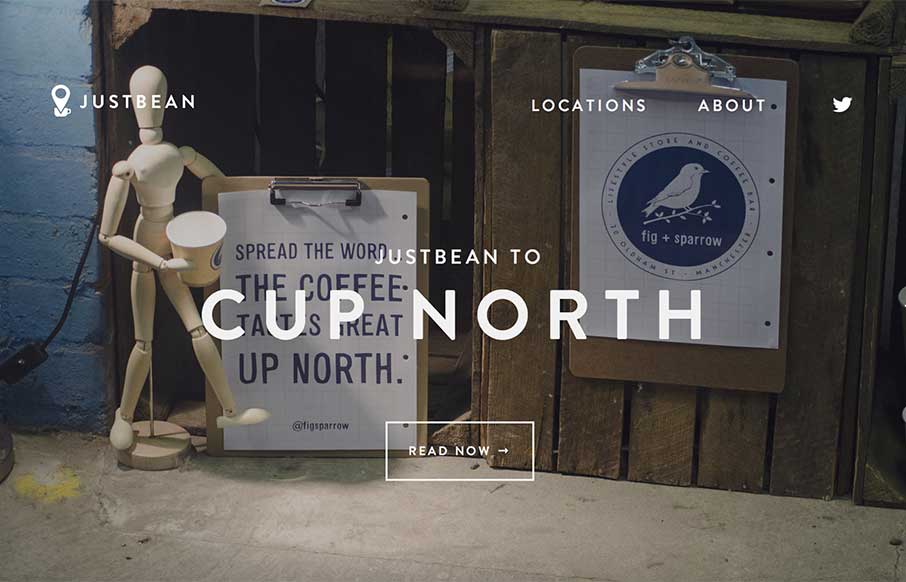
JustBean
I'm on a small movie set right now with my jugged coffee from the caterer, in a styrofoam cup, with some International Delight French Vanilla creamers in it... and then I look at this site - I am envious, and want to be in Manchester, UK right now. The site is very...
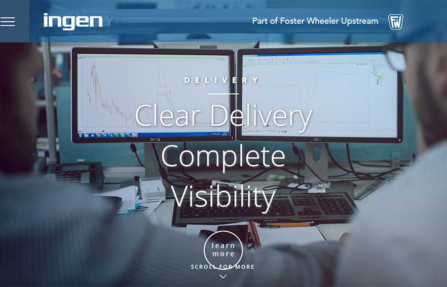
Ingen
Very clean design on the home page - content pages are clean too, but a bunch of text (which may make sense for this type of client). I like the approach of making the site ready for mobile by going ahead and making the hamburger menu the main nav. Below, the designer...

Activate Design
Like the use of the gray and green to be a canvas for the portfolio area. And like the Matrix pattern behind their server tech. Do wish that it was responsive - think they could do some cool things with that based on their current layout, and could help with SEO. Also...
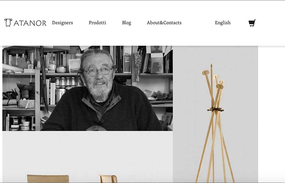
Terre Di Atanor
I really like websites that deal with architecture or furniture design. It always feels like the web designer tries to emote the things the company designs within the website design itself. I like how the products and designers are changed out with Masonry - but still...
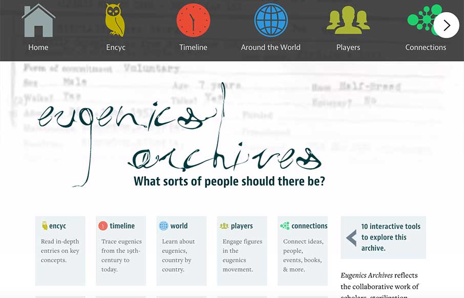
Eugenics Archives
This is a fascinating site for two reasons. The first is the amount of work that went into each section of interactivity (re: every page is wholly different from the rest of the pages). The second part is of the information itself. The about page info is a little hard...
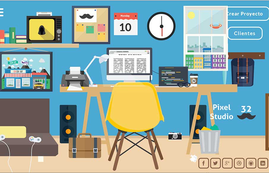
Pixel Studio 32
This review is taking a while to write... since I've been playing with their site for half an hour... and then I showed it to my son, and my computer was commandeered for another fifteen minutes.. The entire site has a huge amount of time and effort put into it. The...
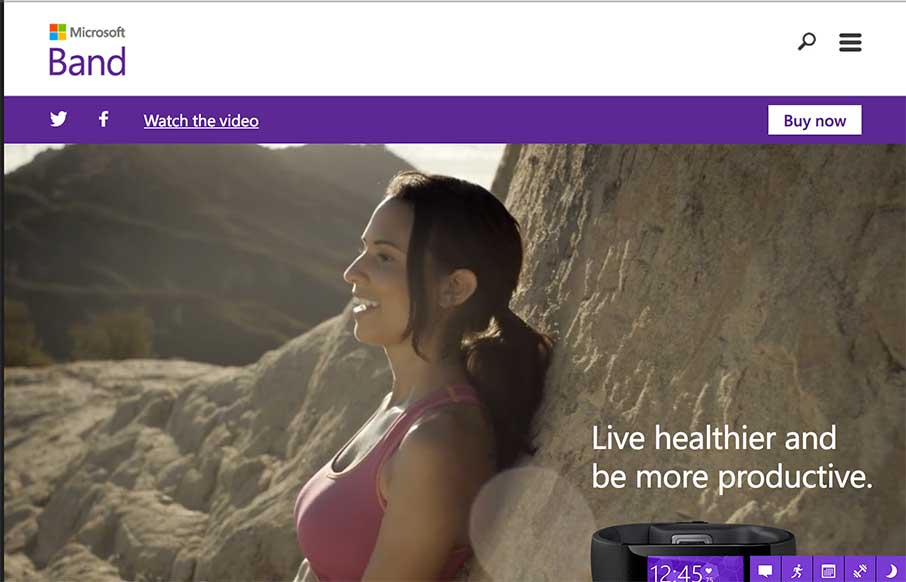
Microsoft Band
My first thought after going through this site was, "me want." Which should be the point of a site like this. Then I remembered that I'm looking at the site for a different reason... so... basically, I had a good time on the the site - good and timely use of...
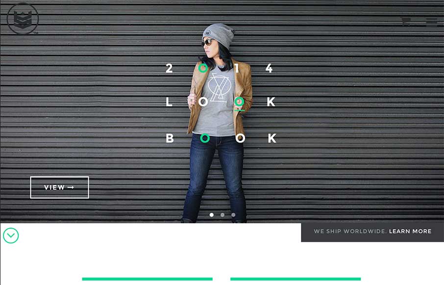
United Strands
I made my first website in 1996 - it was a shopping site for a crappy private label golf company - it was probably the worst website ever created - but I got to learn HTML, while someone paid me a whole 250 monies. My point... so I really enjoy seeing how far...
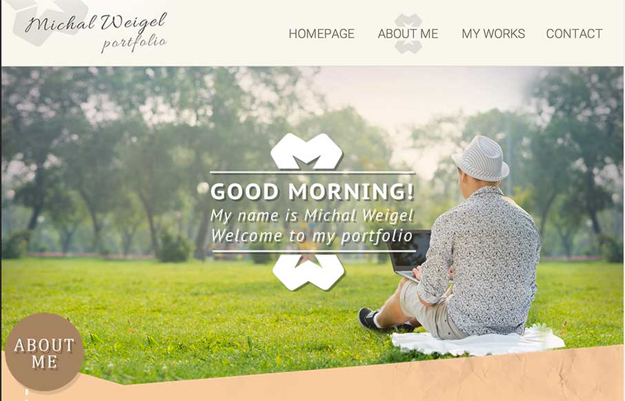
Michal Weigel
Some good work from Michal Weigel. Two main things I like is the texture he puts into the site, and then the non-rectangularness of the site. Submitted by: Michal Weigel Role: Designer
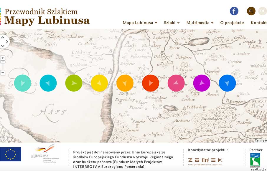
Map of Lubinus
This is a fun one to end the week with. As you'll see below from the person who submitted this site, the map is based off of the Google Maps Engine, which I don't think I would have caught if they didn't mention it (make sure you scroll out). i want to share...
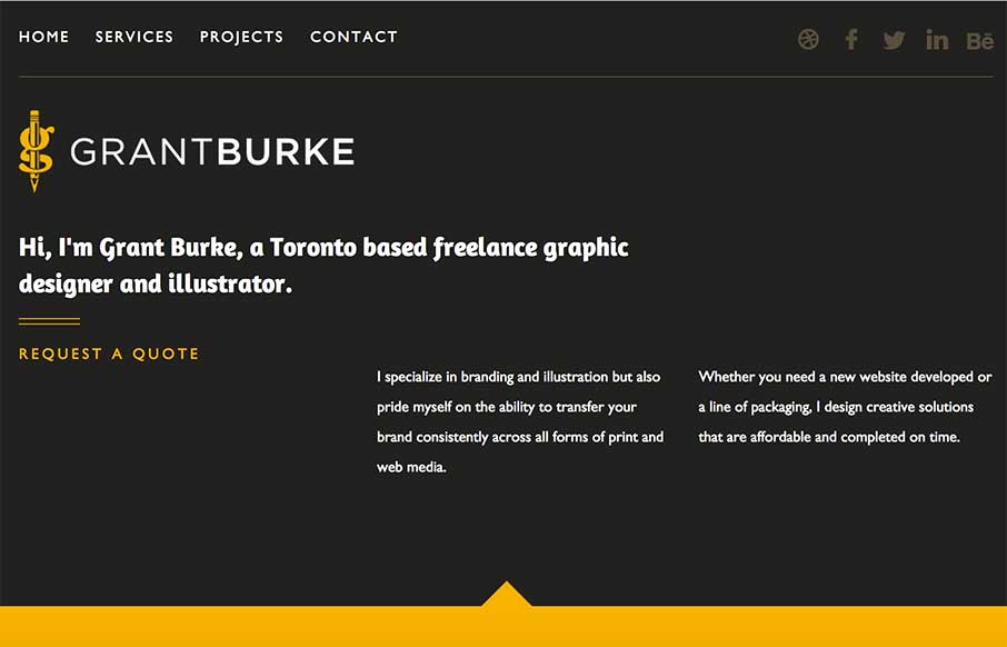
Grant Burke
This website is clean, modern and easy to use. It features responsive design that allows for an solid experience no matter what platform or device you are using to view it. Submitted by: Grant Burke Role: Designer Twitter: @GBDesigns1
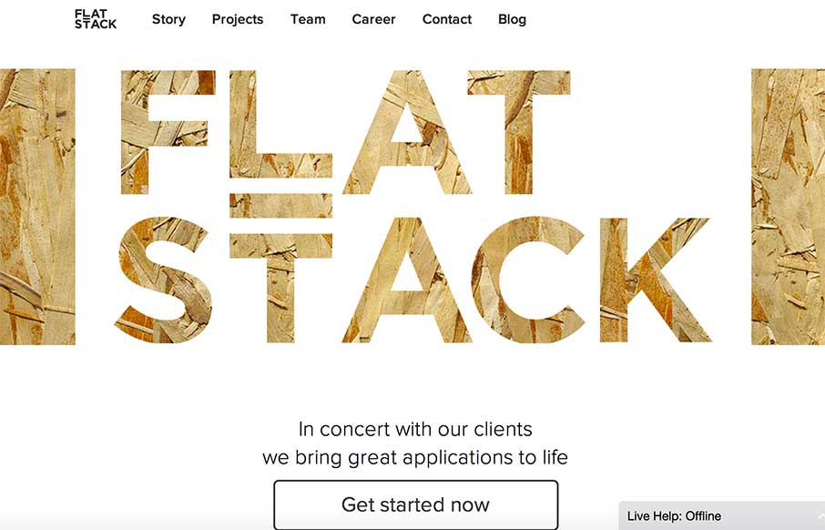
FlatStack
This is an awesome software development firm's website. It is clean, concise, and modern. The meet us page is particularly cool, and gives people the opportunity to get to know their team in a creative way! Submitted by: Abigale James Role: Sales...
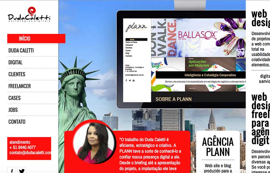
Duda Caletti
Good portfolio site from Duda Caletti out of Brazil. Like the flat illustrations throughout. I don't think the links are working to her work / jobs, so would like to see them to see her work. Submitted by: Duda Caletti Role: Designer & Developer...
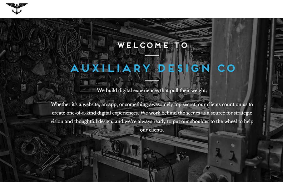
Auxiliary Design Co.
This is the website for Brooklyn-based Auxiliary Design Company. It uses lots of subtle (and sometimes not-so-subtle) interactions that give it a unique feel. It's a responsive site that actually all lives on a single page, although it definitely doesn't feel that way...
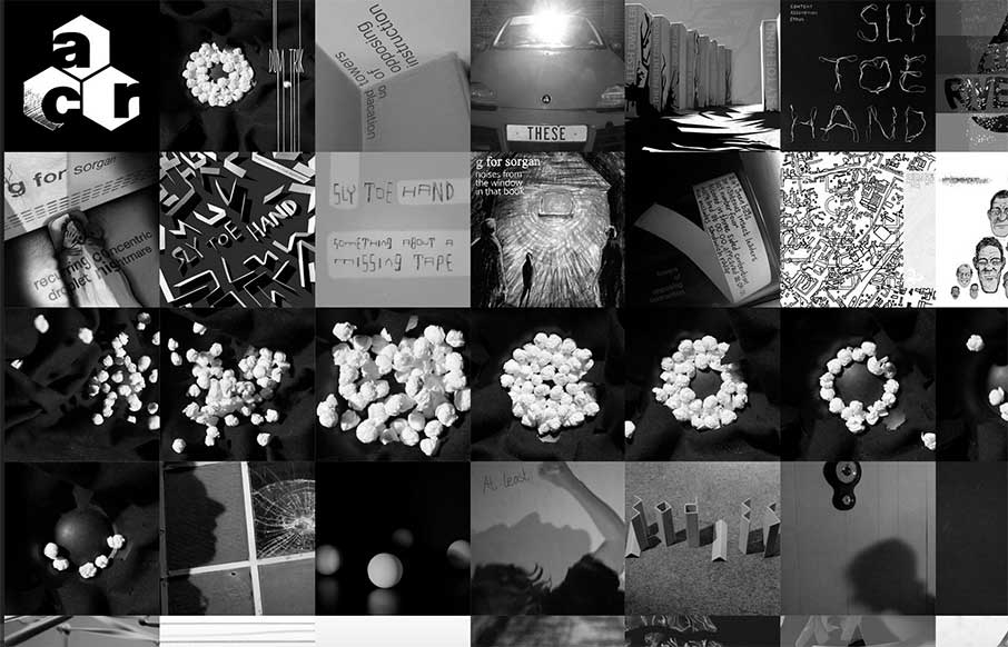
Almost Complete
Really cool and (for me) fast loading site. I had to go back and read the description (below) about what it's used for - but cool way to present music / videos for this record label. Like how the videos and the site seem to mesh well too. Responsive site for...
Daniel Snows
What the freak>?! If you're going to do a portfolio site - make it different. Daniel Snows has accomplished that. I wanted to take a screenshot of the entire site... but you'll just have to have fun for your self!
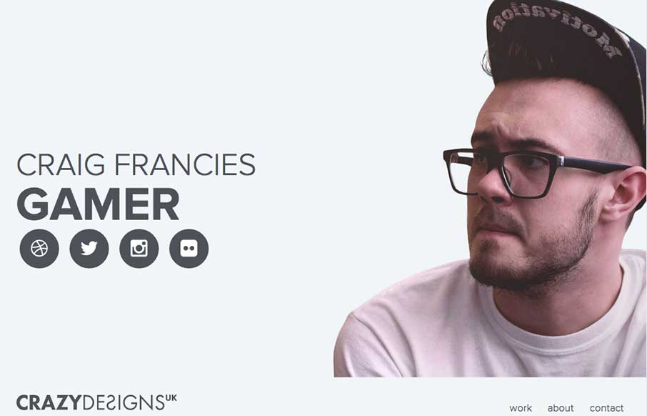
CrazyDesignsUK
It's a simple website but it has tons of personality, just by the photo and portfolio images. It looks well curated. I do also like the way the big portrait photo gets folded out to the right as you minimize the screen to the smaller widths. Very well thought out site...
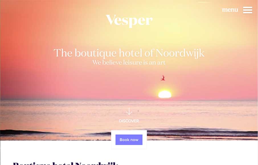
Vesper Hotel
I really like the way the "departure" and "arrival" search is placed. It's front and center, very good UI. I also dig the way the images reveal as you scroll down, normally I don't like that kind of treatment too much but it works well here to me for some reason....
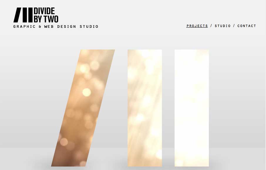
Divide by Two
Nice simple layout. I like the logo treatment in the hero image space with the animation/video in the background of the letter forms. Nice touch there. Submitted by: Joana Carvalho Role: Designer & Developer This is my own studio's website. We tried to create a...
EMAIL NEWSLETTER
News & Articles
BizCraft Episode 5 – Working With Agencies
 Episode 5 of the BizCraft podcast with Carl Smith and Gene Crawford. Recorded live on August 10th. Discussing web design business basics, working with an agency and the state of the industry.
Lou Rosenfeld on The NBSP Show
![]() This episode’s guest is independent information architecture consultant, and founder and publisher of Rosenfeld Media, Lou Rosenfeld. Episode hosted by Christopher Schmitt and Dave McFarland.
This episode’s guest is independent information architecture consultant, and founder and publisher of Rosenfeld Media, Lou Rosenfeld. Episode hosted by Christopher Schmitt and Dave McFarland.
Draft Episode 01: Responsive Web Design
 Intro episode of Draft a podcast about the craft of designing for the web. Featuring Giovanni DiFeterici and Gene Crawford.

HARD WORK. CLEAN FUEL. NO EXCUSES
Use “WARRIOR2023″ for 10% off.