
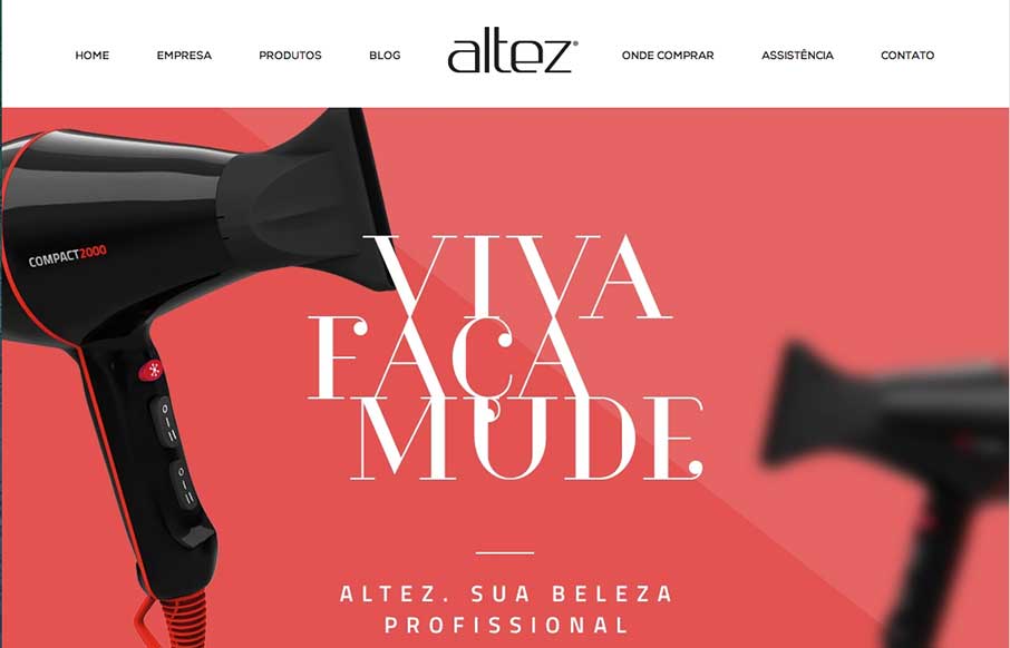
I like the trend that Altez follows – sites associated with the beauty industry have the hi-fidelity of slick industry magazines. It plays well for this site. My only suggestion is on the map – since the site is full-width (which adds to it’s appeal), it make scrolling on the Google map part a little problematic. We’ve run into this issue too with our conference sites (and have seen on many sites). This doesn’t take away from the great design, but may be helpful for a better experience.


Fitts’s Law: Why the Easy Button Wins
Large, close targets are faster to hit than small, distant ones, that’s Fitts’s Law. A look at the 1954 rule behind buttons, prime and magic pixels, thumb zones, and dark patterns.


0 Comments