Web Design Inspiration Curated
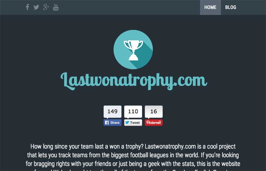
Last Won a Trophy
We admit it - sometimes we don't just review sites for their aesthetic beauty - sometimes we review sites that are submitted because we can see there is love behind it. The LastWonATrophy site by Digital Zoo out of the UK looks like cool and fun side project for these...
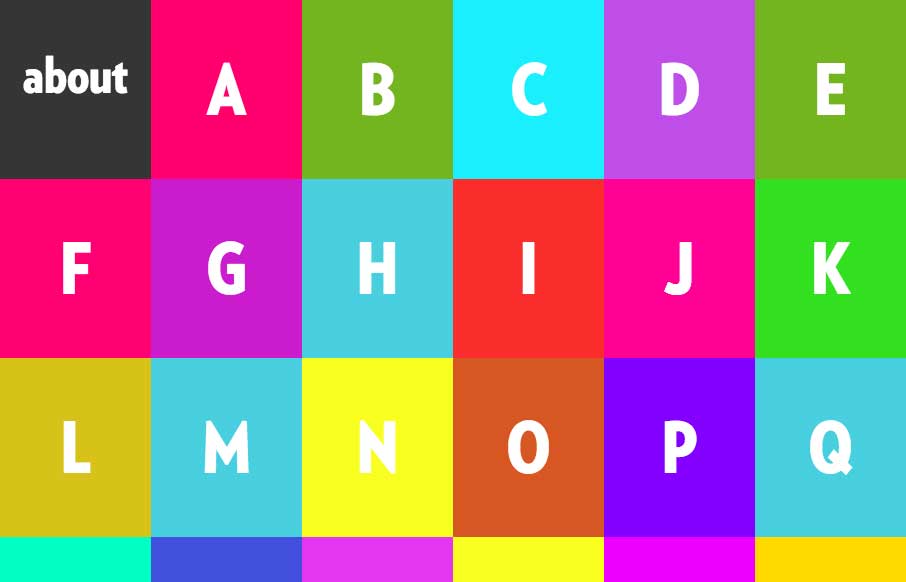
Alphabreast
We're seeing more and more animated gifs being used for more than just cats with lasers coming out of their eyes memes... we're seeing them used as the main feature of some sites. Alphabreast has done this in a clean way that really gets their point across in this...
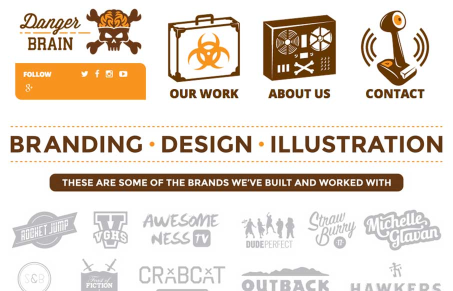
Danger Brain
Fun way to start the day with a site from Danger Brain out of Florida. Feel like I'm back in my BMX / skating days with the artwork and design. And I may have to start watching Video Game High School... just sayin'. From the designer: "Really good site with bold...
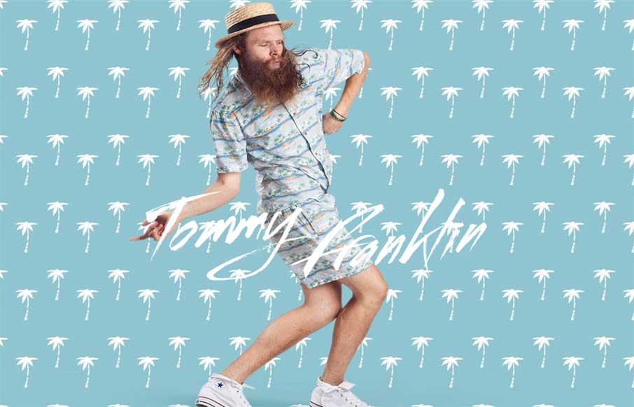
Tommy Franklin Official Website
"Love like you've never been hurt, sing like nobody's listening and dance like you're Tommy Franklin" This site from G'day Byron Bay design company is pretty stellar. I'll let them explain the impetus for the site, but I love it's design, how it moves, and it's...
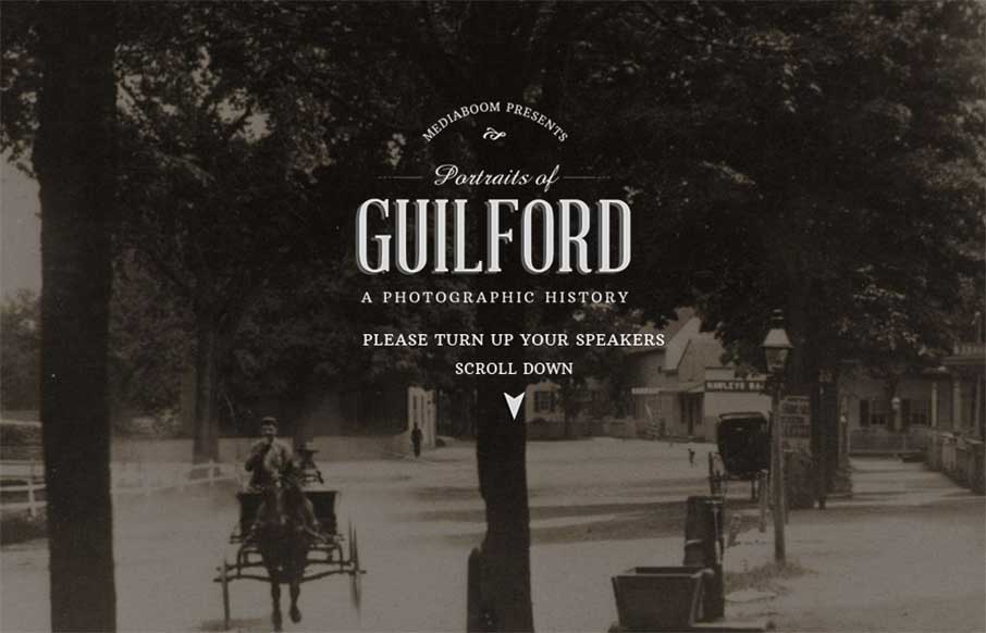
Portraits of Guilford
I really like what mediaBoom has done with Portraits of Guilford (Connecticut) - a historical / social photo sharing site for the town. I'm a history buff, so love to see the progression of the photos over time. Also like the sticky footer, and how when you change...
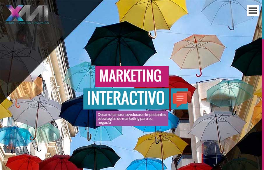
XMI – Marketing Interactivo
Something bright and shiny to wake you up this morning! This full-width site from XMI out of Colombia uses your standard en vogue colors, but makes them big and bold instead of just using them as highlights. It goes all out, and makes the site kind of exciting. Also...
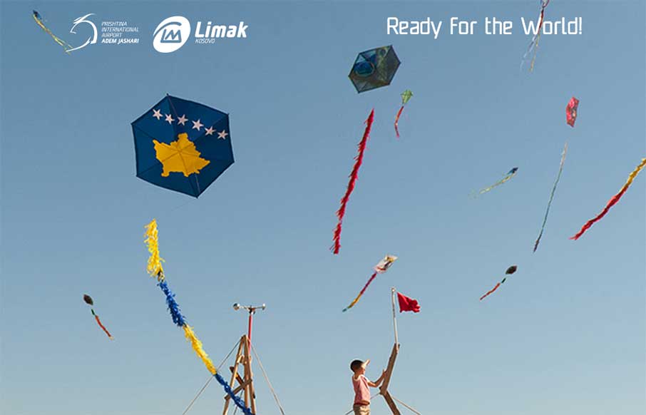
Prishtina International Airport
Very interesting airline website. They use the large hero image slider pattern but then get into some really nifty layout stuff regarding the times and airlines stuff. I like the layout changes as you minimize the window down from desktop to phone screen widths too....
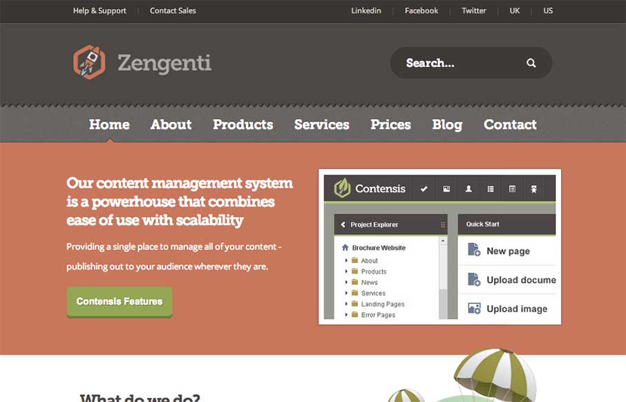
Zengenti
Nice web app site design. I like how it's a little old school but also new school at the same time. Lovely stuff. Our content management system is a powerhouse that combines ease of use with scalability. Submitted by: Alex Dixon @alexdixondesign Role: Designer &...
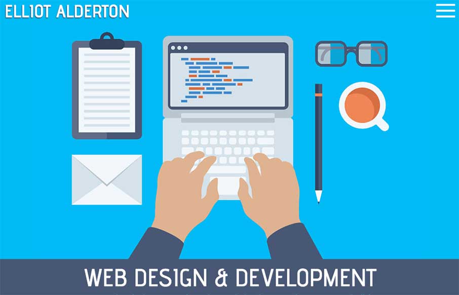
Elliot Alderton
Some really hot illustration work closes the deal on the look of this website for me. The underlying layout isn't all too different in the design patterns the site utilizes but man, those illustrations. I also really like how the main one is responsive. It's subtle...
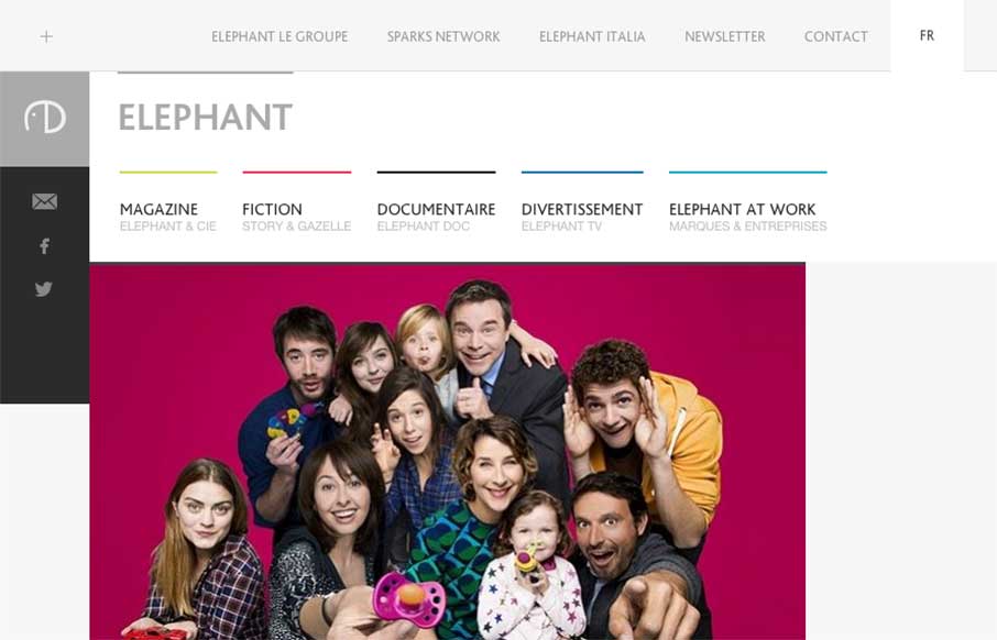
Elephant Group
Cool blocky design for the Elephant site. I dig the adaptive looking approach to the layout across various screen widths. The zoom on hover for the main page's images keeps me engaged somehow as well.
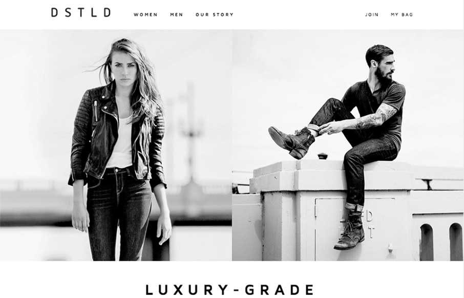
DSTLD Jeans
Beautifully simple layout for DSTLD Jeans. I like the left or right approach to making the women to men selection. It keeps the overall same feel no matter what screen width you view the page at. It's also beautifully black and white which I always love when it's...
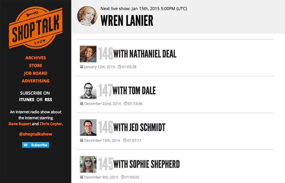
Shop Talk Show
The new Shop Talk Show website is up. Retaining the same branding and colors but very much looks like it just goes straight for mobile users. Likely a very smart move. The content is in the audio and getting people to that fast not in showing off a super slick site...
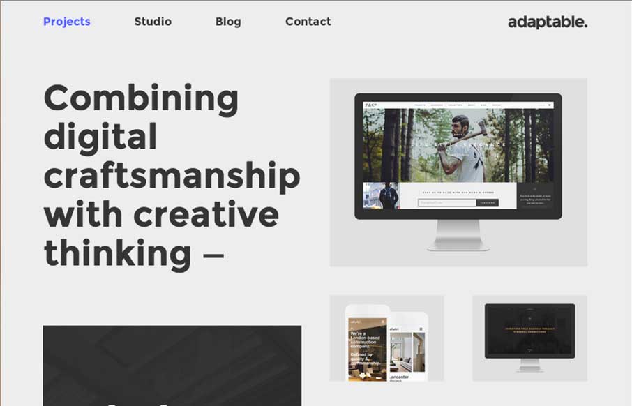
Adaptable
I love this layout. It's simple and to the point as well as a nice example of responsive design. The scaling of the main images is nicely done and in contrast the larger bolder type in the layout works our really well.

Tuxedo No2
It's 5 o'clock somewhere right? Who needs the Bartender's Pocket Guide anymore - you can head to Tuxedo No.2 for great responsive, Instagram photo, easy to navigate (the drinks are the navigation), drink recipe / instructional guide. As an SEO person - I like all the...
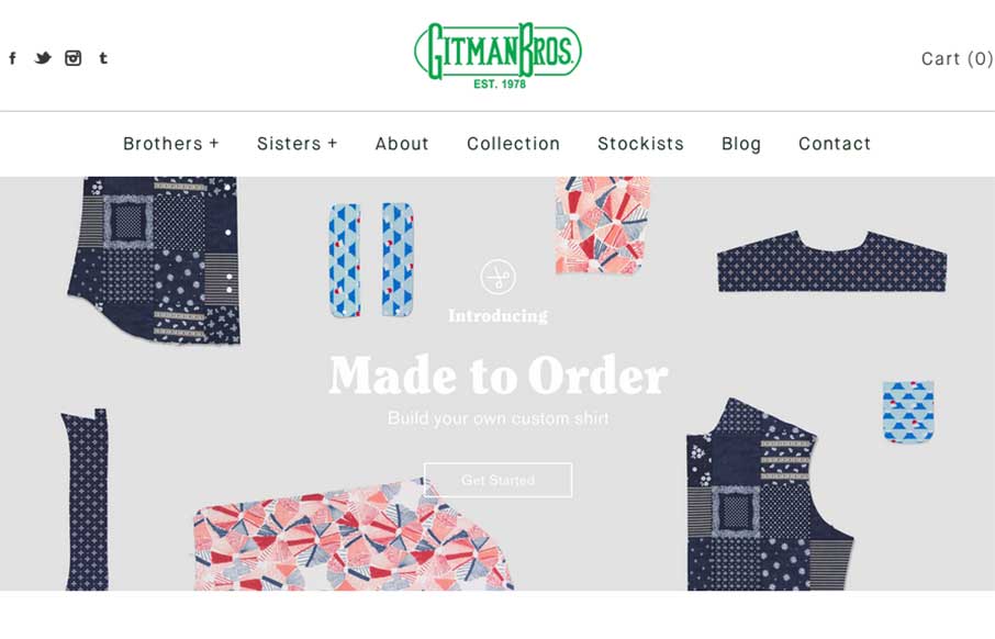
Gitman Bros Vintage Clothing
Good Monday Morning to you! I'm responding to Gitman Bros's Instagram message this morning. Offering cool vintage style shirts through their Shopify site, Gitman's site is clean and easy to navigate (not always the case for shopping sites). Really like their new...
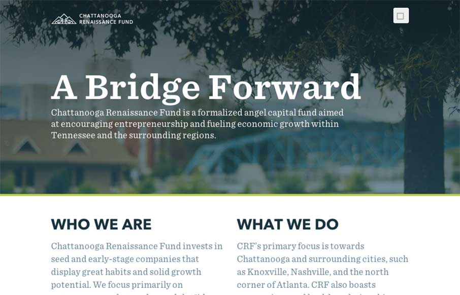
Chattanooga Renaissance Fund
Good way to end the week. The Chattanooga Renaissance Fund's site has great sweeping full-width shots and video backgrounds of Chattanooga that is fun just to look at from a design perspective. Especially like the footer image. Also like the vertical type on the sides...

Electric Pulp
When I was starting to look at Electric Pulp's new site, I realized this is the third time we've reviewed their website (2010, 2013 below). So it's cool to see evolution of websites, and especially from companies that we really like. This new version of the site is...
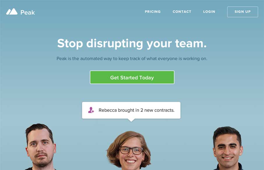
Peak
Looks like the folks at MetaLab (that made Slack) have added to their suite of apps with Peak. The app's site is clean and has some of the expected app product page features - screen shots and explanatory copy - but what I like is how it handles screen width with the...
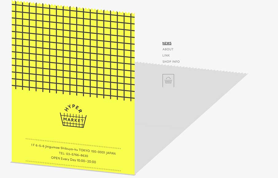
Hyper Market
Ok - it took me a minute to see what Hyper Market's website was doing here. Scroll all the way down, and you see the gray on the right is a shadow of the yellow that's scrolling up the screen - which is a cool effect. To accomplish that, it looks like they used an...
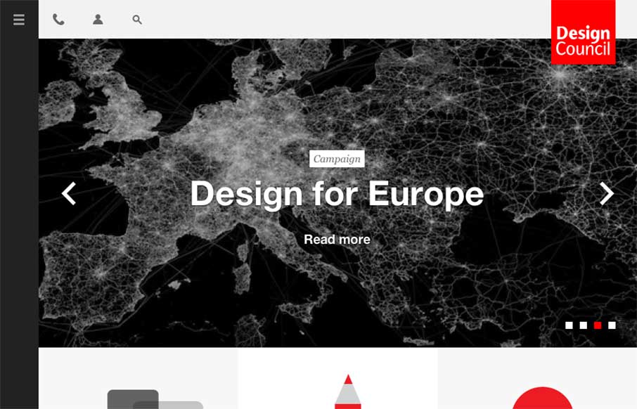
Design Council
Make sure you expand / contract your browser width on this one - the menu and svgs grow and animate with the changes - meaning the Design Council has also thought about what designers do when we look at other websites: we experiment (the fact that the hamburger icon...
EMAIL NEWSLETTER
News & Articles
Remix South 2012
 I’m excited to introduce you to Remix South, a 2 Day, 5 Tracks, 26 Sessions, 5 Workshops, long learning experience that is bringing together designers, developers and the startup community.
Mat Marquis on The NBSP Show
![]() This episode’s guest is Mat Marquis from The Filament Group and is hosted by Christopher Schmitt and Dave McFarland.
This episode’s guest is Mat Marquis from The Filament Group and is hosted by Christopher Schmitt and Dave McFarland.
BizCraft Episode 7 – With Guest: Brian Hoff
 Episode 7 of the BizCraft podcast with Carl Smith and Gene Crawford. Recorded live on September 7th. In this episode we have Brian Hoff as a guest.

HARD WORK. CLEAN FUEL. NO EXCUSES
Use “WARRIOR2023″ for 10% off.