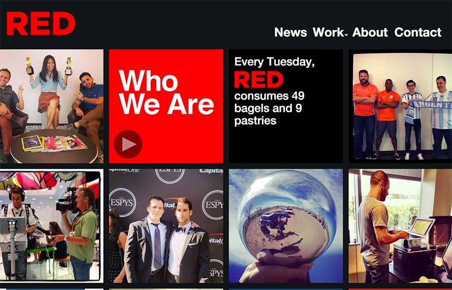
The way the site is built out of squares that adapt to the width of the browser screen (see what I did there?) is really neat. It’s simplicity but not overtly done. The nav reflects the simple approach to the layout too which is nice and clear.


The Call to Action, Revisited
The Call to Action hasn’t changed in a decade, but the bar has. A fresh look at prominence, copy, mobile tap targets, and accessibility, with lessons from three major design systems.


0 Comments