Web Design Inspiration Curated
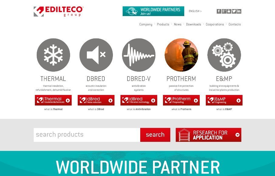
Edilteco
Standard layout here, but what's neat is the main icon designs and their interactions. Needs to be responsive for sure though. From the Designer: An extreme usable way to let clients discover the company world. A web place projected and designed to show all the...
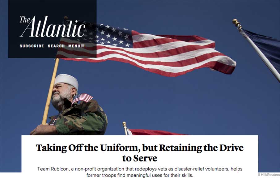
The Atlantic
The layout of The Atlantic is insanely simple. In many ways it mimics such things as say Instagram. It keeps me intrigued with headline after headline and super great photo after photo. I love this, just sitting here scrolling and reading and looking. Thing does it's...
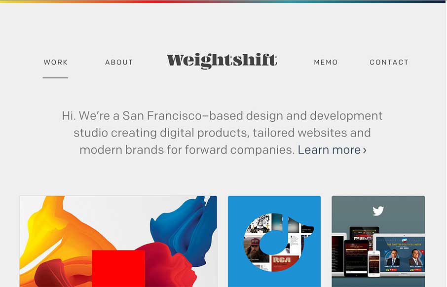
Weightshift
Every now and then Weightshift will rework their website. I'm in love with this version for sure - not that the past dozen were not good by any stretch. I love simplicity and the way this site has traveled down that path over the years is a work of art. Luuurrve this...
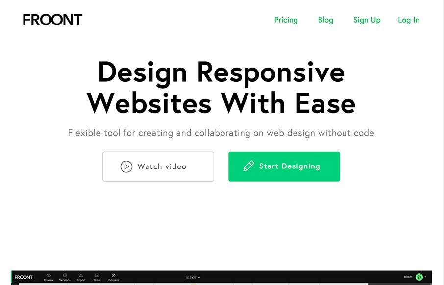
Froont
I LOVE the Froont website design. Man those gifs are fantastic for explaining what the heck the app is all about. Then the Features and Pricing section on the home page is brilliantly designed IMHO. Love it, all the way.
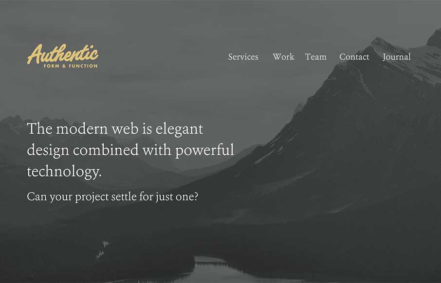
Authentic
I like they way the site for Authentic Form & Function here uses the 'hero' area to sort of lay out a presentation of sorts. Then you taper down into a more or less typical website layout. All the way down to the footer area which is quite nicely executed.
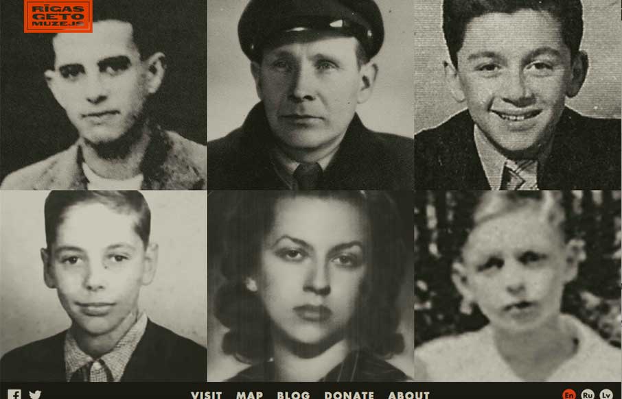
RGM.LV
This is a sadly beautiful site about horror and atrocities of the Riga Ghetto in Latvia during the Holocaust. It weaves images, illustrations, video, audio, and even Google Street View into incredible multi-experience stories. "THE RIGA GHETTO AND HOLOCAUST IN LATVIA...
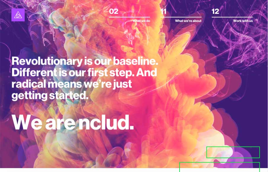
nClud
There's a glitch in the Matrix... sometimes glitches are good, like nClud out of DC - their site is trippy, but a cool experience. Great transitions between pages, and creative use of type heavy pages. (I do think the Pink Floyd documentaries I watched last week are...
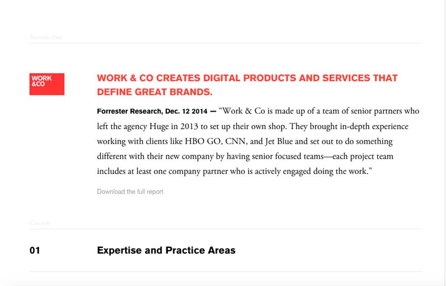
Work.co
So... at first I wondered if I was getting into a blog with the way the Work.co flows at first - but there were hints that this was going to be an subtle intro to the rest of the site - ended up loving this site! Love the page layout of the navigation - you scroll...
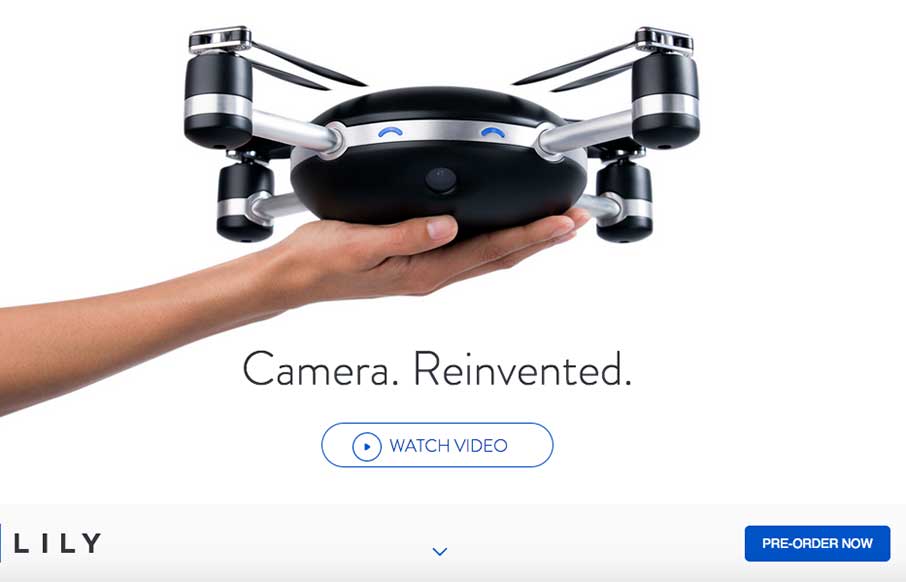
Lily
This falls into the category of "Me Want" - Lily: a drone - an HD video camera - and it follows you and your GPS tracker. I'm thinking about how many times it would have to just hover there while I'm picking myself up and out of the snow while snowboarding... but...
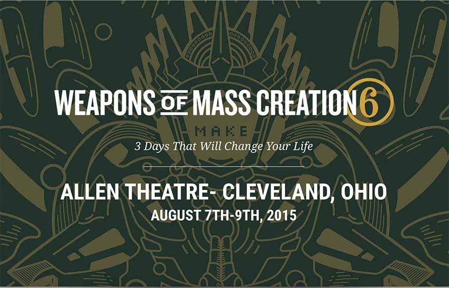
Weapons of Mass Creation 6
Not only is the flow funky, but the hovers are real cool and fit really well with this site by Go Media. There's also a Save the Date at the bottom that's real cool as well. Side Note: I love the idea of a mystery speaker. What say you though?
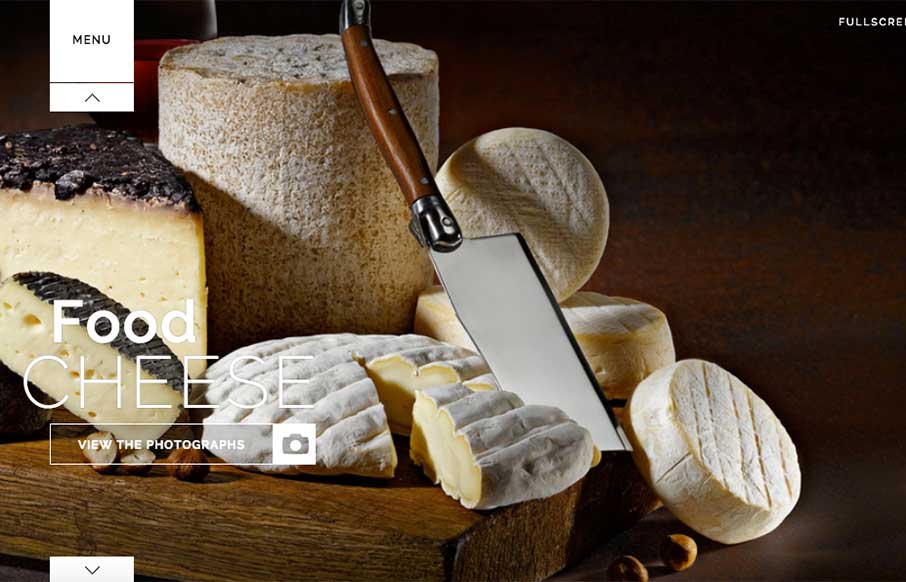
Hermes Tochetti
Great photographer portfolio site for Hermes Tochetti out of Italy. Like that the directive is to view the work, and nothing else - that's why the "Fullscreen" button ask (top right), and the scroll arrows is smart.
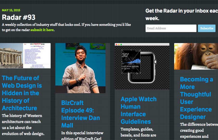
UMS Radar #93
In this week's Radar: The Future of Web Design is Hidden in the History of Architecture BizCraft Episode 49: Interview Dan Mall Apple Watch Human Interface Guidelines Becoming a More Thoughtful User Experience Designer Faster Font Loading with Font Events, How to Use...
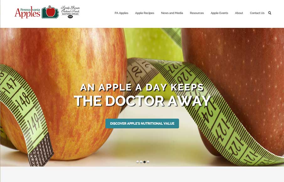
Pennsylvania Apples
Straight forward website layout for Pennsylvania Apples, but the imagery is super great. Awesome photography and it's use can really carry a project, this site is no exception. I love the little hop the apples do as you mouse over the different types of them, fun.
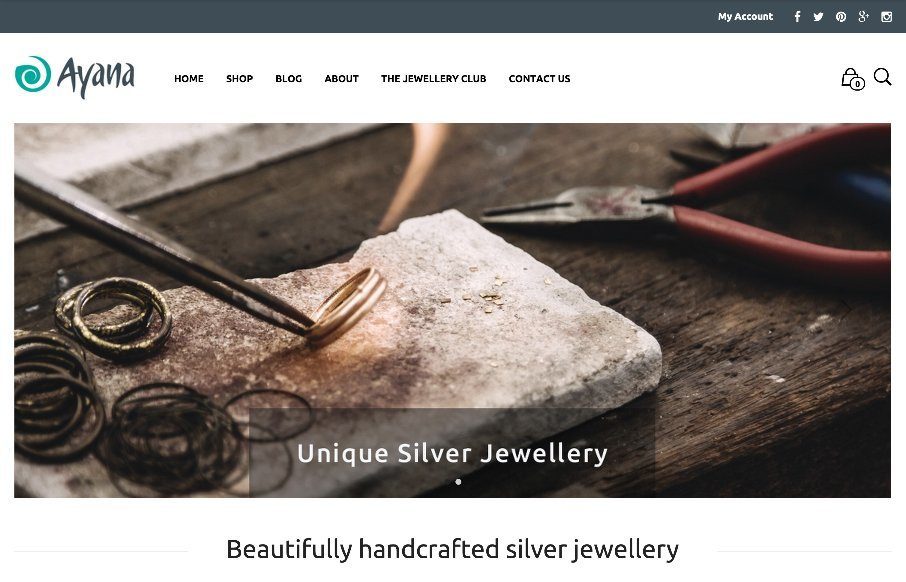
Ayana Jewellery
Good looking jewelry shopping site from Ayana Jewellery, done by Loophole out of London. Clean and easy to maneuver - looks like it's done through WooCommerce and WordPress. Like the idea and the flat illustration of/on the Jewellery club. From the Designer: We are...
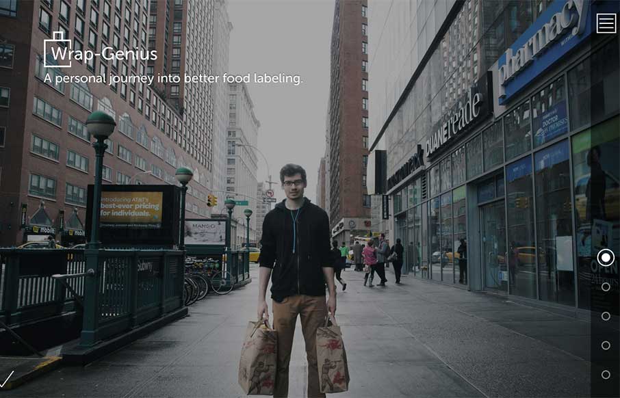
Wrap Genius
Recently I stumbled upon Sam Slover's attempt at pushing the envelope in the food labeling department. This is a beautifully designed site that Sam created to track his food for 10 weeks. The colors and illustrations are well done and the actual flow of how he tracks...
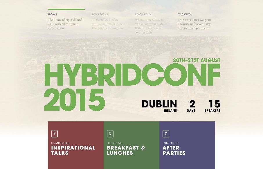
HybridConf
Sweet looking conference website for HybridConf. Man, wish I could go! I dig the way the main nave is kept simple in it's breadth but has description written under each element. My favorite part is the way they've done the speaker profile/images. Clever layout here....
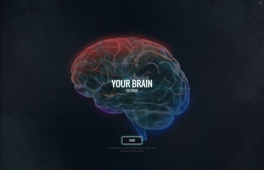
Your Brain On Poker
Interesting technical website. I like the way you interact with the sections and the animations of the brains are well done indeed. It starts to feel more like a slideshow than a web app or website in the end. That's not to say it's wrong, just what it feels like to...
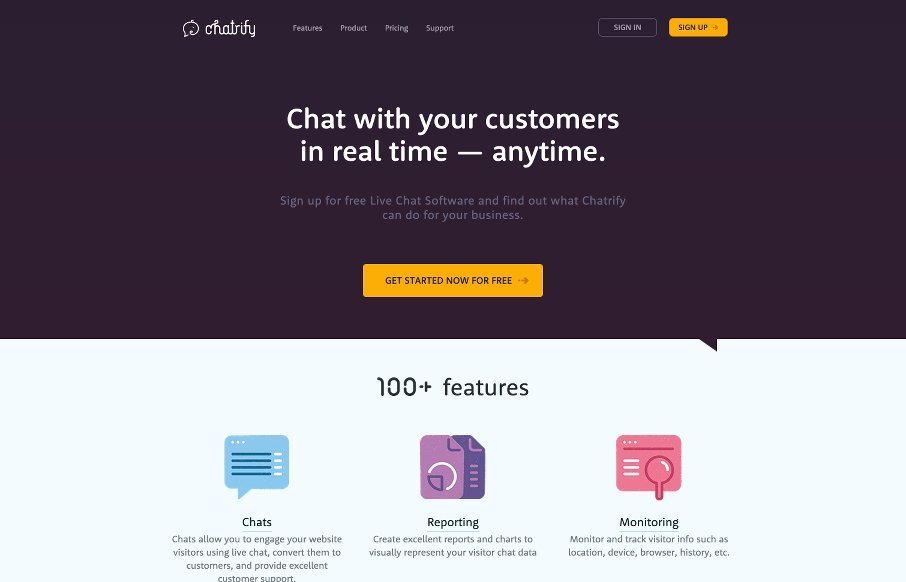
Chatrify
As product websites go the one for Chatrify is pretty stellar. Sleek and simple and packed with some badass icon designs. I love this mighty little site. Super great stuff here. From the Designer: Chatrify is Live chat software that engages your website visitors in a...
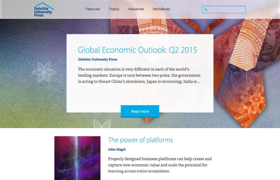
Deloitte University Press
Good standard looking blog layout that's responsive and nicely put together. I really dig the 2nd portion where all the fixed content lay. I also gotta say some of the interaction animations make me excited. Check this blog out when you can folks - give it a bit too,...
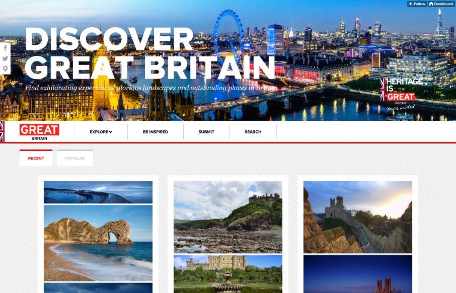
Discover Great Britain
Pretty cool Tumblr theme usage. I dig the color and photography utilized here to make what's just a tumblr blog of photos into something fun and useful.
EMAIL NEWSLETTER
News & Articles
InControl Orlando 2013: Christopher Schmitt
 Talking all about the upcoming InControl Orlando with Christopher Schmitt. Plus ticket giveaway.
Draft Episode 15: Why Sass?
 In this episode of Draft we talk about the merits and ideas behind pre-processors, specifically Sass.
BizCraft Episode 14b: Employee compensation & pre-holiday prepping
 This episode of BizCraft was recorded before we had Dan Mall join us. We discussed salaries/compensation ideas, end of year planning and crazy holiday client calls.

HARD WORK. CLEAN FUEL. NO EXCUSES
Use “WARRIOR2023″ for 10% off.