Web Design Inspiration Curated
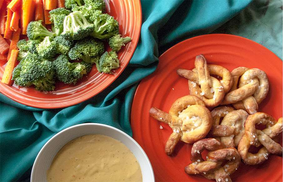
Pizza Dough Pretzel Page
It's not the entire website that i'm wanting in the gallery here but this Pizza Dough Pretzel Page in particular. I love the typography work here and how it all interplays with the photos. Super smart layout choices that mimic print pretty well too. Love this page!
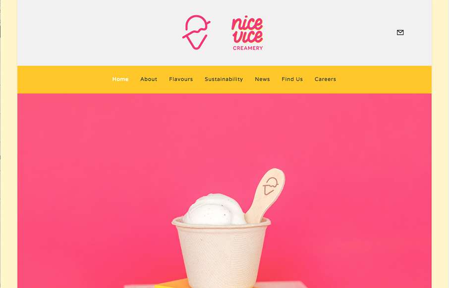
Nice Vice
I love the simplicity and straight forwardness of the Nice Vice website design. It's simple and to the point which is nice. I also dig the nav/logo transformation that happens as you scroll down the page, that's a nice touch for the site design.
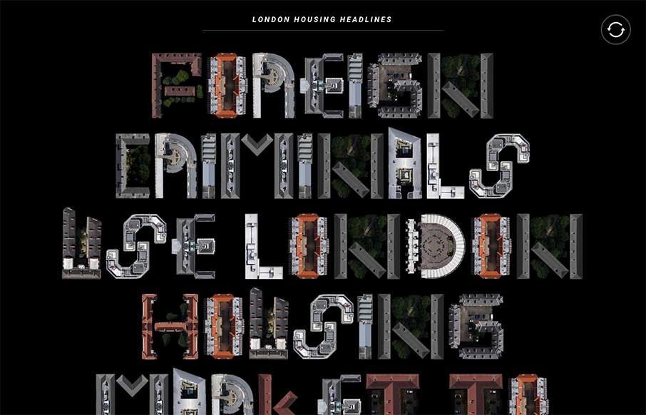
London Housing
The London Housing site is very simple in concept - I just like the typewriter movement of it, along with using real shapes to make the font / lettering. Here's a little more about the site: "This project is a compilation of recent media articles about the housing...
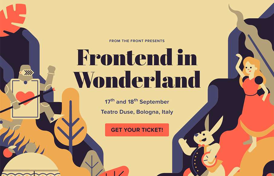
Frontend In Wonderland
Love the artwork in this year's From The Front conference out of Italy: Frontend in Wonderland. We're always happy to see other conference series pushing hard with design boundaries.

Briefing
Black and White and Re(a)d All Over.... Ok, I looked in the CSS, and there is no #ff0000, but I liked the joke. Love the simplicity of Briefi.ng - both in the design, and the stories - great for someone like me with ADD.
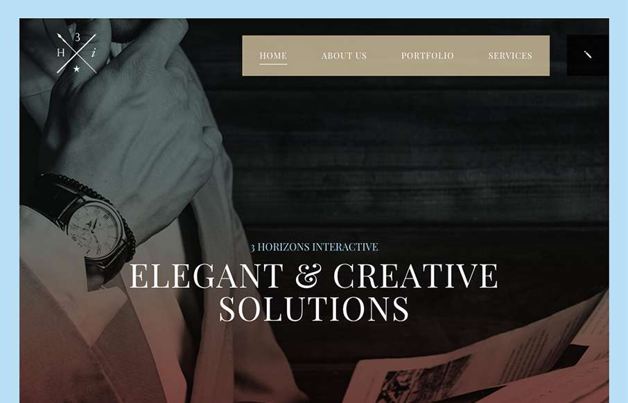
3 Horizon Interactive
Some pretty crazy interactions going on here. I dig it though. The colors and type that are paired together give it a rather open yet heavy feeling. I'm a fan of the navigation design too, see, what's the harm in just showing the nav at all times?
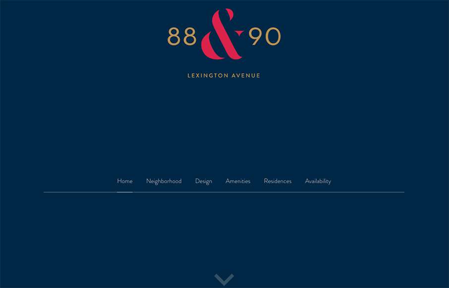
88and90lex.com
Nice single page scrolling design for 8and90lex.com. It's a smooth experience overall, you can just scroll or navigate by the header section too. The illustrations hit at the right times and look great.
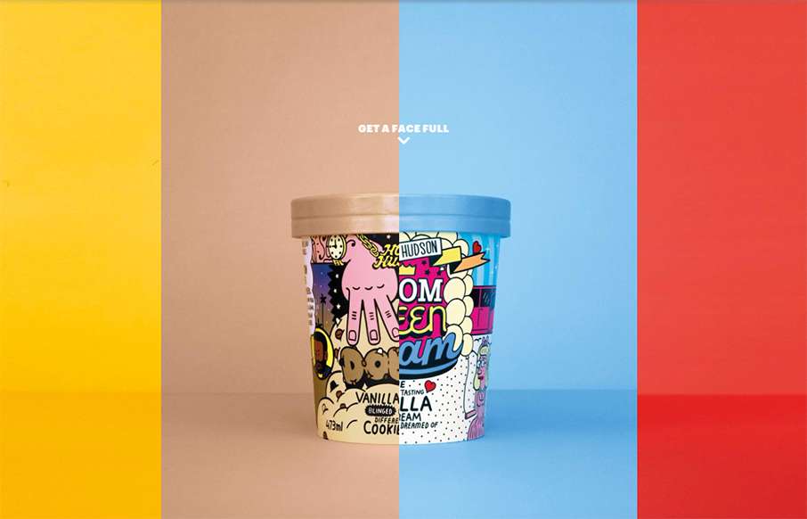
Homer Hudson
Never too early in the morning to think about ice cream... mmmm... ice cream... Homer Hudson's site out of Oz is bright and different. Looks like one page with a few modals - compact, with all emphasis on the product. It's a little bit of UX risk with the scroll left...
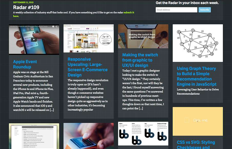
Radar #109
In this week's 109th Radar: Apple Event Roundup Responsive Upscaling: Large-Screen E-Commerce Design Making the switch from graphic to UX/UI design Using Graph Theory to Build a Simple Recommendation Engine in JavaScript CSS vs SVG: Styling Checkboxes and Radio...
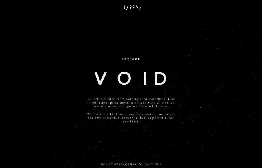
Void By Hi-Res
I didn't even attempt to see what was under the hood on this site - didn't care - was having too much fun with it. Void was done by Hi-Res out of London. Not sure why they did it - but who cares - pretty darn awesome - happy Friday!
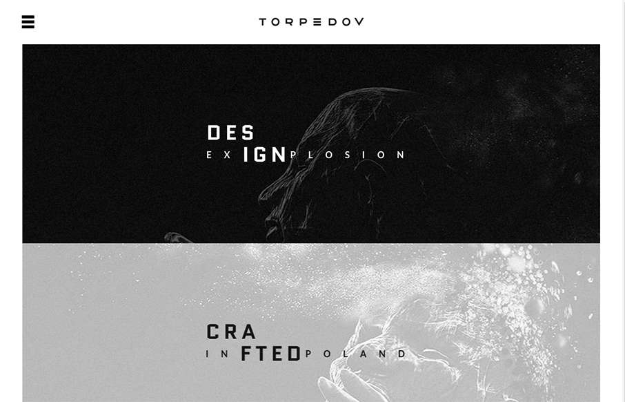
Torpedov
Pretty solid graphics on the home page, I dig that left or right choice. I also like how he's used the hamburger menu thing in the logo look as well. It helps tie it together for people. Nice use of slight animations in the case study imagery as well. From the...
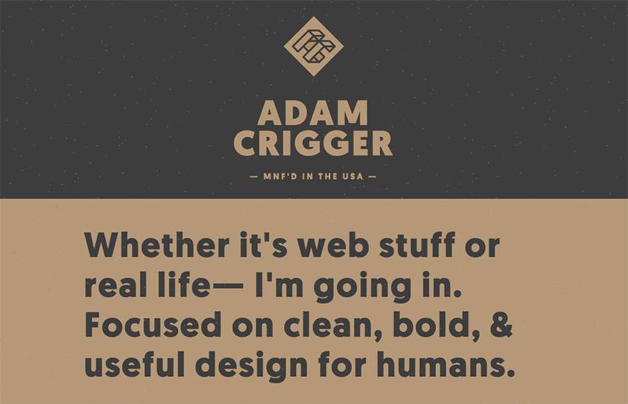
Adam Crigger
Well, damn. Adam Criggger - well done. He's made his portfolio / resume site look unique, subtle and clean. And the fact that he has a seemingly out of place Biggie Smalls quote and video hanging out on the site, with the star field background floating through......
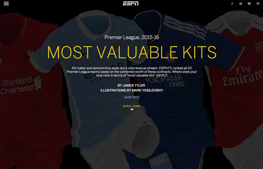
EPL – Most Valuable Kits
Love this way ESPN has made this interactive infographic for the English Premier League's "most valuable kits" this year. Great work on the kit illustrations and the overlay work to see home and away kits. Like the marketing aspect of it too - links to Dick's Sports...
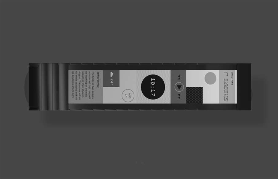
Wove
Well - we're back to a "me want" product. I live on my iPhone and FitBit - something tells me Wove may be a pretty cool symbiosis of the two. The site is minimal, but has a lot going on. Starts with a cool intro - that goes into a "static" page with minor animations...
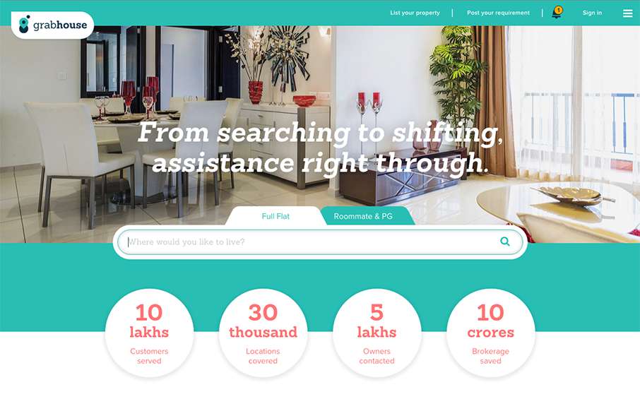
Grab House
Pretty utilitarian design for Grab House, but somehow they've made it look appealing visually. I dig the search box area and then as you scroll down there are timed info blocks that load pretty smoothly.
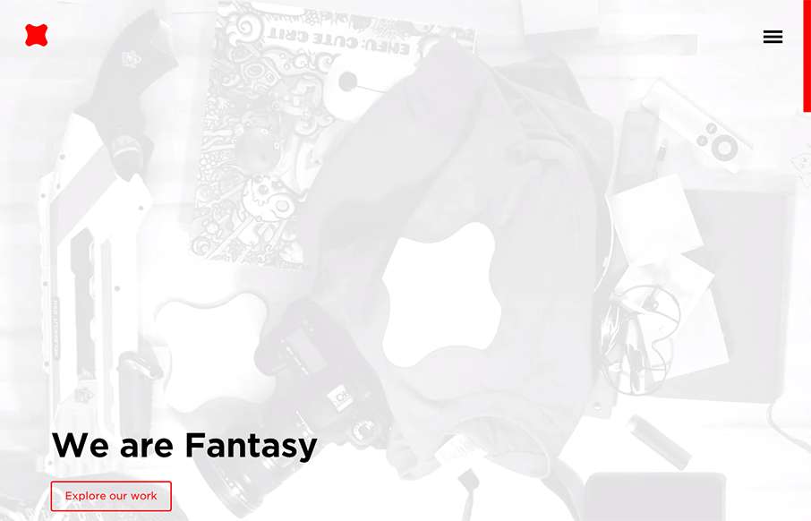
Fantasy
Newly updated (not sure how long) design for Fantasy Interactive. It's amazing to me to see this design, i've followed Fantasy for the entire time they've been around. You can almost track the times in design from their websites over the years. this iteration is a...
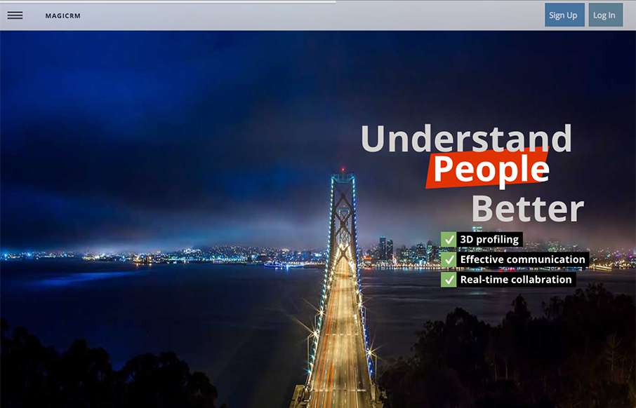
magicrm
Mostly posting this for the navigation pattern. I like how when you simply mouse over the hamburger icon it loads a small set of icons for the nav. Yes, we can probably pick that apart, but i've never seen that before. I like it as a design pattern as a way to combat...
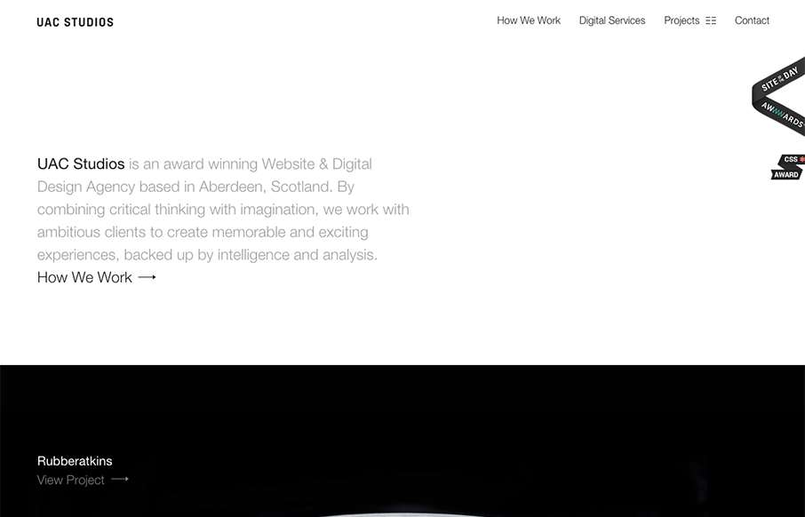
UAC Studios
Beautifully simple design for UAC Studios. I really like the large imagery used for the project sections. I also like how it's pretty much all about the work, that's just about all I ever care about when I check out another company's website that do what I do. 🙂
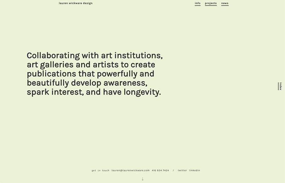
Lauren Wickware
I love, love, love the way the scrolling works on this website. It's smooth and very unique to experience. Very memorable experience here.
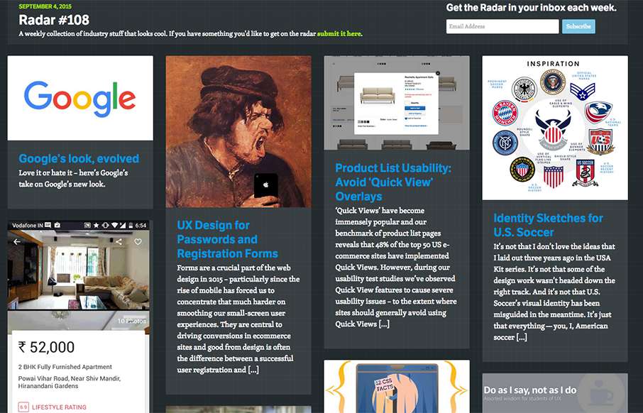
Radar #108
In this week's 108th Radar: Google's look, evolved UX Design for Passwords and Registration Forms Product List Usability: Avoid 'Quick View' Overlays Identity Sketches for U.S. Soccer Designing Photostories 12 Little-known CSS Facts - The Sequel Do as I say, not as I...
EMAIL NEWSLETTER
News & Articles
BizCraft Episode 27: Hitting the reset button and removing management
 In this episode of BizCraft we talked about hitting the reset button in your business, recap of ConvergeFL and removing management from your company and what that means.
Eye Tracking Google Maps
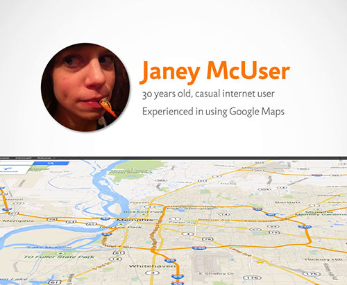 An eye-tracking test of a user working through tasks of Google Maps. Guest post by Simplefocus.
Build Responsively Workshops @ Converge
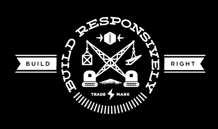 A quick interview with Ben Callahan of Sparkbox. Instructors and producers of the Build Responsively Workshop Series.

HARD WORK. CLEAN FUEL. NO EXCUSES
Use “WARRIOR2023″ for 10% off.