A while back, Google let some of us in for a preview of the Google Maps redesign before they opened it up to the general public. We wanted to see how a regular user might respond, unwarned, to a redesign of a tool that just about everyone knows how to use the old way.
We brought in a friend (we’ll call her “Janey McUser”), gave her some tasks to perform and used our eye tracker to follow her as she discovered the new Maps application for the first time.
Getting Directions
We started by asking her to find directions. Her eyes went straight to the input field with no hesitation. This makes sense as it’s not really moved much from the old design and besides, it’s a logical spot.
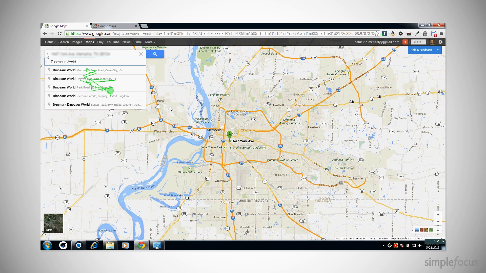
It was fun to watch her enter the locations. You could watch her enter a few characters and then scan the dropdown for the correct locations.
Printing
The first major hiccup was trying to figure out how to print directions. It took close to half a minute for her to find a print button. Turns out, it’s buried in the Step by Step instructions. Google is clearly interested in pushing users to use their mobile devices to take directions with them, but this is a major action that you’re going to want from time to time. There are still lots of people (ahem, people’s parents) who want to print their directions.
Bad Spelling
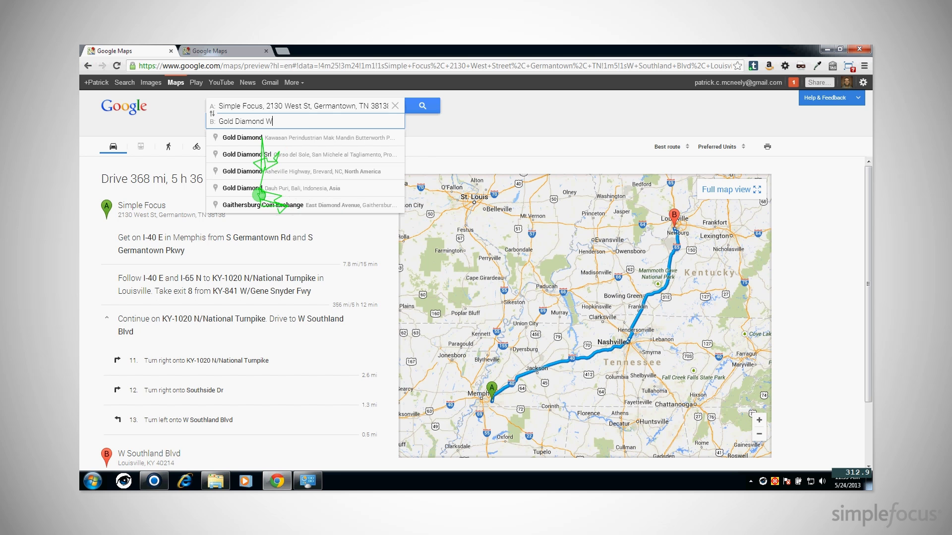
Straight-up Google Search is great at auto-correcting spelling mistakes or making intelligent guesses as to what you’re really looking for. You’d think that Maps would have that same brain, but for some reason it doesn’t. Janey couldn’t remember the exact name of a jewelry store within five miles of her location, but the application never suggested the right place.
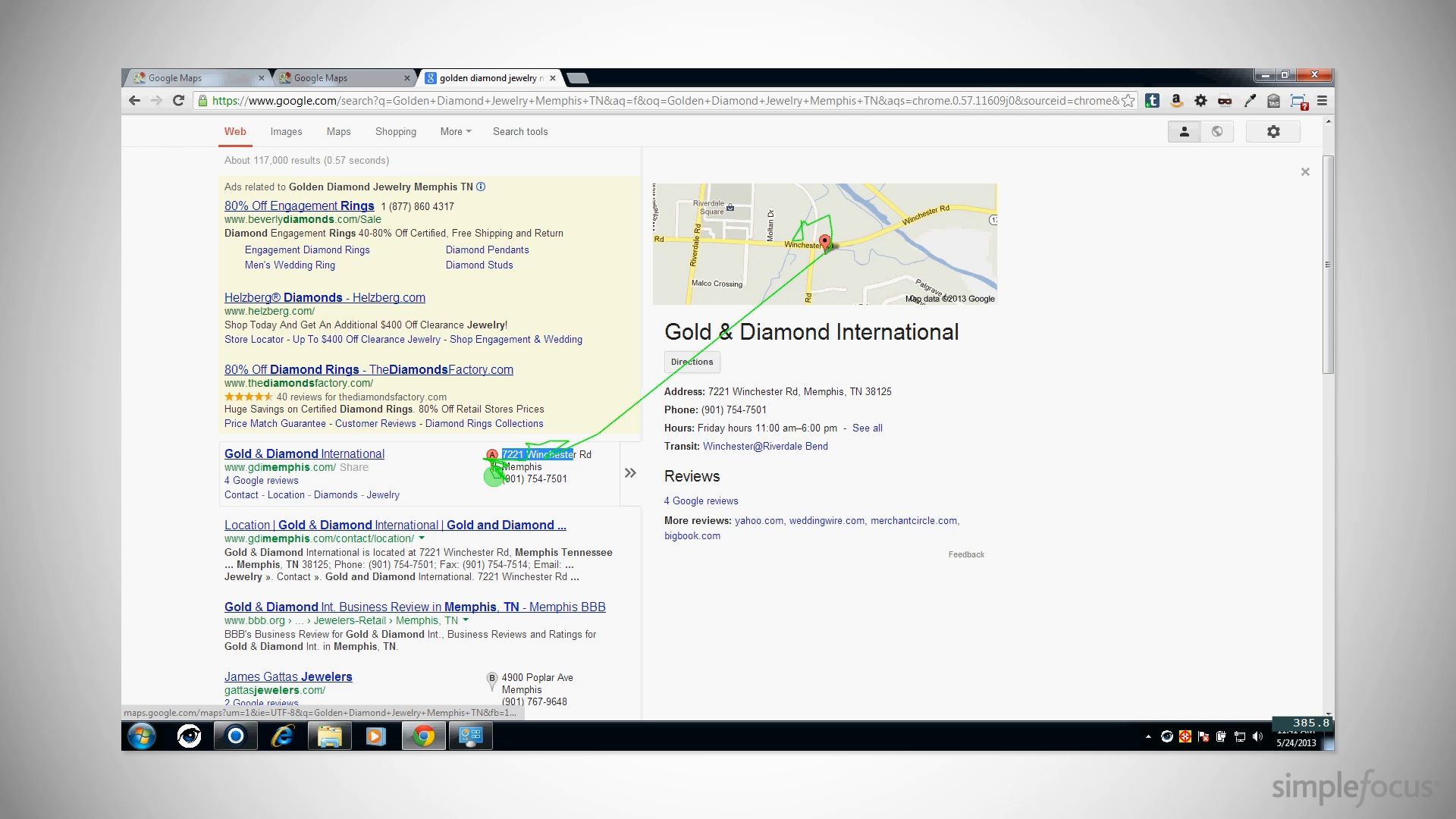
Eventually, she gave up on Maps, ran a regular ‘ole google search, and clicked from there. It works, but why on earth should she have to use a separate Google product to get there?
Playing with Street View
Next, we wanted to see how Janey did with Street View. We asked her to find our office. The search was easy enough, particularly with autofill.
She had a small amount of trouble at first trying to click the map marker to get the Street View. It didn’t take but a few seconds for her to decide that the control is in the hovering window on the upper left.
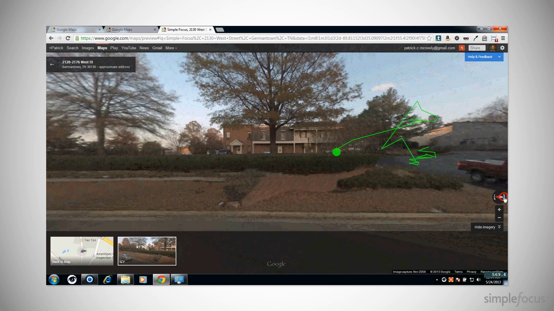
Once she learned this, it was smooth sailing. The usual controls for navigating the 3D space were easy to find and intuitive.
The eye tracker can’t really capture this, but this is when Janey legitimately started having fun. We gave up giving direction and just let her play.
Photos and the Map
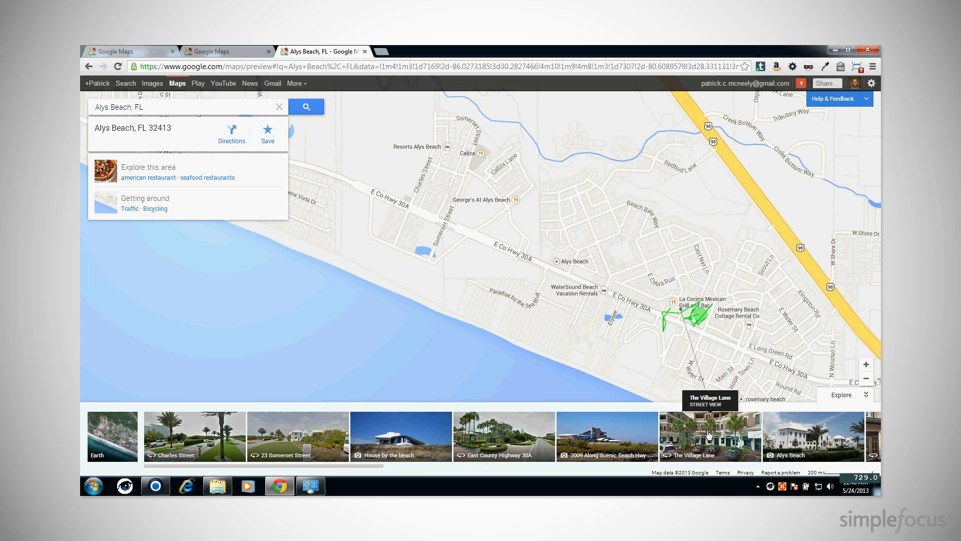
One of the coolest moments was when she searched for a favorite vacation spot. She immediately figured out that the photos at the bottom of the screen were associated with specific plot points on the map. We could watch her eyes jump quickly from the photos to their corresponding locations.
At this point, Janey totally forgot she was part of a usability test and started daydreaming about going to the beach.
Lessons Learned
Sure, the new Google Maps team has a few things it could work on, but for the most part it’s an amazingly smooth transition to the new design.
When you think about how complex of a tool it really is, it’s a small miracle that it only takes a few seconds to overcome even its worst usability speed bumps.


You have shared really interesting information about Google map.