Web Design Inspiration Curated
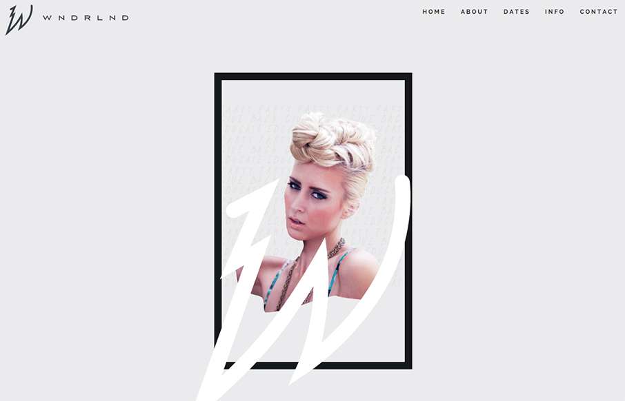
The WNDRLND
This is a great site called WNDRLND, that is aimed at the salon and stylists industries. Seems very fashion forward in both web design and design in general - which is good, since they are trying to inspire an industry of professionals who need to keep ahead of the...
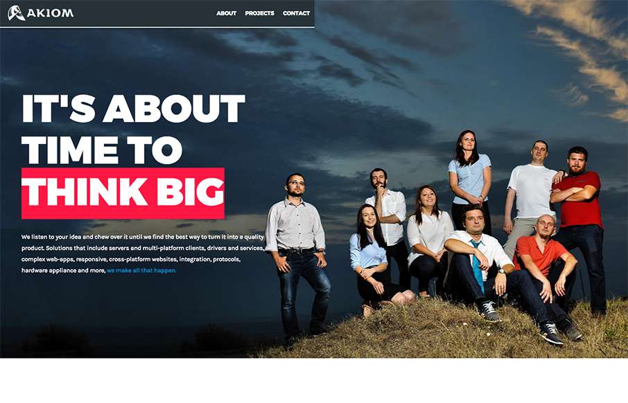
Akiom – Digital Studio
I had to look at this site by Akiom, out of Romania, a few times - and I think it's grown on me. At first I thought the site was unbalanced (leaning to the right) - but the more I look at it, I like how it flows - I think the large, awesome-like images really play...
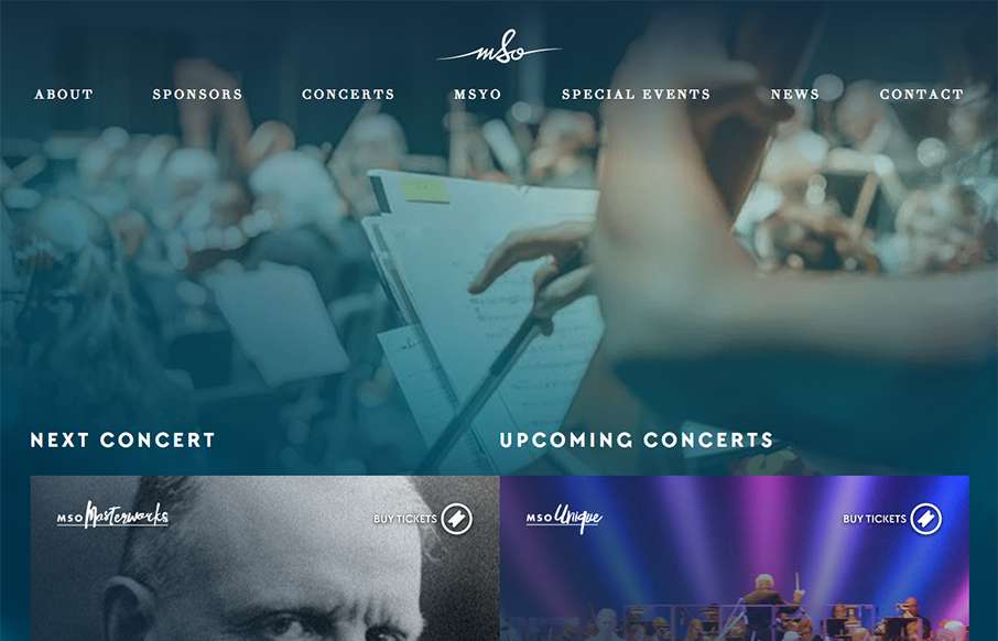
Mississauga Symphony Orchestra
Beautiful, flowing site from Chargefield out of Ontario, for the Mississauga Symphony Orchestra. With flat / material design and other design trends, we see less "textured" type backgrounds it feels like. They've done a good job of having the "melding" the overlaid...
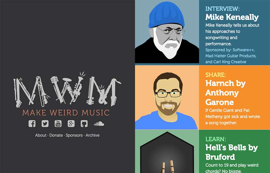
Make Weird Music
Good looking pet project site by Anthony Garone from Arizona, called Make Weird Music - interviews with musicians that make, well, weird music. Really like the split design, and illustrations. From the Designer: A 50/50 vertical split flexbox-based responsive design,...
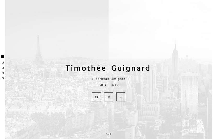
Portfolio – Timothee Guignard – UX/UI
Love this portfolio site from Timothee Guignard out of NYC. Simple and understated on top - awesome detail in the Portfolio Detail pages. From the Designer: Portfolio of Timothee Guignard, UX, UI, Webdesigner Submitted by: Timothee Guignard Twitter: @timguignard Role:...
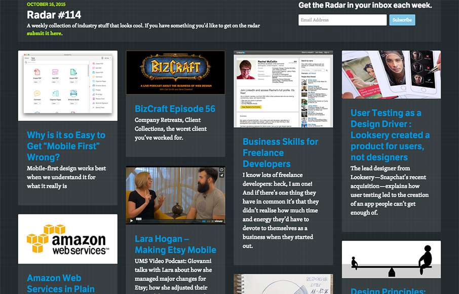
Radar #114
In this week's 114th Radar: Why is it so Easy to Get "Mobile First" Wrong? BizCraft Episode 56 Business Skills for Freelance Developers User Testing as a Design Driver : Looksery created a product for users not designers Lara Hogan – Making Etsy Mobile Amazon Web...
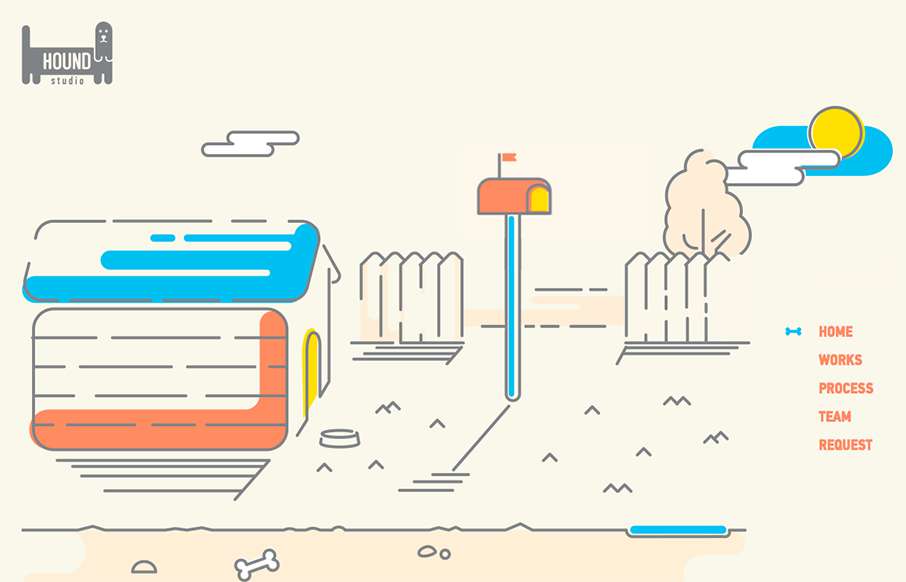
Hound Studio
This is a fun, quick, one-pager from Hound Studio out of the Ukraine, with cool animated illustration gifs - and good animated sales funnel. From the Designer: Imagine that you have 90 seconds to explain the customer the main idea of your business and all its...
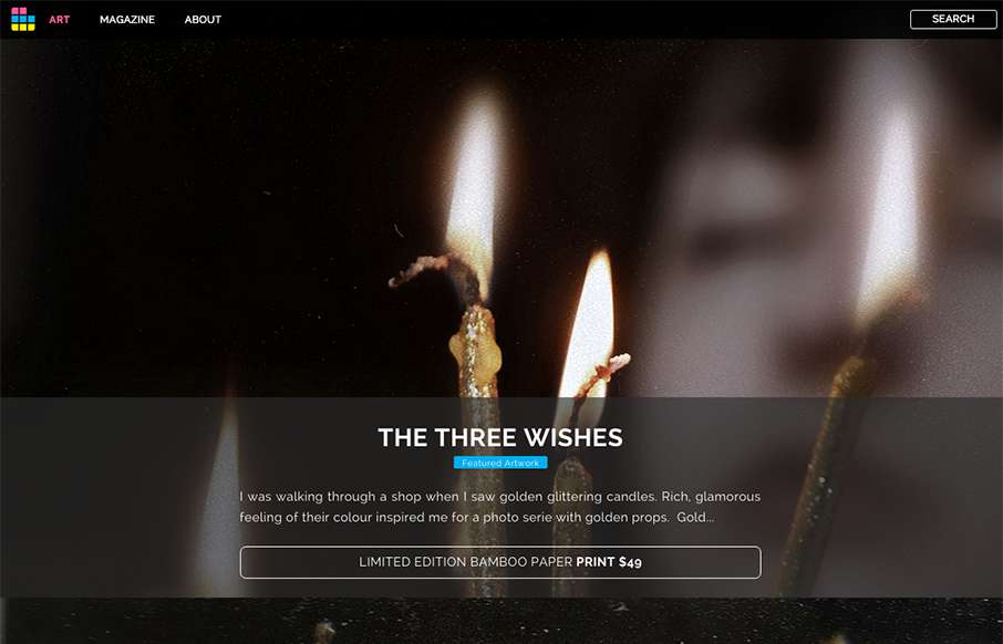
ArtSocket
Looks like ArtSocket has changed it up a little since we reviewed them in January. They've continued to focus on the Art side, but making the experience a little more immersive with the full-width art scroll on the home page, and more detail on interior pages - new...
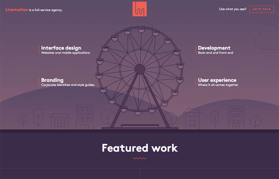
Linemotion
I like the header intro for Linemotion out of Serbia - it's an interesting way to highlight the different pieces of work that go into their agency - how UI, branding, and development all come together to build UX / User Experience. Good job with the animated SVGs too....
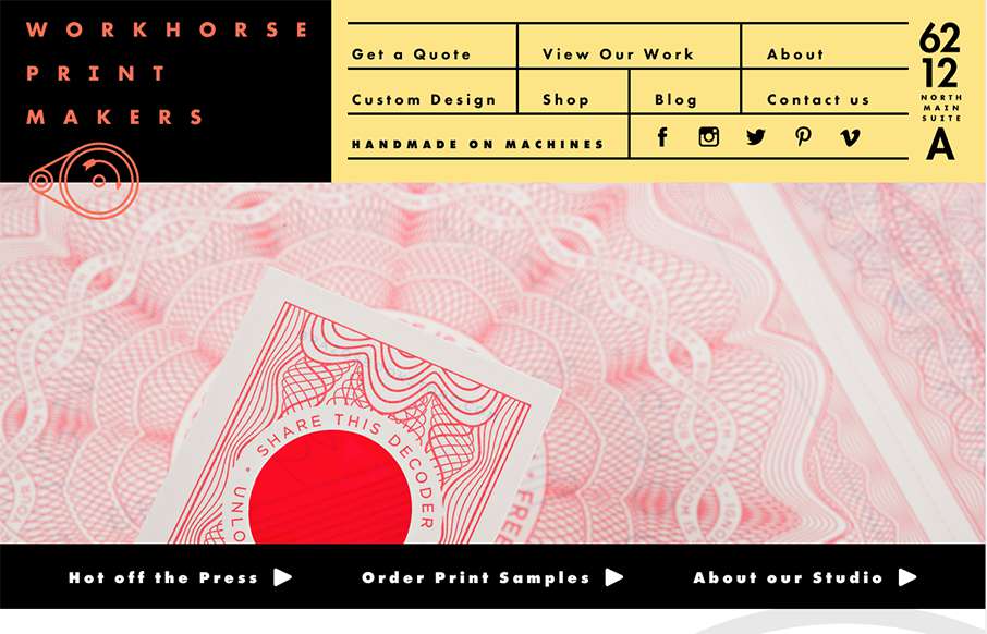
Workhorse Printmakers
Hands down, the best navigation we've seen in a while in this site for Workhorse Printmakers, made by Spindletop out of Houston (think we've reviewed their site earlier this year too). Love this header nav block - definitely makes you think of a print house /...
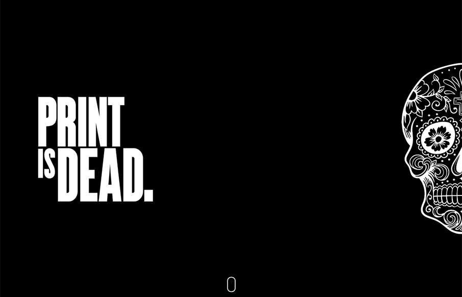
raise the dead with us
Very cool single page site done for Hadgins Engraving, by 15 Fingers out of Buffalo. Two colors, some illustrations, some good typeface, and a little interaction - very good. Especially like the "skull fashion plates" lower in the page. From the Designer: this is the...
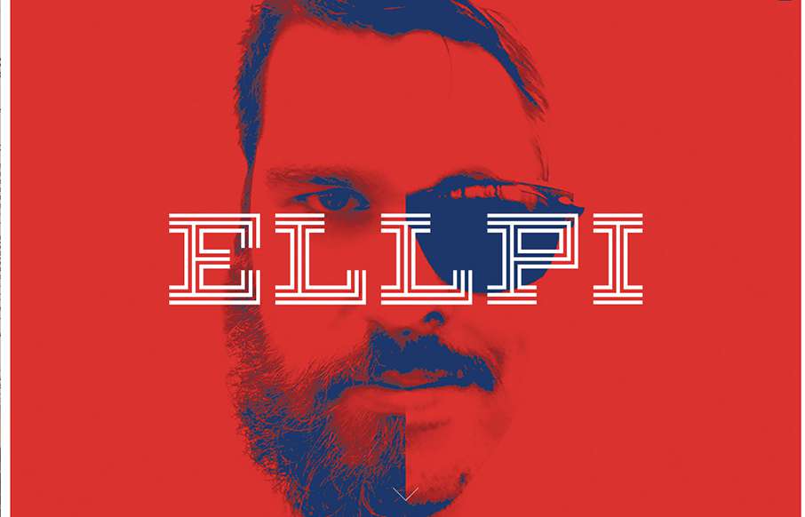
ELLPI
Cool looking red, blue and white agency site out of Montreal from Ellpi. It's very simple and clean, with good white (red) space. I like how the video backgrounds on the site are not featured, they are more like footers on interior pages. From the Designer: ELLPI is a...
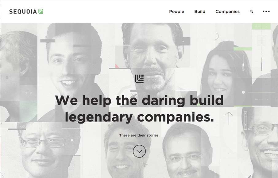
Sequoia
Sharp new site from Sequoia Capital out of Menlo Park. Like the intro image that leads down to the cool vertical slideshow, with great suped-up images, and a cool overlay on the left.
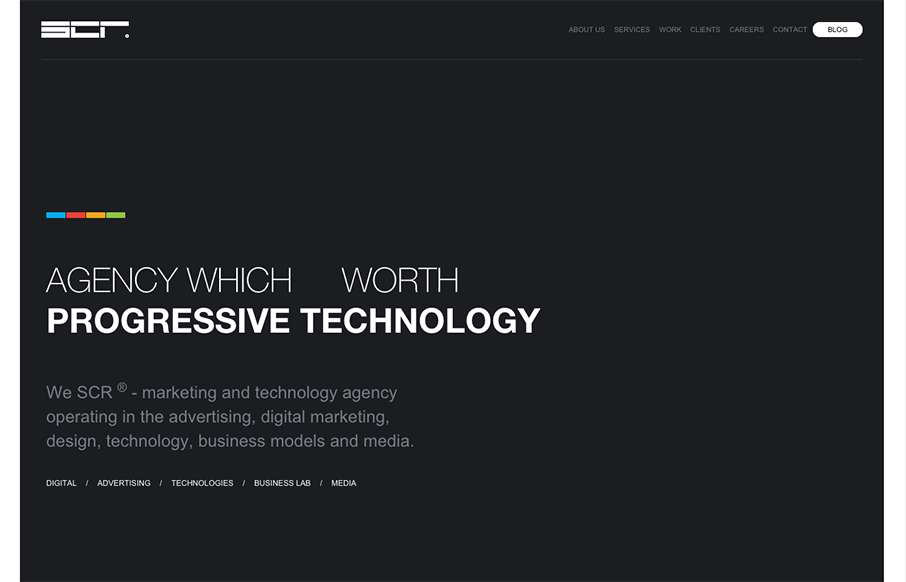
SCR fullservice agency
We usually don't see many dark websites that really "work", but the SCR agency site out of Slovakia makes a good case for it. Unlike other dark sites though, they have good, bold and bright colors to counter-balance everything. Like the collage / block design areas...
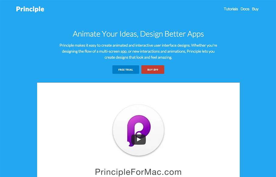
Principle
Good site from Principle out of Atlanta - for their interactive UI tool. The hero video is a great sales tool - and the looped videos are a cool, active way to make sure you understand the app allows animations and interactions. Clean and crisp on all the other parts...
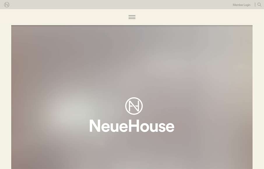
NeueHouse
I think I've spent about longer looking at this site for NeueHouse then I normally do for reviews. The site is extremely well put together - love the secondary nav at the top and bottom, as well as the movement overall on the site. The work on the NeueJournal part of...
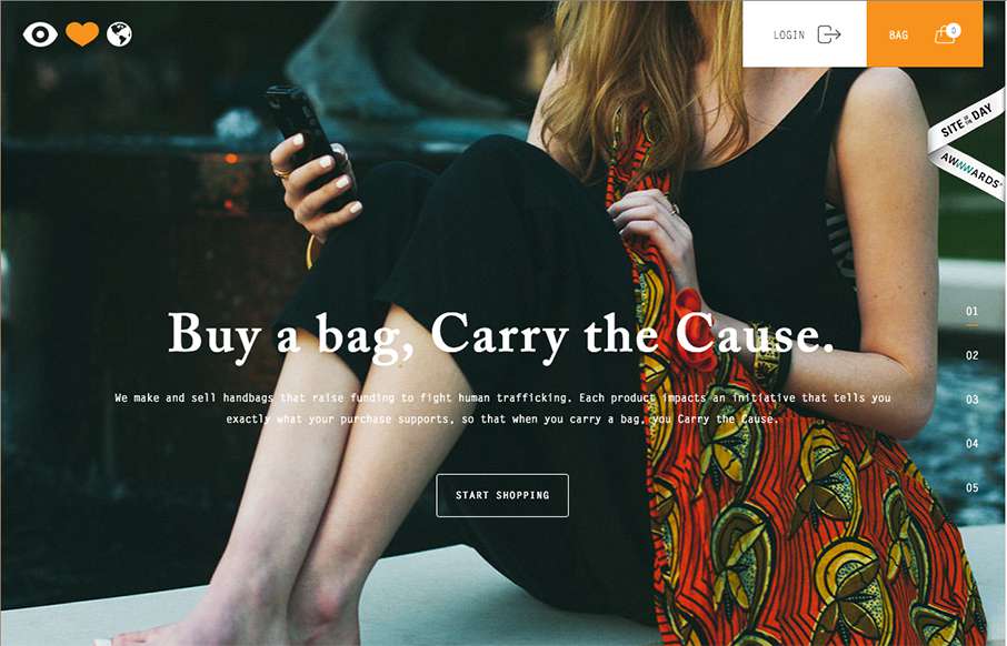
Eye Heart World
Great looking site, with really good purpose - Eye Heart World, out of Tampa, Florida, is a non-profit dedicated to stopping human trafficking. Really good work on The Cause page too.
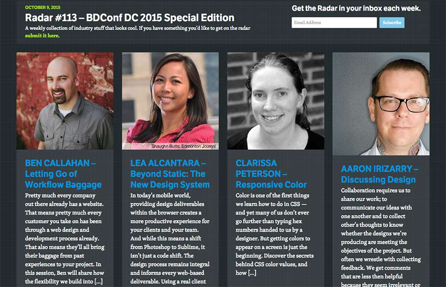
Radar #113 – BDConf DC Edition
This week's 113th Radar is a special edition - a preview of BDConf DC that we'll be at October 22-23, 2015: BEN CALLAHAN – Letting Go of Workflow Baggage LEA ALCANTARA – Beyond Static: The New Design System CLARISSA PETERSON – Responsive Color AARON IRIZARRY –...
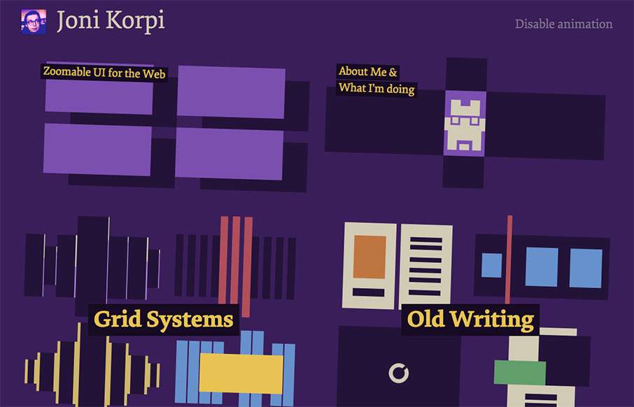
Joni Korpi
I've seen a couple of sites last year that had something similar to what Joni Korpi is doing with his portfolio site, doing zoomable UI for the web. His is pretty smooth. Here's a little bit about his work, the why and how:...
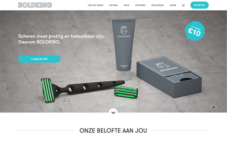
Boldking
Love this site from Boldking out of Amsterdam. Great illustrations and animation help tell their story. Also love how the real and non-real elements work together.
EMAIL NEWSLETTER
News & Articles
CSSOff 2013 is Now Live
 The 2013 CSSOff front-end contest has started. Go and get the design and begin the battle.
BizCraft Episode 30: I deflect negative energy, find a coach + remote working
 In this episode of BizCraft we discuss how you must deflect negative energy to stay sane, how finding a mentor or a personal coach is a good thing and quickly cover 37signals new book about remote working.
Draft Episode 27: Design for Goals & Objectives
 In this episode of Draft we talk about how it’s important to design for your project’s goals and objectives also avoid stakeholder barf.

HARD WORK. CLEAN FUEL. NO EXCUSES
Use “WARRIOR2023″ for 10% off.