
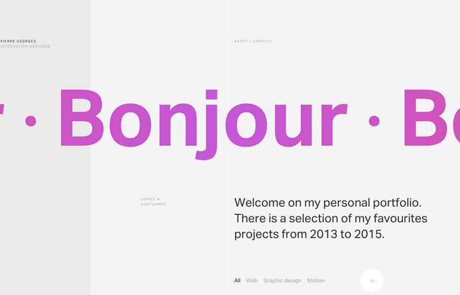
Super sleek grid based layout. I love that he’s using the grid visually and structurally. I also love the way it plays with the typography and then the interactions feel perfectly placed. The layout of the work samples get kind of tedious as you scroll down the page, mainly because there’s so many of them, the details still look gorgeous though.


Fitts’s Law: Why the Easy Button Wins
Large, close targets are faster to hit than small, distant ones, that’s Fitts’s Law. A look at the 1954 rule behind buttons, prime and magic pixels, thumb zones, and dark patterns.


0 Comments