Web Design Inspiration Curated
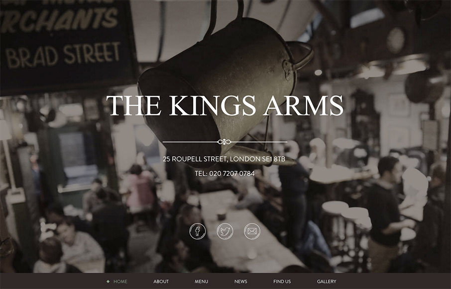
The Kings Arms
Great, tight one-pager from The Kings Arms pub out of London. Subtle grays and greens to give the site a warm aesthetic, which I'm assuming is the same for the pub itself (will have to find out next time in London).
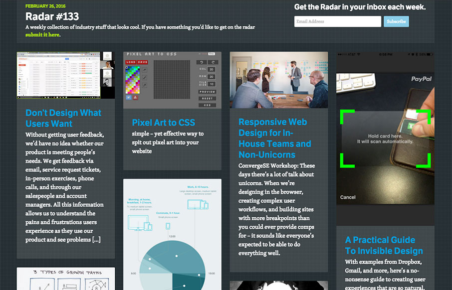
Radar #133
Each week, we do a round up of curated "stuff from the interwebs" that we call Radar. In this week's 133rd Radar: Don’t Design What Users Want Without getting user feedback, we’d have no idea whether our product is meeting people’s needs. We get feedback via email,...
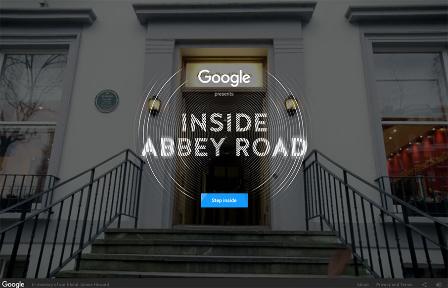
Inside Abbey Road
Man, I love this virtual tour of Abbey Road Studios done in collaboration with Google and their indoor mapping / 3d imaging / video / webgl work. It all combines into an incredibly cool, immersive experience, complete with quadrophonic sound (if you're using...
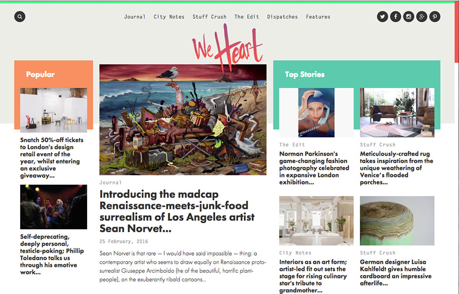
We Heart
This digital magazine / newspaper from We Heart out of Barcelona and London is pretty sweet. It's a great example of our "old timey" blogs have evolved into robust and exciting centers of knowledge - and with so much content, I think they've found good ways of serving...
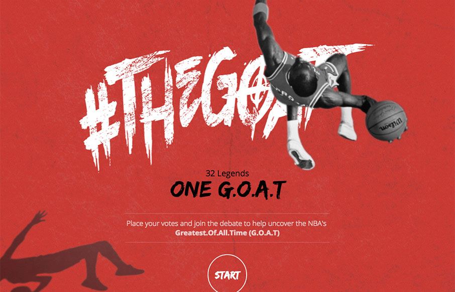
NBA Faceoff
32 Legends - 1 G.O.A.T - I'm sitting here listening to The Script's Hall of Fame (featuring will.i.am), one of my son's favorite songs right now - voting on my favorite NBA players of all time - it's a good morning. And look - there's the South Carolina Gamecock and...
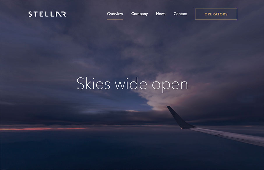
Stellar
I think this is a cool site - Stellare.aero out of Palo Alto - a digital marketplace for private aviation. Very clean and airy with cool animation and video. Also really like the color combination / palette and animated icons on the Operator page.
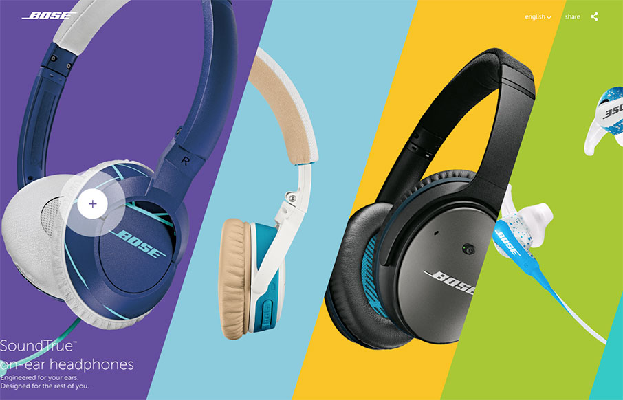
Bose
Very cool site for Bose's new stuff (me want). Very different way of navigating through the products - the home images are the nav - then I like the vertical nav for the specific product. The URL is special.bose.en - I kind of feel like we all should have a "special"...
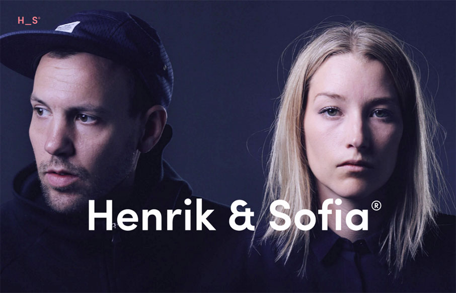
Henrik & Sofia
Bold site from Henrik and Sofia out of Sweden. I like the "cheekiness" of the design of the Selected Work as you go down the page. Good work on the portfolio / work detail pages too.
Nuts & Woods
Out of Berlin - Nut & Woods' site is pretty tight. The best thing about the site has to be the navigation - hover over the "Tables" nav item - see the "dropdown" - but then (since they are selling stuff) the dropdown nav cycles through the product categories...
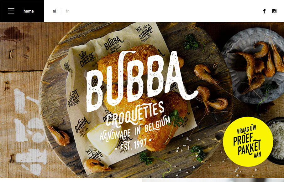
Bubba Croquettes
Good looking block design site fro Bubba Croquettes by Skinn out of Bruges, Belgium. Two things I especially like - first - the hamburger menu drawer opens to just the nav items - not to this huge overlay. Then second - I like how the footer isn't at just the bottom...
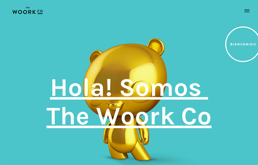
The Woork Co
Bienvenido to your Monday - here's a quick site out of Madrid from The Woork Co. I like the little surprise of the animated gifs in the block design as links to their work. The whole site is very clean and crisp and solid. From the Designer: Madrid based studio design...
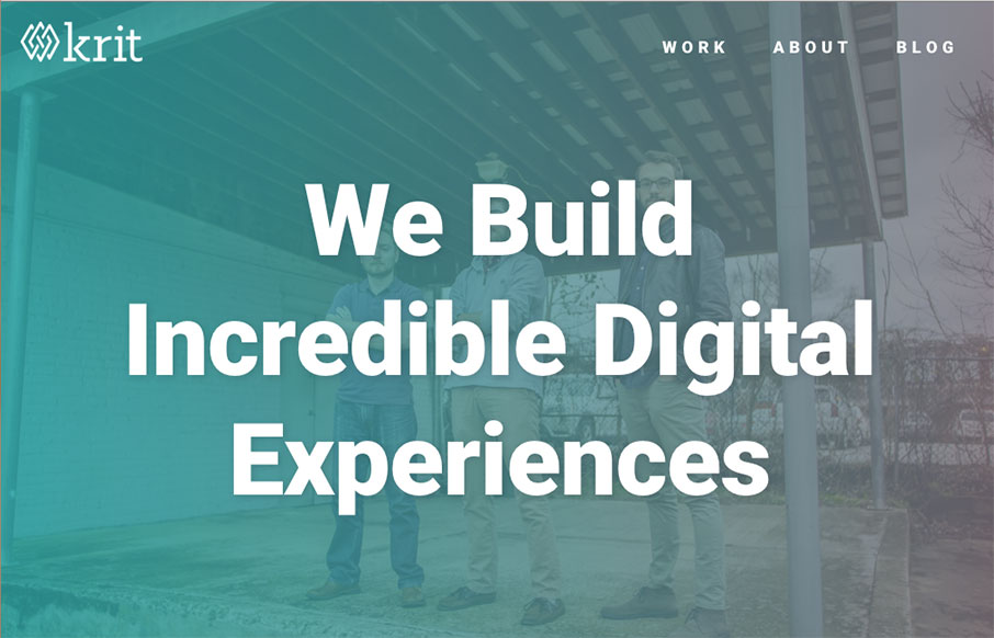
Built By Krit
Full disclosure - the boys at Krit are friends of ours - they actually sit, um, right there 10 feet away from us in the co-work we run - and they have a lot to offer. We were building our new "agency" site at the same time, so it's been fun to watch each other's work...
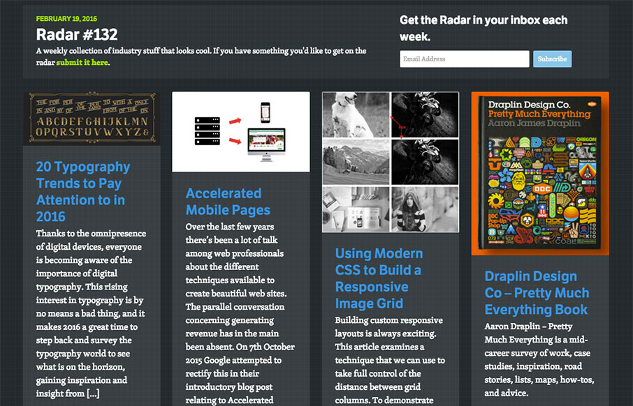
Radar #132
Each week, we do a round up of curated "stuff from the interwebs" that we call Radar. In this week's 132nd Radar: 20 Typography Trends to Pay Attention to in 2016 Thanks to the omnipresence of digital devices, everyone is becoming aware of the importance of digital...
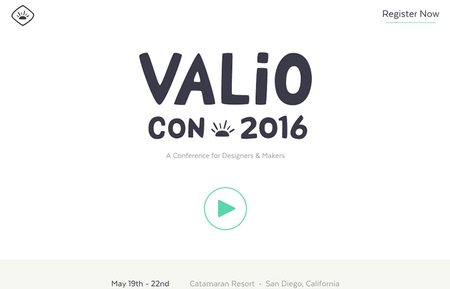
Valio Con 2016
Smooth, and seemingly minimal work from the Valio Conference out of San Diego - the site looks great on desktop and mobile, and kind of has a cool parallax effect between speakers. Also love the Instagram-feed looking slide-show - nice touch!

Taikonauten
Good full-width agency work from Taikonauten out of Berlin. I like how they make the device images complement the page coloring - and show the devices in different views and states - smart for agency / portfolio work.
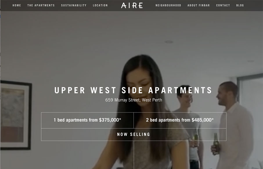
Aire West Perth
Dang - that's a cool website for Aire West Perth - an apartment building sales site out of Australia. Great video background work - and then about everything you would need to get you to come and visit in person. I mean hey - it made me want to go back to Australia...

Herdl
Nice minimal site from Herdl out of the UK. Minimal because they hit you with headlines on the front page, instead of a lot of words (that your potential client never reads anyway... no... really). There's meat in the Services pages - but the home is simple, but with...
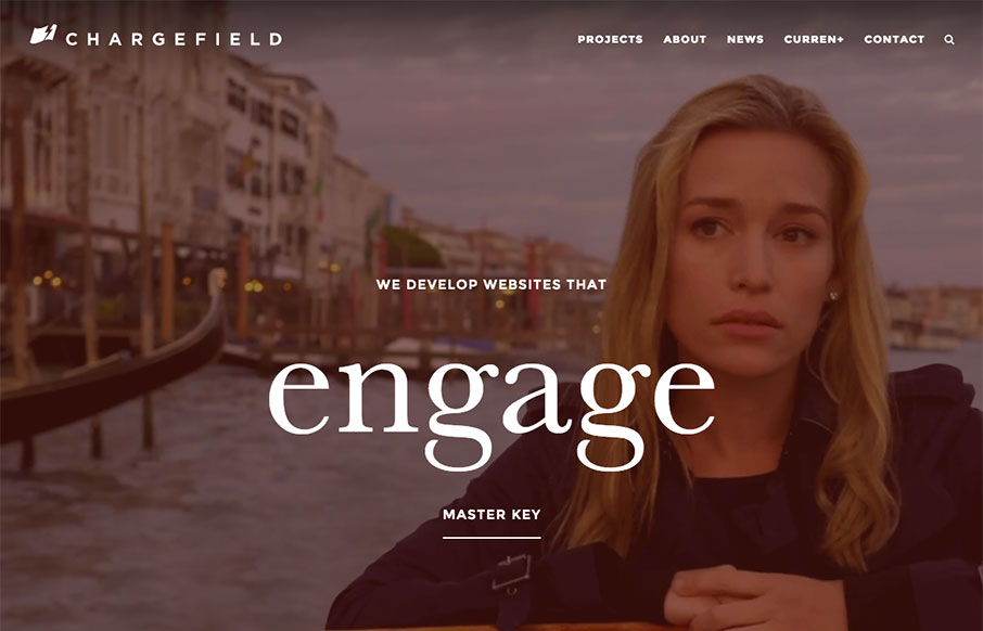
Chargefield
Maybe it's the engaging, parallax images on the home page - maybe it's just Piper Perabo - but I'm really drawn into the Chargefield site (out of Ontario). Crisp work all the way through - very cool. Submitted by: John Godfrey Twitter: @Chargefield Role: Designer &...
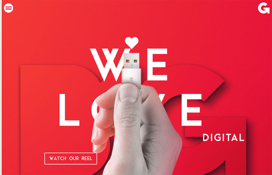
B1G Digital
Big and bold is the B1G Digital site out of Colombia. I really do love the above the fold imagery - very cool. And not easy to get that iPhone cord to match up to the next section - but good job of keeping the theme running down the page a bit. From the Designer: B1G...
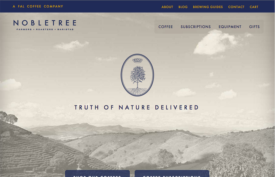
Nobletree Coffee
Rich and subtle color palette for Nobletree Coffee out of Brooklyn (looks like it was made by Figureground out of Minnesota). Really like the card design for the coffees - smart way to present the flavor and body notes. From the Designer: Clean, elegant and easy...
EMAIL NEWSLETTER
News & Articles
Kickdrop Code Sample: Expanding Content Overlay
 This simple expanding overlay effect code snippet leverages CSS3 and a little bit of Javascript to do it’s magic.
A to Z CSS: Display
 Different types of elements have different display values by default. These include inline, block, list-item, table and many more.
A to Z CSS: Color
The web would be a pretty dull place without a splash of colour. There are a number of different properties that take a colour value and there are four different colour syntaxes in CSS and that’s what we’ll be focusing on in this video. Those formats are colour keywords, hex, RGB and HSL

HARD WORK. CLEAN FUEL. NO EXCUSES
Use “WARRIOR2023″ for 10% off.