
Web Design Inspiration Curated
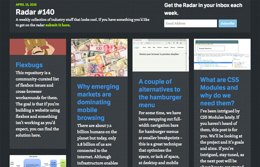
Radar #140
Each week, we do a round up of curated "stuff from the interwebs" that we call Radar. In this week's 140th Radar: Flexbugs This repository is a community-curated list of flexbox issues and cross-browser workarounds for them. The goal is that if you’re building a...
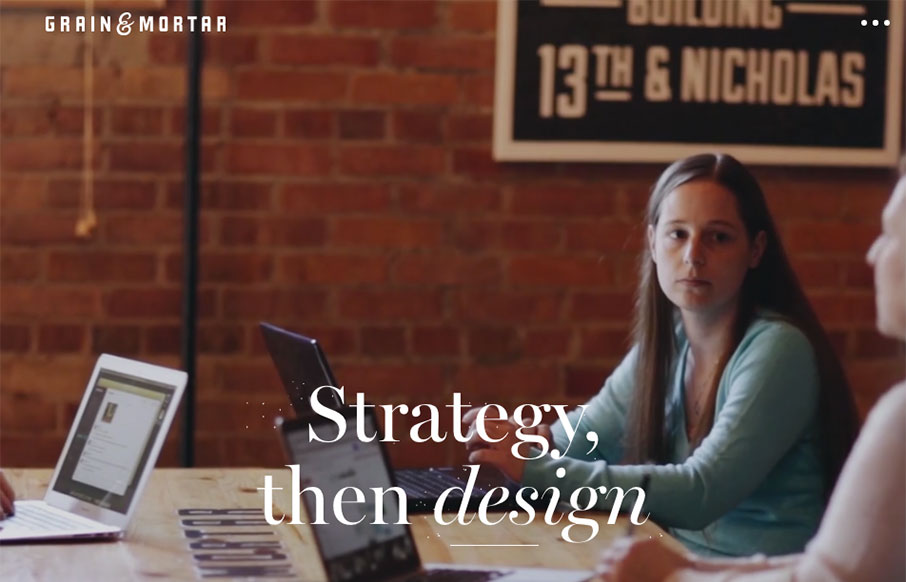
Grain & Mortar
Beautiful work. I love the feeling of richness this website exudes. From the photography to perfectly selected typefaces to match it's solid from top to bottom. I especially like the rhythm of the page, going from larger hero sections to smaller more open blocks of...
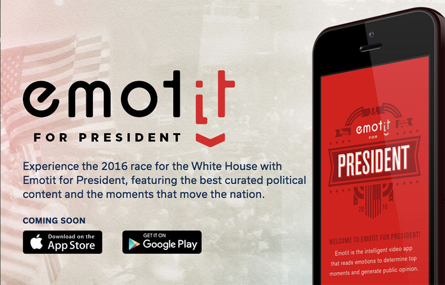
Emotit For President
Real real solid product website here. I dig the overall concept of the way the app is presented. Also the detail work of the slight parallax in the bigger hero views really makes the site sing. The app itself looks beautiful and so the website pulling in some of that...
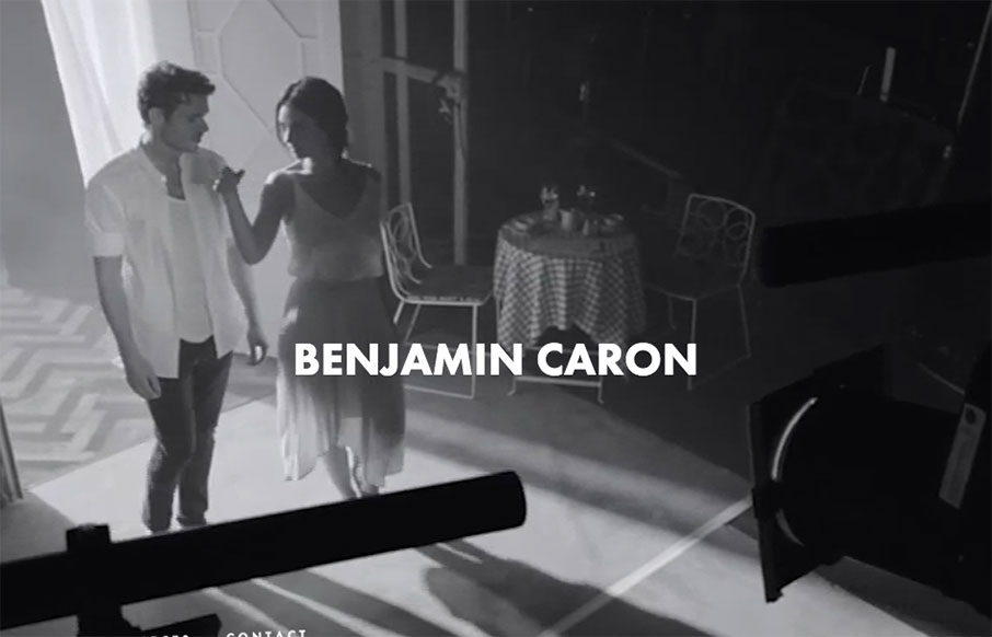
Ben Caron
Pretty strong layout to go around putting a pretty hefty amount of copy on the page as well as lots of elements and even video. Simple and straight-forward enough to make it all work seamlessly well together.
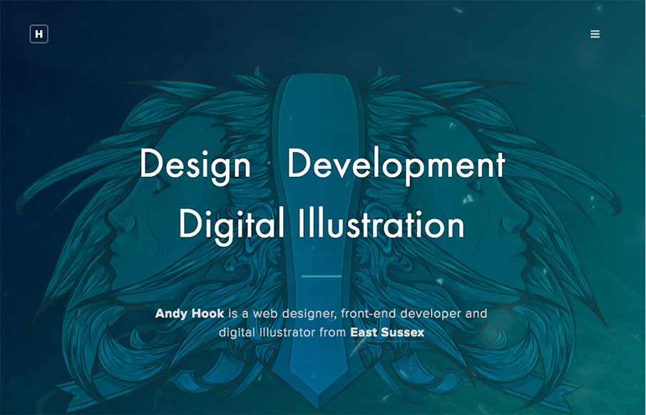
Andy Hook
Man - another great portfolio site from the UK for Andy Hook. Cool illustrations and great tone to the site. Nice. Submitted by: Andy Hook Twitter: @andy_hook Role: Designer & Developer Country: England
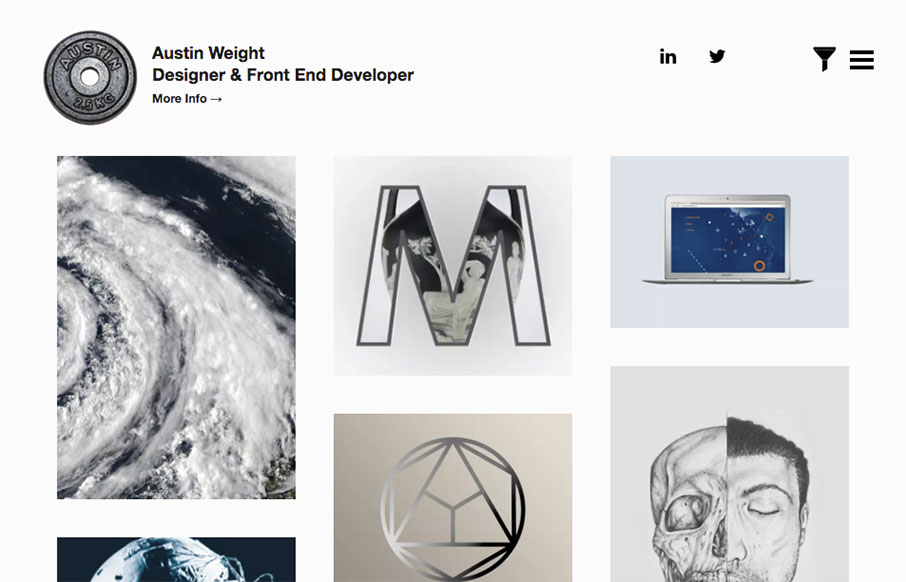
Austin Weight
I kind of love this portfolio site from Austin Weight out of London. Scroll over the work samples on the Home page - very cool effect that we haven't really seen much of yet. Also really like the work he did on "The Connection - Scales of Reality". And yes - the...
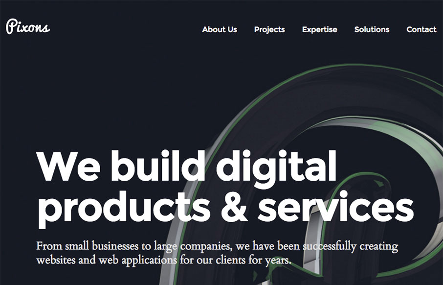
Pixons – Digital Agency
Good, clean site out of the Ukraine for Pixons. I like the block design and work on the Projects page especially - good balance with imagery and descriptive text. From the Designer: This is our company brand new website. We build digital products & services. From...

Evan Kosowski
Solid, simple 3 column based layout. Dark background is good as well. What I love most and what IMHO really sets this website off into orbit is the navigation design/interaction. I freaking LUUURRRVE this thing! A personal portfolio design is never an easy task. 5...
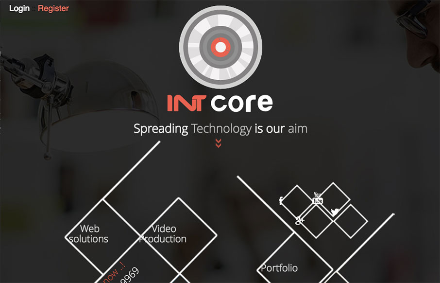
INTcore
Pretty straightforward design. It isn't perfect but it does have several cool details that are worth reviewing. From the Designer: Intcore is one of the Egyptian leading companies in software development and media production that working hard to meet all technology...
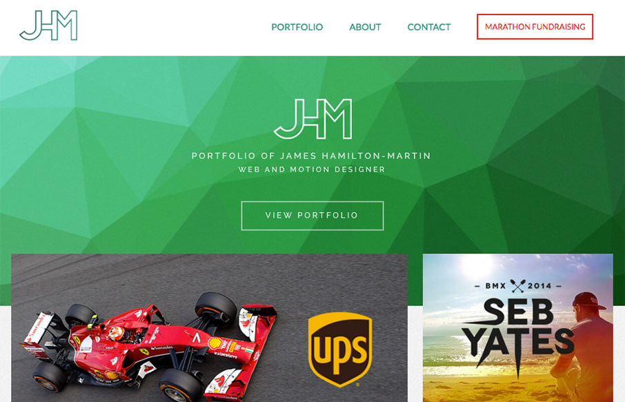
JHM Creative
Nice portfolio site for James here. I love the green background/shapes and the way the portfolio pics overlap slightly. Very clean layout and I loves it! Also, he's running a marathon, so give the man some support! From the Designer: A responsive portfolio website...
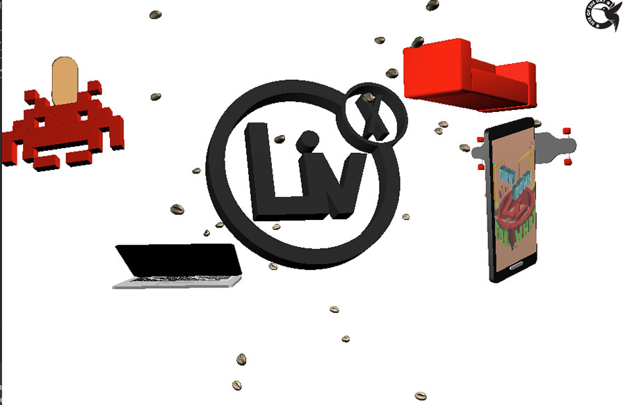
LivX
Some pretty slammin' loading animations in the hero area of this site. Then some here and there down the page as you scroll. Simple layout and straight forward copy make it easy to take in everything about LivX. We are a tightly-knit team of passionate people,...
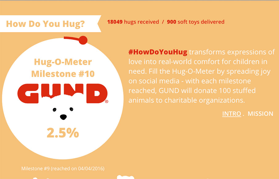
How do you Hug?
Pretty neat idea for Hugs. 🙂 I really do like the way the main three columns are setup, centered around the core content of the website. The bears are a nice central theme element too. Lovely. From the Designer: HowDoYouHug transforms expressions of love into...
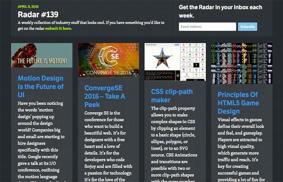
Radar #139
Each week, we do a round up of curated "stuff from the interwebs" that we call Radar. In this week's 139th Radar: Motion Design is the Future of UI Have you been noticing the words ‘motion design’ popping up around the design world? Companies big and small are...
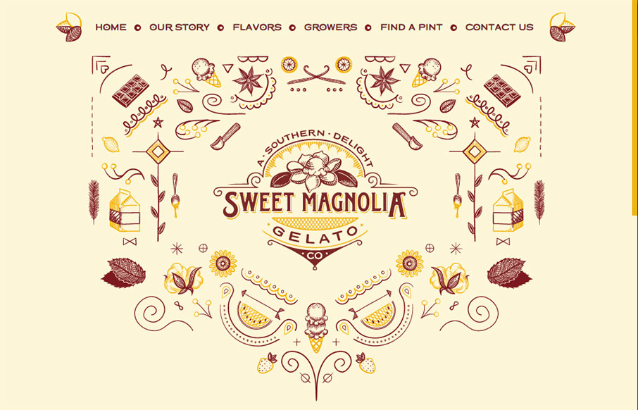
Sweet Magnolia
A lot of fun for this website for Sweet Magnolia gelato. The illustration is top-notch and made extra fun with the animation. The execution might leave something on the table but I don't care. GELATO! From the Designer: Sweet Magnolia Gelato Co. makes gourmet gelatos,...
MYF Web Designer
It's sort of your standard affair in terms of "stuff" on the page, but it just feels nice. I like the dark colors and cool shapes that you start off with. Overall nice design. From the Designer: I'm Bren, a reliable, efficient and motivated web programmer and premium...
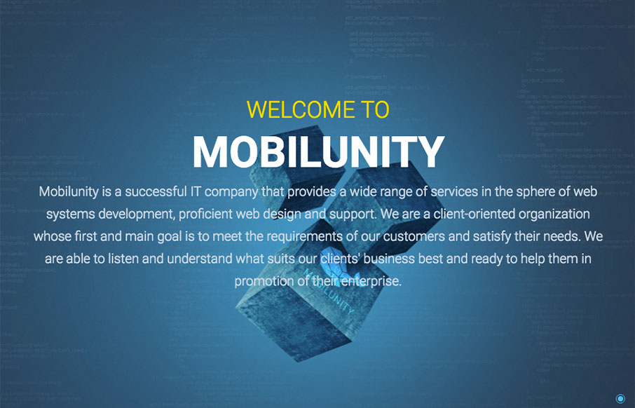
Mobilunity
Pretty unique looking layout. I dig the colors a great deal and the non-traditional way the content loads up on the home page as you scroll down. A little scroll-jacking but I can get over it. Solid mobile views too. Submitted by: Anastasiia Role: Marketing Officer...
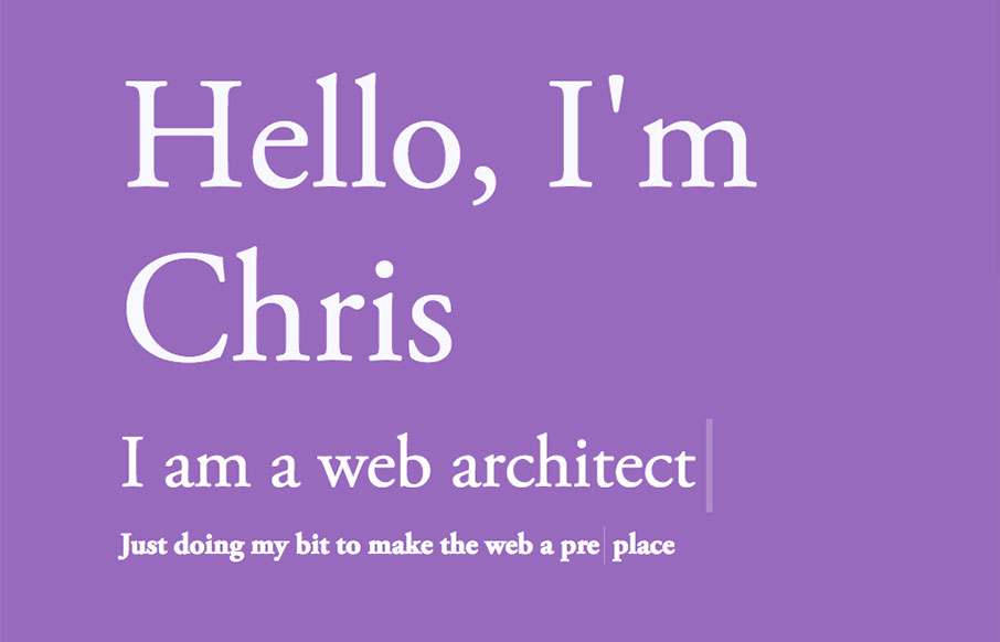
Chris McNally
Really cool pacing on the content blocks as you scroll down the page. Also some really clever interaction points, like the email link/icon that pulses in the corner and the side navigation that appears as you move down the page. Solid stuff there, worth a good long...

Lakewood Design + marketing
Strong graphically. I dig the overall vibe of this website, I extra like the way the two main sections are presented in the "middle" of the home page. I am not a fan of waiting through the loading % bar thing, but I suppose that can't be helped to a far extent....
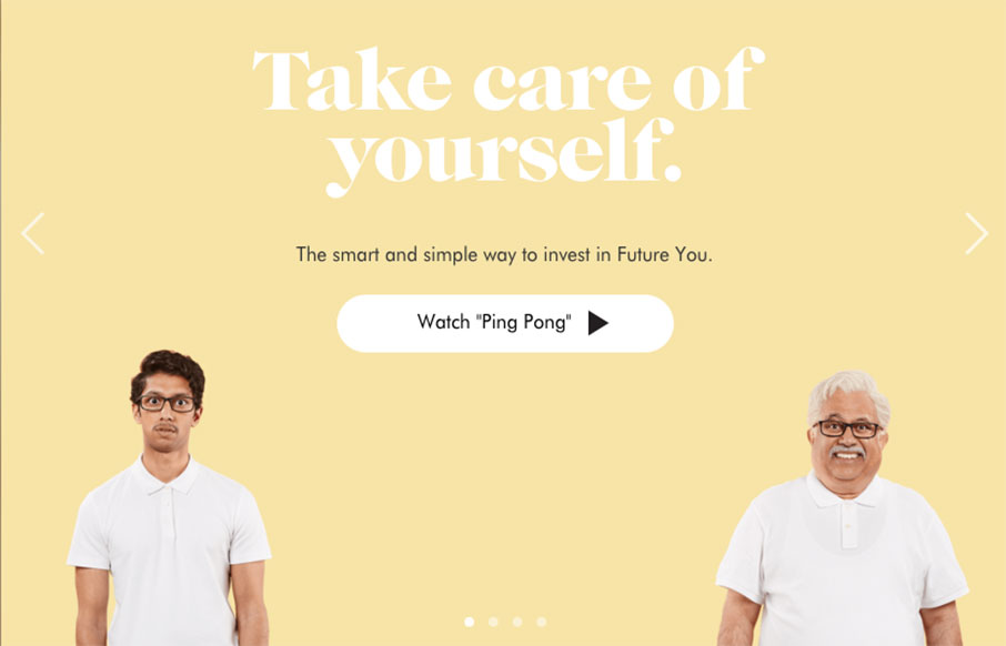
Wealthsimple
Wealthsimple doesn't look like any other financial website i've seen before. Ditching the status quo corporate colors for a softer more non-traditional vibe they really get it right. Playing up the personalization feel to the tee. I love the typography on this site...
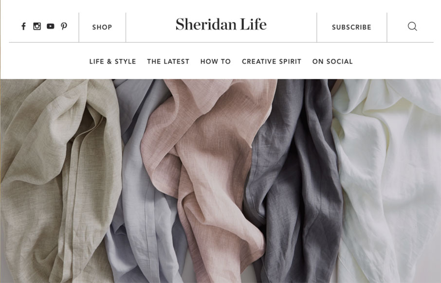
Sheridan Life
The Sheridan Life life page of the Sheridan website is a super sweet page design buried inside the overall corporate website. It's beautiful, great typography and great rhythm, I loved discovering this. My favorite interaction points are the header and the page...
EMAIL NEWSLETTER
News & Articles
Kickdrop Code Sample: Inline Text Editor
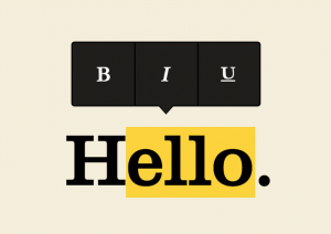 Medium is an amazing blogging platform with beautiful editor. We’ve featured the medium editor in this drop. As the user scrolls over content, they can easily declare headings, edit the style of paragraph text and everything in between.
A to Z CSS: Enabled
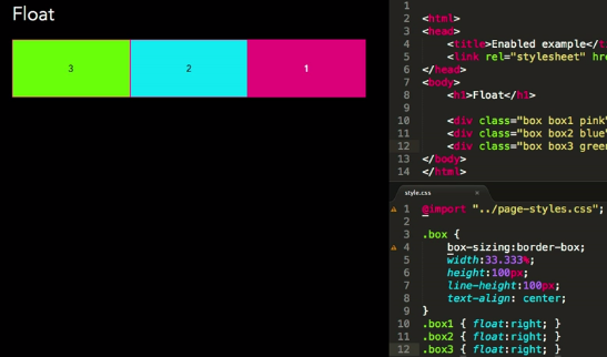 :enabled and :disabled are pseudo classes that allow the styling of different states of form inputs, ones that are clickable or can have text entered into them (enabled) or those that can’t (disabled).
Interview with Eric Dodds from The Iron Yard
 ric Dodds, Partner and Head of Brand and Operations at The Iron Yard, shared with us the path that The Iron Yard took to be where they are today, and why code education is taking off in the Southeast and beyond.
HARD WORK. CLEAN FUEL. NO EXCUSES
Use “WARRIOR2023″ for 10% off.