Web Design Inspiration Curated
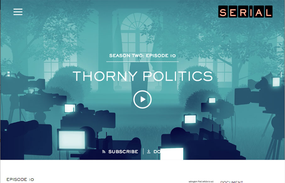
Serial
Yes - I know, I'm late to the party on Serial - I'm still in Season One, and I'm hooked! As far as the design - what first pulled me to this site was actually the podcast player - I've spent a lot of time on podcasts of all kinds in the past couple of months, and have...
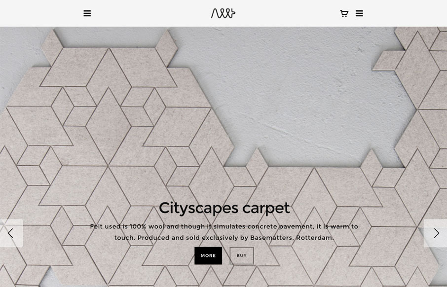
Allt
I love product websites like these, to see the way other designers handle showing off products. This one is superb. I love the hero image area and then how it scrolls quickly and down into some short and sweet product photos. It lets you dig in quick and the editorial...
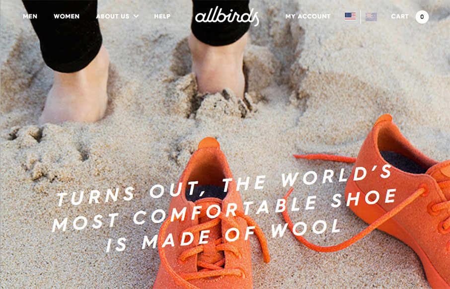
Allbirds
Very nice product website for the Allbirds shoes. I freaking love this site design. It's almost immersive. The photography and editorial for the different sections is all very well done and the timing on placement and video, etc... makes me smile. Now to get my hands...
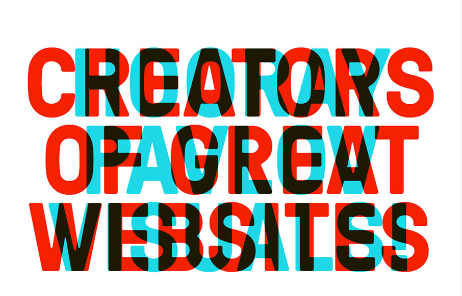
Bolden
Dayum man. I love the bold approach to the typography here, it's a breath of fresh air really. Simple and to the point too. Some nice detail work here and there, solid and awesome work.
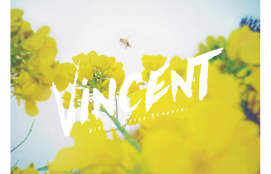
Vincent
It took me a bit to figure out just what this website was for, but once I got it, it's all good. Beautiful design pieces and the website itself has a lot of visual power to me. Romance!
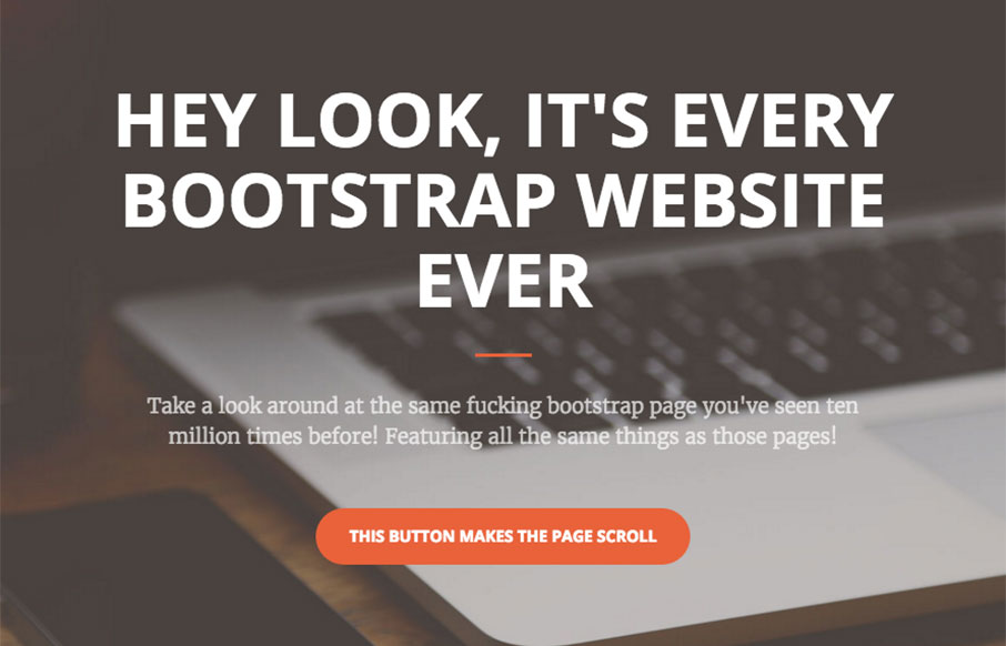
Every Bootstrap Site
Agreed...
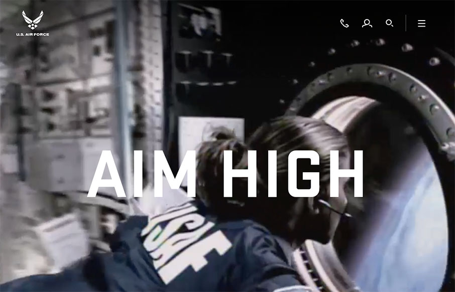
Airforce
New(ish) website for the US Airforce here. There is some serious inspiration to gain from this site. It's executed quite well and has a ton of detail work. Like the main navigation design, I love how it becomes another part of the website almost, not just a big menu...
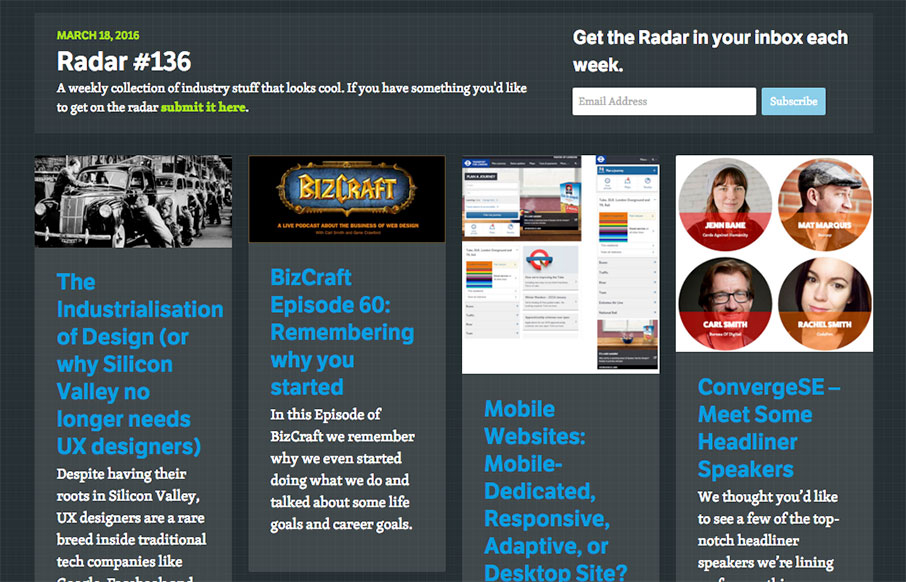
Radar #136
Each week, we do a round up of curated "stuff from the interwebs" that we call Radar. In this week's 136th Radar: The Industrialisation of Design (or why Silicon Valley no longer needs UX designers) Despite having their roots in Silicon Valley, UX designers are a rare...
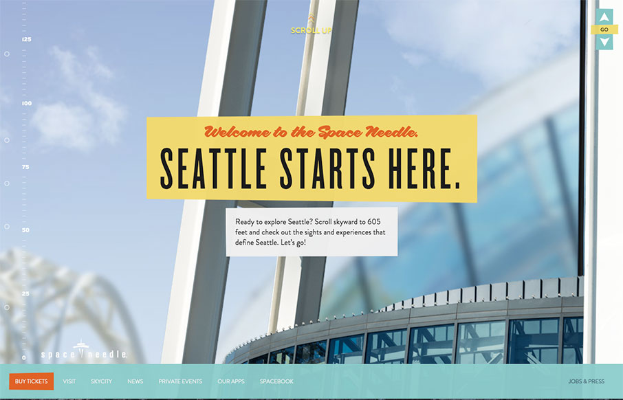
Seattle Space Needle
Get ready to scroll up - the Seattle Space Needle site is simple, and to the point - just a cool way to do something different, thate really makes sense for the location / building - upward and onward!
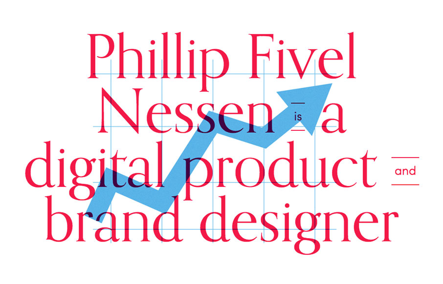
Phillip Nessen
Suuuuper simple layout for the portfolio website of Phillip Nessen. But man, it has some real badass typography and illustration work going on. Love this stuff.
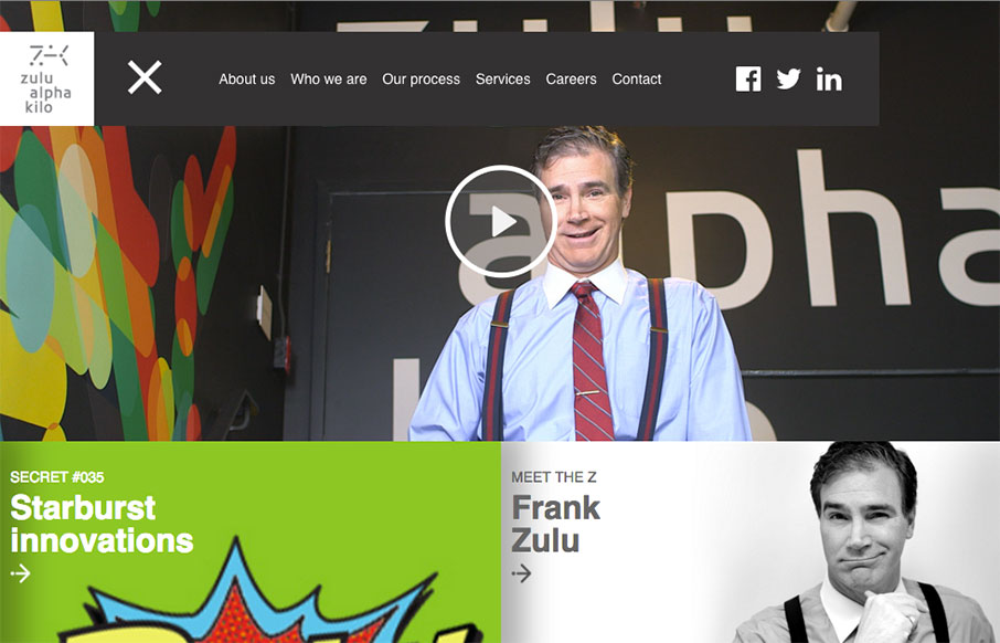
Zulu Alpha Kilo
Yeah it's a parody agency site, but it's actually not that bad of a design. Fun stuff, but it works pretty well.
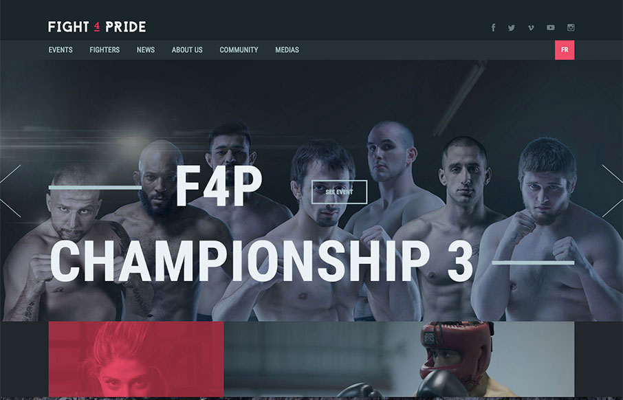
Fight 4 Pride
Great looking site for Fight 4 Pride out of Quebec, created by Phoenix. Excellent coloring and font work. Really like the Fighters landing and detail pages too - laid out very well.
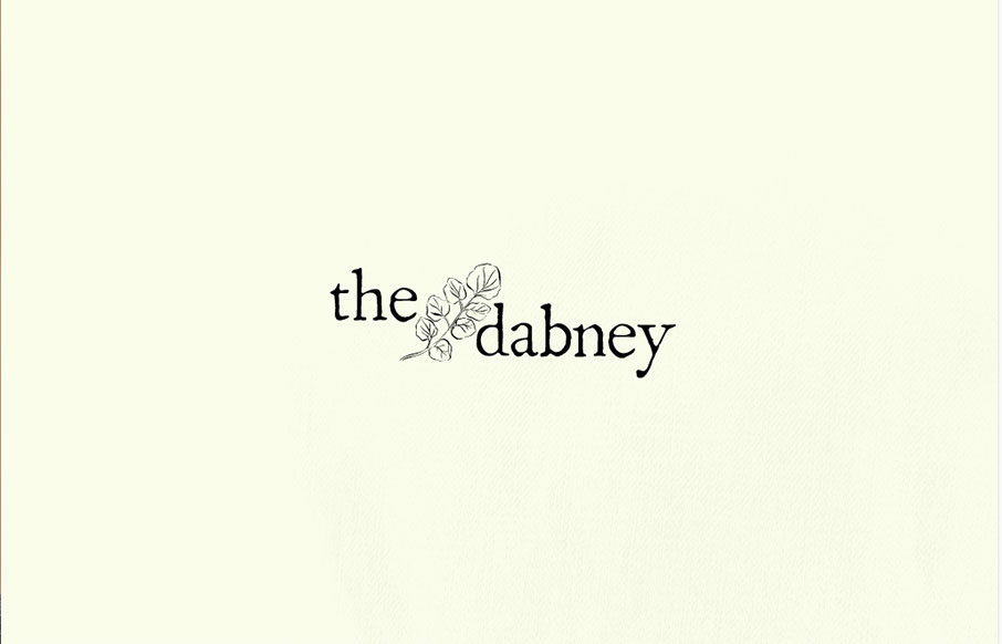
The Dabney
Pretty cool aesthetic to this site. I feels like it perfectly matches what they do in it's visual vibe. It's also kind of interesting with the scrolling and the main links in the top right and left like that. Simple and effective. Love it.
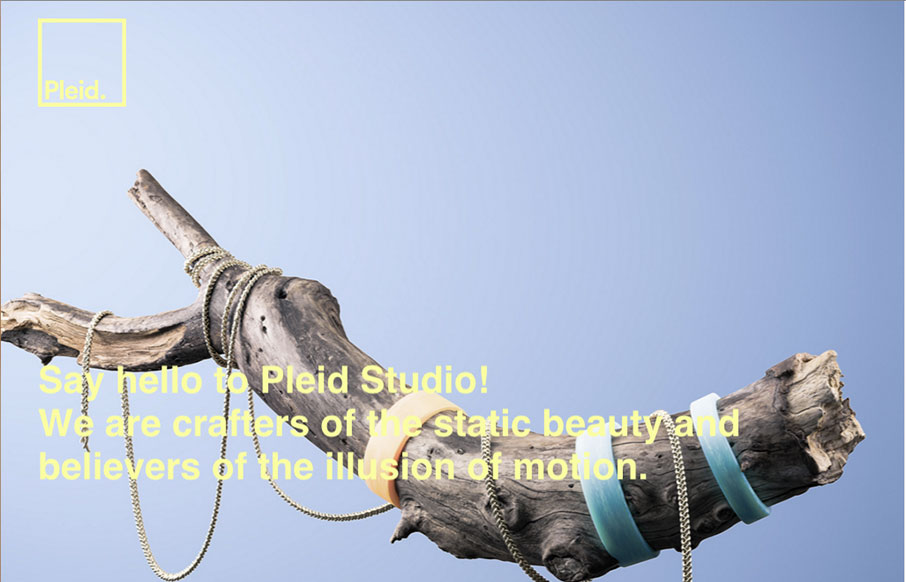
Pleid
Very interesting site design here. I love the colors, the soft pallet and then the usage of the photos in the grid like that, clever work.
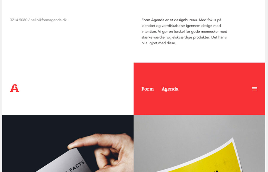
Form Agenda
Super non-traditional looking layout for the Form Agenda website. It does everything right IMHO. I like the contact info in the top left - instead of a logo. Very clever. Then the rest of the grid is very active and keeps it fresh feeling as you scroll down the page....
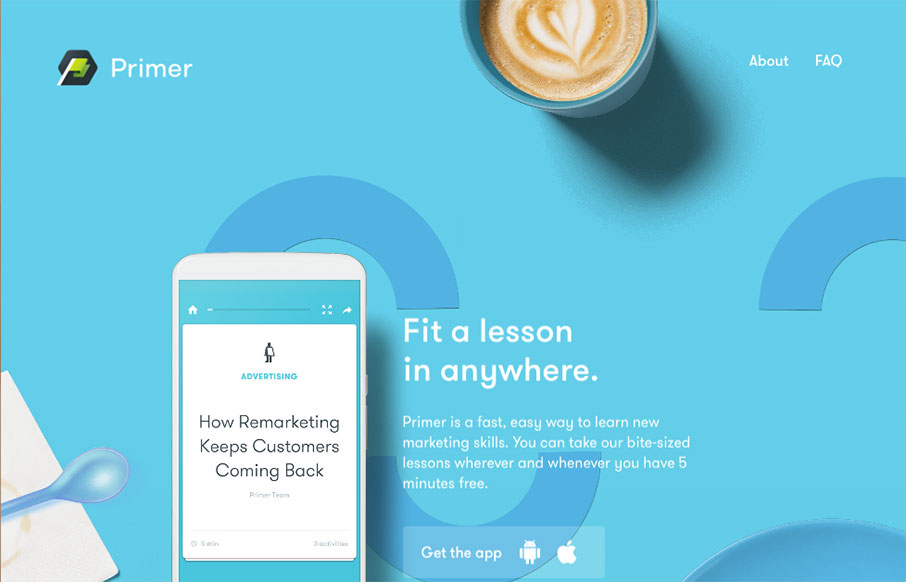
Primer
Yeah, yeah, scroll-jacking and all that. I know i've complained about it myself too. But this is a fairly beautifully designed website. I like a ton of the details in play here. Solid design on top of a bad paradigm, I still find it enjoyable.
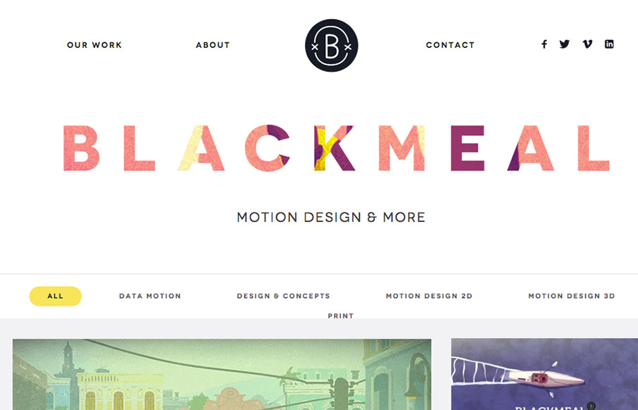
Blackmeal
I freaking love the grid layout here for Blackmeal. It's very dynamic and transitions between screen widths quite well. My favorite part however is the transformative design aspect to the header, as you scroll down, it's mesmerizing to me. It's simple but boy is it...
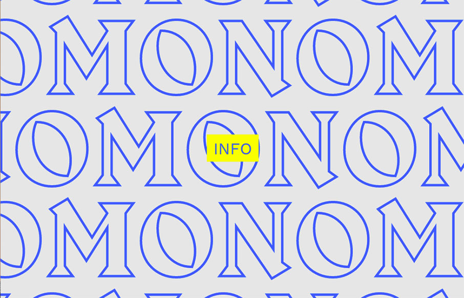
Monomono
Kind of a crazy ass website. I'm enjoying it tremendously even though it largely goes against most of my gut telling me the UX is bad. What do you all think?
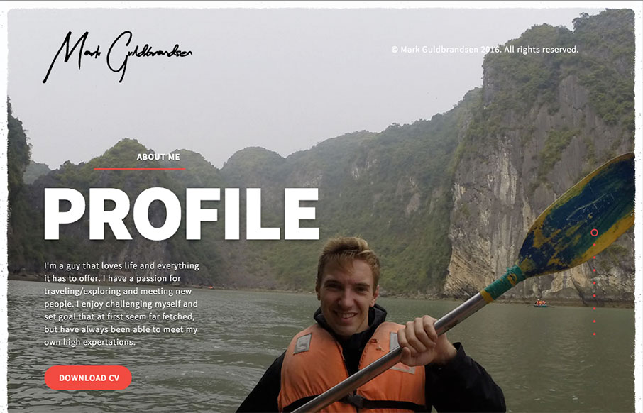
Mark Guldbrandsen
Nice portfolio website. It functions almost like a power point would, with big screens you move between. In that aspect I like the simplicity of the approach. What do you guys think? Does that work for you here?
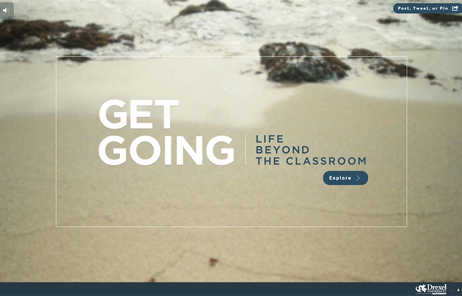
Get Going Today
Great use of multiple video backgrounds (and a slider) to tell stories for Drexel University's Sacramento campus through the site "Get Going Today". It's a cool way to navigate through a site, and just explore.
EMAIL NEWSLETTER
News & Articles
63 Web UI Patterns From Today’s Hottest Companies
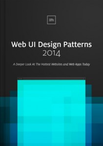 Samples of UI Pattern studies from the UXPin eBook. Good stuff in here. The Web UI Patterns 2014 eBook from UXPin looks at examples from today’s most forward-thinking companies such as Pinterest, Yelp, Twitter, Spotify, Virgin America, Behance, AirBnB and more to match UI patterns to user needs.
Kickdrop Code Sample: Inline Text Editor
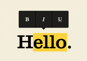 Medium is an amazing blogging platform with beautiful editor. We’ve featured the medium editor in this drop. As the user scrolls over content, they can easily declare headings, edit the style of paragraph text and everything in between.
A to Z CSS: Enabled
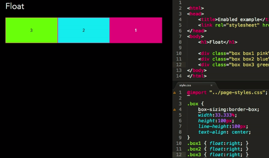 :enabled and :disabled are pseudo classes that allow the styling of different states of form inputs, ones that are clickable or can have text entered into them (enabled) or those that can’t (disabled).

HARD WORK. CLEAN FUEL. NO EXCUSES
Use “WARRIOR2023″ for 10% off.