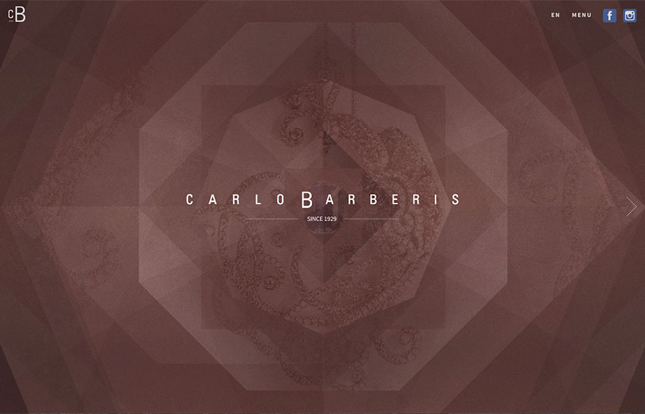
This is a great showcase site for Carlo Barberis’ jewelry collection, out of Italy. Love how the home page is just a scroll slider, but before you start, the changing of the overlaying patterns already give movement and life to the page. Also think the off-screen navigation (click “Menu”) is outstanding, with simplicity, and it frames the the branding – smart and clean.
Glassmorphism: The Transparent Design Trend That Refuses to Fade
Glassmorphism brings transparency, depth, and light back into modern UI. Learn how this “frosted glass” design trend enhances hierarchy, focus, and atmosphere, plus how to implement it in CSS responsibly.


0 Comments