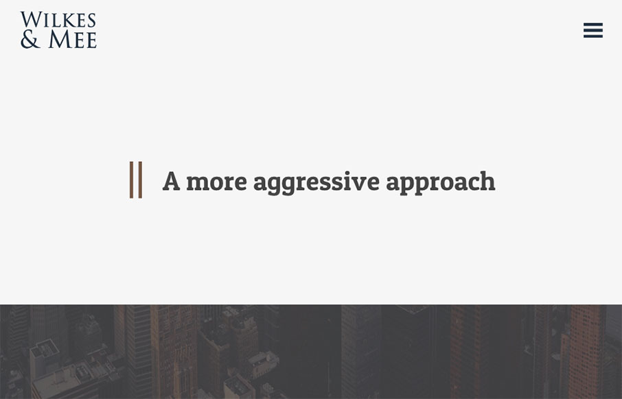
Wilkes & Mee

http://www.wilkesmee.com/

I love minimal design, especially when I see it utilized for a client like this. It’s hard to convince them (typically) of the approach. This site is a great example of how it can work well in a real world scenario. Bravo Garrett.

From the Designer:

Modern and minimal for the highest quality user experience.

Submitted by: Garrett Cook
Twitter: @caycreate
Role: Designer & Developer
Country: United States

0 Comments

Submit a Comment

Your email address will not be published. Required fields are marked *

News & Articles

Sign-Up: Enhancing Conversions through good UX

Sign-Up: Enhancing Conversions through good UX

Optimize your website’s sign-up process by focusing on clarity, ease, and user mindset. Clearly explain the purpose, benefits, and steps, and use social proof to build trust and drive conversions.

The Essential Guide to Getting Started on Freelance Writing

The Essential Guide to Getting Started on Freelance Writing

Explore the lucrative and fulfilling world of freelance writing with our essential guide. Learn about specialties like blogging, social media, article, and technical writing. Build a portfolio, find work, set up your business, and discover the potential earnings. Embrace the freedom of working from home and follow tips for success in your dream career.