Web Design Inspiration Curated
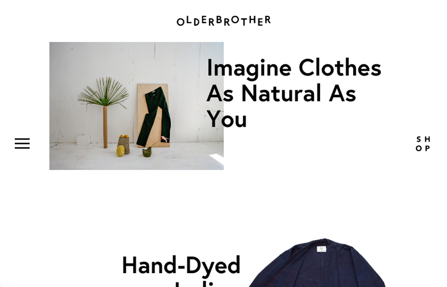
Olderbrother
Based in Portland and LA, Olderbrother is focused on creating gender-neutral luxury clothing items from locally crafted materials and eco-conscious fabrics and dyes. Olderbrother is a playful relief from the stark-seriousness of contemporary society. Their products...
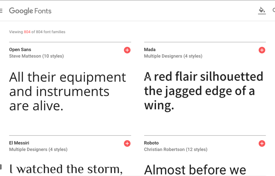
Google Fonts
The Google Fonts site has needed a facelift for a while now. Well, it got one. Pretty damn slick too. You can type directly on top of the sample text and sorting is quite easy. Beautiful website let alone the type sampling work done. Solid.
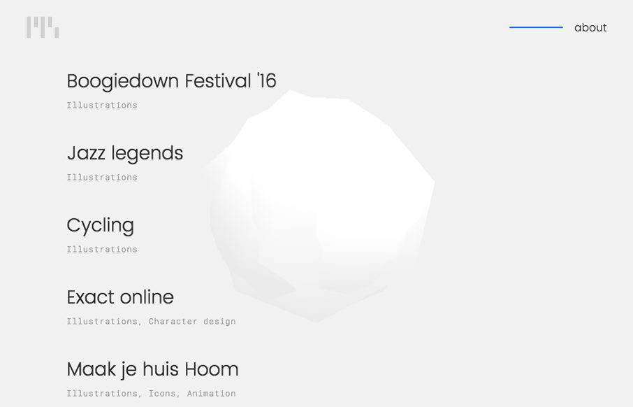
Robin Bierens
Nice three.js implementation and clean design for Robin Bierens' portfolio site. I dig the little details and simple type based approach. Just enough movement/stuff to keep you engaged and just enough simple to make it design review worthy.
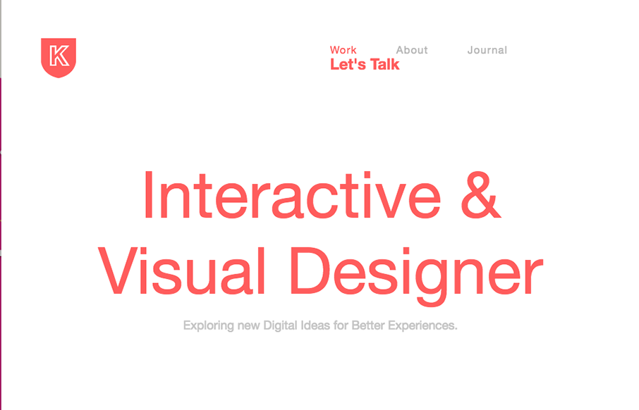
Kultar Singh Kalsi
Very slick yet simple layout. I really love the grid-ness of the design. There is also just enough slight movement as you scroll or interact to make it a bit memorable too. Bright colors and strong headlines help a lot too.
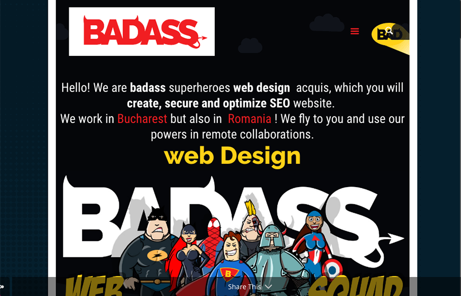
BADASS
I love the strong graphic work, the illustrations the logo all have a good spirit to them. That's enough most of the time to get clients into what you're doing. Love this stuff.
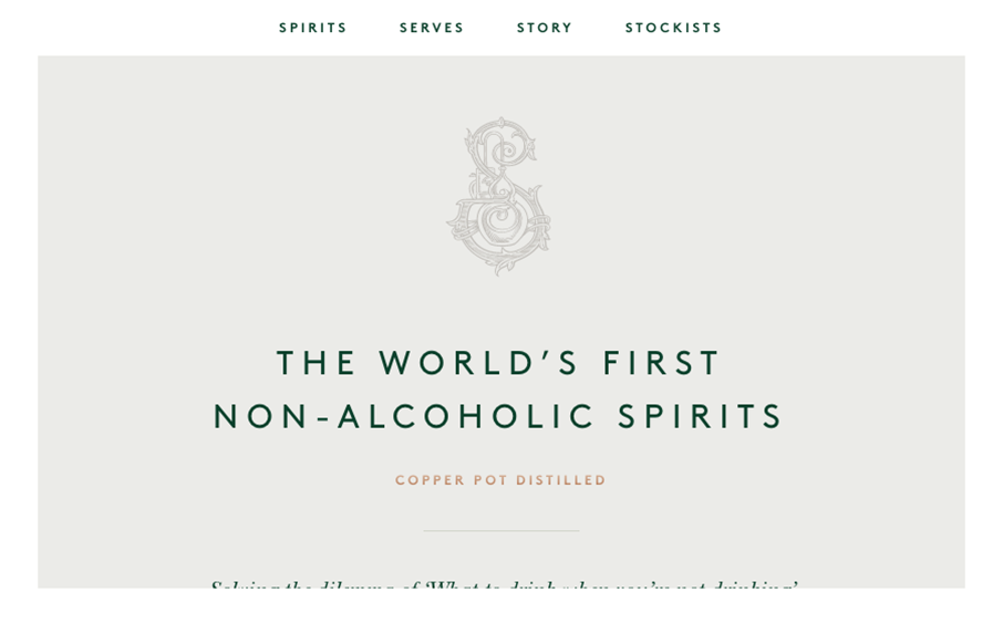
Seedlip
This is just a beautiful website. I love the muted colors except for the product shots. The image treatments and the smaller screen design changes are well done. Lovely website and it's a nice classic look.
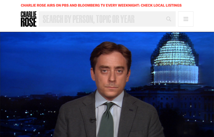
Charlie Rose
I'm digging the Charlie Rose website. There is a lot of pretty solid UX to study here. From the grid layout and display of episodes to the search form. Tip top design here.
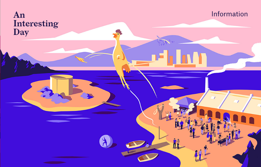
An Interesting Day
Pretty crazy illustrations are the core of this website's awesomeness. Now, normally, we wouldn't post a splash or coming soon page but this one is just so weird and exciting looking. Lurve this kind of thing.
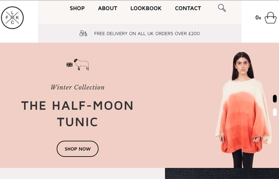
Flock Knitwear
Really cool grid work here. I love the blocky line based layout a lot on this site for Flock Knitwear. The colors some of the subtle off-set-ness. Beautifully done.
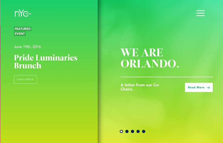
NYC Pride
Really unique website experience here for the NYC Pride site. I really really love how it's a wholly different experience for desktop vs. mobile. Literally different styles of interaction. I dig the monochromatic color palette a great deal too. The overlay nav design...
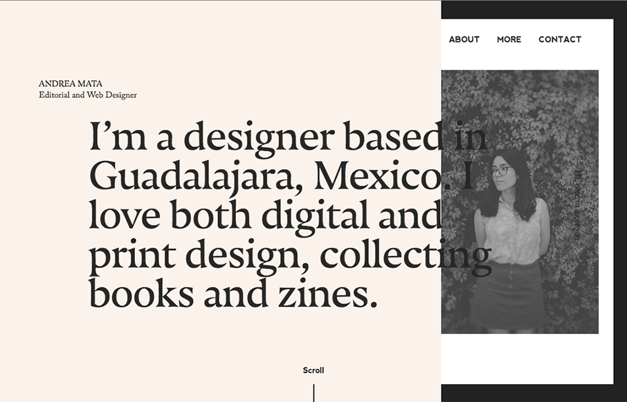
Andrea Mata
Very cool asymetrical layout for Andrea's portfolio site. I love the limited color palette and the off kilter typography. Not a huge fan of the mobile size/design, but overall love the look and feel.
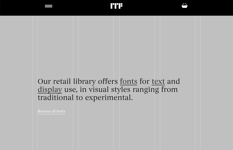
Indian Type Foundry
Super cool, at first glance, standard looking website design. As you scroll around and start checking things out, you get hit with some pretty cool little interactions. Like the mouse overs and then those fly-out nav items on the cart and login. Super cool way to...
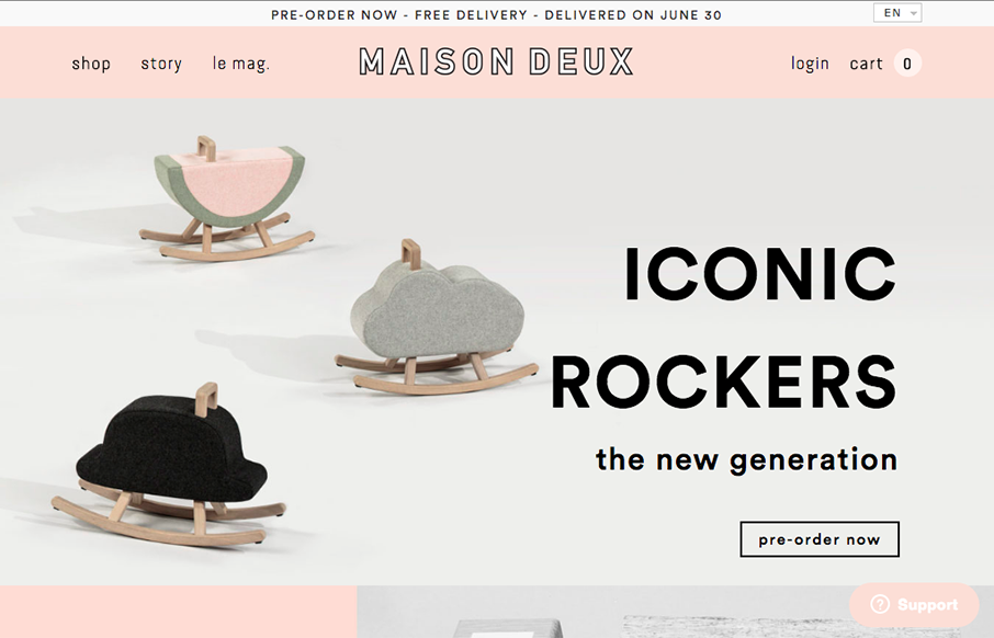
Maison Deux
I like the grid-ness of this layout. That, paired with the simple thick line details around the logo and then elsewhere to help pull it all together visually. It's subtle but works really well and obviously. Good work.
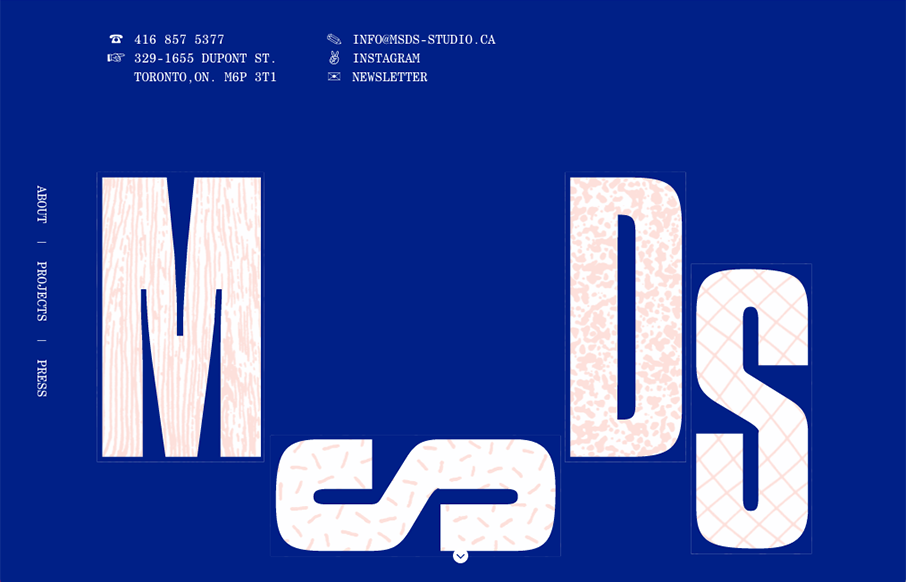
MSDS Studio
Pretty cool, non-standard typography here. Mix that in with that neat thing they're doing on the site, where when you scroll down and back up it changes the site considerably. Pretty cool and unique work.
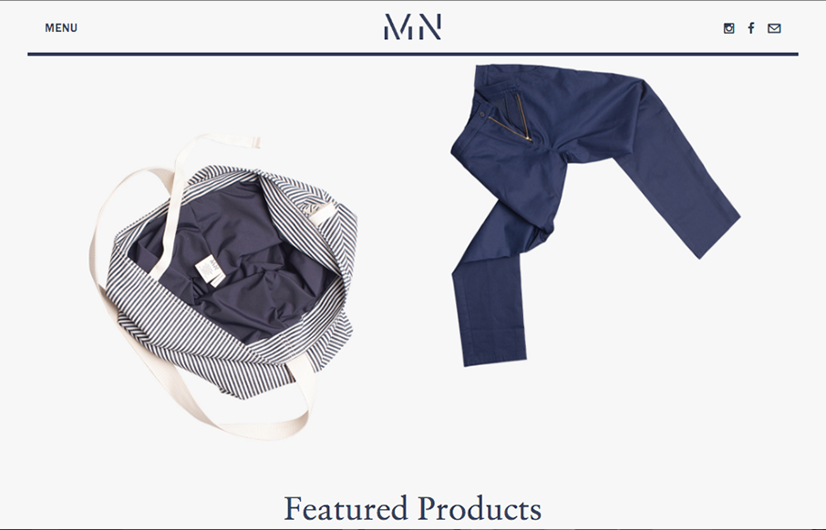
MN Uniform
Pretty cool angle on some now-standard design patterns. I love how the header has that line and everything perfectly scroll-folds up into it. Then the menu is cool, all the lines and blockiness of it make it feel really fresh to me.
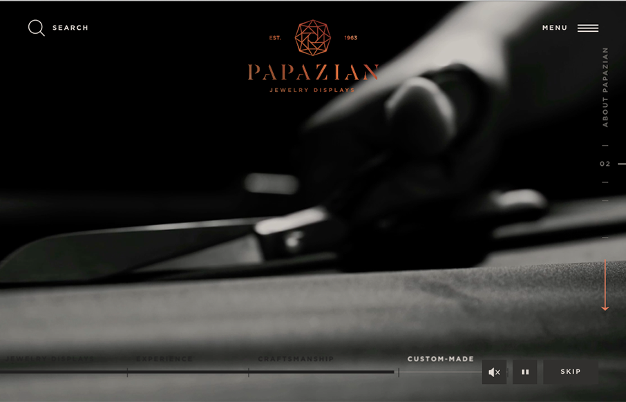
Papazian
Beautifully done website. I love the subtle and fragile looking lines and the way the photography supports it. The News & Updates section of the layout on the home page is wonderful as you get down to it. Really nice website here.
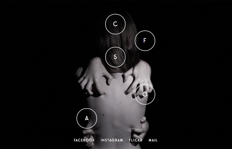
Jolien Roos
Love this photo portfolio site for Jolien Roos out of Belgium - looks to by @studiosiebe. Very unique intro/navigation, five circles that turn into your "hamburger" as you move through the site. For photography sites - the images sell it - and the full width / full...
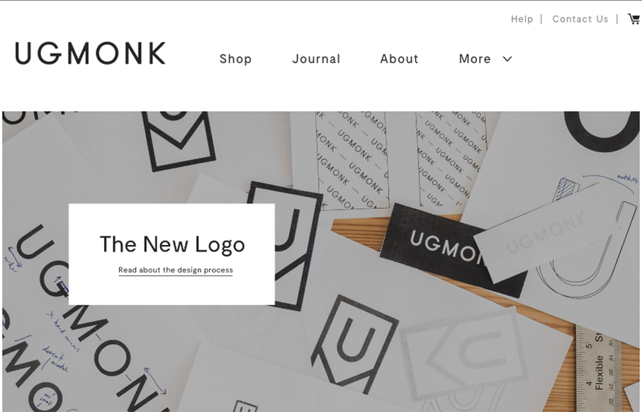
Ugmonk
So our friend Jeff Sheldon at Ugmonk has a new site and logo. (Jeff spoke a ConvergeSE a couple of years ago) Very cool to read where the changes in business and design come from as your company grows, and grows up. Great article here from Jeff about all of it. Here's...
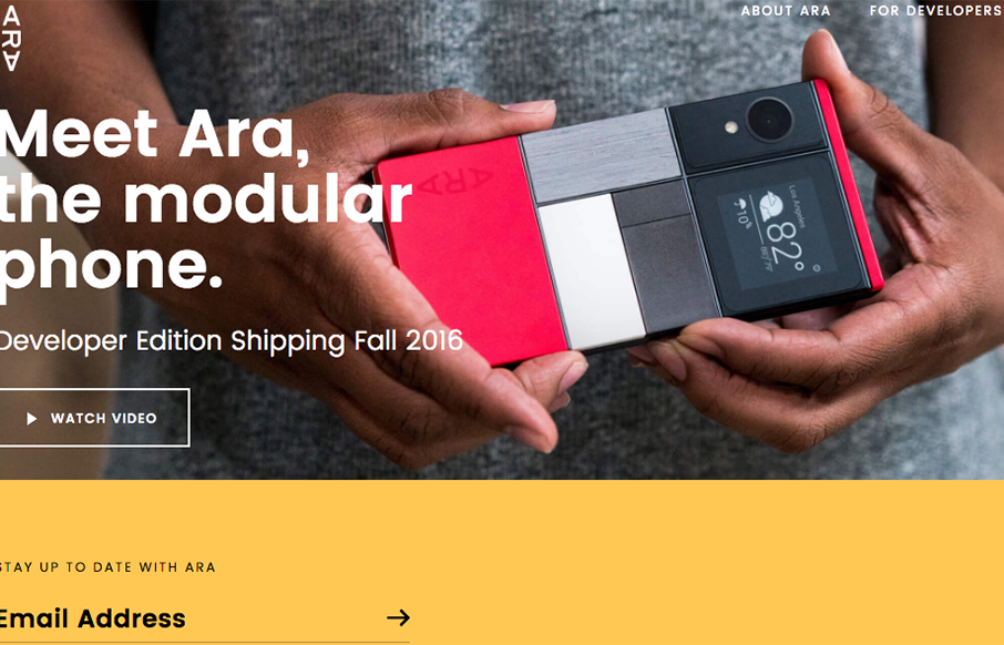
ARA Modular Phone
This website has a nice clean layout that displays its product quite well while replicating the design of the phone into the layout of the site.
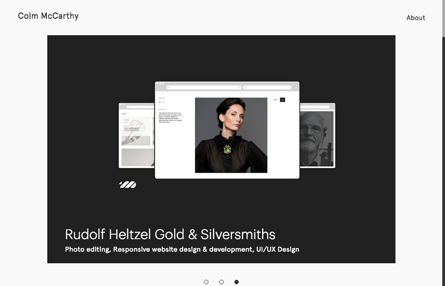
Colm McCarthy
Nice, minimal portfolio site from Colm McCarthy out of Ireland. Like the use of the text over the main image on the work detail pages - interesting to see how it lands on different viewports.
EMAIL NEWSLETTER
News & Articles
Anna Stout’s Astute Design Observations
 Anna’s business story is as insightful as her conference takeaways. She finished school, worked as a front end developer with the GS&F communications agency, resigned from that position to stay home with her almost 2 year-old son, and has now owned her own company for a little over a year.
Prototyping Style – by Ben Callahan @ Beyond the Desktop Conference
 Design deliverables can be challenging in a multi-device world. Front-end developers have had their day playing with fluid grids, flexible content, and media queries. Ben Callahan explains how to let the rest of the team in on the job.
Front-End Conf Lives!
 Dan Denney and UnmatchedStyle have teamed up to continue to bring you the one and only Front-End Design Conference!

HARD WORK. CLEAN FUEL. NO EXCUSES
Use “WARRIOR2023″ for 10% off.