Web Design Inspiration Curated
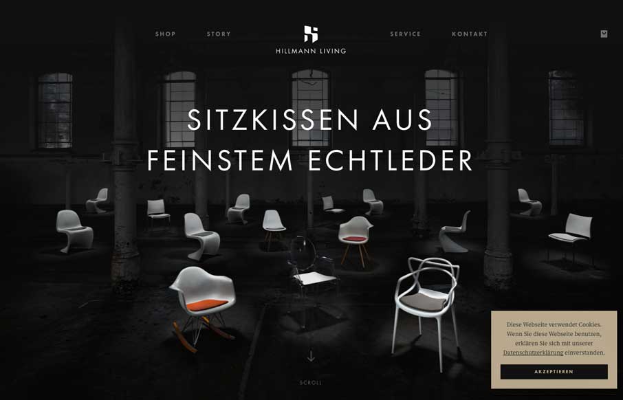
Hillmann Living
Nice clean layout for the Hillman Living website. I love the way the image fades in with those color chairs on that dark background. Cool effect there. I also like the way the first section of product images are worked onto the page. It's chock full of visual interest...
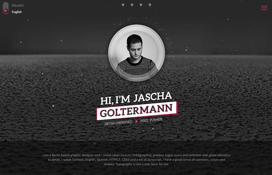
Goltermann.Design
Wow. That's about all that goes through my mind as I check this page out for the first time. What great CSS animation work on the main photo area. Solid layout and detail work. Hire this man! From the Designer: I am a Berlin based graphic designer and I create clean...
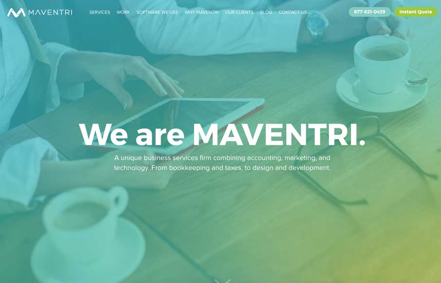
MAVENTRI
This layout has the vibe of a theme but what's been done with it regardless is nice. I love the color scheme here, it feels really new. I also dig the nice use of the case studies. From the Designer: We are a unique business services firm combining accounting,...
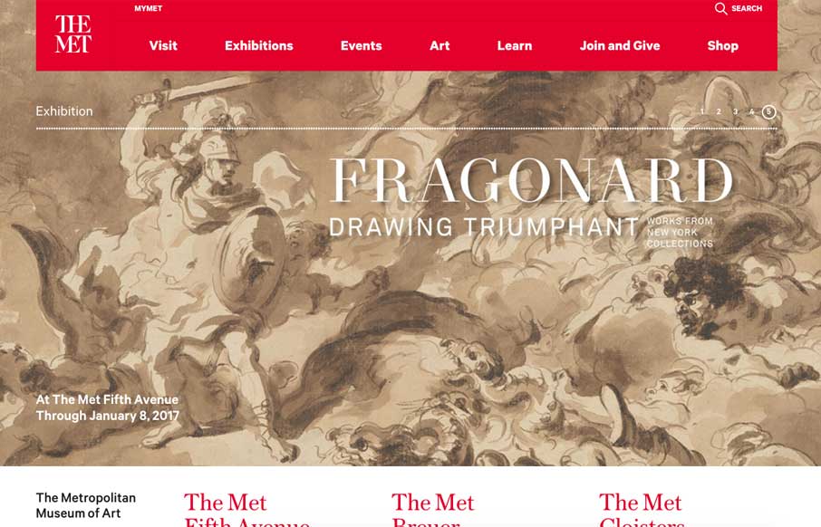
Met Museum
Nice rework of the Met Museum by Fi interactive. I've been following their work since the pre-flash and through the flash era of the internet. I'm glad to see they're still kicking and doing fantastic work. Mobile was a big focus Right “off course it was in this day...
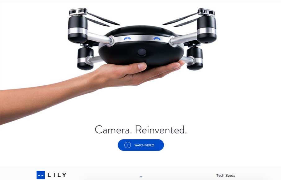
Lily Camera
Pretty rad interaction work here. I love how when you scroll down you are told the story of the Lily camera rig/drone. Some nice illustration work contrasted against good product photos is solid IMHO.
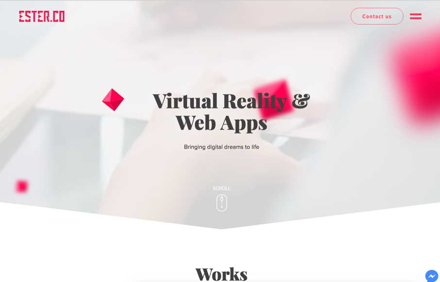
Ester
I like the way the design starts out sort of minimal and get's more and more visually dense as you scroll down the page. The case study marquis are pretty well done and I love the contrast to the rest of the site here. The illustration work is good too.
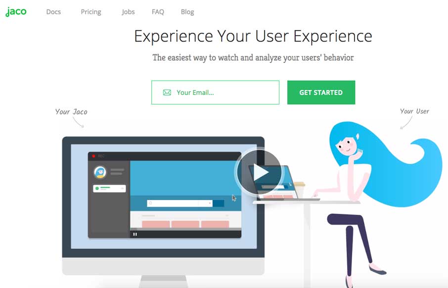
Jaco Analytics
Nice illustrations and video work. I like the way the signup is simplified with just the email asked for. It's cool as you scroll down as well.
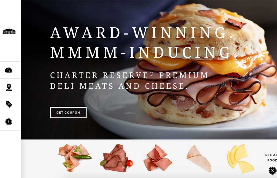
Charter Reserve
I really dig the interactive stuff on this site. The way it shows different details as you scroll is killer. Then the different types of product displayed the way it is is cool. Such a cool site. In partnership with a national agency, 40Digits developed a responsive...
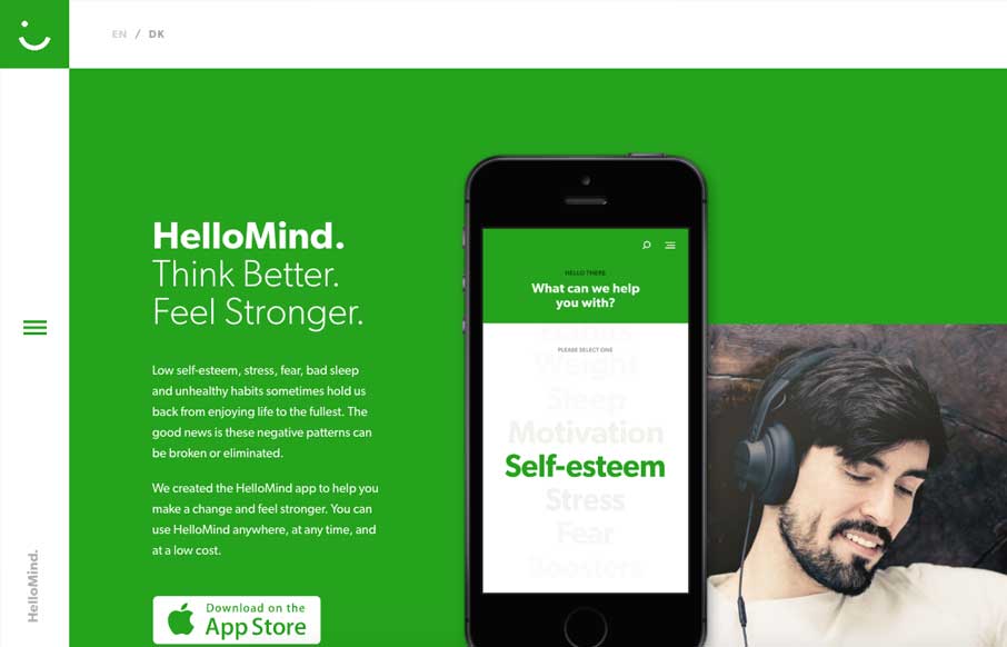
HelloMind
Pretty nifty interactive vibe as you scroll this website. I like the simple palette, the green is bold in this case. I like the vibe. From the Designer: Website for HelloMind - a self hypnosis app made to make people think better and feel stronger. Submitted by: Søren...
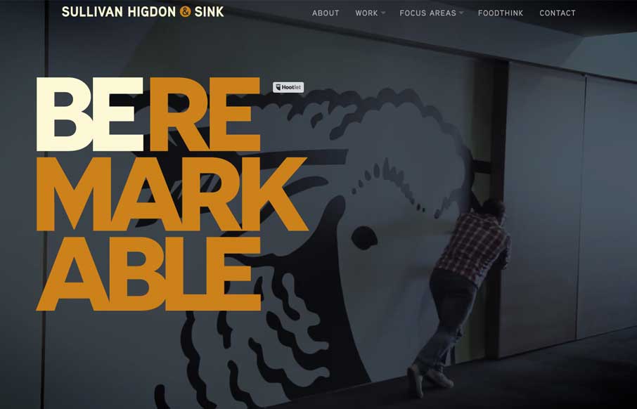
Sullivan Higdon & Sink
Love the bold typography and dark/rich colors. I also really dig the way the marquees are used for the case-studies. Very clever and bold design.
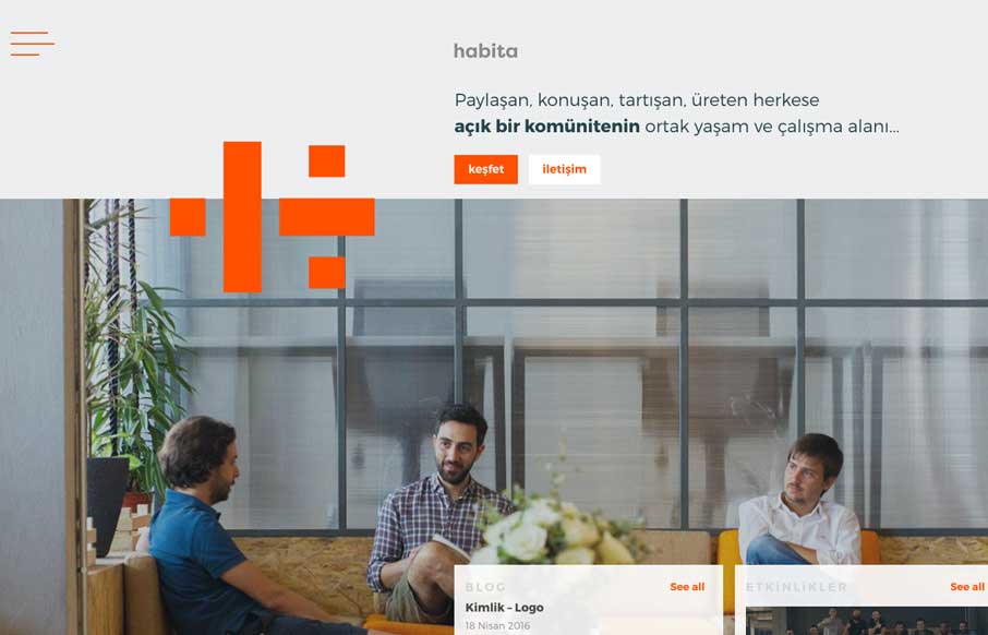
habita
Pretty slick looking layout. My favorite part is how the logo plays off of the navigation. The fly-out nav intersects with the logo visually, then also as you scroll down the logo moves and changes a bit too. Smart work. From the Designer: habita is "an open &...
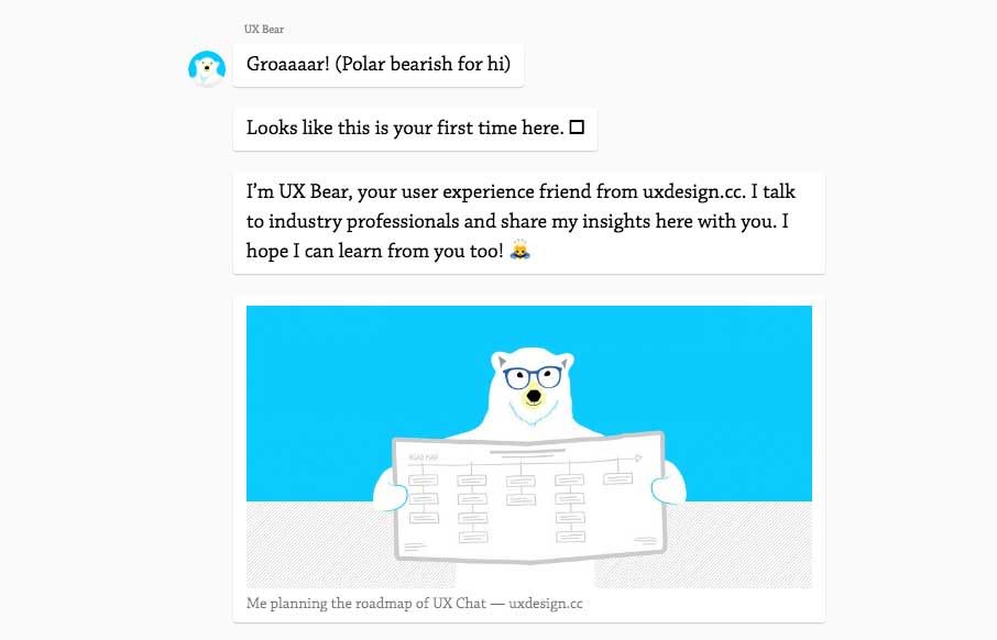
UXChat.me
I kind of dig this idea. A chat, back and fourth, to get you through the content. Pretty clever and really shows they're thinking about UX and what it means. Good stuff to ponder. From the designer, here: In April, I turned my website into a chat. The reactions were...
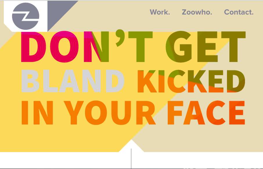
Zoocreative
Pretty cool, just mostly a single column layout. There's some cool mouse-over type interaction on the large imagery that make up the case-study sections. Love it. From the Designer: Lovingly curated portfolio of Zoocreative, an Irish design studio that specialises in...
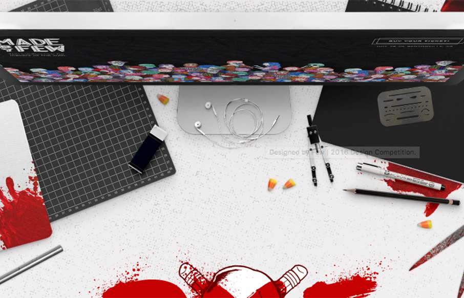
Designed by Few
Super fun website for Designed by Few. I really like the horror aspect to the look & feel. Music, the mouse cursor and all that. Very cool. From the Designer: Designed by Few is a friendly, high-paced design competition and party hosted by the Made by Few conference....
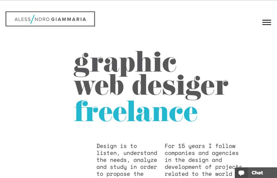
Alessandro Giammaria
I really like the openness of the website here for Alessandro Giammaria. It has a nice vertical rhythm and mostly minimal approach overall. ubmitted by: Alessandro Giammaria Twitter: @agiammaria Role: Designer & Developer Country: Italy
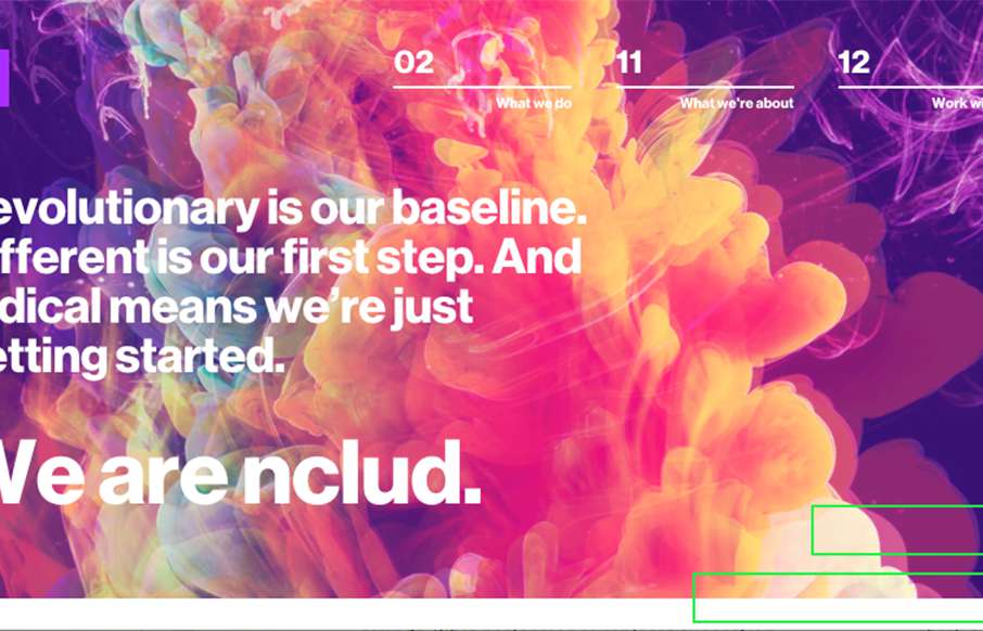
nclud
Man, I really dig this site design for nclud. I like the vibe and all the over states on the nav items here and there. Super rad color palette too. Solid work! Submitted by: Kerry Gunther Twitter: @nclud Role: Designer & Developer Country: USA
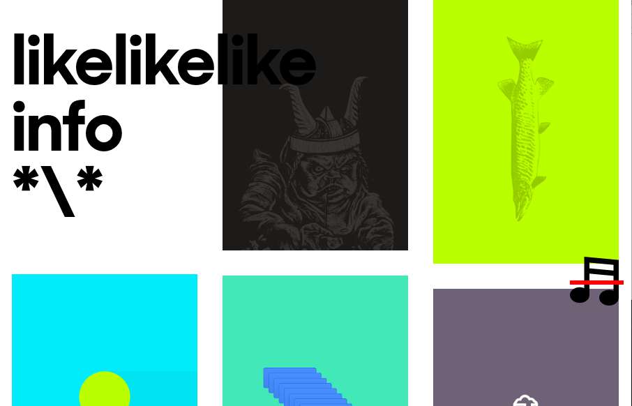
likelikelike
Super rad layout and interactions here on likelikelike. It doesn't "feel" like other websites i've visited, but man it's super simple in it's execution. I love that the most about it. Simple, fundamental, smart.
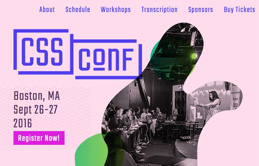
CSS Conf
Really smart looking site for the 2016 CSS Conf website. I love the shapes and how they layer as you scale the browser down. Something for us Frontenders to dig on. Overall straight forward layout too, dig it in a big way.
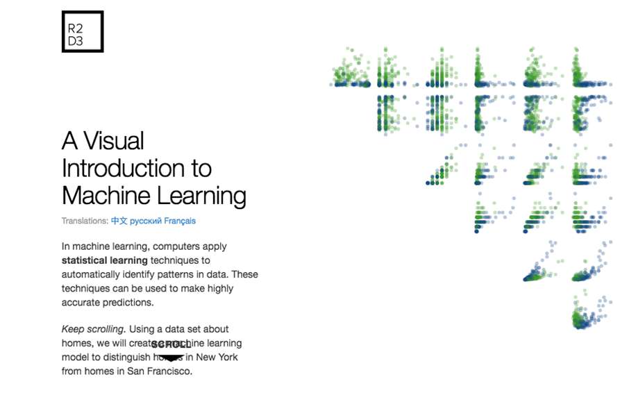
Machine Learning
Pretty great example of scroll-jacking gone right. Give it a spin and see what you think?
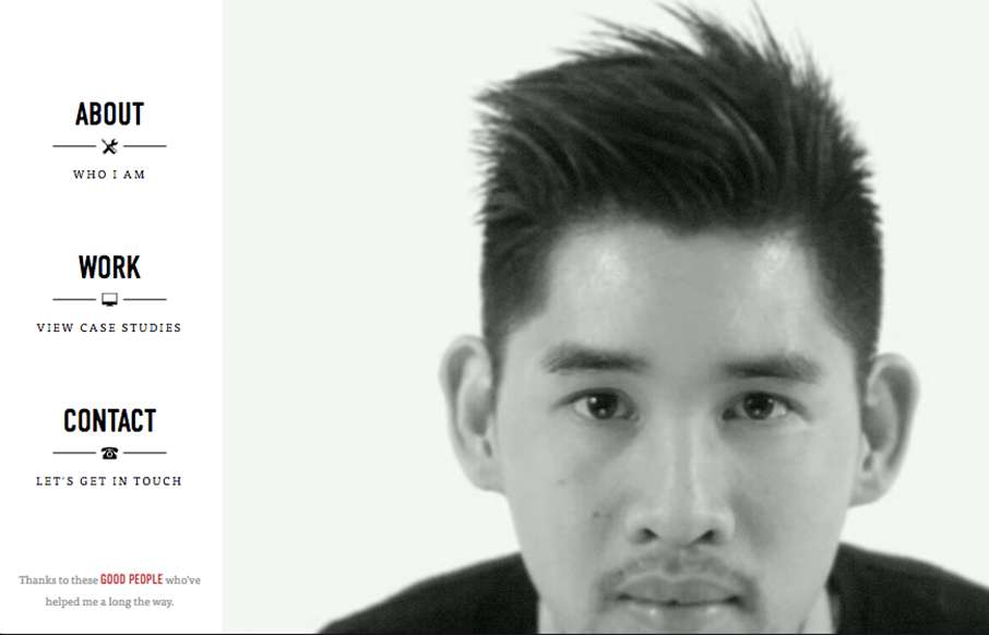
Michael Ngo
Pretty fun personal/portfolio site for Michael Ngo. I really love the video loop and then the feet at the bottom. 🙂 Pretty sweet graphic design flourishes too.
EMAIL NEWSLETTER
News & Articles
Stephanie Hay – Content-first UX Design
 Giovanni talks with Stephanie about how she promotes a content first approach that stands our traditional production process on its head and makes content and message the first priority, not the last.
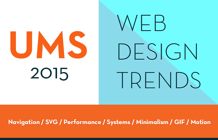
Web Design Trends 2015 – UMS Reader Thoughts
 Some of our Unmatchedstyle readers add their thoughts to Web Design Trends for 2015. What do you think will be big in design this year?

4 Tips for Getting a Job in Web Design and Collaborating with Non-Web Designers
 Monique Rivers from Ninefold talks about 4 tips for getting a job in web design and collaborating with non-web designers.

HARD WORK. CLEAN FUEL. NO EXCUSES
Use “WARRIOR2023″ for 10% off.