Web Design Inspiration Curated
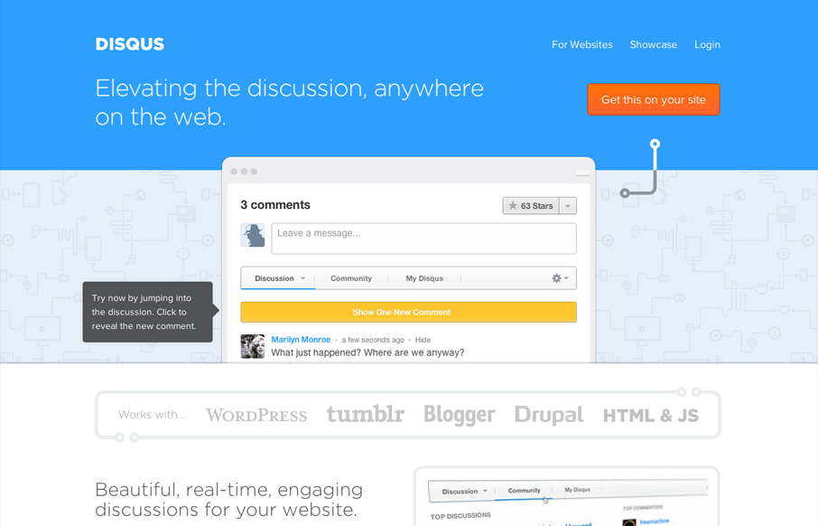
disqus.com
The new disqus.com is pretty neat. Disqus is rolling out quite a few new features into their product, so to bring users up to speed quickly and easily, their site has become an interactive demonstration on how these new features will affect conversations on the web....
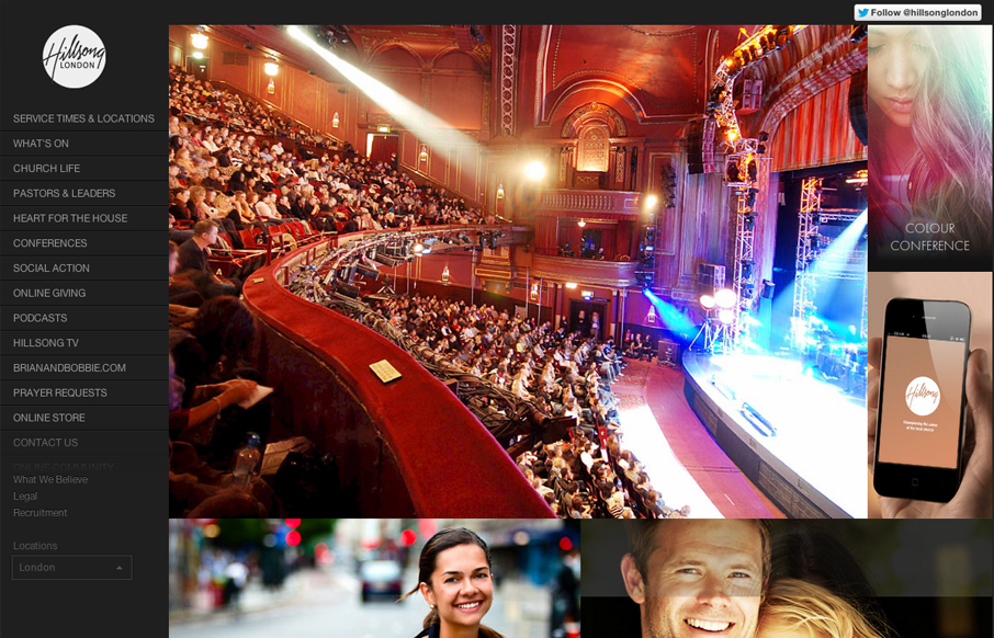
hillsong.co.uk
The thing I like most about this site is the extra wide screen size treatment, having the images fold out like one of those masonry type websites set's this design off. I like how the images are also nav items and mostly mirror the navigation on the left. The sub...
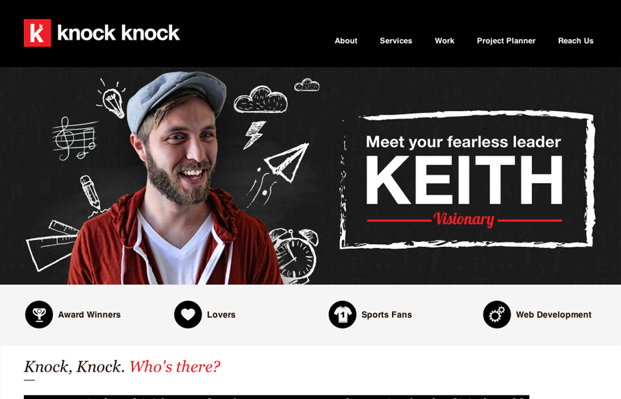
knockknockfactory.com
We are a pixel pushin’ factory that focuses on top notch creative for the digital world. Creating experiences, products, platforms, and content that helps brands build meaningful relationships with its consumers, is what we’re all about! Submitted by: Keith Burnson...
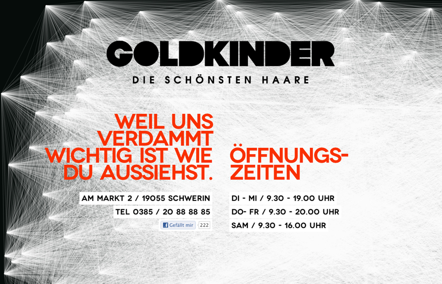
goldkinder-friseur.de
Paralax Scrolling html5 site for a hairstylist from schwerin / germany Submitted by: herrlich media @fimbim Role: Designer & Developer Cool interactions on this parallax design. I like the stark black and white and the way the lines animate in on page load. Then as...
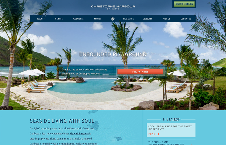
christopheharbour.com
There's truly a whole lotta sexy going on with this site. Aesthetically and developmentally it's a site full of rich treasures. No exaggeration. I almost don't want to point anything out and just let you experience it on your own, but I suppose I wouldn't be doing my...
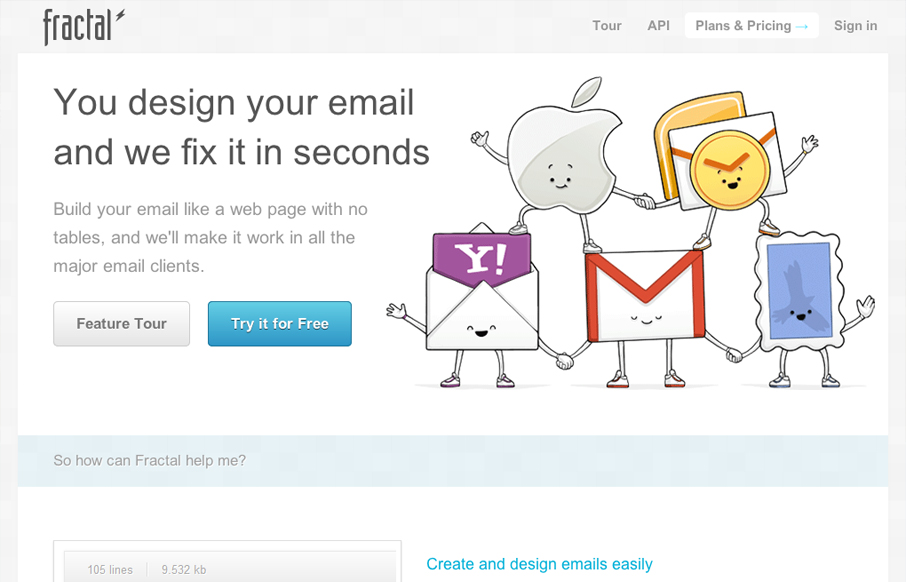
getfractal.com
I'm not ashamed to say the illustrations do it for me here. There's something to be said for the emotional responses they evoke. The site itself is pretty straightforward but where I think this wins is that the drawings give life and a positive personality to what...
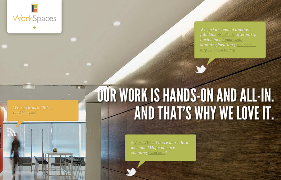
workspacesllc.com
I love the look and execution of the WorkSpaces website. The responsive design and parallax effect with the main images is quite well done. It gives an overall timeless feeling design some current edge. Typically I don't like it when a design hides navigation items...
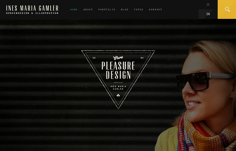
purepleasuredesign.com
Very nice textural and layered design. I love the feel to this site design, the dark header and footer areas with the light background content section in between on the homepage is a nice way to ground the page. The typography is well done all across the website as...
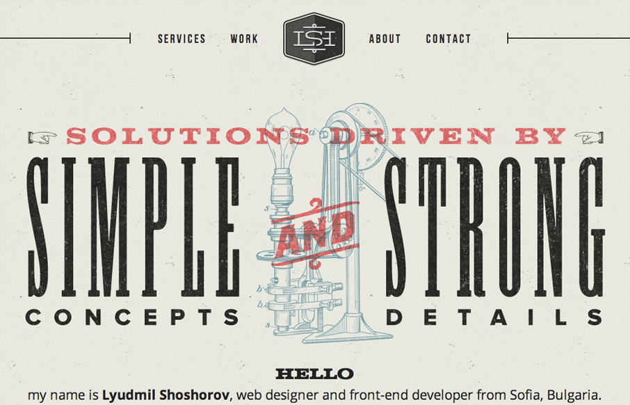
shoshorov.net
This one pager has a really nice aesthetic to it. It comes standard with the usual suspects: good (typography, use of color, texture). I like the couple of small animated elements such as the portfolio brain loader and auto-advancing services. I feel like some...
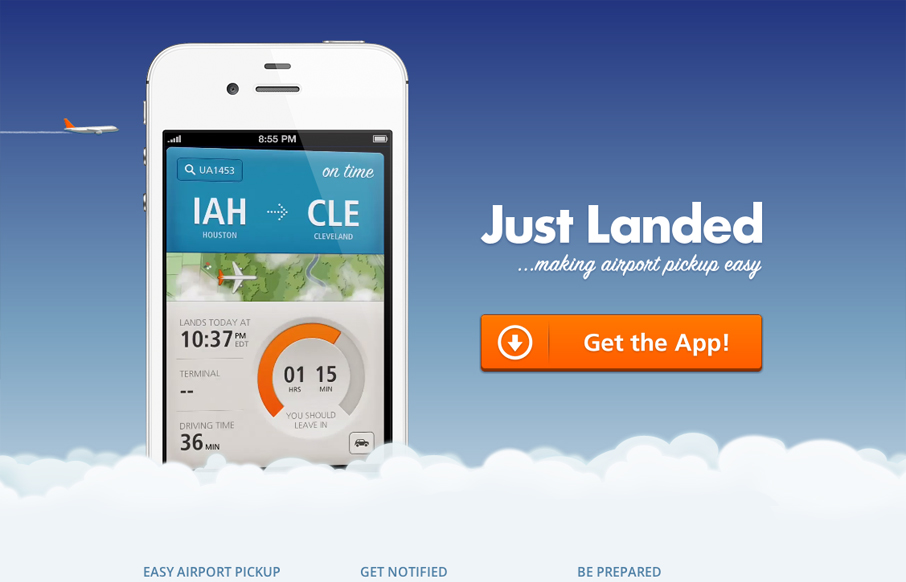
getjustlanded.com
Okay, so I might be cheating a bit with this review, but when I saw this yesterday, I just had to write about it. While I do like the landing page for Just Landed, the helpful video of the app in action, the little touches like the animated clouds and jet to drive...
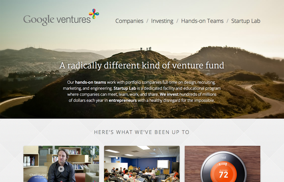
googleventures.com
Google has done a lot lately to refine their visual style, and this couldn't be more true than in the Google Ventures website. Beautiful photography, simple and clean typography, and a clever use of icons, make the site a joy to look at and simple to use. Whitespace...
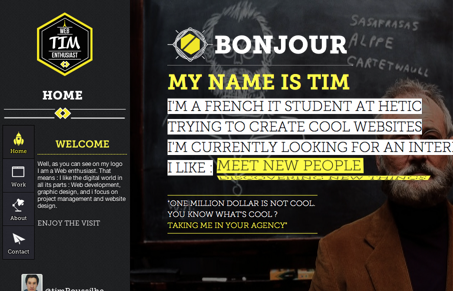
timothee-roussilhe.com
Fantastic innovation on display here; Timothee has really gone to town creating this inviting and rewarding website. For such a small website content-wise there is a wealth of inviting features, such as a strong and fun navigation system, an unconventional colour...
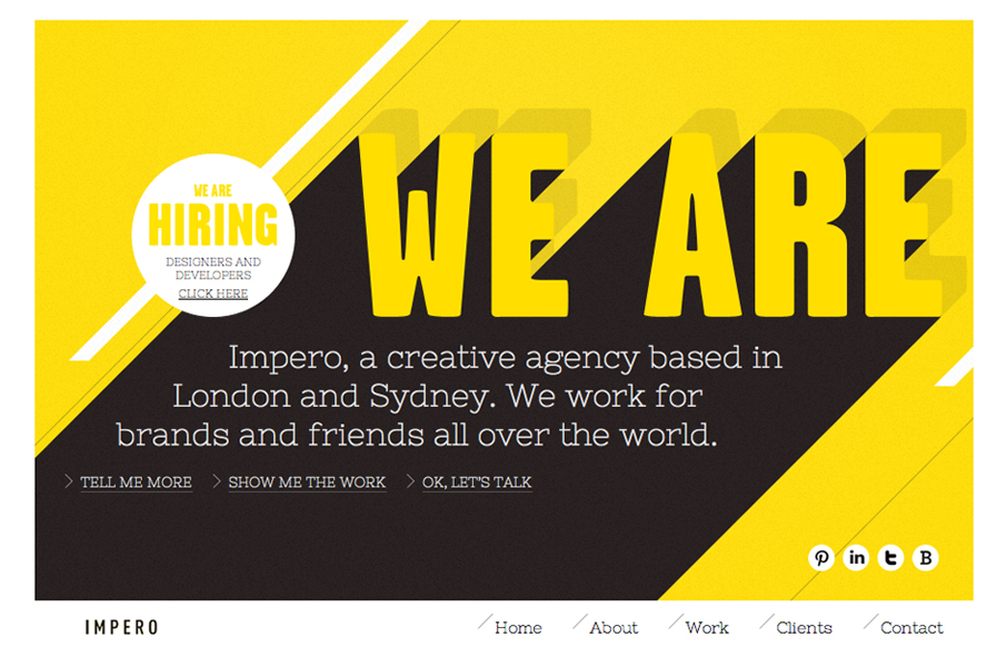
weareimpero.com
Submitted by: Michael Scantlebury @weareimpero Role: Designer Wonderful interaction overall on this website. The horizontal scrolling elements keep it super interesting - after all it's the same basic two types of animations but it just keeps looking fresh as you go...
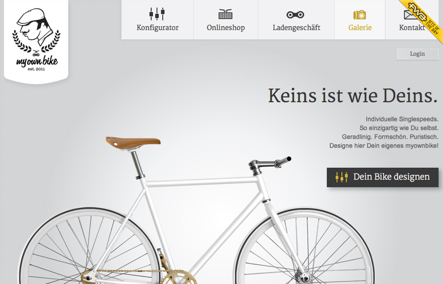
myownbike.de
I really liked looking through and interacting with this site. I don't know that there's anything profound about it, and at the risk of sounding bland in my description - it's just NICE! There's a great feel due in part to the shimmery color scheme, typography, and...
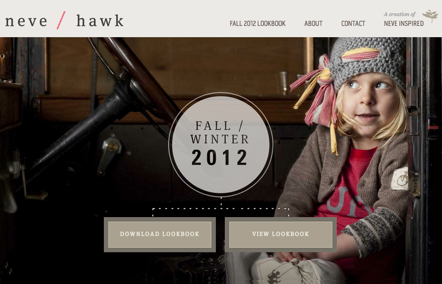
neveandhawk.com
Lovely site for children's clothes by neve / hawk. It's simple and clean and feels very classic like the clothes. I can't really imagine trying to create a brand for clothes that fits the clothes' style and the website at the same time. Bravo, great work here.
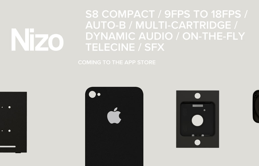
nizoapp.com
What can I say? Scroll that page, my dear friends and see something very cool. This is a very clever design. Its minimal and sleek, with very few elements... initially. Then, as we scroll down the page, we are shown something beautiful and engaging... and then we see...
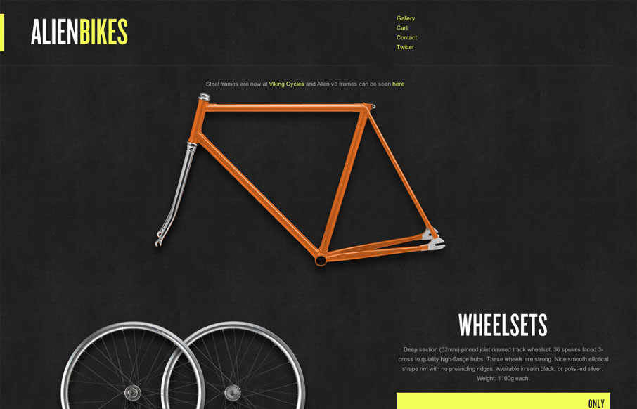
alienbikes.com
Alienbikes.com is lovely. Well, it's mostly lovely. I think the gallery is under designed, but its a small complaint. I want to focus on the store. First of all, the store offers only a few items so the layout is considerably more open than most commerce sites. It...
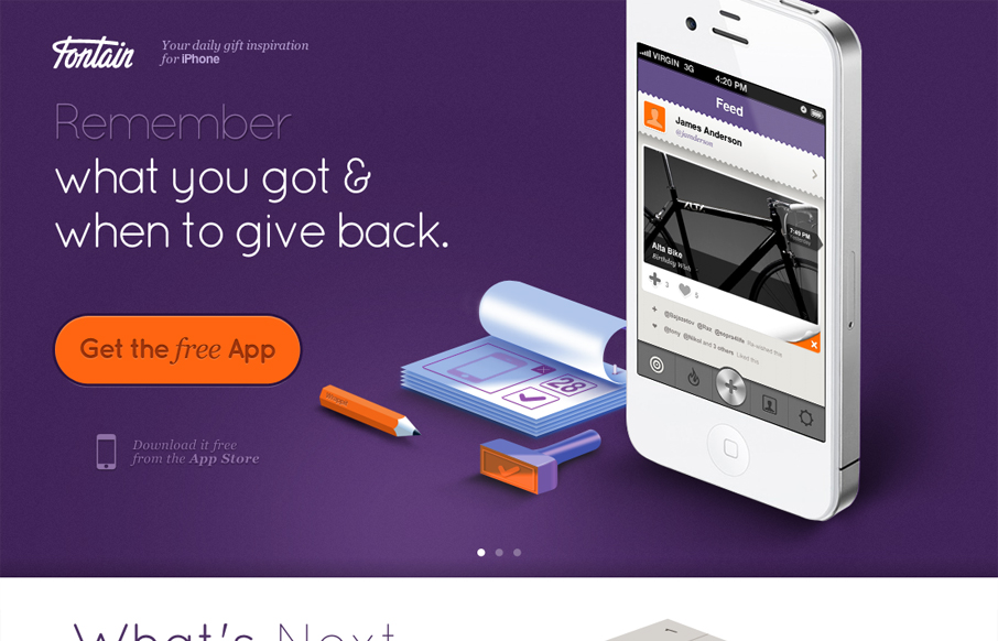
thefontain.com
I love how all the items/things used on the page are rendered, even the iPhone. It creates a very unique vibe. I love the colors and the dark first half and light second half, it creates a nice dichotomy for the site design. I also dig the way the slideshow is used,...
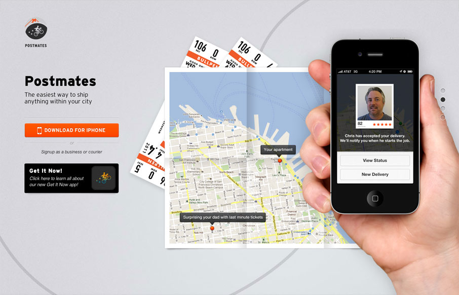
postmates.com
Nice single page website for an iPhone app. I like how all they do is just show off the app and focus on telling the story of what the app does. Putting you in a scenario you can understand quickly with just a background image of a map and a sentence "sending your dad...
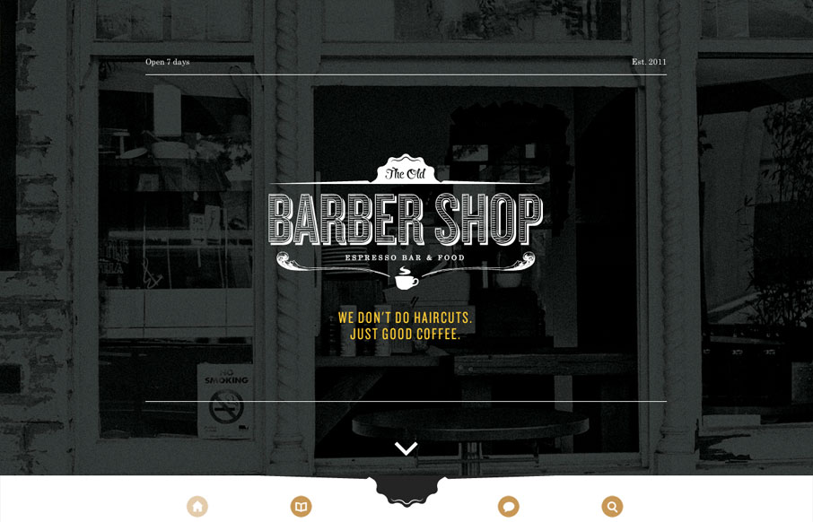
oldbarbershop.com.au
Gene must be in love with full screen imagery and minimalism because oldbarbershop.com.au is another great example of both. The design is so simply structured that, even though its responsive, one break point suffices to accomodate all devices. I think thats...
EMAIL NEWSLETTER
News & Articles
unmatchedstyle
Truly interesting study of the design of Highrise from 37Signals : http://jasonzimdars.com/svn/highrise.html (via @squaredeye) #ums
unmatchedstyle
Dave Shea on font embedding. http://bit.ly/10IjTr #ums
unmatchedstyle
Using the new version of http://pulseapp.com, this app is beautiful and extremely helpful. #ums

HARD WORK. CLEAN FUEL. NO EXCUSES
Use “WARRIOR2023″ for 10% off.