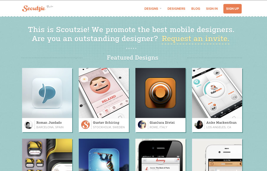
Cool concept and a cool design. I love the colors, the orange just kicks it off too. I like the content hierarchy of the home page, from featured designs, to designers to public content it’s nicely stacked. I’m not super hip to the invite link being just an email, i’d love to see these guys design a form – please, let’s see what you got, you’d kick butt on it.


The Call to Action, Revisited
The Call to Action hasn’t changed in a decade, but the bar has. A fresh look at prominence, copy, mobile tap targets, and accessibility, with lessons from three major design systems.


0 Comments