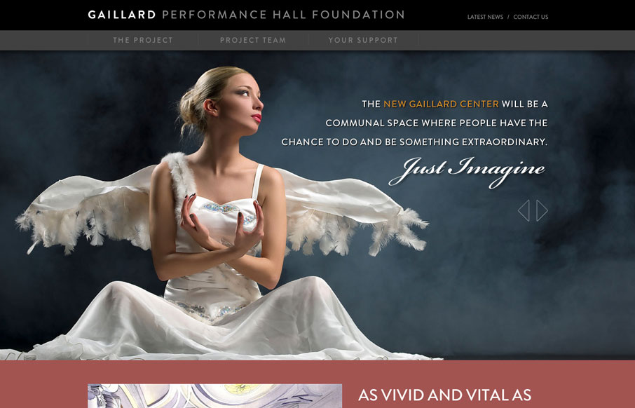
This is a visually expansive site. The imagery is stunning throughout and I like the added interest the typography lends. There are some CSS transitions in use that might be pushed a little more, but their existence at all helps to add some elegance to the experience. The biggest drawback I see on the home page is that there really isn’t a defined call to action. There’s a great representation of the vision of the Gaillard Center, but there isn’t a clear path to find out how I can contribute. Even on subsequent pages, “Ways to Support” is buried. The rest of the site feels so well thought out aesthetically and that missing piece would really create something engaging.


The Call to Action, Revisited
The Call to Action hasn’t changed in a decade, but the bar has. A fresh look at prominence, copy, mobile tap targets, and accessibility, with lessons from three major design systems.


0 Comments