Web Design Inspiration Curated
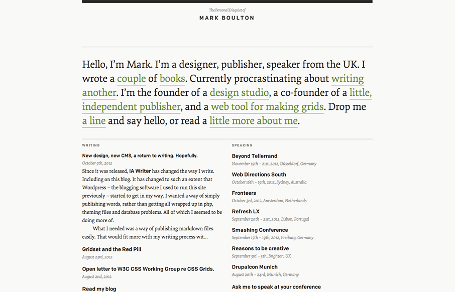
Mark Boulton
I've watched Mark Boulton's blog/site designs over the years make this really refreshing trip towards being completely minimal. I love it. He's gotten down the just the bare essence of what he needs in a website, particularly with this latest design iteration. Mark...
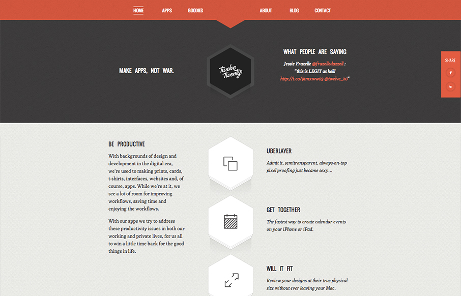
Twelve Twenty
Really tightly designed website for Twelve Twenty. The little interactions that happen when you mouse over the icons are nice and keep you interested. The overall sharpness and minimal approach of the design mixed with limited color palette make it kind of stick out.
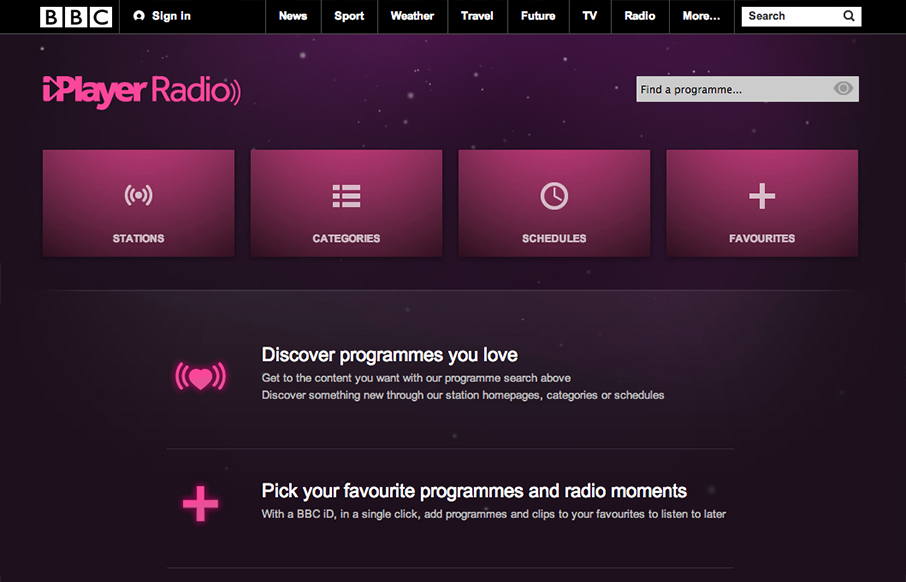
BBC Radio
Well, well, well: looks like the BBC Radio site’s just launched a fine-lookin’ responsive site. bbc.co.uk/radio/ /via @paulrobertlloyd— Responsive Design (@RWD) October 8, 2012 While this isn't a typical "website" it's still worthy of checking out. The design...
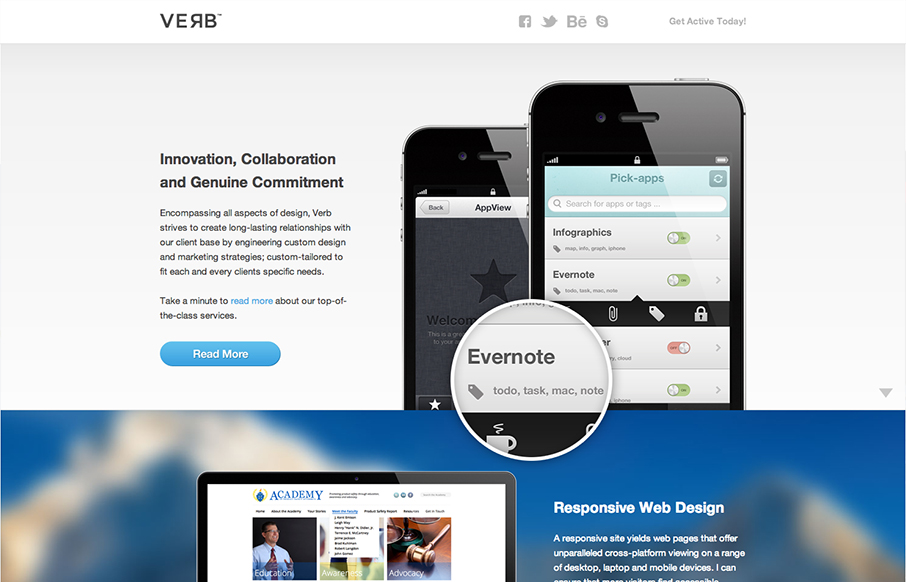
Verb
Submitted by: Alex Deeley @aedeleey Role: Designer & Developer At first I thought the design was for a product, then read the copy and saw it was for a web design firm. I can dig that. Overall it's a dang fine looking site and I like the slight parallax going on with...
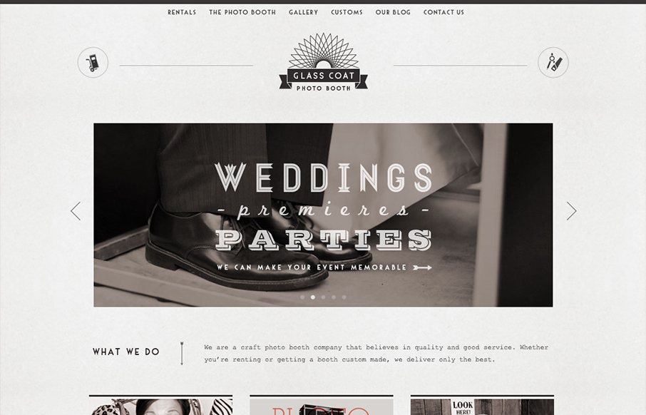
Glass Coat Photo Booth
Really digging the style of this site, combined with the fun animations and pics glasscoatphotobooth.com — Dan Denney (@dandenney) October 1, 2012 Nice clean design with a striking monochromatic "grey" color scheme. It's nice when you check out the gallery and all the...
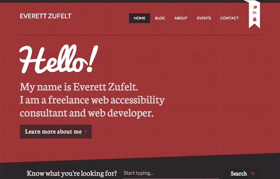
Everett Zufelt
The red and black design always works IMHO. Mixed with a nice grid and a diagonal it just comes off as smart. I like the subtle grid pattern that can be seen behind the design and the type mix works well with the grid vibe. I like that search form design a lot. Great...
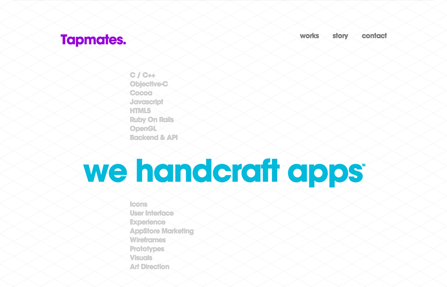
Tapmates
Wow, what a beautifully designed layout. It immediately makes me think of the swiss school of design. I love the diagonally aligned screenshots and then the timeline is a really smart inclusion. I also love how it get's more involved visually and interaction wise as...
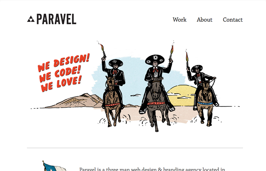
Paravel
New update for the Paravel team's website. They've simplified what was there before and boiled it all down to just what's needed to communicate what it is they do and have done. Telling their story quickly with a super badass illustration. The thing about this site...
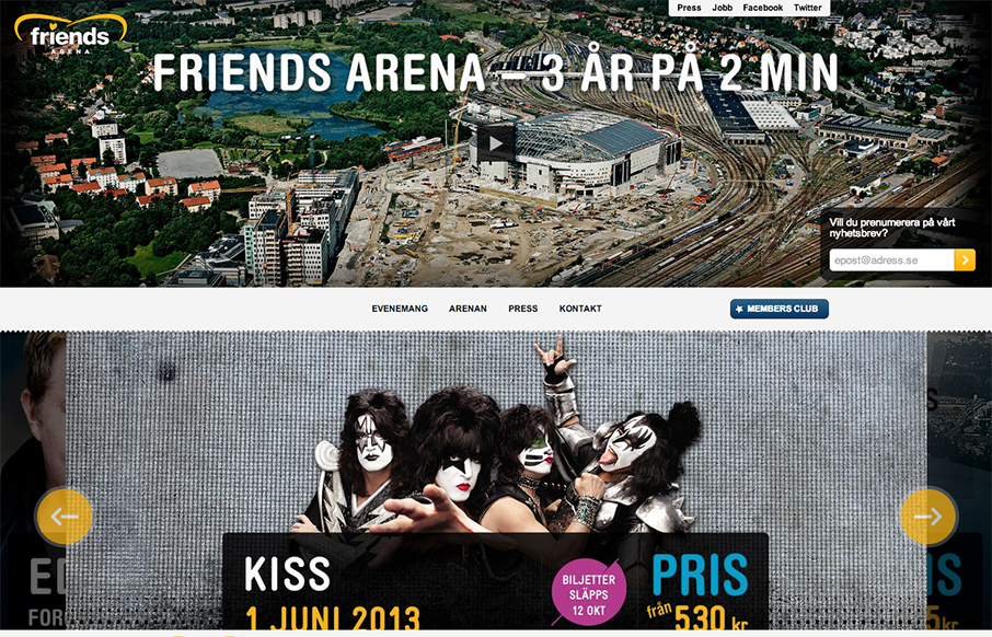
Friends Arena
Those who are about to rock, we salute you: check out the responsive site for Sweden’s national arena! friendsarena.se /via @skogberg— Responsive Design (@RWD) October 8, 2012 I like how the header/navigation goes from being under the main image to being fixed...
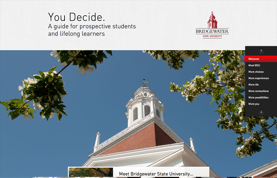
Bridgewater
The whole purpose of this site/page is to help you decide to become a student at this school. It's a great linear narrative and it uses some cool techniques to engage you and some super great photography to show you around. I dig the fixed navigation design, it...
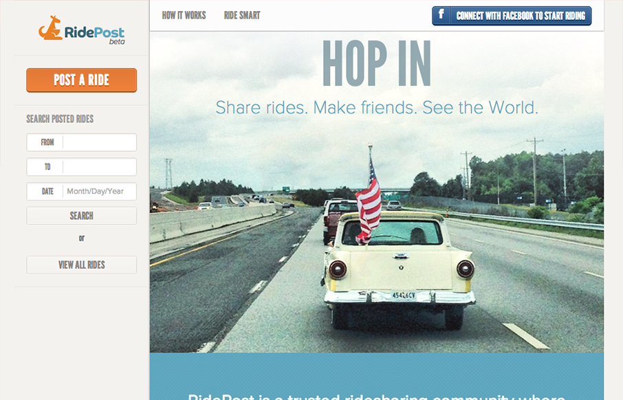
RidePost
I like the fixed window feel to this design. With the header and sidebar staying put the section that scrolls gives the site a real app-like feel. I do wish it was responsive, it would make a lot of sense too for the site/app I think. My favorite part is the...
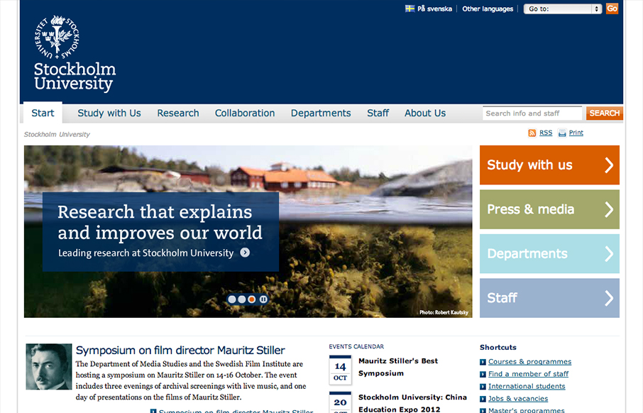
Stockholm University
Looks like @stockholm_uni just went responsive! su.se/english/ /via @jan_lof(Some nice adaptation patterns in there, by the way.)— Responsive Design (@RWD) October 8, 2012 Really dig into the main "hero" area and main navigation and look at the screen size...
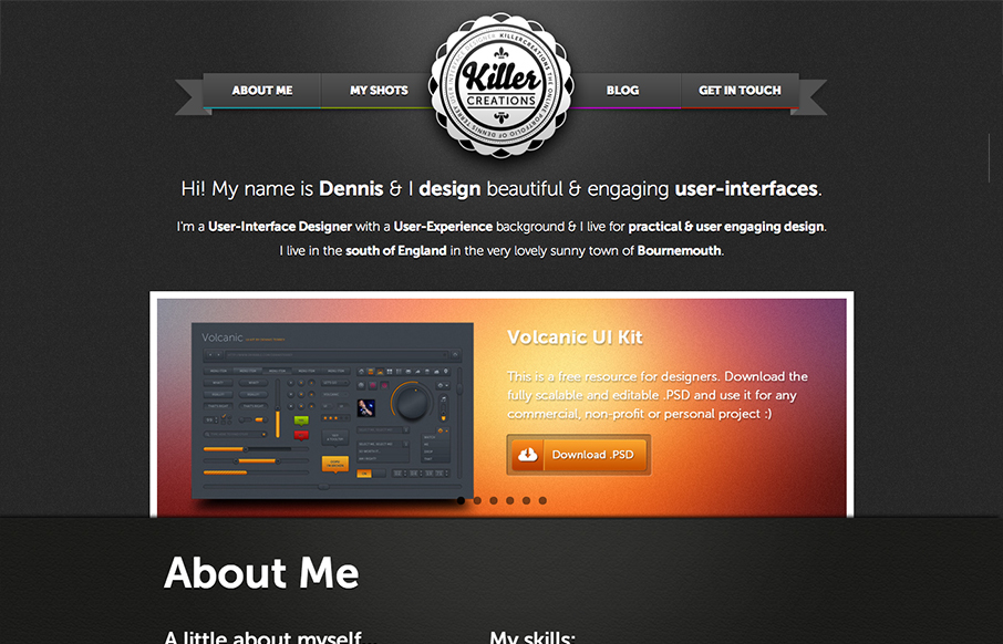
Killer Creations
There's a lot of good design packed into this website. So many blocks of details and very dense visually. I like the interactions the most, the fixed nav that appears as you scroll and then the different design looks as you size down the browser for the different...
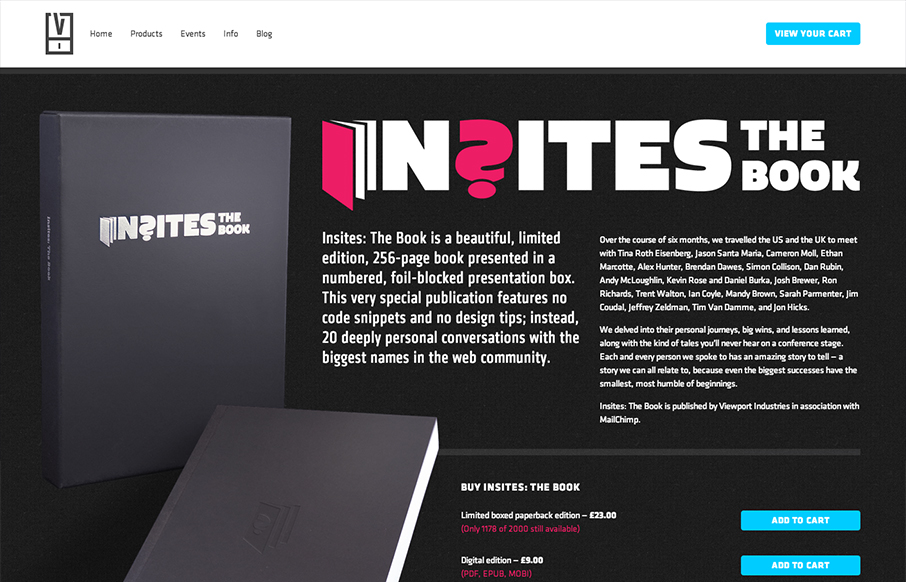
insights the book
The Insights book site is a well structured and bold design. I like most that they've designed it for super wide monitors and iPhone screens alike. Super nice design!
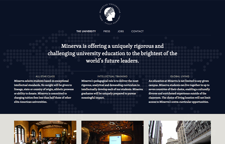
Minerva Project
I like the patter of going dark to light with a top down design for websites like this. It makes the transition into more dense content very palatable to me for some reason. The way the navigation get's fixed as you scroll down the page on this site is a nice touch...
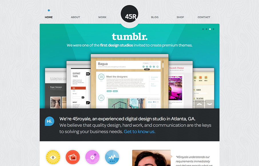
45royale
There's so much design goodness here it's making me giddy. From the rich colors, the way the home page slider has been designed to the custom photography it's just a super high level effort. Check out the more in depth video review above or at this link it it doesn't...
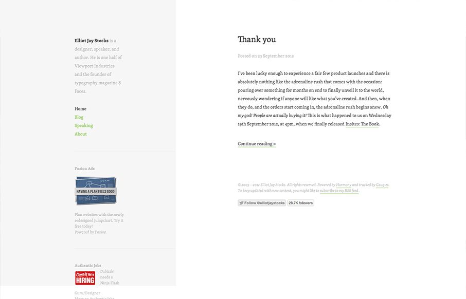
Elliot Jay Stocks
Minimal design approach on Elliot Jay Stocks website redesign. I like the intellectual approach to keeping the design focused around the content. In his post on the redesign Elliot says: When we focus on measure, we are of course focussing on the pleasure of the...
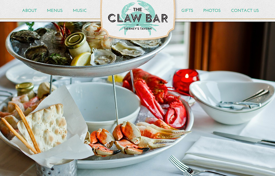
The Claw Bar
Nice touch with the fixed header and footer, it makes the site really feel like a menu. Wonderful example of a restaurant website, if only it were responsive it'd be perfect IMHO. But it's pretty damn close now...
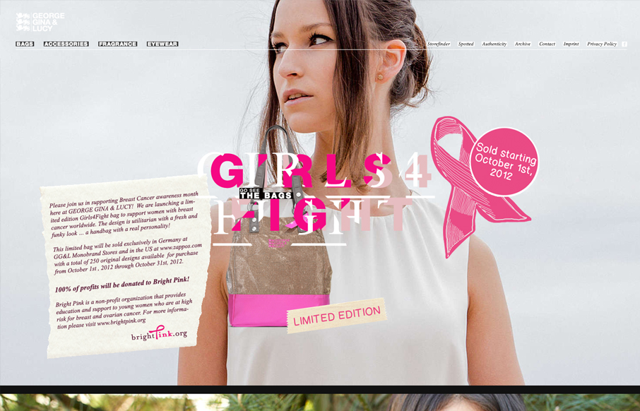
George Gina & Lucy
It's definitely the year of scrolling/parallax designs. This one is quite nice. The crazy type effect reminds me so much of something David Carson would do. It feels fun and free yet ordered.
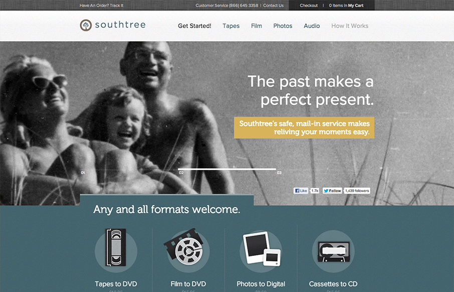
South Tree
The visual pacing when you scroll this home page down is superb. There's a nice detail of the sideways movement when you get to the "preserve yours" section with the image. This is really the structure that makes the page sing for me, it's all just arranged so well....
EMAIL NEWSLETTER
News & Articles
Jay & Gene speaking at RefreshColumbia
I'm reposting this from our local RefreshColumbia website since both Jay and I were given the opportunity to speak to the wonderful people that come to the Columbia (SC) Refresh meetups. There is some good stuff here from our good friends Jason Beaird (@jasongraphix)...
YUI 3.0 with Jonathan LeBlanc from the Yahoo Developer Network
We recently sat down with Jonathan LeBlanc of the YDN to discuss their recent launch of YUI 3.0.0 beta 1.
All about the Blueprint CSS Framework
Blueprint is a project that has been alive and well since 2007, and as a current core contributor and community manager for the project, I am a big supporter of it. The framework provides a few building blocks that CSS gurus have been recommending for a long time; a...

HARD WORK. CLEAN FUEL. NO EXCUSES
Use “WARRIOR2023″ for 10% off.