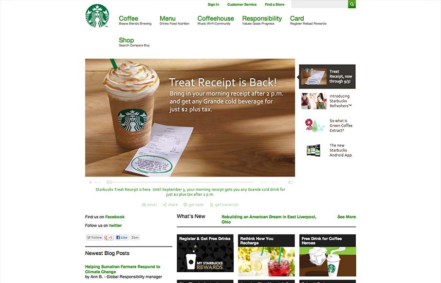
Pretty much have to include the new(ish) responsive Starbucks Coffee site in here. It has some neat sections of it’s design that are worth studying for sure. Like the different views for different screen widths on the big slideshow slider. We’ll take a closer look at that in the video screencast.
Glassmorphism: The Transparent Design Trend That Refuses to Fade
Glassmorphism brings transparency, depth, and light back into modern UI. Learn how this “frosted glass” design trend enhances hierarchy, focus, and atmosphere, plus how to implement it in CSS responsibly.


I’m sorry not sorry. But I have to be unprofessional and interject here and say the voice of this screencast is really sexy. *tip of the hat*
Back on topic: I was originally not for this #RWD situation, but since it’s heighted prominence this year, I see how cool, *considerate*, and responsible it is. Responsive web design is responsible web design. Starbucks’ jump on the bandwagon is a formidable jump at that. They did a good job. Several focused experiences in one web site. Kick-ass.
Completely agree.