Web Design Inspiration Curated
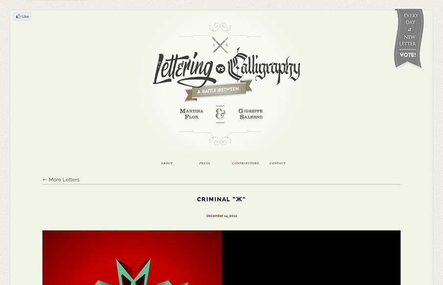
Lettering Vs. Calligraphy
First I didn't know whether to make this a radar resource or a gallery entry. Duh! The design is hot so it goes in the gallery. There's some nice little design flourishes here and there and I just want to keep scrolling and voting. Love this.
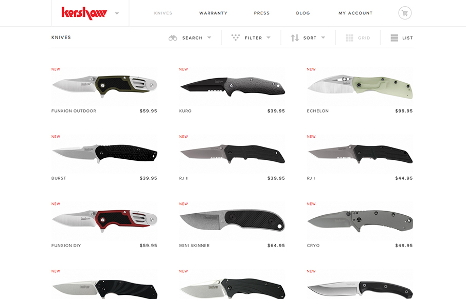
Kershaw Knives
Another superb responsive ecommerce website design. Looks like some image swapping going on for the different screen widths too. Smartness.
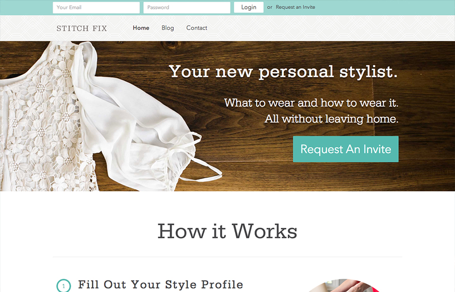
Stitch FiX
The new stitchfix.com looks hot! Bravo to @mrmrs_ !— Samantha Warren (@SamanthaToy) December 15, 2012 Looks good indeed. I particularly like the login box in the header area, the changes it goes through for each screen width design. I like details like that a...
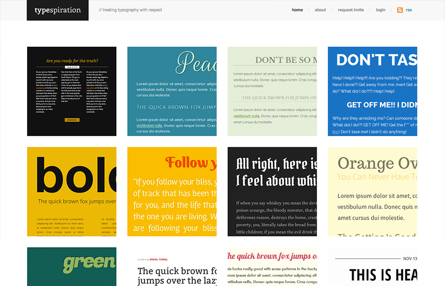
Typespiration
Love the content and idea of this website a great deal. The execution is also very nicely done. The responsive design and cleanliness of the site make me smile. Rafal Tomal has a great write up on his blog about building and designing Typespiration that you should...
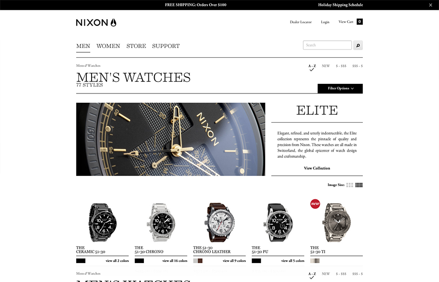
Nixon mens watches
A great example of responsive design used in an ecomerce situation. And the work and product are very high quality so they have to match and the design doesn't disappoint.
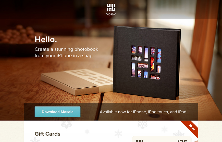
Mosaic
Beautifully simple website design for Mosaic. It has just the right amount of showing off the product, how it works and how you can gift it with animations timed to go off as you scroll. It has that Apple feel without going over completely. I love this.
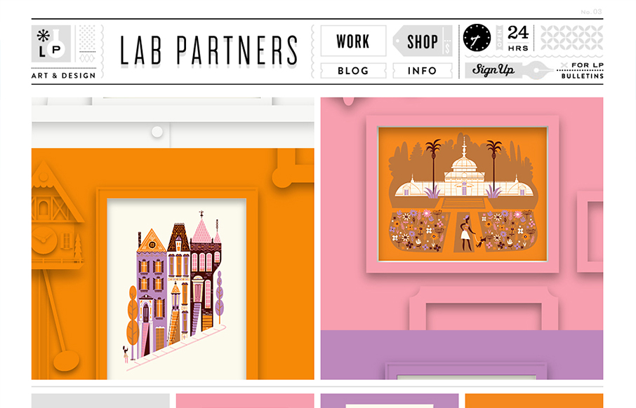
Lab Partners
This is just a visual feast. I love the work presented here and I love how it all ties together with the site design. That top header and nav area is pretty dang cool. The slideshow is very interesting too with the pieces coming together dynamically like that. Fun!
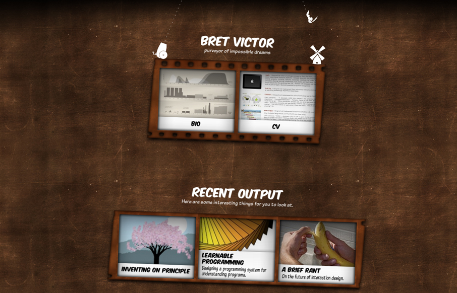
Bret Victor
The personal website for Bret Victor is a great experiment in both design and interaction. Yes it's pushing the boundaries of UX and how you take in a website but that's what I love about it. It's thoughtful and interesting to study on both the surface and...
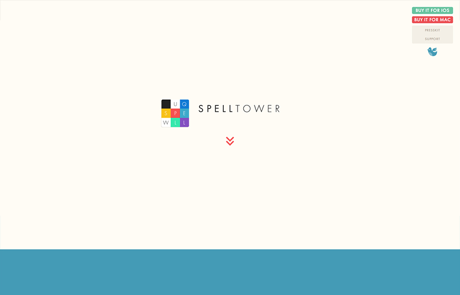
Spelltower
Superbly minimal design with the game's narrative told mostly through illustrations and quick witted copy. It works pretty much the same in most screen width environments too. Bravo, the site makes me want to check it out with out even reading a single word.
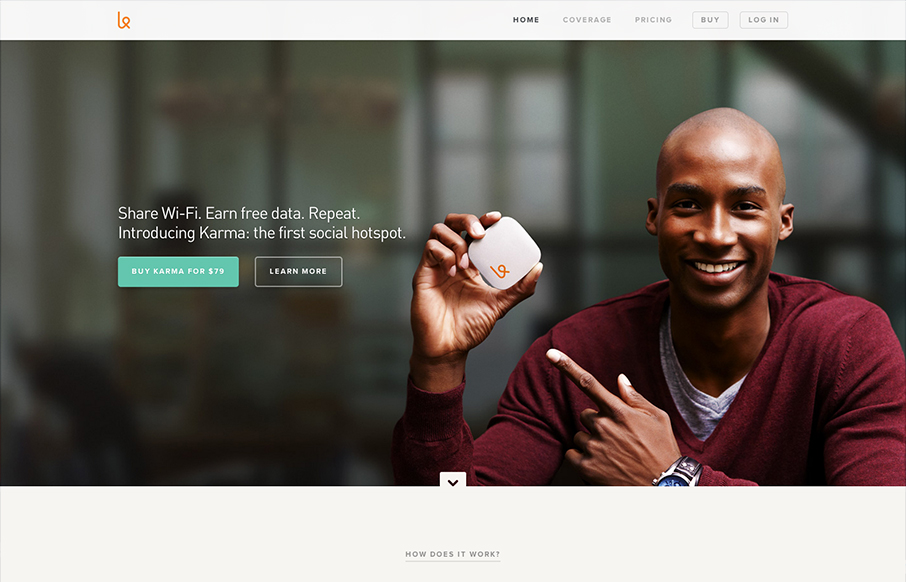
Karma
First off the design is gorgeous. The colors, typography and overall gestalt of the various elements make the design feel very welcoming and open. What I like most is the basic narrative, of "how does it work", "how do I use it", etc... I years past i've seen this...
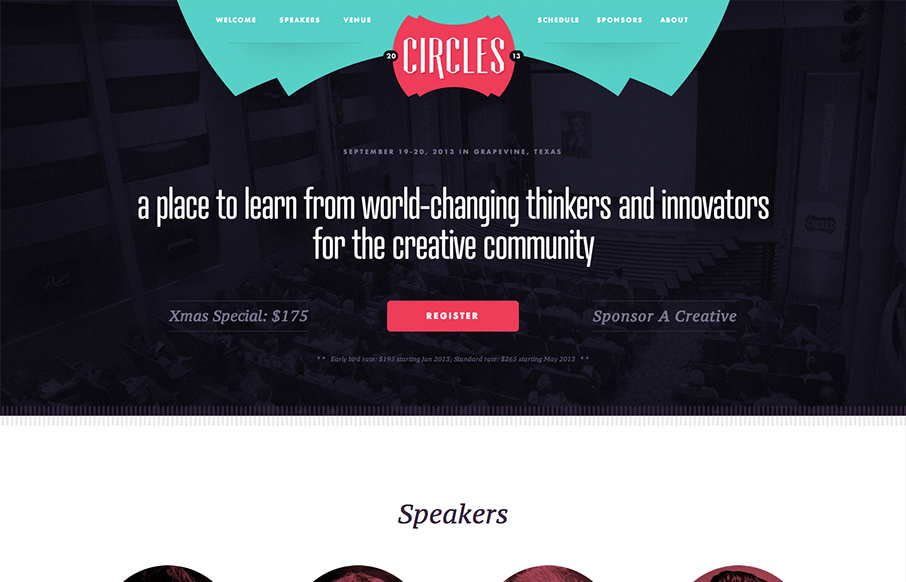
Circles Conference 2013
Superb conference website. I love the clean glide of the design, it's just easy to scroll down and scan. Without even reading a word you know what the deal is going to be. It also makes you feel welcome with the color tones and soft cornered elements. Love it....
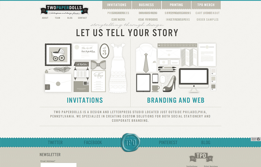
Two Paper Dolls
Gawd I love these illustrations, so precise and fun. The second thing is I like how upfront the two directions in service are displayed. "Invitations" and then "Branding & web" you can choose your adventure. That's smart if the invitations are a solid offering. I know...
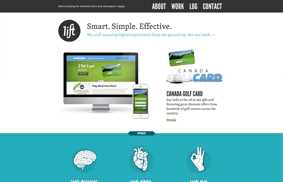
Lift Interactive
Hands down a superbly designed and executed website for Lift Interactive. It's full of some really great interaction design that also doubles as a super simple layout too built up with solid illustration work. It's layered, that's what i'm trying to say here. It's a...
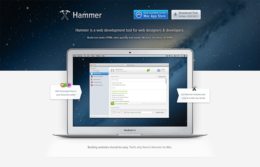
Hammer
Beautiful website for Hammer. I love the airy-ness of the way the content is designed and balanced with colors. The slideshow (not sure that's quite the name for it) is masterful. I love the zoom in to see the detail of the screens and the interactions overall are...
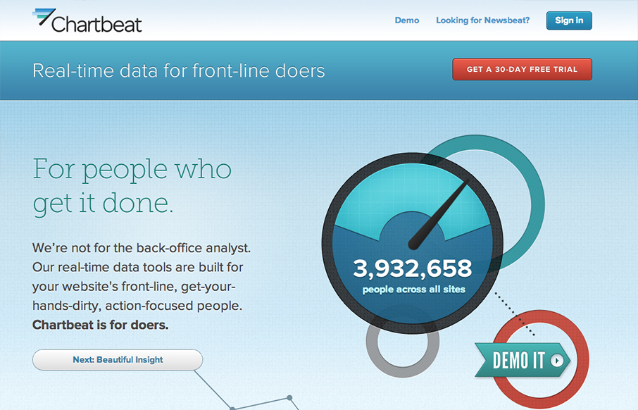
Chartbeat
I really love this narrative as you scroll home page for Chartbeat. It just sings to me. You can essentially get acclimated to what the product does for you as you make your way through the page. It's also superbly executed. It's exciting visually. This is a great...
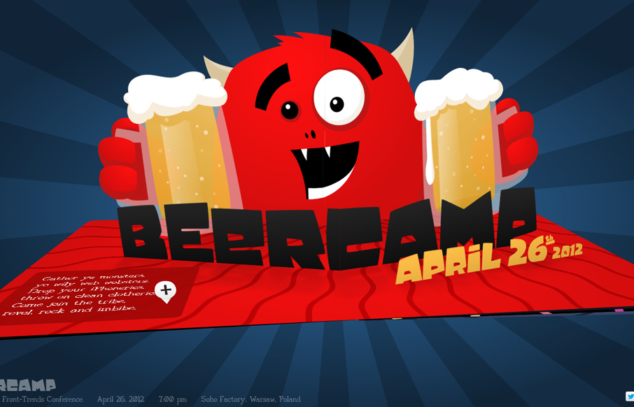
Beercamp 2012
I can't believe we didn't review the 2012 Beercamp site so far this year. This site will not escape the gallery here on UMS. It's a friggin' pop-up book for crying out loud. Just marvel at it's awesomeness and enjoy. Also, Monsters!

Skype
Nice clean and sleek looking new design for the Skype website. It's responsive too which is super smart for them to not miss this type of user since Skype is not available on most mobile platforms. I love the big call to action in green almost in the center of the...
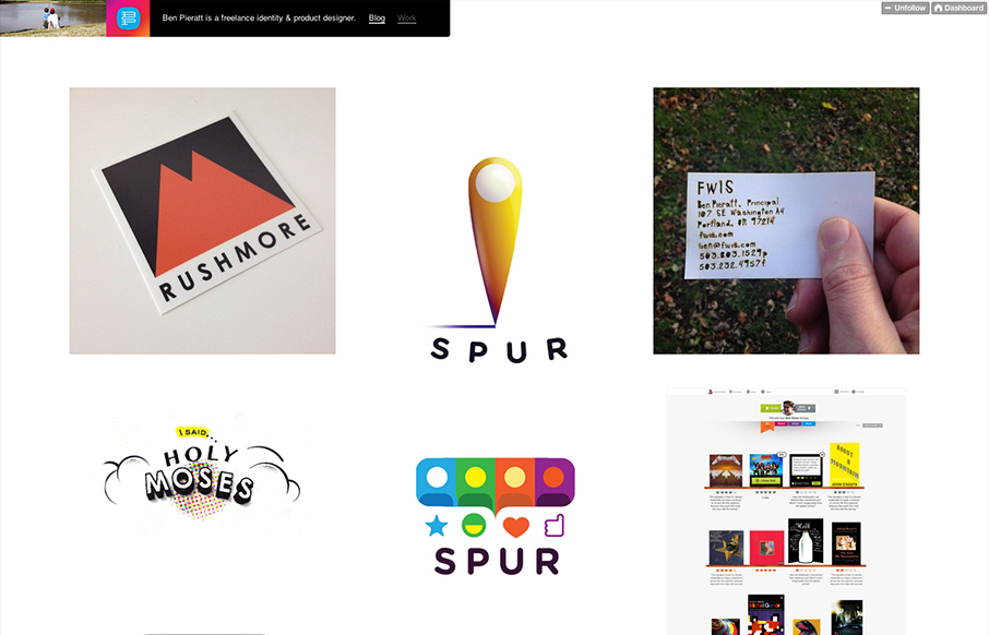
Ben Pieratt
Poring over @pieratt's new site. Lots of beautiful and thoughtful work here: dmall.me/Udbqtz— Dan Mall (@danielmall) December 4, 2012 Super simple and minimal design for Ben Pieratt's portfolio website. It's a Tumblr site too, I always love it when someone does...
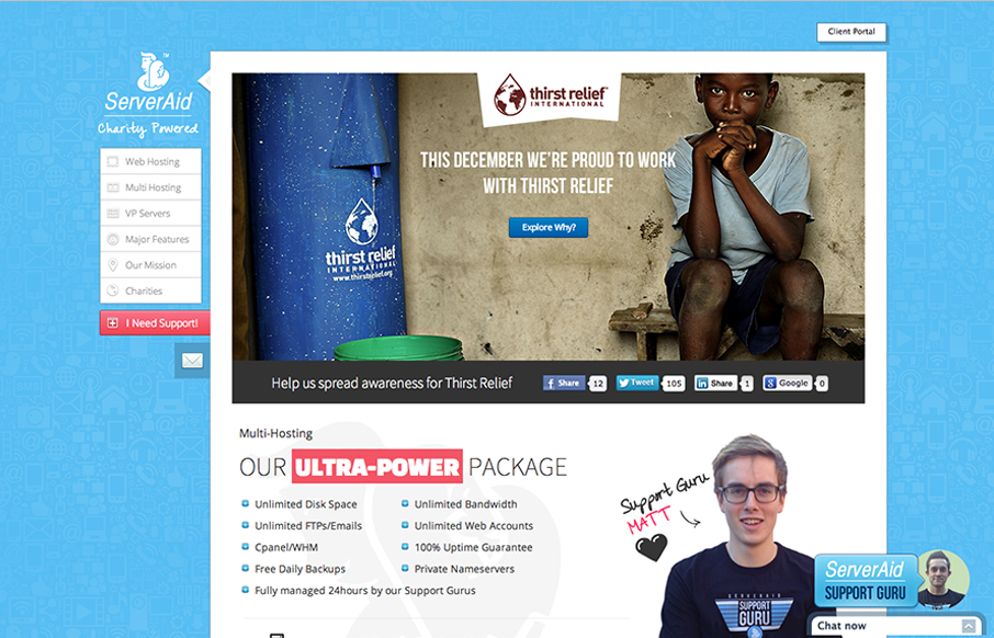
ServerAid
Cool fixed nav on the left side of the site. I like the non-traditional feel of this layout. It makes it stand out pretty well. They've managed to pretty thoroughly explain what it is they do and also humanize who they are with the design as well. Smartly done.
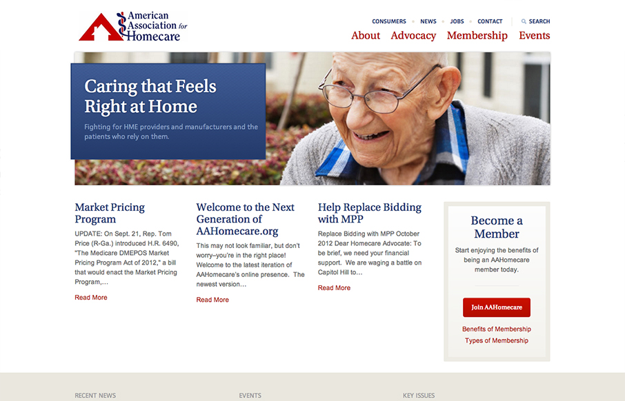
American Assoc. of Homecare
I like the changes in the way the main nav and "tools" nav are handled in the transition between screen widths. Nice simple clean design makes it easy to get in and out of the content.
EMAIL NEWSLETTER
News & Articles
Designer Chat Session with Trent Walton
 Trent Walton is the founder & 1/3 of Paravelinc.com, we talk business and how his team approaches their work.
Practical steps for using @font-face in your websites now
 Jay takes us through how to use @font-face now. Useful techniques and gotchas. This post is epic.
Handcrafted CSS: Book Review
 We review the book: Handcrafted CSS by Dan Cederholm.

HARD WORK. CLEAN FUEL. NO EXCUSES
Use “WARRIOR2023″ for 10% off.