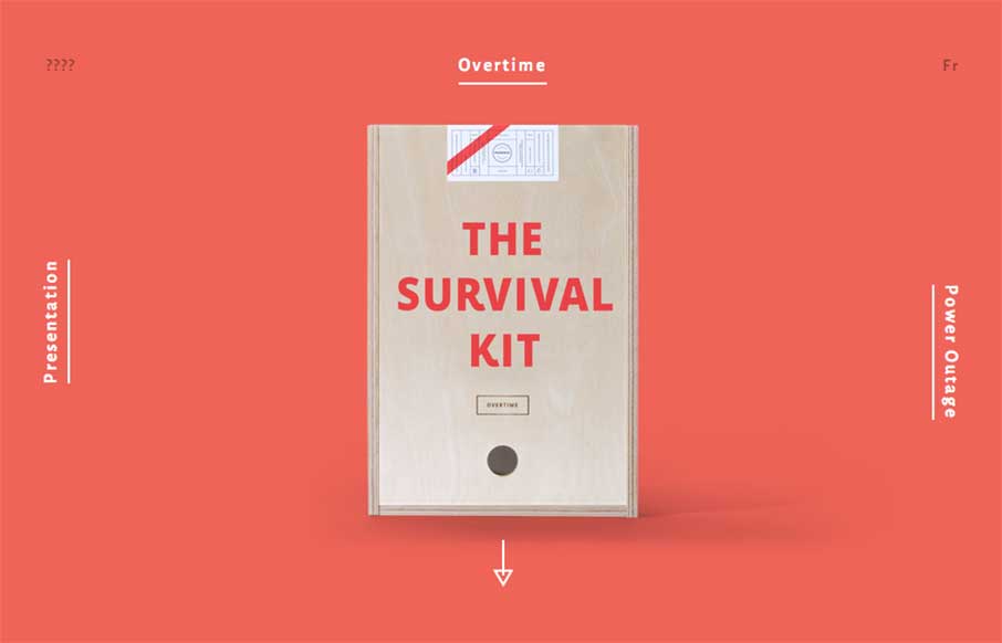
by Aaron Griswold | Dec 30, 2014 | Gallery, Shopping
Fun and maybe appropriate way to end the year with Montreal’s Phoenix Creative Studio’s Agency Survival Kits. Basically – our normal MO during the last two weeks of the year for our client services part of our business, Period Three, we go minimal,...

by Aaron Griswold | Dec 19, 2014 | Gallery, Shopping
Good way to end the week. Since you may be in “giving” mode right now, Thankful Registry – a gift registry site that doesn’t feel clunky, and makes the experience for the gift giver a little easier. Nice large images on the home page and the...
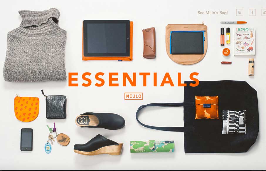
by Aaron Griswold | Dec 1, 2014 | Gallery, Shopping
Something a little different – this is a splash site from Mijlo.com, based on their Kickstarter campaign for a sustainable backpack. MIJLO reached out to a select group of global creatives to curate a collection of essential items – with one caveat –...
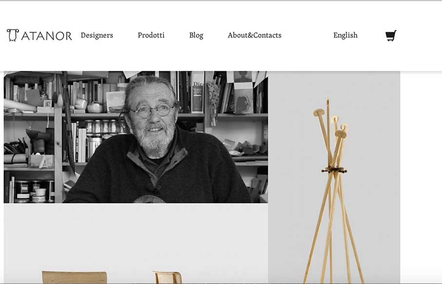
by Aaron Griswold | Nov 11, 2014 | Gallery, Shopping
I really like websites that deal with architecture or furniture design. It always feels like the web designer tries to emote the things the company designs within the website design itself. I like how the products and designers are changed out with Masonry – but...
by Aaron Griswold | Nov 10, 2014 | Gallery, Shopping
I made my first website in 1996 – it was a shopping site for a crappy private label golf company – it was probably the worst website ever created – but I got to learn HTML, while someone paid me a whole 250 monies. My point… so I really enjoy...

by Aaron Griswold | Jul 14, 2014 | Gallery, Shopping
Awesome page interactions at work on this site for sure. I dig the line based design then the sharp, quick and smooth movements are nice. I luuurve the way they use the hamburger icon and how when you simply mouse over it you get navigation choices, brilliant.