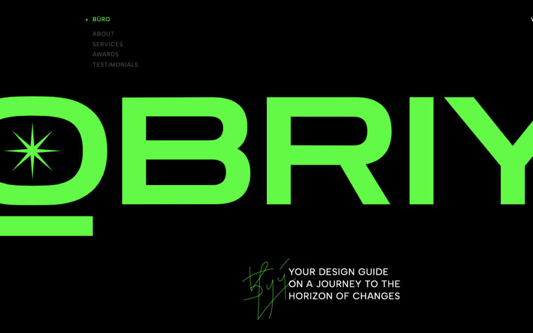
by Gene Crawford | Mar 12, 2025 | Design Firm, Gallery
Modern corporate website for a design agency. Inspired by a brutalist web design style, the site combines a structured layout with color accents, 3D elements, and a modern aesthetic.
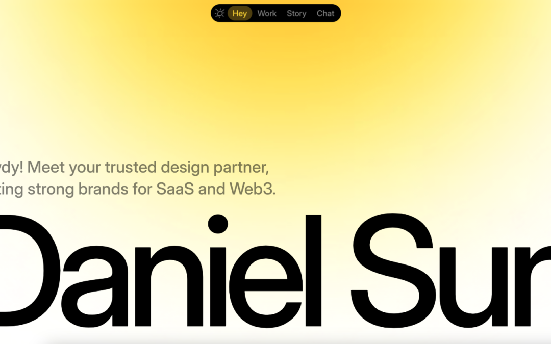
by Gene Crawford | Mar 11, 2025 | Gallery, Product
Beautiful design here. I love the bold imagery and clean lines of the chosen type. The small nav design is cool, I dig it, but I wonder if it really communicates “navigation bar” to most people? Thoughts on it?
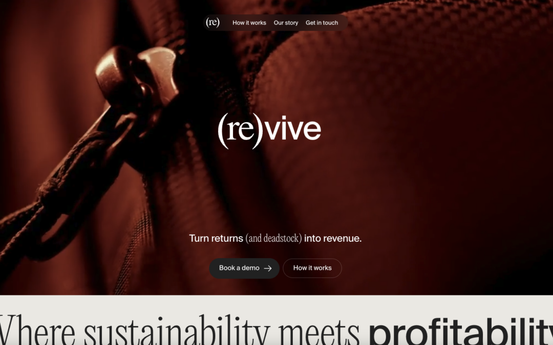
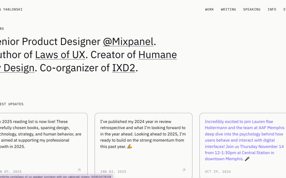
by Gene Crawford | Mar 10, 2025 | Gallery, Portfolio
I like the simple approach the content, keeping it simple. I also dig the way the header nav and then the footer portion play together to keep it simple and straight forward.
by Gene Crawford | Mar 7, 2025 | Design Firm, Gallery, Screencast Review
A brand design firm founded by Angelica Barco with 25 years of experience, widely recognized for its commitment to projects that matter and impact, moving towards a better future.
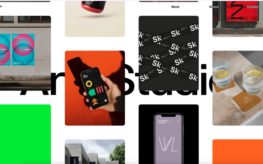
by Gene Crawford | Mar 6, 2025 | Blog, Gallery, Portfolio
I love this minimal design so much. It’s minimal but there’s quite a lot of detail here for you to study.
by Gene Crawford | Mar 5, 2025 | Design Firm, Gallery
I LOVE the three dimensional imagery that rotates as you scroll. It just makes the website memorable.