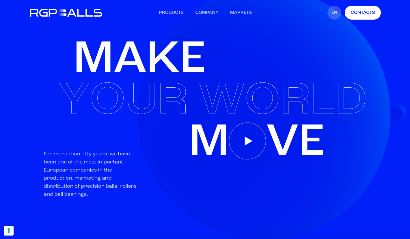
There is some neat stuff going on with this website. It feels overly “engineering” and has solid grid work and monochromatic coloring. I love the hover effect of going from blue to b&w color photos in the section selector area. The subtle animations take what could be a pretty boring layout to that next level that makes it truly interesting visually.
Glassmorphism: The Transparent Design Trend That Refuses to Fade
Glassmorphism brings transparency, depth, and light back into modern UI. Learn how this “frosted glass” design trend enhances hierarchy, focus, and atmosphere, plus how to implement it in CSS responsibly.


0 Comments