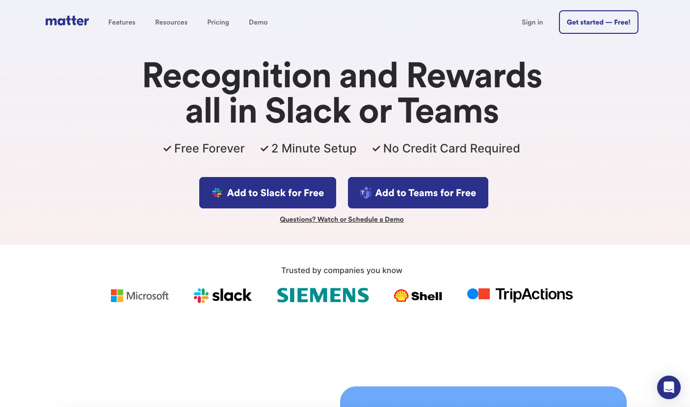
At first glance it’s just a straight forward, minimal-ish looking product website. When you study it, it is a class in minimalism; keeping things easy to understand, telling the story of the product and getting you hooked with clean and classy illustration work. Bravo.
Glassmorphism: The Transparent Design Trend That Refuses to Fade
Glassmorphism brings transparency, depth, and light back into modern UI. Learn how this “frosted glass” design trend enhances hierarchy, focus, and atmosphere, plus how to implement it in CSS responsibly.


0 Comments