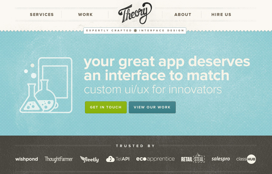
by Gene Crawford | May 18, 2012 | Gallery
A one-pager with loads of subtle texture and a gentle worn vintage look. The landing page utilizes HTML5/CSS3 and a bit of javascript to engage users and showcase the interface design work. Really wonderful design, with some super nice details. I love the fixed header...
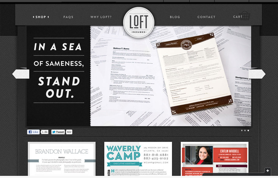
by Gene Crawford | May 17, 2012 | Gallery
We’re trying to bring great visual design job seekers’ resumes to help them standout. It’s a document that normally doesn’t get a lot of design love. We built the site on Shopify but we’ve done some nice little customizations – some...
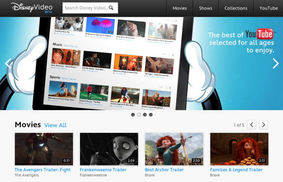
by Gene Crawford | May 17, 2012 | Entertainment, Gallery
Well hello there, newly responsive video.disney.com — you’re lookin’ *fine*. /via @simplebits— Responsive Design (@RWD) May 16, 2012 The Disney Video is pretty well done, nice large image slider and clean grid for other video views. It’s responsive which...
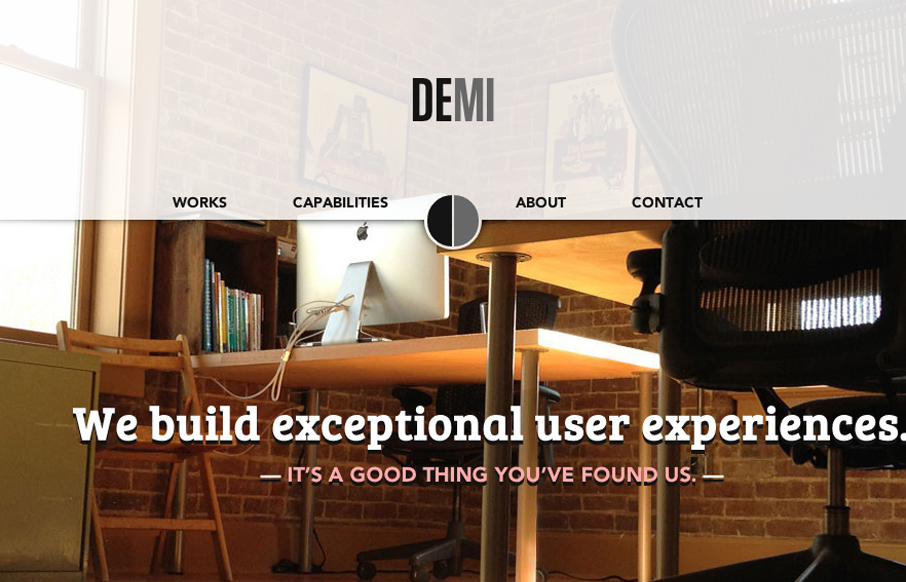
by Gene Crawford | May 17, 2012 | Gallery
Submitted by: Dan Spencer @demicreative Role: Designer & Developer I love this clean crisp layout. The “slide into” fixed header is a nice little interaction and surprise. It’s moments like that when you fall head over heals for a site design...
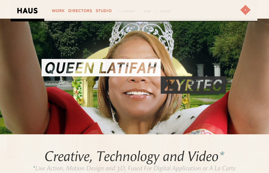
by Gene Crawford | May 16, 2012 | Design Firm, Gallery
I immediately love the content hierarchy on the home page, the shapes and spacing of the content groupings really let it ease into your view. The fixed header is a nice touch, especially the slight transparency as you scroll. Really loving the circle images and the...
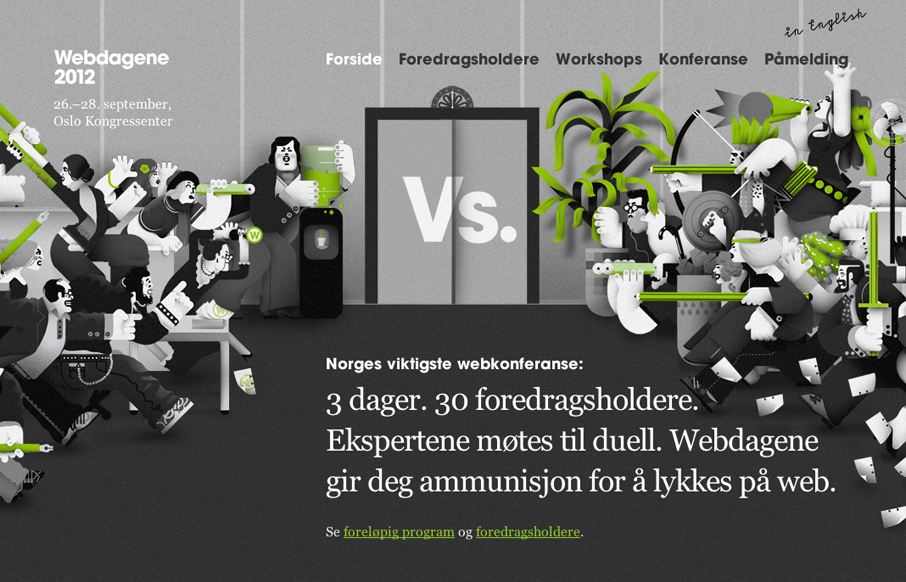
by Gene Crawford | May 16, 2012 | Gallery
Really fun responsive conference website design. I love how the main illustrations interact differently with the other screen sizes. The illustrations are also really fun too. Overall it’s a lovely website for a conference and if the show is as good as the site...