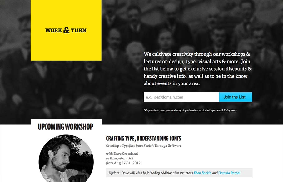
by Gene Crawford | Sep 18, 2012 | Gallery
Nice asymmetrical yet super balanced feeling design. From the colors, the yellow and black with that blue is striking – can you make colors feel asymmetrical too? Super clean look and feel with some superb type handling pitched in for good measure.
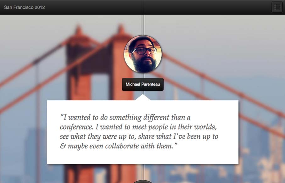
by Gene Crawford | Sep 17, 2012 | Gallery
This is a tale of a Designer/Developer that went on a trip to meet people in the product space in San Francisco. The plan was simple: take some conference budget and get creative with it. When it is all said and done.. make a small mini-website and tell a story....
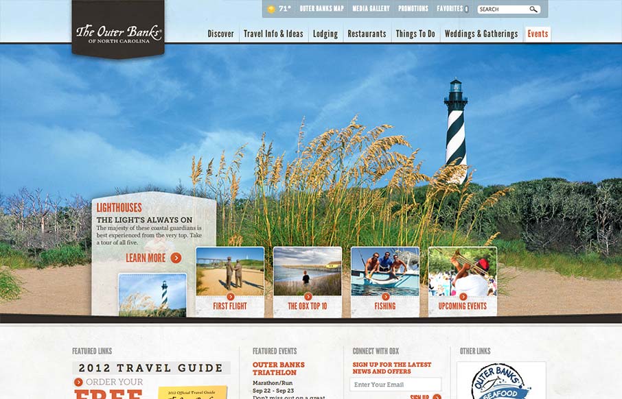
by Maria | Sep 17, 2012 | Gallery, Travel
Really slick vacation marketing site for The Outer Banks of NC. I like the hero area slide show’s interactions, they’re quite involved but they look tempting to click around on. The mid area feels a bit cramped with the 4 columns at first but they’ve...
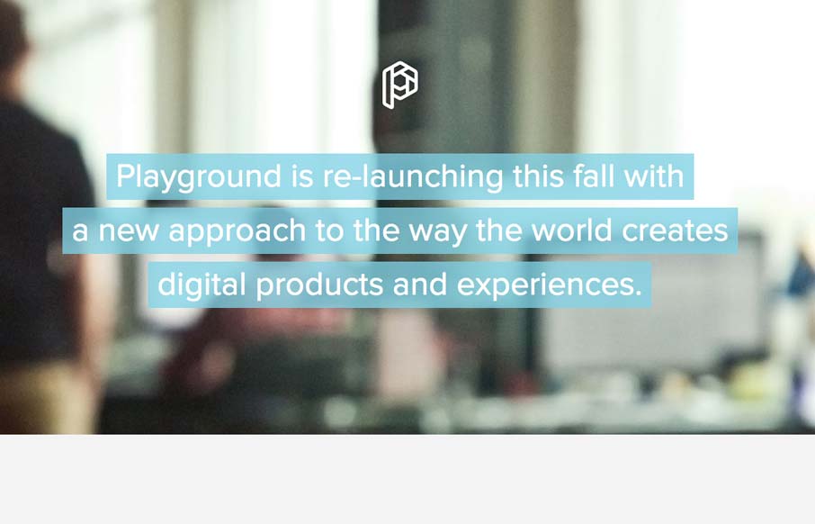
by Gene Crawford | Sep 17, 2012 | Design Firm, Gallery
Pretty crazy design with the full screen background video. Love the cow suit! The interactions are all over the place but look interesting and there is real content here too. Overall pretty fun website design and I dig it.
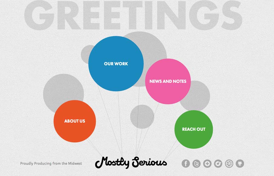
by Giovanni DiFeterici | Sep 13, 2012 | Gallery
This is an interesting site. It’s a pretty sweet idea and the floating balloon nav is kind of mesmerizing. Each page is a custom design, which is great. It’s a fun design that sells mostlyserious’ brand.
by Giovanni DiFeterici | Sep 13, 2012 | Gallery
This is how you should post job openings. This is a lovely little site to entice people of the ‘web nerd’ persuasion. I think that the photo animation is a bit much and seems a little out of place in an otherwise tight and professional design, but...