by Gene Crawford | Nov 5, 2012 | Gallery, Portfolio
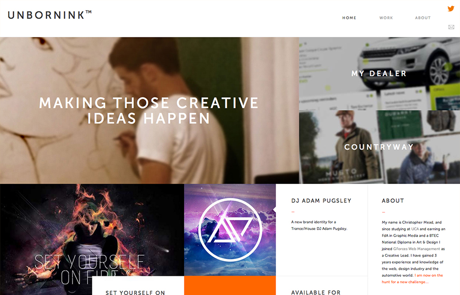
Man, at first glance I totally thought this was as website for a high end design agency only to discover it’s basically just a portfolio for one person. That’s impressive to me because it’s not just the look that pulled me in, the the presentation of...
by Gene Crawford | Nov 1, 2012 | Design Firm, Gallery
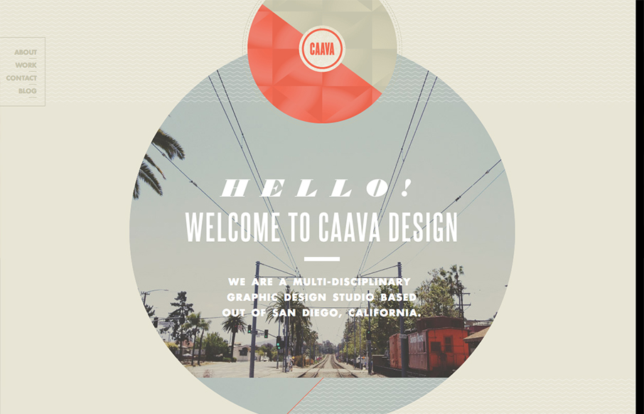
Nice touches here and there make this a really interesting site design. I really dig the big circle with the image in it and how it stays put as you scroll. I’ve seen that before but it feels fresh here.
by Gene Crawford | Nov 1, 2012 | Gallery
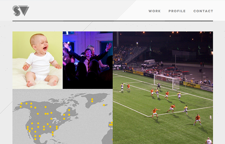
Great simple but bold graphic website. I dig the grid and the way the responsive system works for this site. The portfolio section is great too with the way they demo the designs.
by Gene Crawford | Nov 1, 2012 | Gallery
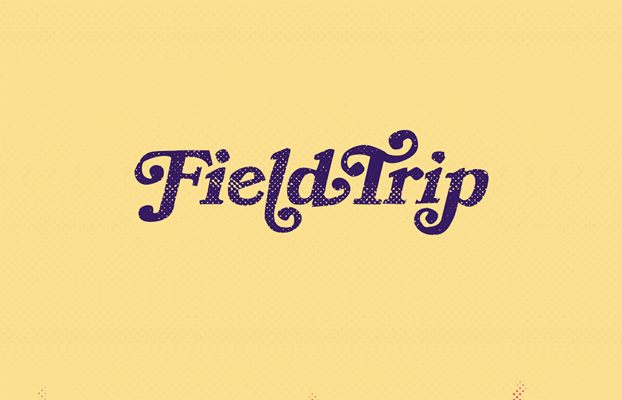
Lovely home page design. With the split/slide in animation of the creative tools as you slide down the page the site immediately feels activated. I think that’s the point given the subject matter and way the FieldTrip conference is supposed to play out. Just...
by Gene Crawford | Oct 31, 2012 | Gallery, Photography
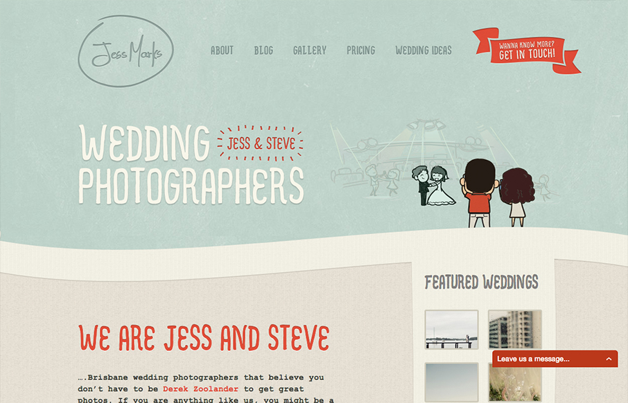
I love these colors, they feel so soft and welcoming and perfect for the subject matter. The little slideshow/animation of the scenes helps you understand really quickly what the site is all about if you don’t notice the large type “wedding...
by Gene Crawford | Oct 31, 2012 | Gallery, Music
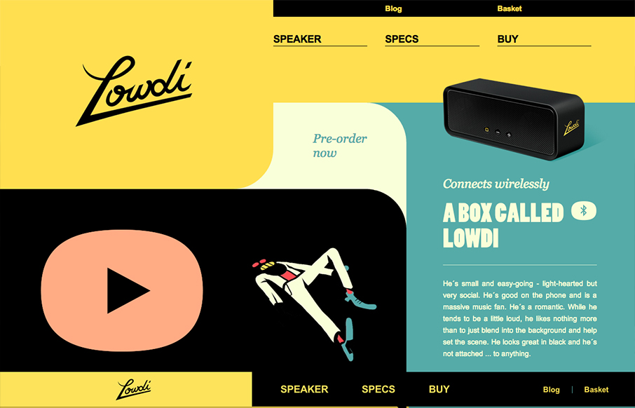
The design is a nice example of an asymmetrical design that leads to a symmetrical as you scroll down. I like that balance. Nice colors and interactions make this a well rounded design that’s going to be memorable.
