
by Gene Crawford | Oct 29, 2012 | Gallery
Very nice responsive website design. I like these web based magazine sites the Verge is the center of. Polygon is no exception. I like the header that slides up to a fixed position, once highlighting the top three stories then getting out of your way as you scroll....

by Gene Crawford | Oct 26, 2012 | Gallery, Portfolio
Submitted by: Simon Pan @span870 Role: Designer & Developer Creating a site about myself was a challenging task. I aimed to craft something that arouses trust from my users through a pure and sincere presentation. My aims were to strive for a timeless aesthetic,...

by Gene Crawford | Oct 26, 2012 | Gallery
Submitted by: Brinton Boehm @styli_se Role: Designer & Developer We’re a group of creative individuals making thrilling web experiences. We create stunning websites that cater to your audience. Nice smooth experience from desktop to mobile here on Styli.se....
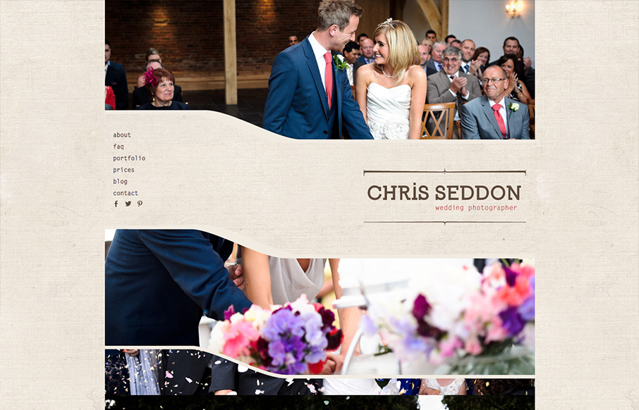
by Gene Crawford | Oct 25, 2012 | Gallery
Submitted by: Katherine Cory @katherinecory Role: Designer Cool take on a photography site. I like the parallax approach with the imagery too, it activates them in a very positive way. The background is pretty mute which makes the photos really stand out on top of it....

by Gene Crawford | Oct 25, 2012 | Gallery, Music
Submitted by: Matt Brothers @grooveshark Role: Designer & Developer Landing page for early access to the new Grooveshark redesign. Nice new design update for the Grooveshark experience. I understand this to be a gateway to get to the updated Grooveshark....

by Gene Crawford | Oct 24, 2012 | Gallery
Nice clean design with a nice background pattern to break it up and keep it visually active. I like the strong/simple grid underlying the design too. The best part about the site IMHO is the responsive work. The nav is a typical horizontal words based nav but when...
