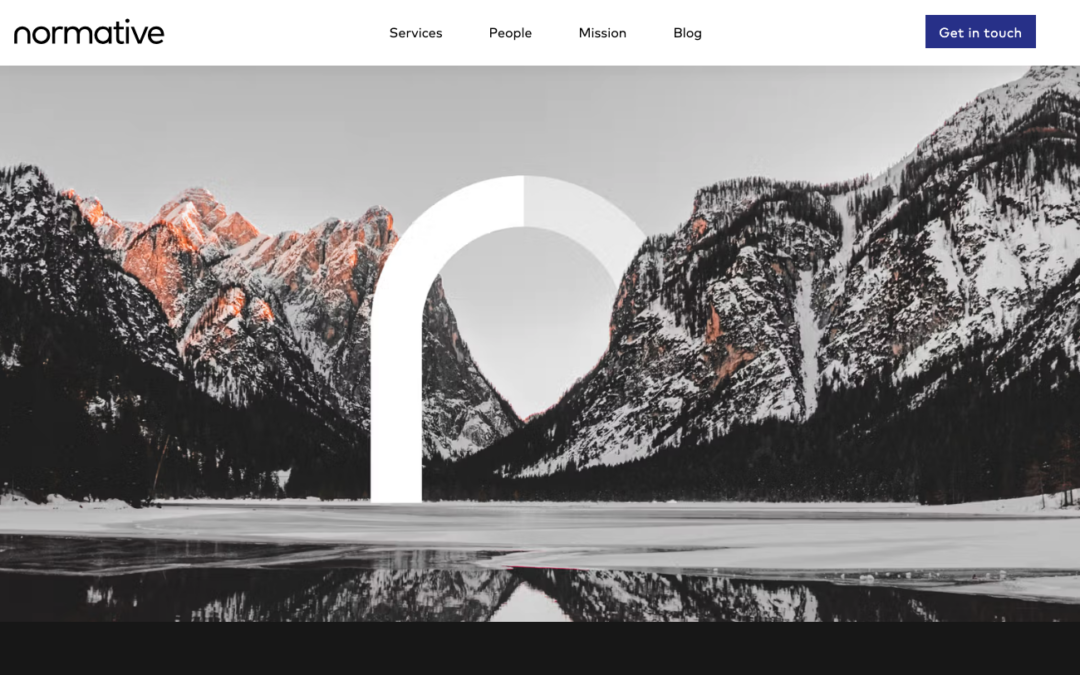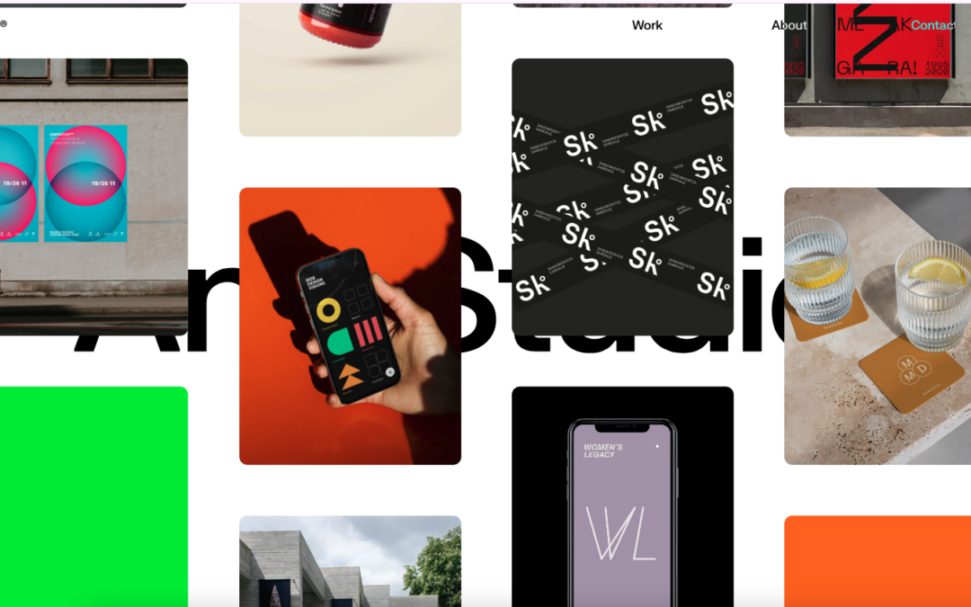
Cool new product and website for Cast (by Genii). While I'm not sure who Genii is, I get Cast right away - and the animated video background helps (except for that one dancing dude on the right - reminds me of the Katy Perry Left Shark... but I digress). Good use of...
Stampsy
Really like the movement of the Stampsy site, a photo story / mood board / visual essay site, especially from the second to the third frames of the site. Everything is very well designed, and simple - using the video to tell their story. Also think the fourth frame is...
Tapdaq
I always like to review product websites and Tapdaq is an interesting study in keeping things simple. I dig the way the graph loads the first time you visit the site. I also really like the simplicity in the overall approach to the design of the site; yet at the same...
Twitch 2014 in Review
I've said before that we really like these year-end summary sites for different companies - and Twitch's is a good one too! Pretty cool that you can have a multi-million dollar company based on watching other people play video games - but aside from that, I like the...
St. Louis Browns
My 9yo son has his second baseball game of the season tonight. I showed him the St. Louis Browns website last night at 8:30pm (his bedtime) - and I found myself explaining the site and the team to him until 9pm (my bedtime) - Satchel Paige, 3'7" Eddie Gaedel, and yes,...
Résidence Mixte
Lovely type based design for the Résidence Mixte website. I dig it in so many ways. Kind of cool how the slider actually changes the whole page - an added level of navigation. The colors are soft and also the French. 🙂
Rethink Digital Healthcare – By Fantasy
No matter what your political slant, we could probably agree with the statement that digital healthcare, with all of our technological and interwebs advances, could be seriously improved. So I really love Fantasy, a digital design agency out of San Francisco and New...
Kirin – Mets
"We Want Mets - We're the funky, spunky, younger generation..." is now in my brain for the rest of the day - well played Kirin - well played. I've been a fan of Kirin, out of Japan, since before I can legally say. They have a soft drink called Mets - and it's website...
Prollective
This Prollective site is a theme, that they made - they note it at the bottom of the page. It's a pretty dang good looking site and template too, just thought you would enjoy checking out what these guys do with it. We’re a collective of handpicked web specialists who...
Johan Gunnarsson
Something about a classic looking simple design. Johan's portfolio website has "it". I dig it greatly! Submitted by: Johan Gunnarsson @nahoj Role: Designer
tix02 design studio
Cool and kind of trippy agency site out of Belgium, from tix02. The scroll is reversed, and the Work section through me off guard for a second; but it's definitely unique in it's design, and should stand out to potential clients. I really like the section on "Building...
Nivas
Dynamic and bold design from Nivas out of Croatia. The multi-hued chevrons really make this site - and the line art illustration is a great background to start the page. Also like the Work page, and how the chevron shape is included in the work portfolio.
Wide Open Technologies
I was looking up some information on one our ConvergeSE speakers - Adam Smith - and took a look at his company's website, a Wilmington, NC based firm - Wide Open Technologies. This is a solid site, that is clean and easy to follow. I especially like the Services page...
BigCartel 2014 Recap
I really like this trend over the past couple of years of companies spending a little time summing up their year in a fun and interesting way. BigCartel has done that here with their 2014 "Cheers to Last Year". SVG and illustration rich - and smart links to parts of...
Luxx Web Design
TLDR' - Good agency / portfolio site out of Germany - from a couple of 15 y/o's. Great to see someone with ambition and skill just starting out in the industry - working on client projects before half of the web designer population has even started training in...
Limonadas S/A
This is a fun, one pager agency site from Limonadas SA out of Brazil. I'm always impressed when someone can take illustrations and make them work on the page seamlessly with the rest of the elements there. Also like the "motion" on the header / nav as you scroll down...
Toi
Solid agency site work coming out of Toi, based in California, Texas and Buenos Aires. Like the use of the animated gif background at the top of the home page - gives it a feel of a video, and somewhat parallax background, and may work better with the speed of the...
Bloomberg Media
With the new Bloomberg Business website that launched a couple of weeks ago (which we made some observations here), well it looks like the media giant also has a separate site for the media / advertising / marketing sales division - Bloomberg Media (BBM). We thought...
Dog Studio
Dog Studio out of Belgium is pretty darn cool. Their site is a little unconventional - but it seems in-line with their immersive website work. The Projects pages are really rich - especially check out the Waterloo page. Good... stuff! (yes, a play on their motto).
Benvisual
I don't need to say much - Bence from Budapest has the description of his website down to a T: From the designer: I like how the images really dominate the whole site. The UI is extremely boiled down, so the pictures can shine. Submitted by: Bence Löcsei Twitter...
La Haute Societe
I will tell you that your Macbook will be running hard when you clickthrough to La Haute Societe's site - but it will be worth it. This is one of the best use cases of video background - because it's pervasive throughout the entire site. It has a good flow and story...
LGK
Really like this portfolio site from Luke Greenway out of Brighton, UK. It's smooth and classy? - can't find better words for to describe that right now. Also starting to like this trend of sticky headers that reveal in a different color when you scroll down (white to...
Mass Effect
Good clean agency site out of Sydney from Mass Effect. There are some places that could use a little less SEOing (like the footer) - but I like when sites use neutral coloring like this as a backdrop - and let their work be the coloring - would like to see some more...
Navy
The angles make this design feel dynamic. They're almost too much but it works. I particularly like the pattern the triangles make in the footer area.
Wolf and Son
What a beautiful grid based layout for the Wolf and Son website. There isn't much I don't like about this site design. The colors and photography really just seal the deal to make this a really great looking site.
25 Art House
The 25 Art House website has a really cool vibe with the clean and crisp typography and the large notecard looking case study link blocks. I dig the 'masonry' loading and sliding around the link blocks do as well on screen resize. Cool site.
Cookiesound
My wife and I love travel, and were remembering back to living in Australia and traveling to Bali (pre-kids). So I'm always interested in traveling blogs, and just caught Cookiesound this morning. Looks like a mother and daughter (Ulli and Nisa), from outside of...
Formagramma
Really interesting visual approach. It has the 'feel' of an art or design magazine for sure. I really like the 'view article' overlay for the sections as you make your way past the hero area. I also like the way they've handled the main nav and the more nav section...
Taostudio
I really enjoyed looking through this website. BTW the fish blinks... The design is beautiful and I love the contrast with the light line work in the design with the heavy typeface.
Beech Mountain Resort
This is a follow up to our review on Friday for Burton Snowboards. It's nice to have a platform to thank people and businesses when you've had a good experience with them - and as someone who has owned companies in the hospitality business, I know that complaints...