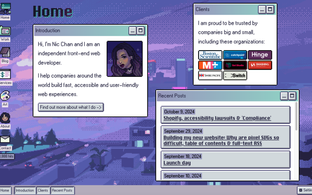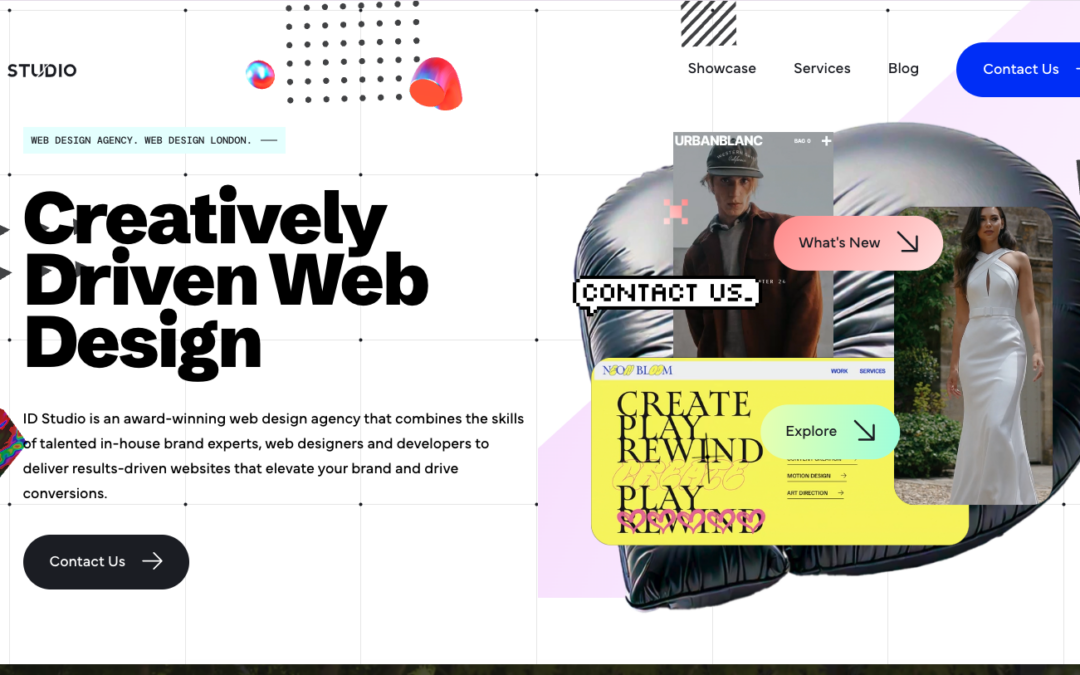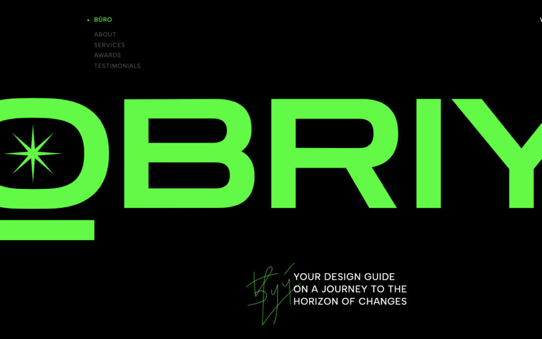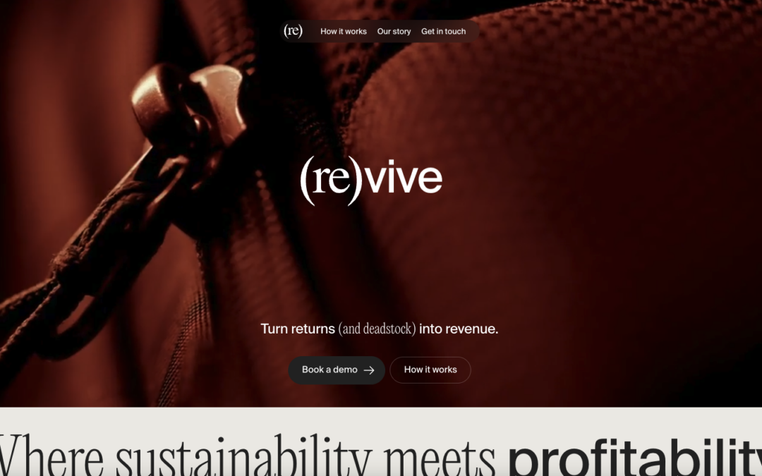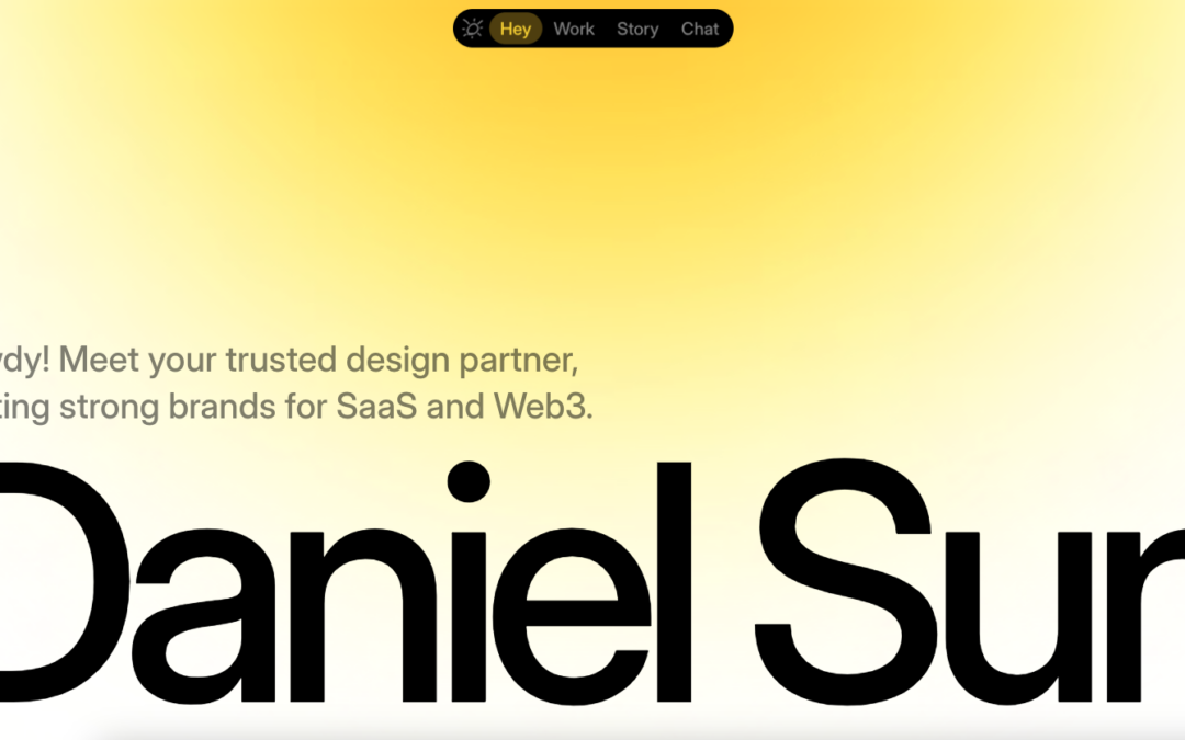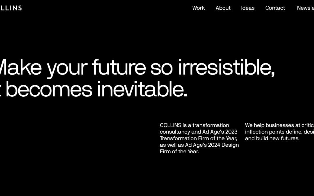
We're starting to see more and more one pagers - especially from start up agencies / freelancers. Pixenum out of Croatia is one of these sites, and it's a good one. Good web design is not only about the look and feel - it should also be about getting your user to do...
Pedro Landaverde
Cool animated SVG portfolio site from Pedro Landaverde out of Mexico. It looks like a simple one pager - but there are literally a lot of moving parts. Not crazy about how the Project photos clash a little with the rest of the site (maybe add a filter?) - but like how...
Greek Tour Guide
The Greek Tour Guide of Ancient Olympus is a simple site, but I think that's why I like it - we don't do enough simple. I was reading the copy of the site - and decided that you don't need much more than this to get your point across "come see this incredible place,...
Hyperquake
"Evolve or Fade Away" - strong motto from the Cincinnati based agency Hyperquake - strong site too. Good block design throughout the site makes it clean and crisp along with the color combination. Like the design aesthetic in their work too - has a sense of old meets...
Csaba Gabor
Csaba Gabor's portfolio is definitely different - from the vertical nav, to the myriad of areas he touches on here. The block design, with static images and animated gifs, some that link - make a cool secondary navigation - and the movement of the About page on-scroll...
Woven Magazine
Woven Magazine, out of Austin, is pretty cool - with in-depth articles about crafty people (see below); and has some unique ways it displays the story links on the home page. The article are image rich - and a good read too. From the Designer: "Woven Magazine exists...
Welcome to the New WIRED
Beautifully simple and powerfully functional. I've seen this style popping up for publication style via CircaNews ( http://circanews.com/ ) and Medium ( https://medium.com/ ) and the trend is one that I can see designers getting behind for its high level of...
Masonry
Man this site is tight. The aesthetic is pretty awesome - love the typography design, and then the mix of the full width and the margined areas. Also like the Work detail pages at the top - cool overlay. It may be my connection right now, but transitions were a little...
Species in Pieces
Turn your passion into something cool That's what Bryan James did here in his personal project called Species in Pieces. ( @WengersToyBus www.bryanjamesdesign.co.uk ) Above are some of the 30 endangered species that he hand crafted using CSS polygons and webkit / CSS...
Mother Volcano
Cool site to end your Thursday from Mother Volcano out of Portugal. This is an illustration intensive site from an illustration intensive company - so most of the site is either .pngs or background images. I really like the integration of the social media icons at the...
Search Discovery
Once again - it's cool when the designer gives us a lot of detail on what went into making a site - even better on a site re-design. John Williams tells us a little about the redesign of the Search Discovery site out of Atlanta: From the Designer: "Search Discovery's...
Creativepark
Guillaume Grimaud out of France's portfolio site has cool movement with the pre-loaders, that you don't feel like you're waiting. Also like the movement on the slider when the projects go out and come in. Simple, dark, and good. From the Designer: "Creativepark is the...
Nicolas Thomas
Like this portfolio site from Nicolas Thomas out of Paris. At first look, above the fold - it's extremely crisp with the contrasting black and white of the image a copy, but the moon and cloud gives it something extra that I can't describe right now. Have seen the...
Leap
I'm going to assume that the initial pitch for Leap was "It's like Uber - for buses." I drive daily now, but when we lived in Sydney - I would have paid extra for this service since my commute was 45 minutes from the CBD to North Ryde where I was going to school. The...
Movement Mortgage
Yesterday, we posted a real estate site that broke molds of website design that exist in their industry - today we do the same, with the financial / mortgage industry with Movement Mortgage. As Brittney says below, user experience on most mortgage sites are pretty...
Kooba
I had to get one Irish design company on St. Patricks's Day, even if it is late in the evening there - and with Kooba, think it's a good one (ther also might be a good chance that they won't see this for a couple of days - St. Pat's isn't just one day there). Besides...
Saimawn Si-Shen
Depending on the type of site, and who you're trying to reach - visuals (images / illustrations / icons / video) are a huge part of conveying your message. I'm going to guess that in the way that YouTube and Vimeo transformed the industry and marketing abilities for...
The Cliffs
We really don't get very many real estate themed sites at Unmatchedstyle - that's probably because most of them are pretty horrible (if you don't believe me, Google real estate in your locale - if you have exceptions - submit them here). However... The Cliffs website,...
The Spotify House
So... if you're in Austin this week for that little soiree called SXSW, um, and we know half of you are there by your drunken tweets throughout this week.... (yes... you know what you did, and the Twittersphere does too). Head on down to The Spotify House - our buddy...
Celcius Concept
Celcius out of Switzerland looks to be the graphic design arm of Crayonoir, which also has a good site. The site transitions from a video background a split screen site - description on left - work (or team) on right. Good concept and way of presenting since the...
Maks
Cool way to start the week. A developer from France - Maks. That's really all the info I have - but I like his site. It's a quick side-scrolling one page portfolio site, but it's pretty dynamic. All the images are links to work or to email Maks - simple and to the...
Thierry Ambraisse
I found this site from a photographer and art director from Paris, Thierry Ambraisse, a little while back - and for some reason didn't review it. I found it again this week, and something resonated with me, and really paid attention to the photos, the transitions, and...
The Web Ahead
You know why we like this site? Besides the fact that it's a great resource with interviews with some of the best and brightest on the web? We like The Web Ahead site because no one else is really doing this - making a site that's all about text. It's a content rich...
Mast
We're starting to see a trend with some agency sites lately: Header -> Agency Logo -> Little bit of intro copy -> Straight to client work / portfolio Man, is that effective - and Mast out of Denver, Colorado is doing that to a T. Love the block design (that doesn't...
August
Man, what a beautifully executed design on the August website. Fun layout and some super slick illustrations and animation really drive this design home for me. The main navigation is very interesting too. It's one of those that take over the design but I really dig...
Italic Studio
The more I played with the Italic Studio website, out of Los Angeles, the more I really dig it. The whole work on the About / Home page is cool and fairly seamless. Their Work is pretty darn good too - I remember seeing the Reebok Rally women's magazine / catalog when...
Voltage
Continuing with Reebok day - Voltage, out of Colorado, just worked on the Reebok site we reviewed this morning. When we searched for who did the work - we found their site, and man is it good. The video background and the full-width images - with some good scroll...
Reebok – ZPump Fusion
Today is Reebok Day. It could be that Gene and I are fanboys of Reebok, and in fact just ran our third Reebok sponsored Spartan Race this past Sunday in Atlanta (awesome images below). Plus, there's some good design on the site and in the companies associated with...
Flat Cow Studios
I'm not sure if the name Flat Cow is a play on an oxymoron, but design-wise, I like the contrast between the flat design, coupled with robust design - it plays well on this site. Also, the full-width design on the Work page is also pretty cool - and like the different...
C2
Cool and different agency site out of Croatia for C2 - Ana and Sergej. Really enjoyed the opening sequence that turns into your initial navigation with the block C. Also like the use of the slider, plus side scrolling in the Work section. Finally - I like the...