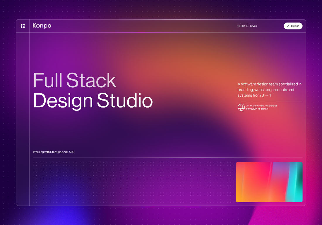
This website was designed using Figma for design and developed on Webflow. Our primary goal was to showcase our work and let it speak for itself. We achieved this by presenting our portfolio across multiple sections of the site with fun micro-interactions, ensuring easy digestion of content.
Given our emphasis on showcasing our work, the /work page and case studies were key avenues to do so; however, even before visitors reach these pages, we ensure they are exposed to a lot of our work. From the initial loading animation to the showreel and throughout the homepage and service pages, we allow our examples to shine, making a large amount of content easily consumable with well-thought-out UX.
You’ll find the dots recurrent throughout our site in title backgrounds, icons, and animations. They originate from our logo and our name, ‘Konpo,’ meaning ‘Component’ in Japanese, symbolizing our operational philosophy as the design component, perhaps even the heart, of an organization’s process.
A variety of cool iterations serve as the highlight of the about page, including the hidden mushroom in the bottom left corner, full-screen menu, and interactive contact us form, among others, making this site unique for its attention to detail.


0 Comments