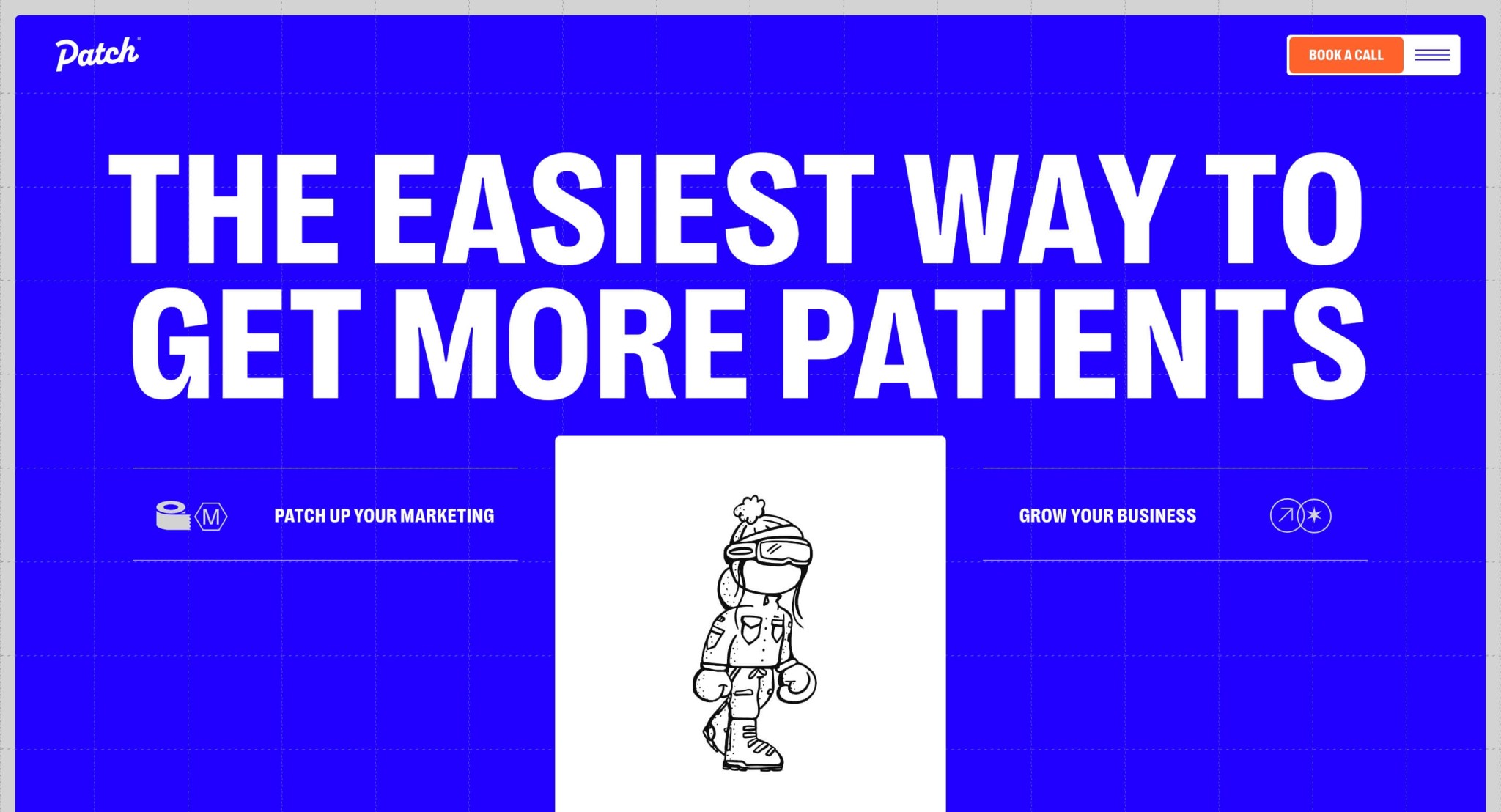
I like the simple approach to color here. Not black and white but not too much color, keeping it surface level and focused on the content and story it’s working to communicate. Smartly done website.
Glassmorphism: The Transparent Design Trend That Refuses to Fade
Glassmorphism brings transparency, depth, and light back into modern UI. Learn how this “frosted glass” design trend enhances hierarchy, focus, and atmosphere, plus how to implement it in CSS responsibly.


0 Comments