by Aaron Griswold | Jul 8, 2014 | Gallery
Cool and simple site on the surface, but we know from experience that getting simple down can be hard. We’re seeing more of the canvas / css / svg animations that respond to your input, and this is a nice, light use of it just to get your attention, but not...

by Gene Crawford | Jul 7, 2014 | Gallery
Nice bold graphics on the Buildfire website. I like the large iPhone graphic that shows off an app. The slight parallax effects behind the main section headers are nicely done too.
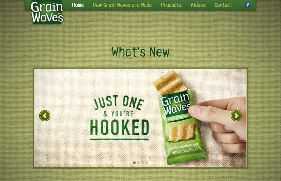
by Gene Crawford | Jul 7, 2014 | Food and Beverage, Gallery
Nice interaction here where the site scrolls up as you click through the navigation. It’s unexpected and entertaining.
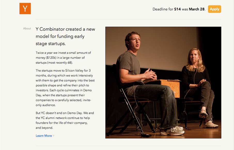
by Gene Crawford | Jul 7, 2014 | Gallery
New design for the Y Combinator site. It’s a nice clean design that’s slightly asymmetrical which I like. I also like how the navigation is played down on the site, it’s at the bottom. The focus is more on the first level content like the startup...

by Aaron Griswold | Jul 3, 2014 | Gallery, Sports/Recreation
Yes – I was hoping to write this review with a smile that was 8ft high x 24ft wide… but alas, that was not to happen. Either way, it is great to see interest in US soccer continues to grow as we start to catch up (yes… little by little) in a sport...
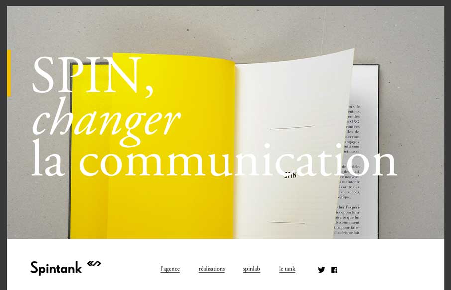
by Aaron Griswold | Jul 3, 2014 | Gallery, Marketing
With as many website submissions as we get, I admit that we have to look at some of them twice to see the clever, little things that make a site worthy of posting in the gallery. Spintank’s site was one of them for me. I think I was thrown off initially by not...