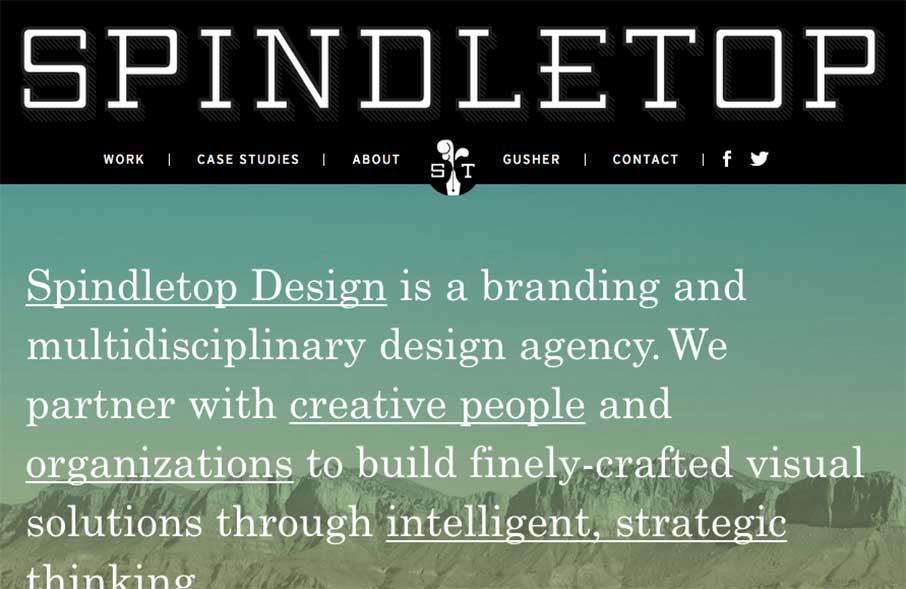
by Aaron Griswold | Jan 19, 2015 | Gallery, Marketing Company
Really like the vibe coming from the Spindletop Design site, an agency out of Houston, Texas. It looks like they like to use a lot of text treatments in their site, and in their client work – which is cool, considering the graphic design trend of Lettering (or...
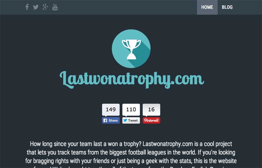
by Aaron Griswold | Jan 16, 2015 | Gallery, Sports/Recreation
We admit it – sometimes we don’t just review sites for their aesthetic beauty – sometimes we review sites that are submitted because we can see there is love behind it. The LastWonATrophy site by Digital Zoo out of the UK looks like cool and fun side...
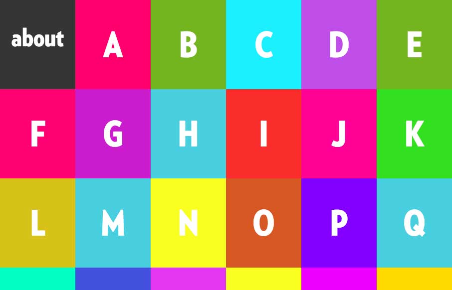
by Aaron Griswold | Jan 16, 2015 | Gallery, Nonprofit, Social Cause
We’re seeing more and more animated gifs being used for more than just cats with lasers coming out of their eyes memes… we’re seeing them used as the main feature of some sites. Alphabreast has done this in a clean way that really gets their point...
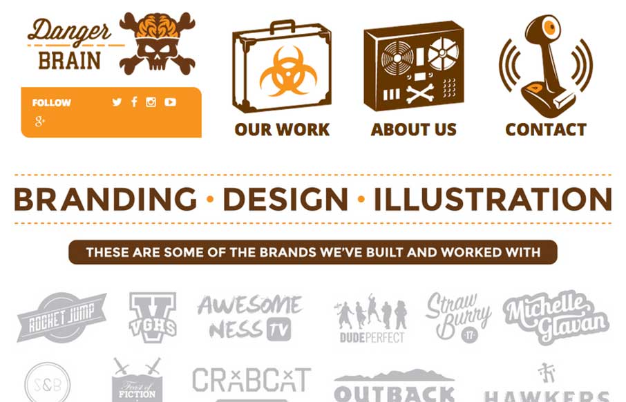
by Aaron Griswold | Jan 16, 2015 | Gallery
Fun way to start the day with a site from Danger Brain out of Florida. Feel like I’m back in my BMX / skating days with the artwork and design. And I may have to start watching Video Game High School… just sayin’. From the designer: “Really...
by Aaron Griswold | Jan 15, 2015 | Entertainment, Gallery
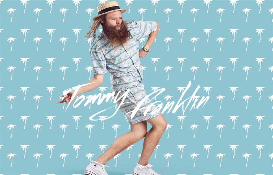
“Love like you’ve never been hurt, sing like nobody’s listening and dance like you’re Tommy Franklin” This site from G’day Byron Bay design company is pretty stellar. I’ll let them explain the impetus for the site, but I love...
by Aaron Griswold | Jan 15, 2015 | Gallery, Nonprofit
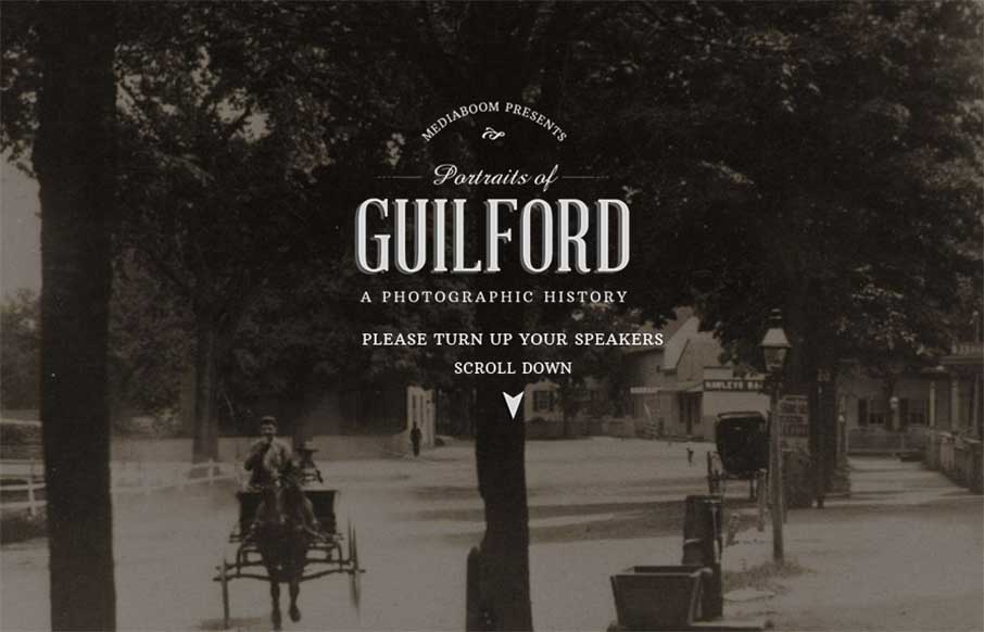
I really like what mediaBoom has done with Portraits of Guilford (Connecticut) – a historical / social photo sharing site for the town. I’m a history buff, so love to see the progression of the photos over time. Also like the sticky footer, and how when...