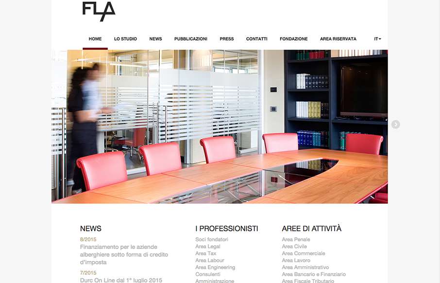
by Gene Crawford | Oct 1, 2015 | Gallery
Pretty straight forward layout for this Law Firm in Italy. I dig the responsive design decisions made though, go ahead resize it and see what’s what.
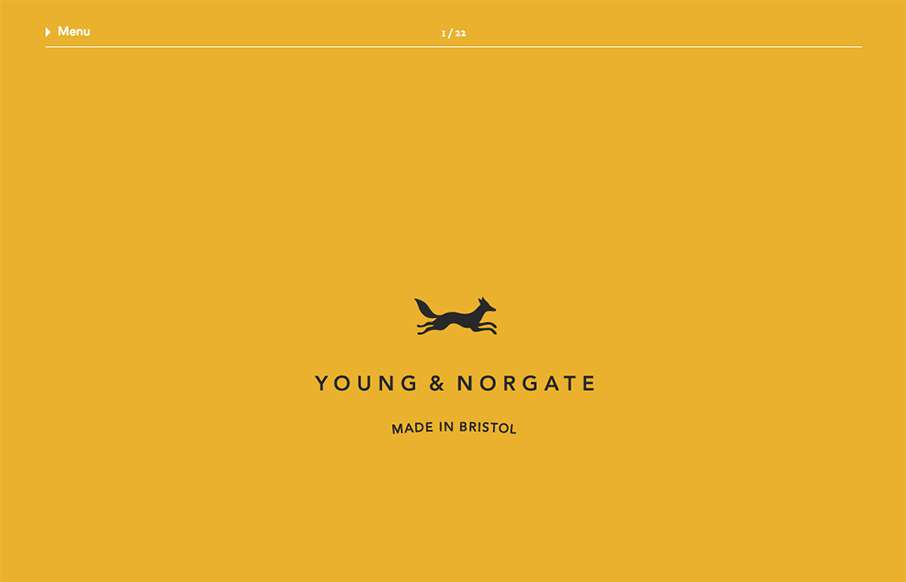
by Gene Crawford | Oct 1, 2015 | Design Firm, Gallery
Really simple layout, it’s like one project at a time to check out then only 2 other simple nav items. I love this approach. I don’t like the bottom “read more” link, I’d like it to be more obvious across all images used for this section....
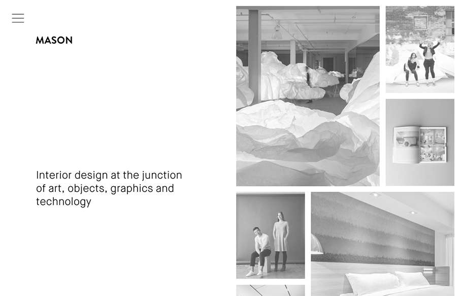
by Gene Crawford | Sep 30, 2015 | Gallery
Really cool minimal approach to the interior design studio Mason’s website. I dig that you basically only check out some images then there’s the hamburger menu, because they take you to some good sample pages of the company’s work. Simple flow of...

by Gene Crawford | Sep 30, 2015 | Gallery
The Loppist is a great example of a website with a “mega” drop-down navigation design. I really like this and how it shows more info before you drill down into the site. It’ll help that pogo-sticking thing that people get into on a product...

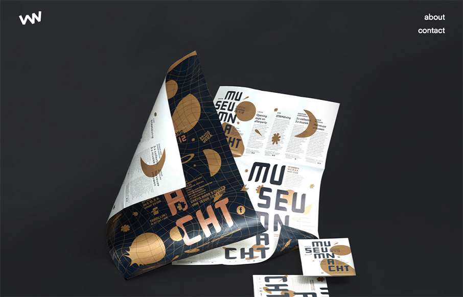
by Gene Crawford | Sep 30, 2015 | Gallery
We’ve created our fair share of event websites here at UMS, and this is one that I instantly fell in love with. I love all the interactions and detail work. It’s chock full of fun discoveries as a visitor as I move around the site, play around with it and...
by Gene Crawford | Sep 29, 2015 | Gallery
I love minimal and clean design. This site pushes it to the limit. It’s doing everything right on that side of the house. I do think it falls short a little with the nav items being set in white text, they can get lost based on the background images. However...