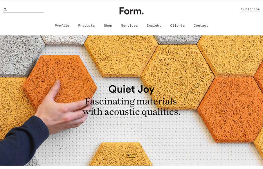
by Gene Crawford | Sep 29, 2015 | Gallery
Beautiful minimal products deserve a website that matches. The Form website doesn’t fall short. A simple and elegant grid layout mixed with some simple type and photo direction make for a really great product website.

by Aaron Griswold | Sep 29, 2015 | Gallery
Good, clean site from Spendee – a product page for a finance app. Good movement on the on-scroll / scroll-jacking actions – and especially like the hamburger menu that opens up simple horizontal nav on the header – it’s actually different than...
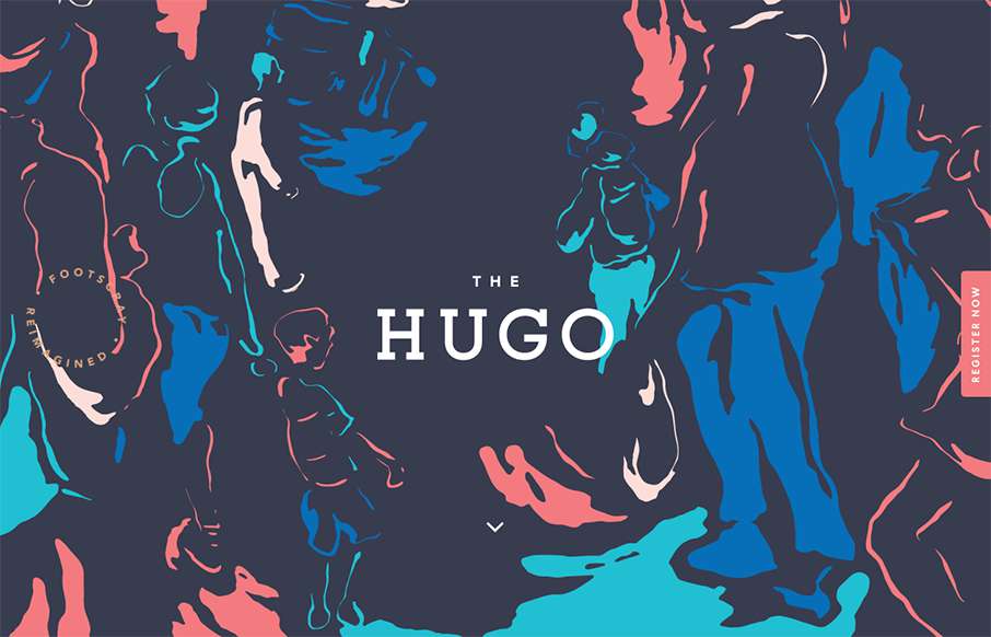
by Gene Crawford | Sep 28, 2015 | Gallery, Real Estate
Pretty clever use of the background image. I really like how it’s used as the hero area image, then you scroll down and the rest of the site kind of slides up. I like the register button and how it works too. Pretty cool 80’s inspired colors too.
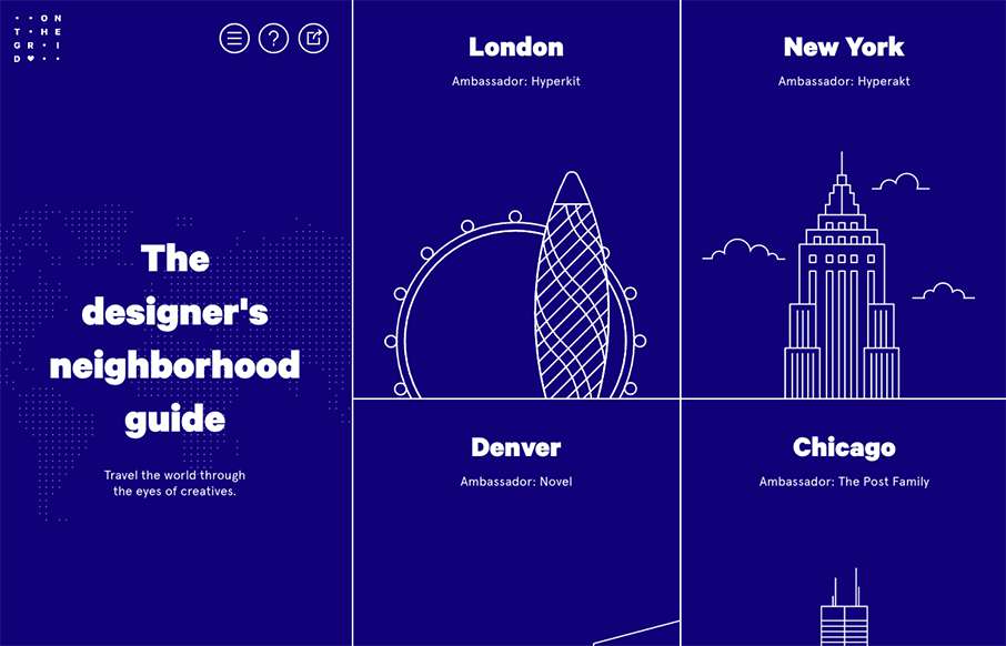
by Gene Crawford | Sep 28, 2015 | Gallery
Pretty cool layout. I like the fixed side bar nav and the illustrations that train your eye on each neighborhood section. Which are all designed quite well using a card style design approach. Check out an example of that here.
by Gene Crawford | Sep 28, 2015 | Design Firm, Gallery
This site design hits all the “now” standard things design and interaction wise. But sometimes you get it just right, I love the smooth feeling vibe to this site and the imagery is quite nice. The way the case study images load as you scroll for the first...
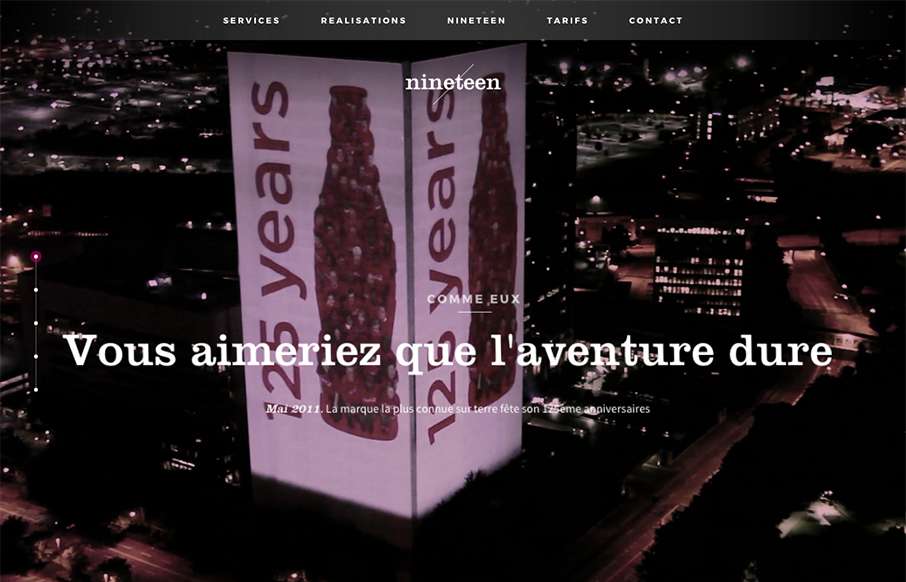
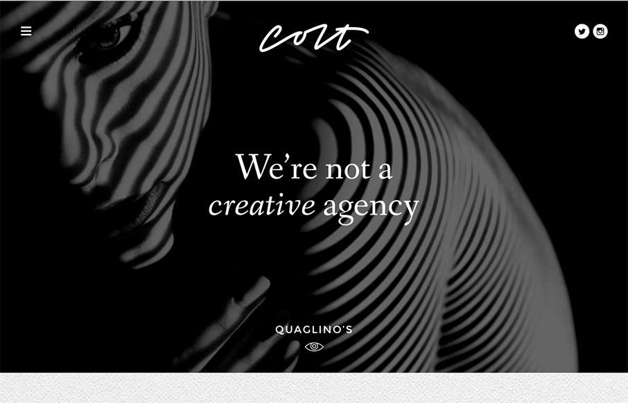
by Gene Crawford | Sep 24, 2015 | Gallery
I like the overall vibe of this site design. The black and white setup is nice and gives it a sense of class. The photos are pretty rad too. Smooth experience as well as you make your way down the page(s). Submitted by: Swann Mayor Twitter: @swann_nineteen Role:...