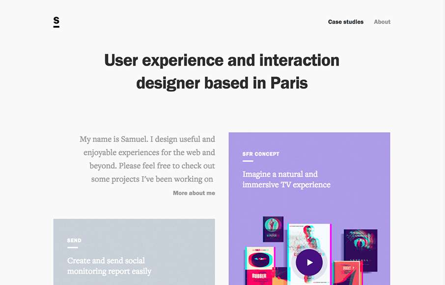
by Aaron Griswold | Oct 6, 2015 | Gallery, Portfolio
I really like how designers are putting some time into their portfolios, and especially the case study parts – like how Samuel Medvedowsky’s Work Portfolio pages use both full and “fixed” width to tell his stories. More so than that, it’s...
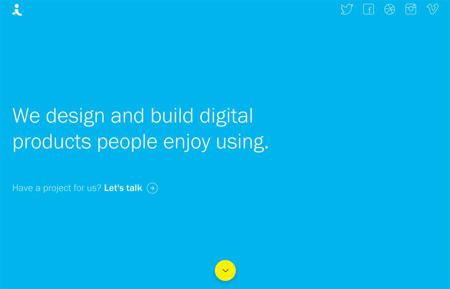
by Aaron Griswold | Oct 6, 2015 | Design Firm, Gallery
There are times when we see sites like the Indicius, and I think – way too busy, what’s going on… I don’t feel like that with this one – especially since there is no other navigation on the site. Really love the movement of the Case Study...
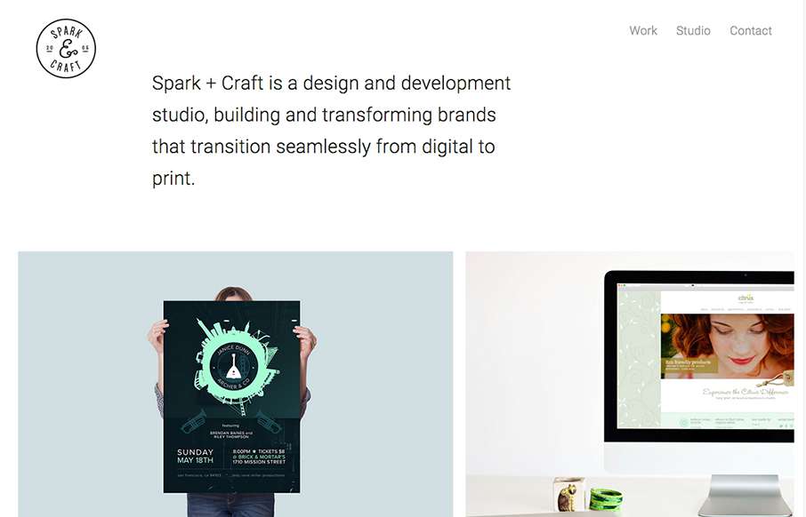
by Aaron Griswold | Oct 6, 2015 | Gallery
Cool and tight site from Andre Ventura, aka Spark and Craft Studio out of Georgia. Really like the block design, and the Work detail pages are really crisp – and like how the logo doesn’t interfere with the images (like we’ve seen a lot lately on...
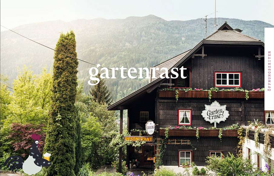
by Aaron Griswold | Oct 5, 2015 | Gallery, Travel
Clean, and a lot of gut white space. Love the hamburger / fork-knife-spoon menu – and roosters too.
by Gene Crawford | Oct 5, 2015 | Design Firm, Gallery
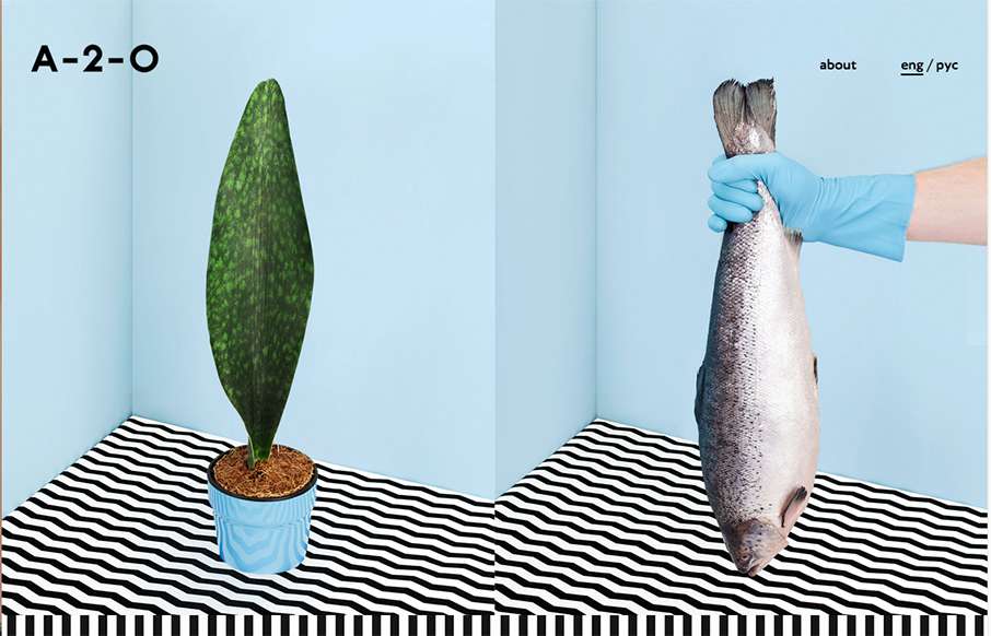
Pretty unique interaction choices on A-2-). It’s different, i’m not sure it doesn’t work though. I like how the cursor changes based on moving over a link, I don’t like how this is a 100% diversion from what the user has always experienced....
by Aaron Griswold | Oct 5, 2015 | Entertainment, Gallery
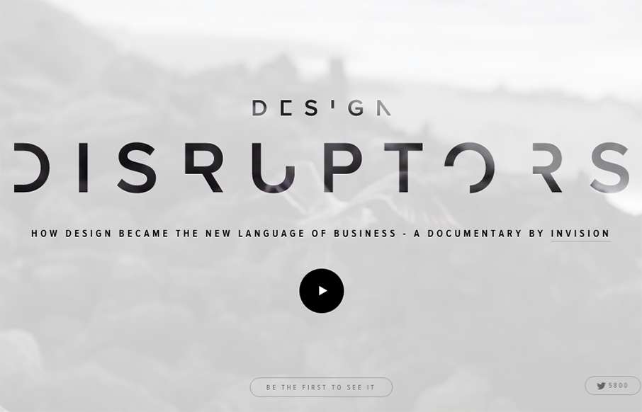
“Design. Changes. Everything.” – Amen. Great website and video work here from InVision, about a topic that’s pretty near and dear to our hearts (and probably your’s too). It’s a promo site for a documentary on how design is...