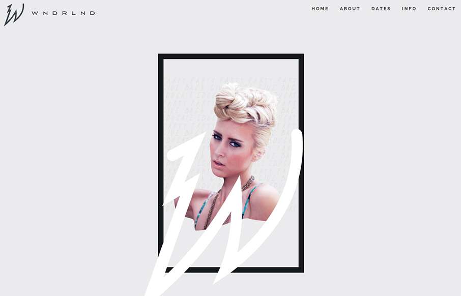
by Aaron Griswold | Oct 20, 2015 | Fashion, Gallery
This is a great site called WNDRLND, that is aimed at the salon and stylists industries. Seems very fashion forward in both web design and design in general – which is good, since they are trying to inspire an industry of professionals who need to keep ahead of...
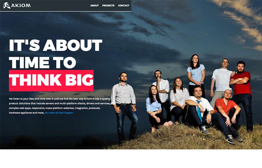
by Aaron Griswold | Oct 19, 2015 | Gallery
I had to look at this site by Akiom, out of Romania, a few times – and I think it’s grown on me. At first I thought the site was unbalanced (leaning to the right) – but the more I look at it, I like how it flows – I think the large,...

by Aaron Griswold | Oct 19, 2015 | Entertainment, Gallery
Beautiful, flowing site from Chargefield out of Ontario, for the Mississauga Symphony Orchestra. With flat / material design and other design trends, we see less “textured” type backgrounds it feels like. They’ve done a good job of having the...
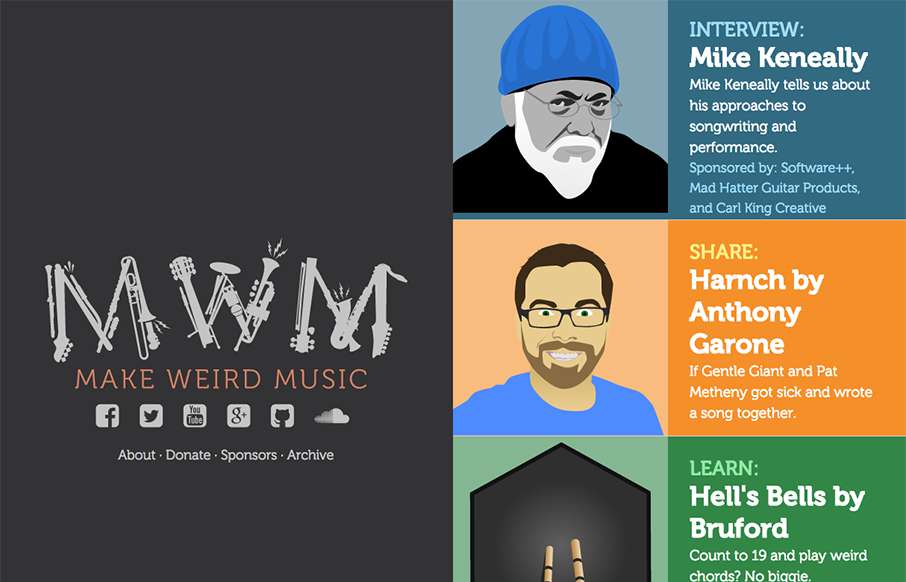
by Aaron Griswold | Oct 19, 2015 | Entertainment, Gallery
Good looking pet project site by Anthony Garone from Arizona, called Make Weird Music – interviews with musicians that make, well, weird music. Really like the split design, and illustrations. From the Designer: A 50/50 vertical split flexbox-based responsive...
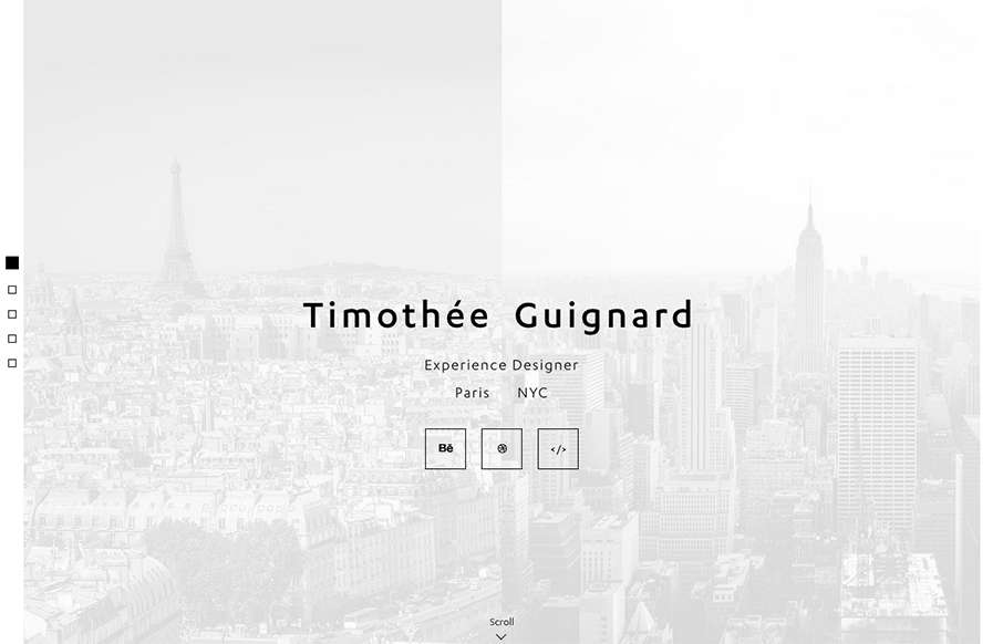
by Aaron Griswold | Oct 16, 2015 | Gallery, Portfolio
Love this portfolio site from Timothee Guignard out of NYC. Simple and understated on top – awesome detail in the Portfolio Detail pages. From the Designer: Portfolio of Timothee Guignard, UX, UI, Webdesigner Submitted by: Timothee Guignard Twitter: @timguignard...
by Aaron Griswold | Oct 16, 2015 | Gallery, Radar
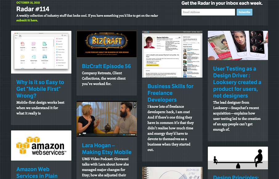
In this week’s 114th Radar: Why is it so Easy to Get “Mobile First” Wrong? BizCraft Episode 56 Business Skills for Freelance Developers User Testing as a Design Driver : Looksery created a product for users not designers Lara Hogan – Making Etsy...