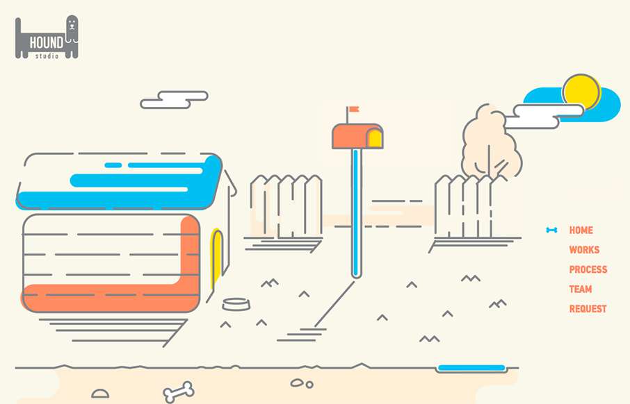
by Aaron Griswold | Oct 15, 2015 | Gallery, Marketing Company
This is a fun, quick, one-pager from Hound Studio out of the Ukraine, with cool animated illustration gifs – and good animated sales funnel. From the Designer: Imagine that you have 90 seconds to explain the customer the main idea of your business and all its...
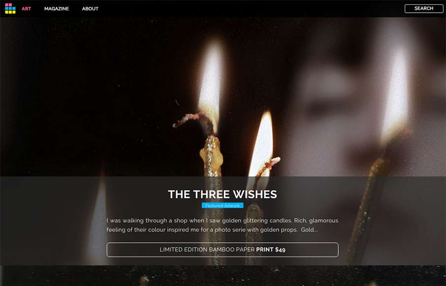
by Aaron Griswold | Oct 15, 2015 | Gallery, Photography
Looks like ArtSocket has changed it up a little since we reviewed them in January. They’ve continued to focus on the Art side, but making the experience a little more immersive with the full-width art scroll on the home page, and more detail on interior pages...
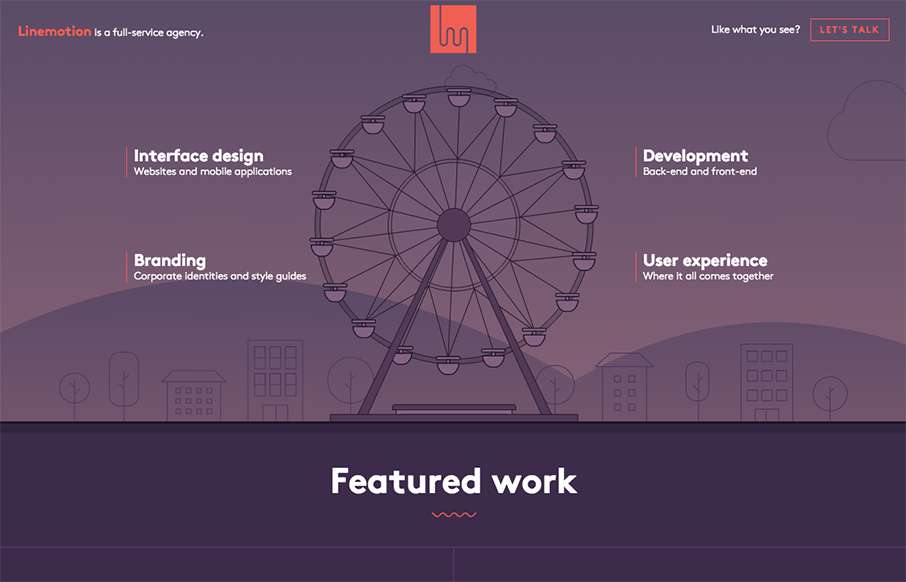
by Aaron Griswold | Oct 15, 2015 | Gallery
I like the header intro for Linemotion out of Serbia – it’s an interesting way to highlight the different pieces of work that go into their agency – how UI, branding, and development all come together to build UX / User Experience. Good job with the...
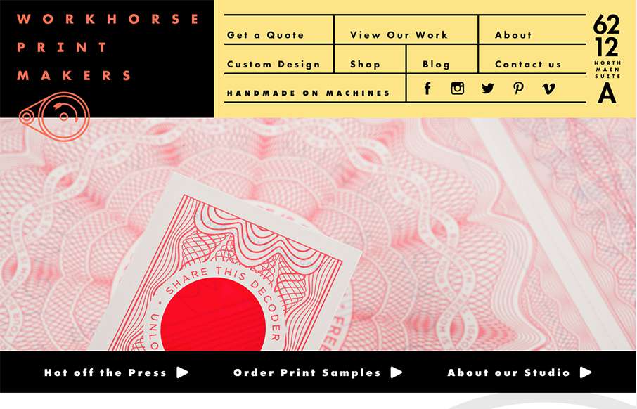
by Aaron Griswold | Oct 14, 2015 | Gallery
Hands down, the best navigation we’ve seen in a while in this site for Workhorse Printmakers, made by Spindletop out of Houston (think we’ve reviewed their site earlier this year too). Love this header nav block – definitely makes you think of a...
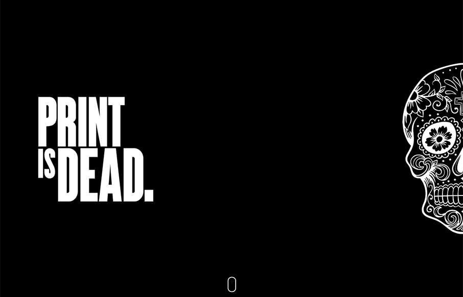
by Aaron Griswold | Oct 14, 2015 | Gallery
Very cool single page site done for Hadgins Engraving, by 15 Fingers out of Buffalo. Two colors, some illustrations, some good typeface, and a little interaction – very good. Especially like the “skull fashion plates” lower in the page. From the...
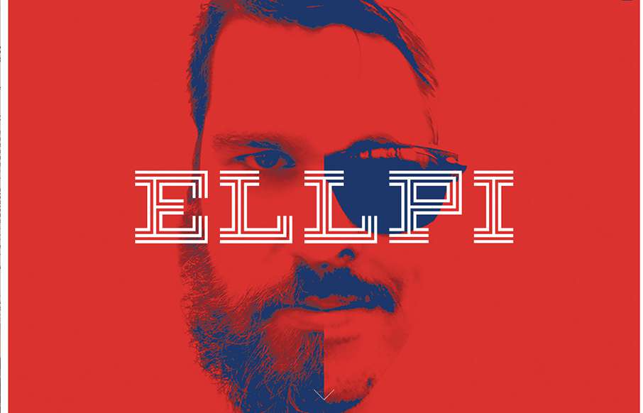
by Aaron Griswold | Oct 14, 2015 | Design Firm, Gallery
Cool looking red, blue and white agency site out of Montreal from Ellpi. It’s very simple and clean, with good white (red) space. I like how the video backgrounds on the site are not featured, they are more like footers on interior pages. From the Designer:...