by Aaron Griswold | Mar 1, 2016 | Gallery, Nonprofit
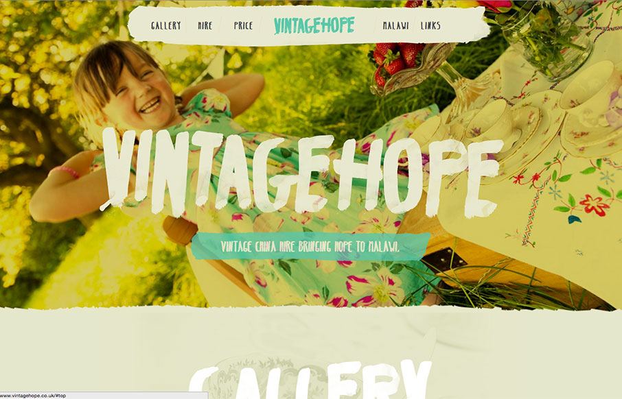
Great typography work on the Vintage Hope site out of the UK. Looks like you rent fine china for different events, and the money goes to a children’s home in Malawi – good social entrepreneurial concept – and a nice looking site.

by Gene Crawford | Feb 29, 2016 | Gallery, Nonprofit
Very simple color palette, and good typography from the TSE Foundation out of Hong Kong. I first saw it in a smaller screen – but it really opens up on a desktop and looks great, because it’s simple.

by Aaron Griswold | Feb 2, 2016 | Gallery, Nonprofit
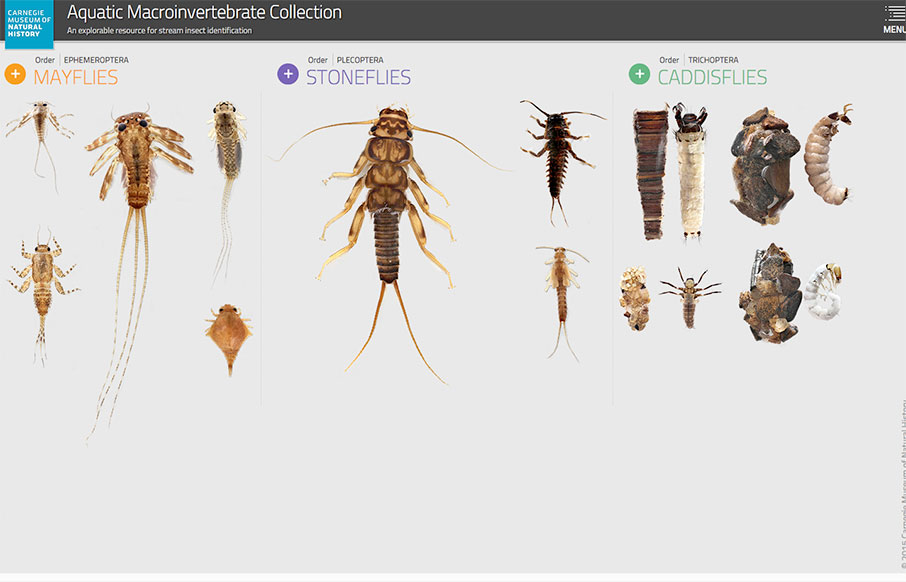
Wow – this is an information architect’s dream site – the Aquatic Macroinvertebrate Collection site from the Carnegie Museum of Natural History out of Pittsburgh. IA’s will love the structure of the order of classification of living things...

by Aaron Griswold | Jan 6, 2016 | Gallery, Nonprofit, Social Cause
Love this site from The Nature Conservancy out of Arlington, Virginia. It’s their “global” sub-domain, slightly separate from their main site – I kind of hope they change the main site to this format. There’s a lot here – but three...

by Gene Crawford | Nov 9, 2015 | Gallery, Nonprofit
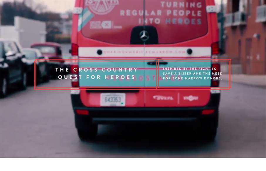
The team here at strADegy would go to the worlds end for these three brave and adventurous women. We were honored to help give Sam, Alex, and Taylor the extra help they needed to travel the country and look great doing so. The website was the final piece to the...

by Gene Crawford | Jun 4, 2015 | Conference, Gallery, Nonprofit
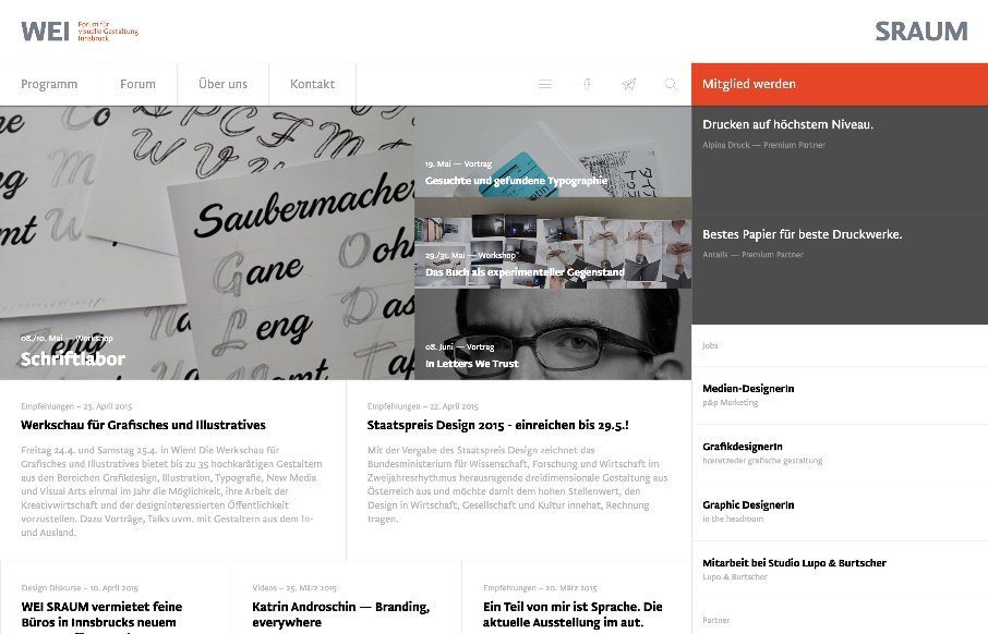
There is a lot going on here to get this website responsive visually. The grid is pretty core to its layout and it flows really well from screen to screen width. I also really dig how the header/nav stays fixed and moves up visually as you scroll down. From the...
